# Content Widget (Android)
Content widget is a feature in the Software Development Kit that allows you to embed an easily customizable view with [recommendations](/docs/ai-hub/recommendations-v2) in your application.
Two view layouts are available:
- Horizontal slider - a single row view that slides horizontally on the screen.
- Grid view - can be displayed as full- or half-screen grid layout within your app.
Both views offer a number of configuration options that allow you to style the view consistently in the app. Additionally, the Content widget automatically tracks 4 events:
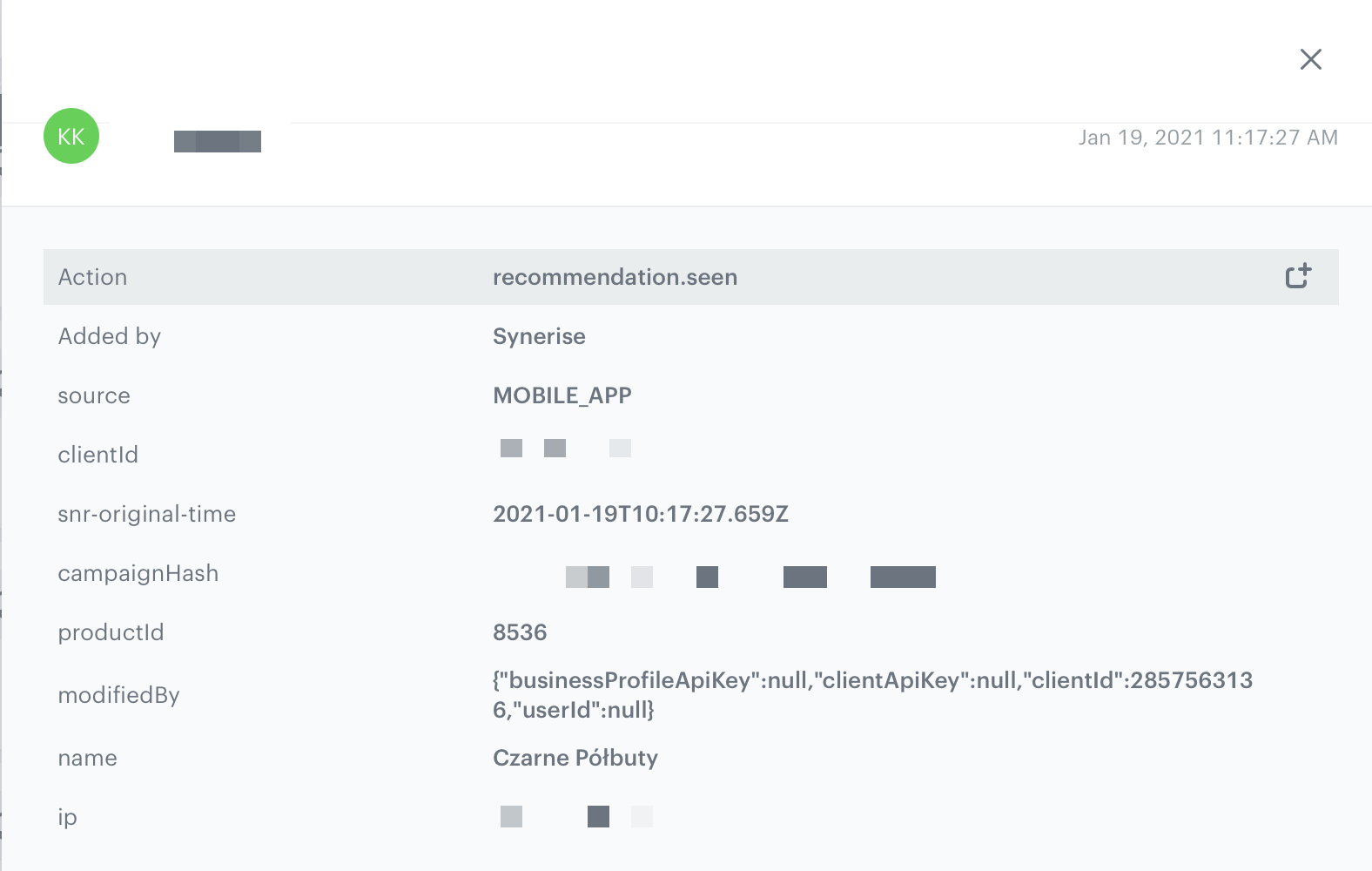
- `recommendation.seen` or `recommendation.view` (depending on configuration) sent when a recommended item is visible to the customer.
Recommendation.seen event
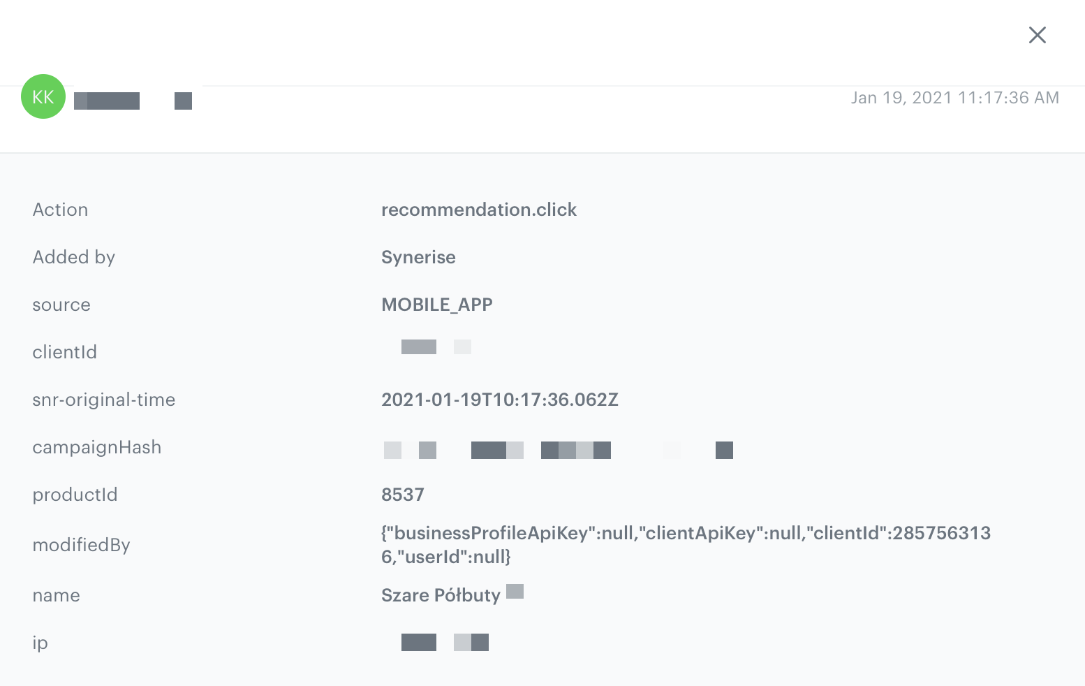
- `recommendation.click` sent when a customer clicks the recommended item.
Recommendation.click event
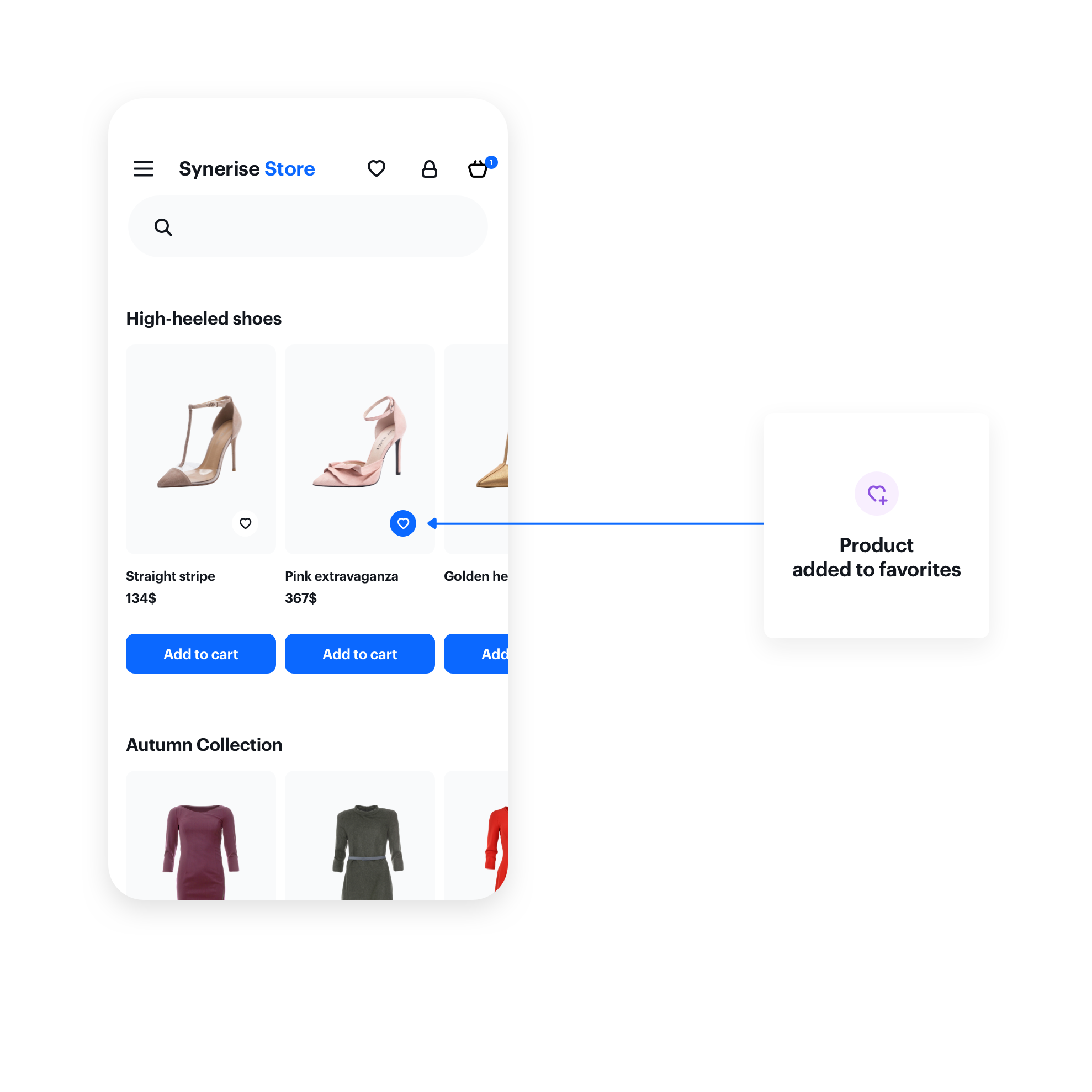
- `product.like` sent when a customer clicks a selectable button in the recommendation. (The button must be added)
Event sent when a user clicks the "like" button on an item
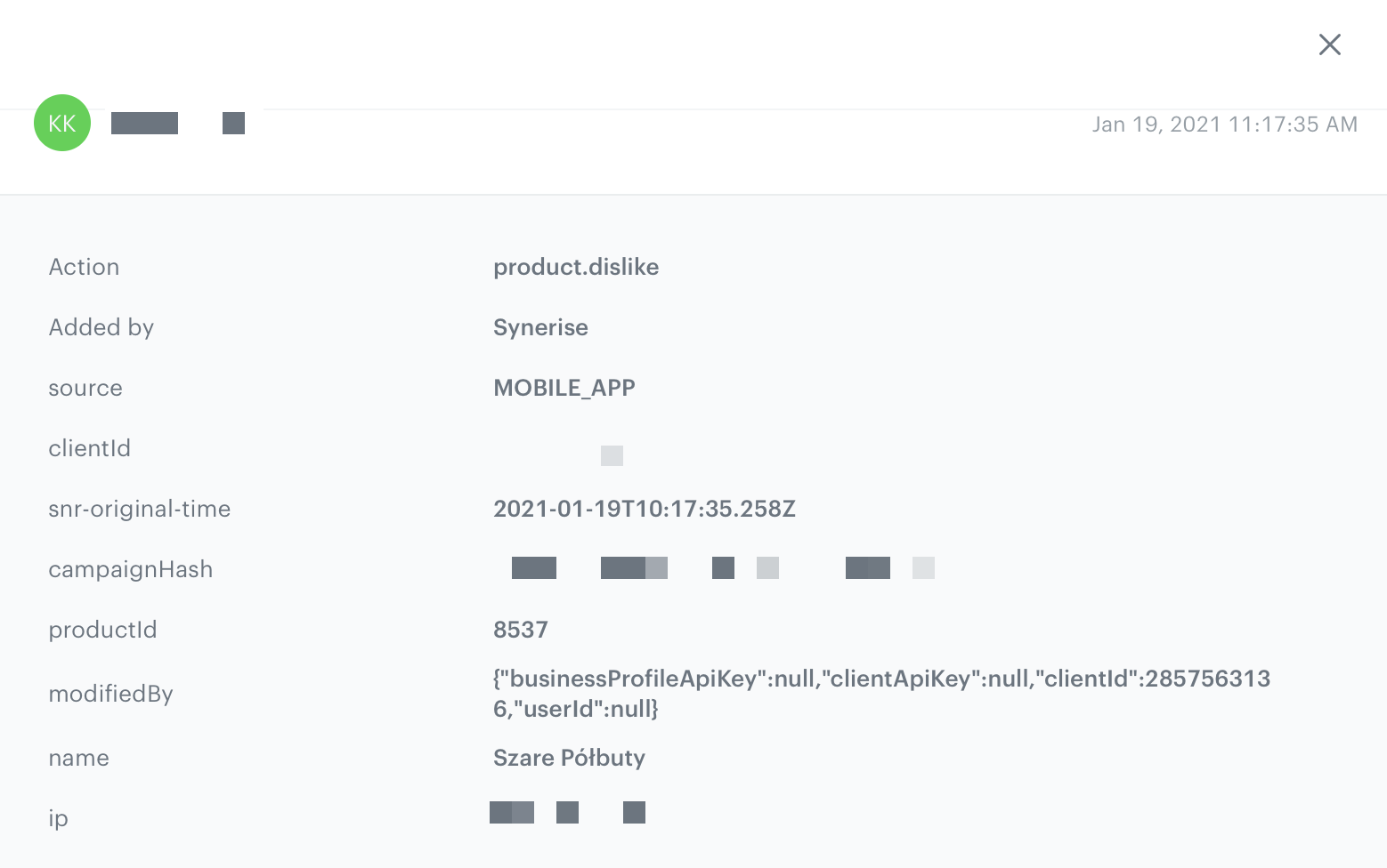
- `product.dislike` sent when a customer clicks a selectable button in the recommendation a second time. (The button must be added)
Product.dislike event
Currently, the widget can only be used for displaying AI recommendations.
## Prerequisites
---
To use the content widget feature, you must:
- Obtain a customer token from [Customer Authentication](/developers/mobile-sdk/user-identification-and-authorization/overview#authenticated-customers).
- [Create an AI Recommendation](/docs/ai-hub/recommendations-v2).
- [Create a document](/docs/assets/documents).
Such a document should contain the following content:
- In the notepad, save the document's slug and the ID of the recommendation for later use.
It's a good practice to name slugs based on the area of the app that you want to place the content in, for example `product-details`, `menu`, and so on.
## Basic implementation
---
Configure the `ContentWidgetOptions` and `ContentWidgetAppearance` settings first.
| Class | Description |
| --- | --- |
| `ContentWidgetOptions` | Contains options for business logic, such as the slug, product identifier, and so on. [Read more](#widget-options).|
| `ContentWidgetAppearance` | Contains the UI configuration. [Read more](#widget-options). |
The example below is the most basic implementation.
```java
String productId = "10214";
String slug = "similar";
ContentWidgetOptions options = new ContentWidgetRecommendationsOptions(this, slug, new OnRecommendationModelMapper() {
@Override
public ContentWidgetRecommendationDataModel onRecommendationMapping(Recommendation recommendation) {
// Mapping provided by
HashMap data = recommendation.getFeed();
String imageLink = (String) data.get("imageLink");
String productName = (String) data.get("title");
String price = null;
String salePrice = null;
try {
JSONObject json = new JSONObject(data.get("price").toString());
price = json.getString("value");
if (data.containsKey("salePrice")) {
JSONObject jsonSalePrice = new JSONObject(data.get("salePrice").toString());
salePrice = jsonSalePrice.getString("value");
}
} catch (JSONException e) {
e.printStackTrace();
}
return new ContentWidgetRecommendationDataModel(productName, imageLink, price, salePrice, null);
}
});
options.attributes.put(ContentWidgetOptions.ContentWidgetOptionsAttributeKeyProductId, productId);
ContentWidgetItemLayout itemLayoutDetails = new ContentWidgetItemLayout();
ContentWidgetHorizontalSliderLayout layout = new ContentWidgetHorizontalSliderLayout();
ContentWidgetAppearance contentWidgetAppearance = new ContentWidgetAppearance(layout, itemLayoutDetails);
ContentWidget widget = new ContentWidget(options, contentWidgetAppearance);
View view = widget.getView(); // our widget
insertPoint.addView(view); // your view which will receive widget
```
```kotlin
val productId = "10214"
val slug = "similar"
val options = ContentWidgetOptions(this, slug)
options.attributes.put(ContentWidgetOptions.ContentWidgetOptionsAttributeKeyProductId, productId);
val itemLayoutDetails = ContentWidgetItemLayout()
val layout = ContentWidgetHorizontalSliderLayout()
val contentWidgetAppearance = ContentWidgetAppearance(layout, itemLayoutDetails)
val widget = ContentWidget(options, contentWidgetAppearance)
val view = widget.getView() // our widget
insertPoint.addView(view) // your view which will receive widget
```
## Widget options
---
The [ContentWidgetRecommendationOptions](/developers/mobile-sdk/class-reference/android/content-widget#contentwidgetoptions) class is responsible for defining the business logic options of the widget, for example:
- document slug
- product identifier (which is stored inside class instance in attributes HashMap)
- recommendation model mapper
The table explains the parameters that can be configured in `ContentWidgetRecommendationOptions`.
| Parameter | Type | Default | Description |
| --- | --- | --- | --- |
| activity | `Activity` | - | Activity to which you insert the widget (must be included) |
| slug | `String` | - | Slug of a document |
| attributes | `Hashmap` | - | Custom attributes for generating data |
| mapper | `OnRecommendationModelMapper` | - | Mapper responsible for mapping data from feed to contentWidgetRecommendation model |
| recommendationEventType | `RecommendationEventType` | - | Recommendation event type.
RECOMMENDATION_VIEW_EVENT sends all products in one event. We highly recommend using this type of event in content widget.
RECOMMENDATION_SEEN_EVENT sends each event as a separate event.
|
### Example
```java
String productId = "10214";
String slug = "similar";
ContentWidgetOptions options = new ContentWidgetRecommendationsOptions(this, slug, new OnRecommendationModelMapper() {
@Override
public ContentWidgetRecommendationDataModel onRecommendationMapping(Recommendation recommendation) {
// here you should implement your mapping to SyneriseModel
HashMap data = recommendation.getFeed();
String imageLink = (String) data.get("imageLink");
String productName = (String) data.get("title");
String price = null;
String salePrice = null;
try {
JSONObject json = new JSONObject(data.get("price").toString());
price = json.getString("value");
if (data.containsKey("salePrice")) {
JSONObject jsonSalePrice = new JSONObject(data.get("salePrice").toString());
salePrice = jsonSalePrice.getString("value");
}
} catch (JSONException e) {
e.printStackTrace();
}
return new ContentWidgetRecommendationDataModel(productName, imageLink, price, salePrice, null);
}
});
options.attributes.put(ContentWidgetOptions.ContentWidgetOptionsAttributeKeyProductId, productId);
```
```kotlin
var productId = "10214"
var slug = "similar"
var options: ContentWidgetOptions = ContentWidgetRecommendationsOptions(this, slug, object : OnRecommendationModelMapper() {
fun onRecommendationMapping(recommendation: Recommendation): ContentWidgetRecommendationDataModel? {
// here you should implement your mapping to SyneriseModel
val data = recommendation.getFeed()
val imageLink = data["imageLink"] as String?
val productName = data["title"] as String?
var price: String? = null
var salePrice: String? = null
try {
val json = JSONObject(data["price"].toString())
price = json.getString("value")
if (data.containsKey("salePrice")) {
val jsonSalePrice = JSONObject(data["salePrice"].toString())
salePrice = jsonSalePrice.getString("value")
}
} catch (e: JSONException) {
e.printStackTrace()
}
return ContentWidgetRecommendationDataModel(productName, imageLink, price, salePrice, null)
}
})
options.attributes.put(ContentWidgetOptions.ContentWidgetOptionsAttributeKeyProductId, productId);
```
The recommendation response depends on your item feed.
In order to map your item feed, override `onRecommendationMapping` and inside it return [ContentWidgetRecommendationDataModel](/developers/mobile-sdk/class-reference/android/content-widget#contentwidgetrecommendationdatamodel).
The configuration of the data frames is available in [AI engine configuration](https://app.synerise.com/spa/modules/ai-v2/config). It is defined separately for each item feed.
## Appearance configuration
---
The [ContentWidgetAppearance](/developers/mobile-sdk/class-reference/android/content-widget#contentwidgetappearance) class is responsible for defining the appearance of the widget.
The class consists of parameters that define the widget's appearance, however, two of them are the most important:
- **Main layout class**: defines the way of distributing elements in the widget. Currently, two layouts are provided:
- `ContentWidgetHorizontalSliderLayout`
- `ContentWidgetGridLayout`
- **Item layout class**: defines appearance and parameters for the item in the widget. Currently, there is only one layout provided: `ContentWidgetBaseItemLayout`.
The table explains the parameters that can be configured in [ContentWidgetAppearance](/developers/mobile-sdk/class-reference/android/content-widget#contentwidgetappearance).
| Parameter | Type | Default | Description |
| --- | --- | --- | --- |
| layout | [ContentWidgetBaseLayout](/developers/mobile-sdk/class-reference/android/content-widget#contentwidgetbaselayout) | - | Class that inherits from `ContentWidgetBaseLayout`, contains the UI details of the widget's layout |
| itemLayout | [ContentWidgetBaseItemLayout](/developers/mobile-sdk/class-reference/android/content-widget#contentwidgetbaseitemlayout) | - | Class that inherits from `ContentWidgetBaseItemLayout`, contains the UI details of a single item in a widget |
## Layouts
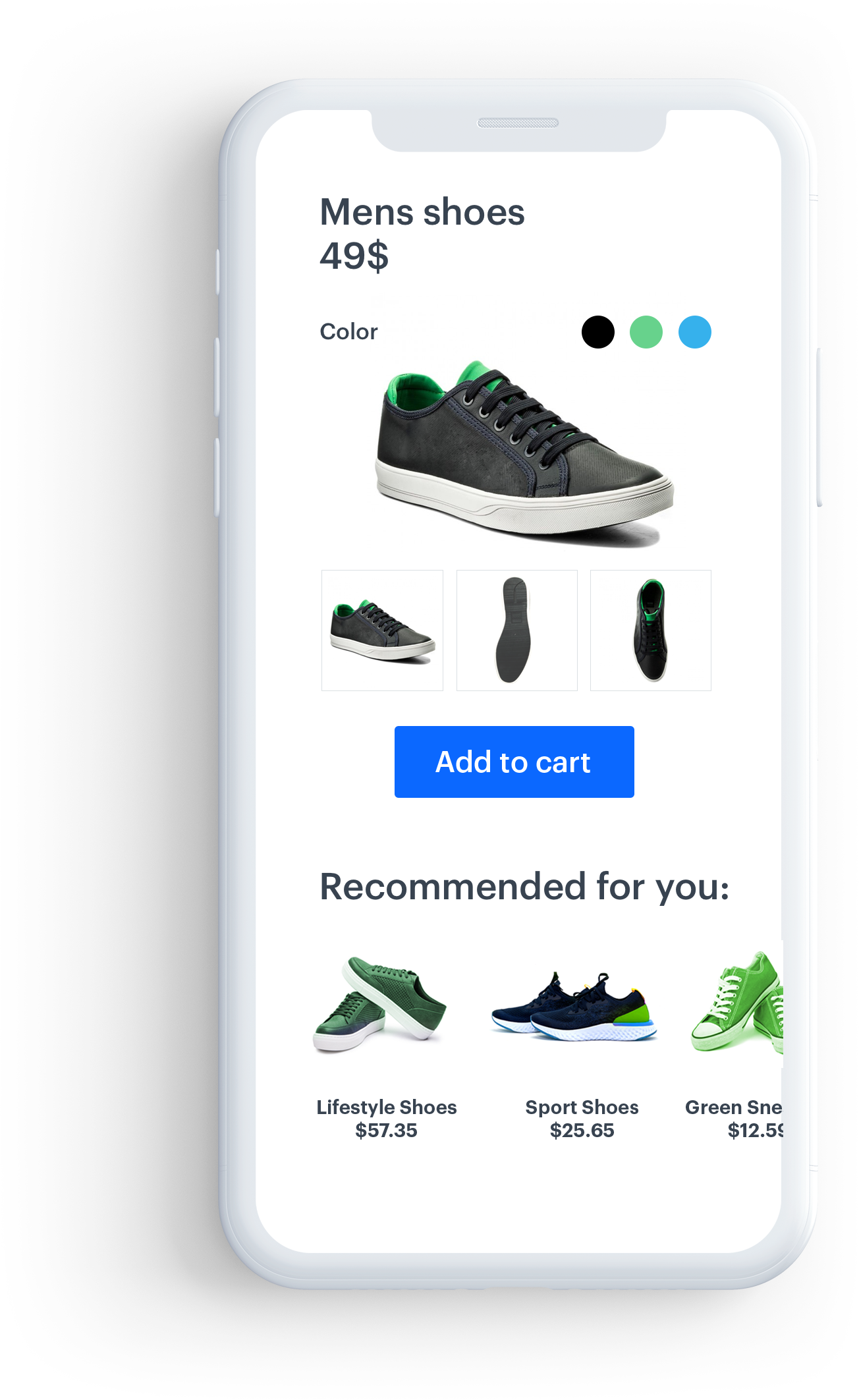
### Horizontal slider
---
This layout is intended to present recommendations in a fixed-hight horizontal scrollable slider.
Each item in the slider is called a *card*.
Click to see a screen with example widget with horizontal slider
#### Parameters
The table below contains the parameters that can be configured in [ContentWidgetHorizontalSliderLayout](/developers/mobile-sdk/class-reference/android/content-widget#contentwidgetsliderlayout).
| Parameter | Type | Default | Description |
| --- | --- | --- | --- |
| cardViewSize | `ViewGroup.LayoutParams` | 0 | Size of a single item (cardView). You can provide this parameter in dp (recommended) or px. |
| cardViewHorizontalSpacing | `Int` | 0 | Horizontal spacing between items. You can provide this parameter in dp (recommended) or px. |
| cardViewBackgroundColor | `Int` | #fff | Background color of a cardView |
`CardViewSize` can be set either by attribution or by a setter.
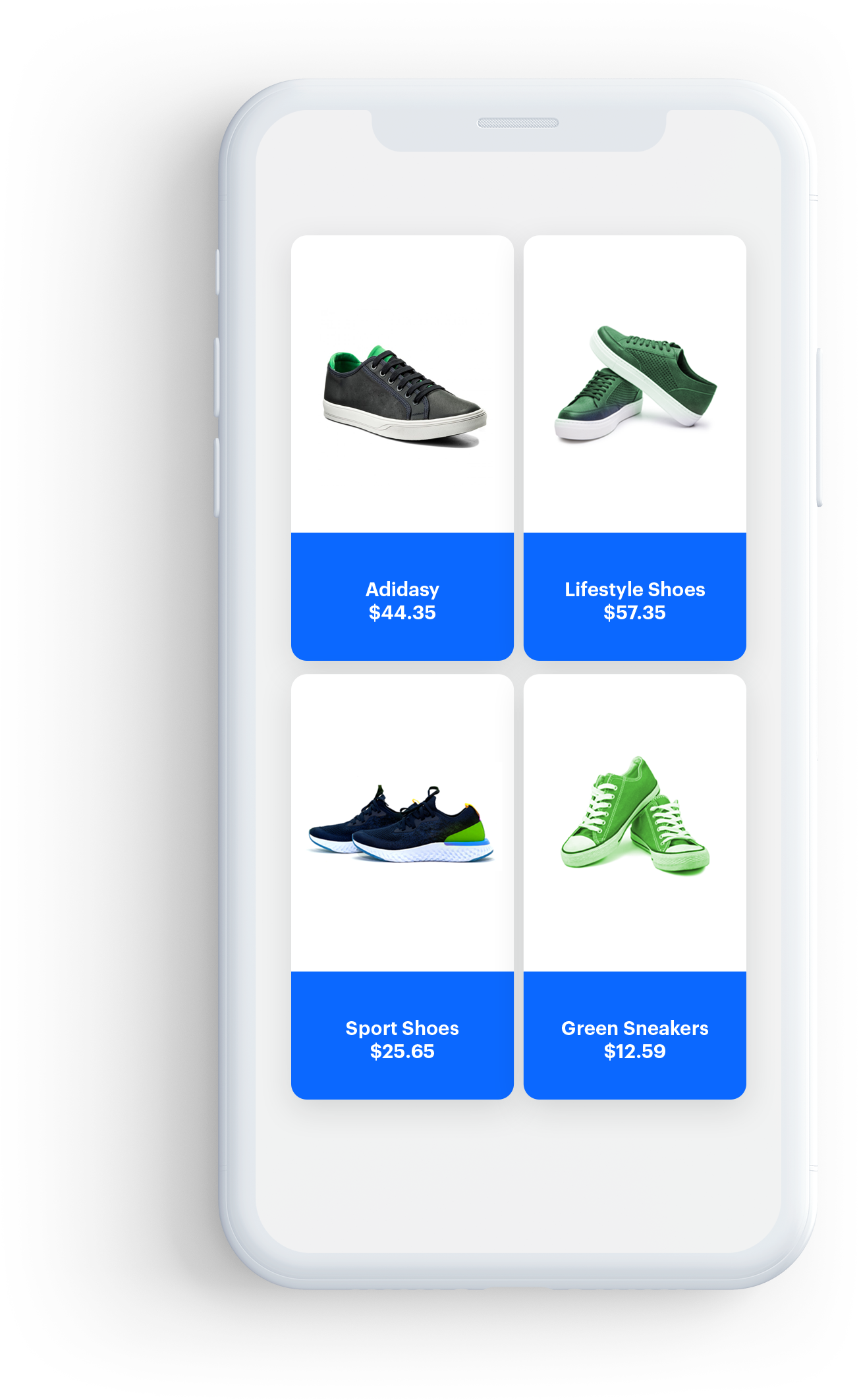
### Grid view
---
This layout presents recommendations in a vertical scrollable grid, with elements organized into columns and rows. You can create a full- or half-screen widget.
Click to see a screen with example widget with grid layout
#### Constructor
| Parameter | Type | Default | Description |
| --- | --- | --- | --- |
| preferredWidth | `Float` | - | Preferred width of your widget. You can pass the width in dp (recommended) or px |
```kotlin
var screenWidthDp = displayMetrics.widthPixels
var layout = ContentWidgetGridLayout(screenWidthDp)
```
#### Parameters
The table contains the parameters that can be configured in [ContentWidgetGridLayout](/developers/mobile-sdk/class-reference/android/content-widget#contentwidgetgridlayout).
| Parameter | Type | Default | Description |
| --- | --- | --- | --- |
| cardViewSize | `ViewGroup.LayoutParams` | 0 | Size of a single item (cardView) |
| cardViewVerticalSpacing | `Int` | 0 | Vertical spacing between items in dp or px |
| cardViewHorizontalSpacing | `Int` | 0 | Horizontal spacing between items in dp or px |
| cardViewBackgroundColor | `Int` | #fff | Background color of a cardView |
| includeEdgeSpacing | `Boolean` | false | When `true`, edge spacing is enabled |
CardViewSize and preferredWidth can be set by attribution or by a setter.
### Basic item layout
---
This is the basic layout for items. It contains: the image, the title, and the price from the uploaded data.
#### Parameters
The table below contains parameters that can be configured in `ContentWidgetItemLayout`.
| Parameter | Type | Default | Description |
| --- | --- | --- | --- |
| imageHeightToCardHeightRatio | `Double` | 0.6 | Image height. A ratio of `0.6` means that the image height equals 60% of the entire height of an item |
| imageWidthToCardWidthRatio | `Double` | 1 | Image width. `1` means that the image width is equal to the width of the item |
| imageScaleType | `ImageView.ScaleType` | ImageView.ScaleType.CENTER_INSIDE | Scaling type of the image |
| imageMargin | `Int` | 0 | General margin of the image |
| itemLabelStyle | `Typeface` | - | Typeface of the label |
| itemLabelSize | `Int` | 12 | Size of the label |
| itemLabelColor | `Int` | #000 | Label text color |
| itemLabelMarginLeft | `Int` | 0 | Left margin of the label text |
| itemLabelMarginRight | `Int` | 0 | Right margin of the label text |
| itemLabelMarginBottom | `Int` | 0 | Bottom margin of the label text |
| itemLabelMarginTop | `Int` | 0 | Top margin of the label text |
| cardViewCornerRadius | `Float` | 0 | Corner radius of the cardView |
| cardViewElevation | `Float` | 0 | Elevation of the cardView |
| itemTitleStyle | `Typeface` | - | Typeface of the product title |
| itemTitleSize | `Int` | 12 | Size of the title |
| itemTitleColor | `Int` | #000 | Color of the title text |
| itemTitleMarginLeft | `Int` | 0 | Left margin of the title text |
| itemTitleMarginRight | `Int` | 0 | Right margin of the title text |
| itemTitleMarginBottom | `Int` | 0 | Bottom margin of the title text |
| itemTitleMarginTop | `Int` | 0 | Top margin of the title text |
| itemPriceStyle | `Typeface` | - | Typeface of the price |
| itemPriceSize | `Int` | 12 | Size of the price text |
| itemPriceColor | `Int` | #000 | Color of the price text |
| itemPriceMarginLeft | `Int` | 0 | Left margin of the price text |
| itemPriceMarginRight | `Int` | 0 | Right margin of the price text |
| itemPriceMarginTop | `Int` | 0 | Top margin of the price text |
| itemPriceMarginBottom | `Int` | 0 | Bottom margin of the price text |
| itemSalePriceStyle | `Typeface` | - | Typeface of the sale price |
| itemSalePriceSize | `Int` | 12 | Size of the sale price |
| itemSalePriceColor | `Int` | #000 | Color of the sale price text |
| itemSalePriceGravity | `Int` | Gravity.LEFT | Gravity of the sale price text |
| itemSalePriceMarginLeft | `Int` | 0 | Left margin of the sale price text |
| itemSalePriceMarginRight | `Int` | 0 | Right margin of the sale price text |
| itemSalePriceMarginTop | `Int` | 0 | Top margin of the sale price text |
| itemSalePriceMarginBottom | `Int` | 0 | Bottom margin of the sale price text |
| itemSalePriceOrientation | `Int` | LinearLayout.HORIZONTAL | Orientation of the sale price text |
| isItemSalePriceVisible | `boolean` | false | Flag determining whether to show the sale price or not |
| itemDiscountPercentageLabelStyle | `Typeface` | - | Typeface of discount percentage label |
| itemDiscountPercentageLabelColor | `Int` | #000 | Color of discount percentage label |
| itemDiscountPercentageLabelSize | `Int` | 12 | Size of the discount percentage label text |
| itemDiscountPercentageLabelMarginLeft | `Int` | 0 | Left margin of the discount percentage label text |
| itemDiscountPercentageLabelMarginRight | `Int` | 0 | Right margin of the discount percentage label text |
| itemDiscountPercentageLabelMarginTop | `Int` | 0 | Top margin of the discount percentage label text |
| itemDiscountPercentageLabelMarginBottom | `Int` | 0 | Bottom margin of the discount percentage label text |
| isItemDiscountPercentageLabelVisible | `boolean` | false | Flag determining whether to show the discount percentage label or not |
| itemActionButton | `ImageButtonCustomAction` | - | Object which stores all information about the ActionButton |
| itemBadge | `ContentWidgetBadge` | - | Object which stores all information about the Badge |
| imageButtonCustomActionGravity | `Int` | Gravity.TOP | Gravity of the actionButton |
- You can combine the `Gravity.*` parameters. For example, to align an item to top and right, use:
```Gravity.TOP | Gravity.RIGHT```
- All text elements are centered horizontally.
ItemTitleMargins, ItemPriceMargins, ItemLabelMargins, ItemSalePriceMargins, and ItemDiscountLabelMargins can be set using setters, as shown below.
```java
public void setItemTitleMargins(int marginLeft, int marginRight, int marginTop, int marginBottom)
```
```kotlin
fun setItemTitleMargins(marginLeft:Int, marginRight:Int, marginTop:Int, marginBottom:Int)
```
## Interaction with the widget
### Public interface
---
`load()` - Starts fetching data and creates a view structure of the widget.
`getView()` - Gets the root view of the whole widget view structure.
`onContentWidgetListener` is used to inform developers about the state of a widget. Read more below.
### Listener
---
- `onLoading(ContentWidget contentWidget, boolean isLoading)` - Called when the widget loading state changes.
- `onLoad(ContentWidget contentWidget)` - Called after the widget is loaded.
- `onLoadingError(ContentWidget contentWidget, ApiError apiError)` - Called when an error occurs while loading.
- `onSizeChange(ContentWidget contentWidget, ViewGroup.LayoutParams size)` - Called when the widget size changes.
- `onClickActionReceive(ContentWidget contentWidget, BaseModel model)` - Called when the customer clicks a widget item.
## Image button custom action
`ImageButtonCustomAction` is used to add `imageButton` to your widget. You can add a `singleStateButton` or a `selectableButton`.
### Parameters
The following table contains the parameters that can be configured in `ImageButtonCustomAction`.
| Parameter | Type | Default | Description |
| --- | --- | --- | --- |
| predefinedAction | `PredefinedActionType` | null | PredefinedAction determines which event is sent on click |
| marginLeft | `Int` | 0 | Left margin of the image button |
| marginRight | `Int` | 0 | Right margin of the image button |
| marginTop | `Int` | - | Top margin of the image button |
| marginBottom | `Int` | 0 | Bottom margin of the image button |
ImageButtonCustomAction margins can be set using setters, as shown below.
```java
public void setImageButtonCustomActionMargins(int marginLeft, int marginRight, int marginTop, int marginBottom)
```
```kotlin
fun setImageButtonCustomActionMargins(marginLeft:Int, marginRight:Int, marginTop:Int, marginBottom:Int)
```
The following table contains the parameters that can be configured in `ContentWidgetBadge`.
| Parameter | Type | Default | Description |
| --- | --- | --- | --- |
| textStyle | `Typeface` | - | Typeface of the text badge |
| textSize | `Int` | 12 | Size of the badge text |
| rule | `Int` | RelativeLayout.ALIGN_LEFT | Rule deremining position of a badge. Can be ALIGN_LEFT or ALIGN_RIGHT |
| paddingLeft | `Int` | 0 | Left padding of the badge text |
| paddingRight | `Int` | 0 | Right padding of the badge text |
| paddingTop | `Int` | 0 | Top padding of the badge text |
| paddingBottom | `Int` | 0 | Bottom padding of the badge text |
| marginLeft | `Int` | 0 | Left margin of the badge |
| marginRight | `Int` | 0 | Right margin of the badge |
| marginTop | `Int` | - | Top margin of the badge |
| marginBottom | `Int` | 0 | Bottom margin of the badge |
ContentWidgetBadge margins and paddings can be set using setters, as shown below.
```java
public void setMargins(int marginLeft, int marginRight, int marginTop, int marginBottom)
```
```kotlin
fun setMargins(marginLeft:Int, marginRight:Int, marginTop:Int, marginBottom:Int)
```
```java
public void setPaddings(int paddingLeft, int paddingRight, int paddingTop, int paddingBottom)
```
```kotlin
fun setPaddings(paddingLeft:Int, paddingRight:Int, paddingTop:Int, paddingBottom:Int)
```
### setStateDrawables
This method is responsible for passing icons to the image button.
**Method name:** imageButtonCustomAction.setStateDrawables(dislikeIcon, likeIcon)
#### Declaration
```java
public void setStateDrawables(@NonNull Drawable defaultStateDrawable, @Nullable Drawable selectedStateDrawable)
```
```kotlin
fun setStateDrawables(@NonNull defaultStateDrawable:Drawable, @Nullable selectedStateDrawable:Drawable)
```
#### Parameters
| Parameter | Type | Mandatory | Default | Description |
| --- | --- | --- | --- | --- |
| defaultStateDrawable | `Drawable` | yes | --- | Icon that appears in default and false state |
| selectedStateDrawable | `Drawable` | no | --- | Icon that appears in the selected state |
#### Return Value
Void type
#### Example
```Kotlin
val likeHeart = ContextCompat.getDrawable(this, R.drawable.ic_heart)
val unlikeHeart = ContextCompat.getDrawable(this, R.drawable.ic_heart_outline)
favouriteIcon.setStateDrawables(unlikeHeart, likeHeart)
```
If you want a `singleStateButton`, pass `null` instead of `selectedStateDrawable`.
### Public interface
Set a listener by using `setOnItemActionListener`.
`OnActionItemStateListener` is used to inform developers about the state of an ImageButton.
### Listener
- `onReceiveClickAction(BaseModel model, boolean isSelected, ImageButton imageButton)` - called when the customer clicks the image button in the widget.
- `onStateCheck(BaseModel model)` - called before showing the view, when `selectableImageButton` needs information about the button state.
### Example
The example shows how to implement the "like" button.
```kotlin
val favouriteIcon = ImageButtonCustomAction()
val likeHeart = ContextCompat.getDrawable(this, R.drawable.ic_heart)
val unlikeHeart = ContextCompat.getDrawable(this, R.drawable.ic_heart_outline)
favouriteIcon.setStateDrawables(unlikeHeart!!, likeHeart)
favouriteIcon.setImageButtonCustomActionMargins(0, 0, 0, 0)
favouriteIcon.predefinedAction = PredefinedActionType.SEND_LIKE_EVENT
favouriteIcon.setOnItemActionListener(object : OnActionItemStateListener {
override fun onReceiveClickAction(model: BaseModel, isSelected: Boolean, imageButton: ImageButton) {
val recommendation = model as Recommendation
ViewUtils.pulse(imageButton)
}
override fun onStateCheck(model: BaseModel): Boolean {
return false
}
})
itemLayoutDetails.setItemAction(favouriteIcon)
```
## Sample implementations
### Horizontal slider
Slider layout with a fixed height.
```java
public void loadWidget() {
String productId = "10214";
String slug = "similar";
ContentWidgetOptions options = new ContentWidgetRecommendationsOptions(this, slug, new OnRecommendationModelMapper() {
@Override
public ContentWidgetRecommendationDataModel onRecommendationMapping(Recommendation recommendation) {
HashMap data = recommendation.getFeed();
String imageLink = (String) data.get("imageLink");
String productName = (String) data.get("title");
String price = null;
String salePrice = null;
try {
JSONObject json = new JSONObject(data.get("price").toString());
price = json.getString("value");
if (data.containsKey("salePrice")) {
JSONObject jsonSalePrice = new JSONObject(data.get("salePrice").toString());
salePrice = jsonSalePrice.getString("value");
}
} catch (JSONException e) {
e.printStackTrace();
}
ContentWidgetBadgeDataModel badgeDataModel = new ContentWidgetBadgeDataModel("Example badge", Color.BLACK, Color.RED);
ContentWidgetRecommendationDataModel dataModel = new ContentWidgetRecommendationDataModel(productName, imageLink, price, salePrice, "PLN");
dataModel.setBadgeDataModel(badgeDataModel);
dataModel.setLabel("Black Week");
return dataModel;
}});
options.attributes.put(ContentWidgetOptions.ContentWidgetOptionsAttributeKeyProductId, productId);
ContentWidgetBasicProductItemLayout itemLayoutDetails = new ContentWidgetBasicProductItemLayout();
ContentWidgetHorizontalSliderLayout layout = new ContentWidgetHorizontalSliderLayout();
//CardView parameters
if (!cardViewWidth.getEditText().getText().toString().matches("") && !cardViewHeight.getEditText().getText().toString().matches(""))
layout.setCardViewSize(Integer.parseInt(cardViewWidth.getEditText().getText().toString()), Integer.parseInt(cardViewHeight.getEditText().getText().toString()));
if (!cardViewElevation.getEditText().getText().toString().matches(""))
itemLayoutDetails.cardViewElevation = Integer.parseInt(cardViewElevation.getEditText().getText().toString());
if (!cornerRadius.getEditText().getText().toString().matches(""))
itemLayoutDetails.cardViewCornerRadius = Integer.parseInt(cornerRadius.getEditText().getText().toString());
if (!horizontalSpacing.getEditText().getText().toString().matches(""))
layout.cardViewHorizontalSpacing = Integer.parseInt(horizontalSpacing.getEditText().getText().toString());
layout.cardViewBackgroundColor = ContextCompat.getColor(Synerise.getApplicationContext(), R.color.regent);
//Image size as ratio to cardview size
if (!imageHeightRatio.getEditText().getText().toString().matches(""))
itemLayoutDetails.imageHeightToCardHeightRatio = Float.parseFloat(imageHeightRatio.getEditText().getText().toString());
if (!imageWidthRatio.getEditText().getText().toString().matches(""))
itemLayoutDetails.imageWidthToCardWidthRatio = Float.parseFloat(imageWidthRatio.getEditText().getText().toString());
itemLayoutDetails.imageScaleType = ImageView.ScaleType.CENTER_CROP;
itemLayoutDetails.imageMargin = 0; //have to be set when you set cardViewElevation
//TextView product label
itemLayoutDetails.itemLabelSize = 12;
itemLayoutDetails.itemLabelColor = Color.GREEN;
itemLayoutDetails.setItemLabelMargins(0,0,2,0);
//TextView product name
itemLayoutDetails.itemTitleStyle = Typeface.create("sans-serif-condensed", Typeface.NORMAL);
itemLayoutDetails.itemTitleSize = 12;
itemLayoutDetails.itemTitleColor = ContextCompat.getColor(Synerise.getApplicationContext(), R.color.charcoal);
itemLayoutDetails.setItemTitleMargins(10, 0, 0, 0);
//TextView Product price
itemLayoutDetails.itemPriceStyle = Typeface.create("sans-serif-light", Typeface.BOLD);
itemLayoutDetails.itemPriceSize = 13;
itemLayoutDetails.itemPriceColor = ContextCompat.getColor(Synerise.getApplicationContext(), R.color.charcoal);
itemLayoutDetails.setItemPriceMargins(10, 0, 3, 0);
//TextView Product Sale price
itemLayoutDetails.isItemSalePriceVisible = true;
itemLayoutDetails.itemSalePriceStyle = Typeface.create("sans-serif", Typeface.BOLD);
itemLayoutDetails.itemSalePriceSize = 13;
itemLayoutDetails.itemSalePriceColor = ContextCompat.getColor(Synerise.getApplicationContext(), R.color.red);
itemLayoutDetails.itemSalePriceOrientation = LinearLayout.HORIZONTAL;
itemLayoutDetails.setItemSalePriceMargins(4, 0, 3, 0);
// CrossedOut Price color
itemLayoutDetails.itemRegularPriceColor = ContextCompat.getColor(Synerise.getApplicationContext(), R.color.com_facebook_blue);
itemLayoutDetails.priceDecimalSeparator = ',';
itemLayoutDetails.priceGroupSeparator = ' ';
// DiscountLabel
itemLayoutDetails.itemDiscountPercentageLabelSize = 13;
itemLayoutDetails.isItemDiscountPercentageLabelVisible = true;
itemLayoutDetails.itemDiscountPercentageLabelColor = Color.BLUE;
itemLayoutDetails.itemDiscountPercentageLabelStyle = Typeface.create("sans-serif", Typeface.BOLD);
itemLayoutDetails.setItemDiscountLabelMargins(4, 0, 3, 0);
// Badge
ContentWidgetBadge badge = new ContentWidgetBadge();
badge.textSize = 12;
badge.rule = RelativeLayout.ALIGN_LEFT; // left or right
badge.setMargins(0,0,0,20);
badge.setPaddings(10, 10, 0, 0);
//ImageButton
ImageButtonCustomAction favouriteIcon = new ImageButtonCustomAction();
Drawable likeHeart = ContextCompat.getDrawable(this, R.drawable.ic_heart);
Drawable unlikeHeart = ContextCompat.getDrawable(this, R.drawable.ic_heart_outline);
favouriteIcon.setStateDrawables(unlikeHeart, likeHeart);
favouriteIcon.setImageButtonCustomActionMargins(0, 0, 0, 0);
favouriteIcon.predefinedAction = PredefinedActionType.SEND_LIKE_EVENT;
favouriteIcon.setOnItemActionListener(new OnActionItemStateListener() {
@Override
public void onReceiveClickAction(BaseModel model, boolean isSelected, ImageButton imageButton) {
Recommendation recommendationModel = (Recommendation) model;
ViewUtils.pulse(imageButton);
}
@Override
public boolean onStateCheck(BaseModel model) {
return false;
}
});
itemLayoutDetails.setBadge(badge);
itemLayoutDetails.setItemAction(favouriteIcon);
ContentWidgetAppearance contentWidgetAppearance = new ContentWidgetAppearance(layout, itemLayoutDetails);
ContentWidget widget = new ContentWidget(options, contentWidgetAppearance);
widget.setOnContentWidgetListener(new OnContentWidgetListener() {
@Override
public void onLoading(ContentWidget contentWidget, boolean isLoading) {
}
@Override
public void onLoadingError(ContentWidget contentWidget, ApiError apiError) {
Toast.makeText(getApplicationContext(), apiError.toString(),Toast.LENGTH_LONG).show();
}
@Override
public void onLoad(ContentWidget contentWidget) {
insertPoint.removeAllViews();
View view = widget.getView(); // our widget
insertPoint.addView(view); // your view which will receive widget
}
@Override
public void onClickActionReceive(ContentWidget contentWidget, BaseModel model) {
Recommendation recommendationModel = (Recommendation) model;
String itemId = recommendationModel.getItemId();
startActivity(WidgetRecommendedProductDetailsActivity.createIntent(getApplicationContext(), itemId));
}
@Override
public void onSizeChange(ContentWidget contentWidget, ViewGroup.LayoutParams size) {
ViewGroup.LayoutParams params = insertPoint.getLayoutParams();
params.height = size.height;
insertPoint.setLayoutParams(params);
}
});
}
```
```kotlin
fun loadWidget() {
val productId = "10214"
val slug = "similar"
var options: ContentWidgetOptions = ContentWidgetRecommendationsOptions(this, slug, object : OnRecommendationModelMapper() {
fun onRecommendationMapping(recommendation: Recommendation): ContentWidgetRecommendationDataModel? {
// here you should implement your mapping to SyneriseModel
val data = recommendation.getFeed()
val imageLink = data["imageLink"] as String?
val productName = data["title"] as String?
var price: String? = null
var salePrice: String? = null
try {
val json = JSONObject(data["price"].toString())
price = json.getString("value")
if (data.containsKey("salePrice")) {
val jsonSalePrice = JSONObject(data["salePrice"].toString())
salePrice = jsonSalePrice.getString("value")
}
} catch (e: JSONException) {
e.printStackTrace()
}
val badgeDataModel = ContentWidgetBadgeDataModel("Example badge", Color.BLACK, Color.RED)
val dataModel = ContentWidgetRecommendationDataModel(productName, imageLink, price, salePrice, "PLN")
dataModel.setBadgeDataModel(badgeDataModel);
dataModel.setLabel("Black Week");
return dataModel
}
})
options.attributes.put(ContentWidgetOptions.ContentWidgetOptionsAttributeKeyProductId, productId);
val itemLayoutDetails = ContentWidgetItemLayout()
val layout = ContentWidgetHorizontalSliderLayout()
layout.setCardViewSize(250, 350)
itemLayoutDetails.cardViewElevation = 5
itemLayoutDetails.cardViewCornerRadius = 10
layout.cardViewHorizontalSpacing = 20
layout.cardViewBackgroundColor = ContextCompat.getColor(Synerise.getApplicationContext(), R.color.regent)
//Image size as ratio to cardview size
itemLayoutDetails.imageHeightToCardHeightRatio = 0.6
itemLayoutDetails.imageWidthToCardWidthRatio = 1
itemLayoutDetails.imageMargin = 5 //have to be set when you set cardViewElevation
itemLayoutDetails.imageScaleType = ImageView.ScaleType.CENTER_CROP;
//TextView product label
itemLayoutDetails.itemLabelSize = 12;
itemLayoutDetails.itemLabelColor = Color.GREEN;
itemLayoutDetails.setItemLabelMargins(0,0,2,0);
//TextView product name
itemLayoutDetails.itemTitleStyle = Typeface.create("sans-serif-condensed", Typeface.NORMAL)
itemLayoutDetails.itemTitleSize = 12
itemLayoutDetails.itemTitleColor = ContextCompat.getColor(Synerise.getApplicationContext(), R.color.charcoal)
itemLayoutDetails.itemTitleGravity = Gravity.LEFT
itemLayoutDetails.setItemTitleMargins(10, 0, 0, 0)
//TextView Product price
itemLayoutDetails.itemPriceStyle = Typeface.create("sans-serif-light", Typeface.BOLD)
itemLayoutDetails.itemPriceSize = 12
itemLayoutDetails.itemPriceColor = ContextCompat.getColor(Synerise.getApplicationContext(), R.color.charcoal)
itemLayoutDetails.itemPriceGravity = Gravity.LEFT
itemLayoutDetails.setItemPriceMargins(10, 0, 3, 0)
//TextView Product Sale Price
itemLayoutDetails.itemSalePriceStyle = Typeface.create("sans-serif", Typeface.BOLD)
itemLayoutDetails.itemSalePriceSize = 13
itemLayoutDetails.itemSalePriceColor = ContextCompat.getColor(Synerise.getApplicationContext(), R.color.red)
itemLayoutDetails.itemSalePriceOrientation = LinearLayout.HORIZONTAL
itemLayoutDetails.isItemSalePriceVisible = true
itemLayoutDetails.setItemSalePriceMargins(5, 0, 3, 0)
// CrossedOut Price color
itemLayoutDetails.itemRegularPriceColor = ContextCompat.getColor(Synerise.getApplicationContext(), R.color.com_facebook_blue);
itemLayoutDetails.priceDecimalSeparator = ',';
itemLayoutDetails.priceGroupSeparator = ' ';
// DiscountLabel
itemLayoutDetails.itemDiscountPercentageLabelSize = 13;
itemLayoutDetails.isItemDiscountPercentageLabelVisible = true;
itemLayoutDetails.itemDiscountPercentageLabelColor = Color.BLUE;
itemLayoutDetails.itemDiscountPercentageLabelStyle = Typeface.create("sans-serif", Typeface.BOLD);
itemLayoutDetails.setItemDiscountLabelMargins(4, 0, 3, 0);
// Badge
val badge = ContentWidgetBadge();
badge.textSize = 12;
badge.rule = RelativeLayout.ALIGN_LEFT; // left or right
badge.setMargins(0,0,0,20);
badge.setPaddings(10, 10, 0, 0);
//ImageButton
val favouriteIcon = ImageButtonCustomAction()
val likeHeart = ContextCompat.getDrawable(this, R.drawable.ic_heart)
val unlikeHeart = ContextCompat.getDrawable(this, R.drawable.ic_heart_outline)
favouriteIcon.setStateDrawables(unlikeHeart, likeHeart)
favouriteIcon.setImageButtonCustomActionMargins(0, 0, 0, 0)
favouriteIcon.predefinedAction = PredefinedActionType.SEND_LIKE_EVENT
favouriteIcon.setOnItemActionListener(object:OnActionItemStateListener() {
fun onReceiveClickAction(model:BaseModel, isSelected:Boolean, imageButton:ImageButton) {
val recommendation = model as Recommendation
ViewUtils.pulse(imageButton)
}
fun onStateCheck(model:BaseModel):Boolean {
// Here you should set buttonState based on a product and a customer.
return false
}
})
itemLayoutDetails.setBadge(badge);
itemLayoutDetails.setItemAction(favouriteIcon)
val contentWidgetAppearance = ContentWidgetAppearance(layout, itemLayoutDetails)
val widget = ContentWidget(options, contentWidgetAppearance)
widget.setOnContentWidgetListener(object:OnContentWidgetListener() {
fun onLoading(contentWidget:ContentWidget, isLoading:Boolean) {
}
fun onLoadingError(contentWidget:ContentWidget, apiError:ApiError) {
Toast.makeText(getApplicationContext(), apiError.toString(), Toast.LENGTH_LONG).show()
}
fun onLoad(contentWidget:ContentWidget) {
insertPoint.removeAllViews()
val view = widget.getView() // our widget
insertPoint.addView(view) // your view which will receive widget
}
fun onClickActionReceive(contentWidget:ContentWidget, model:BaseModel) {
val recommendation = model as Recommendation
startActivity(WidgetRecommendedProductDetailsActivity.createIntent(getApplicationContext(), recommendation.getProductRetailerPartNo()))
}
fun onSizeChange(contentWidget:ContentWidget, size:ViewGroup.LayoutParams) {
val params = insertPoint.getLayoutParams()
params.height = size.height
insertPoint.setLayoutParams(params)
}
})
}
```
### Grid view
---
If you want to avoid double scroll view, set the height as shown in the `widgetSizeDidChange` callback.
```java
private void loadFullScreenWidget() {
String slug = "similar";
String productId = "10214";
ContentWidgetOptions options = new ContentWidgetRecommendationsOptions(this, slug, new OnRecommendationModelMapper() {
@Override
public ContentWidgetRecommendationDataModel onRecommendationMapping(Recommendation recommendation) {
HashMap data = recommendation.getFeed();
String imageLink = (String) data.get("imageLink");
String productName = (String) data.get("title");
String price = null;
String salePrice = null;
try {
JSONObject json = new JSONObject(data.get("price").toString());
price = json.getString("value");
if (data.containsKey("salePrice")) {
JSONObject jsonSalePrice = new JSONObject(data.get("salePrice").toString());
salePrice = jsonSalePrice.getString("value");
}
} catch (JSONException e) {
e.printStackTrace();
}
return new ContentWidgetRecommendationDataModel(productName, imageLink, price, salePrice, null);
}});
options.attributes.put(ContentWidgetOptions.ContentWidgetOptionsAttributeKeyProductId, productId);
ContentWidgetItemLayout itemLayoutDetails = new ContentWidgetItemLayout();
DisplayMetrics displayMetrics = new DisplayMetrics();
getWindowManager().getDefaultDisplay().getMetrics(displayMetrics);
float screenWidthDp = displayMetrics.widthPixels;
ContentWidgetGridLayout layout = new ContentWidgetGridLayout(screenWidthDp);
//CardView parameters
layout.setCardViewSize(250, 350);
itemLayoutDetails.cardViewElevation = 5;
itemLayoutDetails.cardViewCornerRadius = 5;
layout.cardViewHorizontalSpacing = 10;
layout.cardViewVerticalSpacing = 10;
layout.includeEdgeSpacing = false;
layout.cardViewBackgroundColor = ContextCompat.getColor(Synerise.getApplicationContext(), R.color.regent);
//Image size as ratio to cardview size
itemLayoutDetails.imageHeightToCardHeightRatio = 0.7;
itemLayoutDetails.imageWidthToCardWidthRatio = 1;
itemLayoutDetails.imageMargin = 5; //have to be set when you set cardViewElevation
//TextView product name
itemLayoutDetails.itemTitleStyle = Typeface.create("sans-serif-condensed", Typeface.NORMAL);
itemLayoutDetails.itemTitleSize = 12;
itemLayoutDetails.itemTitleColor = ContextCompat.getColor(Synerise.getApplicationContext(), R.color.charcoal);
itemLayoutDetails.itemTitleGravity = Gravity.LEFT;
itemLayoutDetails.setItemTitleMargins(10, 0, 10, 0);
//TextView Product price
itemLayoutDetails.itemPriceStyle = Typeface.create("sans-serif-light", Typeface.BOLD);
itemLayoutDetails.itemPriceSize = 12;
itemLayoutDetails.itemPriceColor = ContextCompat.getColor(Synerise.getApplicationContext(), R.color.charcoal);
itemLayoutDetails.itemPriceGravity = Gravity.LEFT;
itemLayoutDetails.setItemPriceMargins(10, 0, 10, 0);
//TextView Product Sale Price
itemLayoutDetails.itemSalePriceStyle = Typeface.create("sans-serif", Typeface.BOLD)
itemLayoutDetails.itemSalePriceSize = 13
itemLayoutDetails.itemSalePriceColor = ContextCompat.getColor(Synerise.getApplicationContext(), R.color.red)
itemLayoutDetails.itemSalePriceOrientation = LinearLayout.HORIZONTAL
itemLayoutDetails.isItemSalePriceVisible = true
itemLayoutDetails.setItemSalePriceMargins(5, 0, 3, 0)
//ImageButton
val favouriteIcon = ImageButtonCustomAction()
val likeHeart = ContextCompat.getDrawable(this, R.drawable.ic_heart)
val unlikeHeart = ContextCompat.getDrawable(this, R.drawable.ic_heart_outline)
favouriteIcon.setStateDrawables(unlikeHeart, likeHeart)
favouriteIcon.setImageButtonCustomActionMargins(0, 0, 0, 0)
favouriteIcon.predefinedAction = PredefinedActionType.SEND_LIKE_EVENT
favouriteIcon.setOnItemActionListener(object:OnActionItemStateListener() {
fun onReceiveClickAction(model:BaseModel, isSelected:Boolean, imageButton:ImageButton) {
val recommendation = model as Recommendation
ViewUtils.pulse(imageButton)
}
fun onStateCheck(model:BaseModel):Boolean {
// Here you should set buttonState based on a product and a customer.
return false
}
})
itemLayoutDetails.setItemAction(favouriteIcon)
ContentWidgetAppearance contentWidgetAppearance = new ContentWidgetAppearance(layout, itemLayoutDetails);
ContentWidget widget = new ContentWidget(options, contentWidgetAppearance);
widget.setOnContentWidgetListener(new OnContentWidgetListener() {
@Override
public void onLoading(ContentWidget contentWidget, boolean isLoading) {
}
@Override
public void onLoadingError(ContentWidget contentWidget, ApiError apiError) {
Toast.makeText(getApplicationContext(), apiError.toString(),Toast.LENGTH_LONG).show();
}
@Override
public void onLoad(ContentWidget contentWidget) {
insertPoint.removeAllViews();
View view = widget.getView();
insertPoint.addView(view);
}
@Override
public void onClickActionReceive(ContentWidget contentWidget, BaseModel model) {
Recommendation recommendation = (Recommendation)model;
startActivity(WidgetRecommendedProductDetailsActivity.createIntent(getApplicationContext(), recommendation.getProductRetailerPartNo()));
}
@Override
public void onSizeChange(ContentWidget contentWidget, ViewGroup.LayoutParams size) {
ViewGroup.LayoutParams params = insertPoint.getLayoutParams();
params.height = size.height;
insertPoint.setLayoutParams(params);
}
});
}
```
```kotlin
private fun loadFullScreenWidget() {
val slug = "similar"
val productId = "10214"
var options: ContentWidgetOptions = ContentWidgetRecommendationsOptions(this, slug, object : OnRecommendationModelMapper() {
fun onRecommendationMapping(recommendation: Recommendation): ContentWidgetRecommendationDataModel? {
// here you should implement your mapping to SyneriseModel
val data = recommendation.getFeed()
val imageLink = data["imageLink"] as String?
val productName = data["title"] as String?
var price: String? = null
var salePrice: String? = null
try {
val json = JSONObject(data["price"].toString())
price = json.getString("value")
if (data.containsKey("salePrice")) {
val jsonSalePrice = JSONObject(data["salePrice"].toString())
salePrice = jsonSalePrice.getString("value")
}
} catch (e: JSONException) {
e.printStackTrace()
}
return ContentWidgetRecommendationDataModel(productName, imageLink, price, salePrice, null)
}
})
options.attributes.put(ContentWidgetOptions.ContentWidgetOptionsAttributeKeyProductId, productId);
val itemLayoutDetails = ContentWidgetItemLayout()
val displayMetrics = DisplayMetrics()
getWindowManager().getDefaultDisplay().getMetrics(displayMetrics)
val screenWidthDp = displayMetrics.widthPixels
val layout = ContentWidgetGridLayout(screenWidthDp)
//CardView parameters
layout.setCardViewSize(250, 350)
itemLayoutDetails.cardViewElevation = 5
itemLayoutDetails.cardViewCornerRadius = 5
layout.cardViewHorizontalSpacing = 10
layout.cardViewVerticalSpacing = 10
layout.includeEdgeSpacing = false
layout.cardViewBackgroundColor = ContextCompat.getColor(Synerise.getApplicationContext(), R.color.regent)
//Image size as ratio to cardview size
itemLayoutDetails.imageHeightToCardHeightRatio = 0.7
itemLayoutDetails.imageWidthToCardWidthRatio = 1
itemLayoutDetails.imageMargin = 5 //have to be set when you set cardViewElevation
//TextView product name
itemLayoutDetails.itemTitleStyle = Typeface.create("sans-serif-condensed", Typeface.NORMAL)
itemLayoutDetails.itemTitleSize = 12
itemLayoutDetails.itemTitleColor = ContextCompat.getColor(Synerise.getApplicationContext(), R.color.charcoal)
itemLayoutDetails.itemTitleGravity = Gravity.LEFT
itemLayoutDetails.setItemTitleMargins(10, 0, 10, 0)
//TextView Product price
itemLayoutDetails.itemPriceStyle = Typeface.create("sans-serif-light", Typeface.BOLD)
itemLayoutDetails.itemPriceSize = 12
itemLayoutDetails.itemPriceColor = ContextCompat.getColor(Synerise.getApplicationContext(), R.color.charcoal)
itemLayoutDetails.itemPriceGravity = Gravity.LEFT
itemLayoutDetails.setItemPriceMargins(10, 0, 10, 0)
//TextView Product Sale Price
itemLayoutDetails.itemSalePriceStyle = Typeface.create("sans-serif", Typeface.BOLD)
itemLayoutDetails.itemSalePriceSize = 13
itemLayoutDetails.itemSalePriceColor = ContextCompat.getColor(Synerise.getApplicationContext(), R.color.red)
itemLayoutDetails.itemSalePriceOrientation = LinearLayout.HORIZONTAL
itemLayoutDetails.isItemSalePriceVisible = true
itemLayoutDetails.setItemSalePriceMargins(5, 0, 3, 0)
//ImageButton
val favouriteIcon = ImageButtonCustomAction()
val likeHeart = ContextCompat.getDrawable(this, R.drawable.ic_heart)
val unlikeHeart = ContextCompat.getDrawable(this, R.drawable.ic_heart_outline)
favouriteIcon.setStateDrawables(unlikeHeart, likeHeart)
favouriteIcon.setImageButtonCustomActionMargins(0, 0, 0, 0)
favouriteIcon.predefinedAction = PredefinedActionType.SEND_LIKE_EVENT
favouriteIcon.setOnItemActionListener(object:OnActionItemStateListener() {
fun onReceiveClickAction(model:BaseModel, isSelected:Boolean, imageButton:ImageButton) {
val recommendation = model as Recommendation
ViewUtils.pulse(imageButton)
}
fun onStateCheck(model:BaseModel):Boolean {
// Here you should set buttonState based on a product and a customer.
return false
}
})
itemLayoutDetails.setItemAction(favouriteIcon)
val contentWidgetAppearance = ContentWidgetAppearance(layout, itemLayoutDetails)
val widget = ContentWidget(options, contentWidgetAppearance)
widget.setOnContentWidgetListener(object:OnContentWidgetListener() {
fun onLoading(contentWidget:ContentWidget, isLoading:Boolean) {
}
fun onLoadingError(contentWidget:ContentWidget, apiError:ApiError) {
Toast.makeText(getApplicationContext(), apiError.toString(), Toast.LENGTH_LONG).show()
}
fun onLoad(contentWidget:ContentWidget) {
insertPoint.removeAllViews()
val view = widget.getView()
insertPoint.addView(view)
}
fun onClickActionReceive(contentWidget:ContentWidget, model:BaseModel) {
val recommendation = model as Recommendation
startActivity(WidgetRecommendedProductDetailsActivity.createIntent(getApplicationContext(), recommendation.getProductRetailerPartNo()))
}
fun onSizeChange(contentWidget:ContentWidget, size:ViewGroup.LayoutParams) {
val params = insertPoint.getLayoutParams()
params.height = size.height
insertPoint.setLayoutParams(params)
}
})
}
```
### More information
---
You can find more information under the following links:
- [Sample App on GitHub](https://github.com/Synerise/android-sdk)
- [Horizontal slider implementation in the Sample App on GitHub](https://github.com/Synerise/android-sdk/blob/master/sample/src/main/java/com/synerise/sdk/sample/ui/dev/content/WidgetHorizontalSliderActivity.java)
- [Grid implementation in the Sample App on GitHub](https://github.com/Synerise/android-sdk/blob/master/sample/src/main/java/com/synerise/sdk/sample/ui/dev/content/WidgetGridViewActivity.java)