The dynamic content template builder allows you to:
- create dynamic content templates from scratch and edit them by using HTML, CSS, and JavaScript
- use the ready-made templates from the folders with predefined templates.
The folders with predefined templates provide you with templates for the most common campaign scenarios such as surveys, opinion avatars, subscription forms, cookie banners, pop-ups, and so on.
Modification of the ready-made templates doesn't require applying changes to the template code. The template builder contains a user-friendly configuration form that brings editing down to filling out fields that define the properties of the template. This makes editing templates possible by any user regardless of the programming skills. You can [simplify the editing of your own templates as well](#template-editing-simplification) by creating custom configuration form adjusted to your needs. Thanks to this you can edit your template or create its variations dedicated for different scenarios.
Additionally, you can personalize the content of the message by [using snippets](#adding-a-snippet-to-the-template-code) and [Jinjava inserts](/developers/inserts) to inject data such as profile attributes (for example, name), recommendations, analysis results.
[Snippets](#adding-a-snippet-to-the-template-code) also let you re-use the same content in multiple templates, or create a reference to a fragment that you only need to update in one place to see the change in all templates where it's used.
## Editing a ready-made template
---
1. Go to **Experience Hub > Dynamic content**.
2. On the left pane, select **Templates**.
3. From the list of template folders, select a folder with the predefined templates.
- Insert object templates - This folder contains the templates that can be used for a dynamic content that inserts an object into your website code. For example, a frame with recommendations, banner with timer, and so on.
- Web layer templates - This folder contains the templates that can be used for a dynamic content that is displayed as a layer on your website, for example, a pop-up, surveys, a frame with recommendations in the form of a pop-up, exit intents, and so on.
- Script templates - This folder contains the templates that are used only to execute certain JS scripts. For example, script for AB tests, for gathering web push agreements, and so on.
4. Select one of the templates to edit.
**Result**: You are redirected to the code editor.
4. You can edit the template in two ways:
- Edit the code of the template ([add inserts](#adding-a-snippet-to-the-template-code), [add variables](#adding-a-variable)).
- Go to the **Config** tab and fill out the form.
5. After you make changes to the template, you can check the [preview](#previewing-templates).
6. If the template is ready, in the upper right corner click **Save this template > Save as**.
7. On the pop-up:
1. In the **Template name** field, enter the name of the template.
2. From the **Template folder** dropdown list, select the folder where the template will be saved.
3. Confirm by clicking **Apply**.
## Creating a template
---
1. Go to **Experience Hub > Dynamic content**.
2. On the left pane, select **Templates**.
3. In the upper right corner, click **New Template**.
4. Use the **HTML**, **CSS**, and **JavaScript** tabs to define the properties of the template.
6. If the template is ready, in the upper right corner click **Save this template > Save as**.
7. On the pop-up:
1. In the **Template name** field, enter the name of the template.
2. From the **Template folder** dropdown list, select the folder where the template will be saved.
3. Confirm by clicking **Apply**.
### Adding a snippet to the template code
[Snippets](/docs/assets/snippets) let you:
- insert data such as profile attribute, recommendations, or analysis results into the communication.
- create re-usable pieces of static content, so you don't need to manually copy and paste between templates.
- create dynamic pieces of content that are updated in all templates when you update the snippet definition.
1. Click **Snippets**.
**Result**: The snippet widget opens.
2. Add a snippet as described in [Snippets](/docs/assets/snippets).
## Template editing simplification
To make your template more accessible to users without programming skills, you can add a configuration form with variables dedicated for the template, so the user can make adjustments to the template.
The effect of template editing simplification is that you can edit templates by filling out a user-friendly configuration form (available in the **Config** tab) whose fields define the value for each property of the template.
The process of template simplification involves replacing values with variables in the HTML, CSS, and JavaScript code elements, such as alignment, font, color in CSS, or HTML tags as title, description or buttons. You can also add a variable in the place of Jinjava elements, such as a recommendation campaign ID, voucher pool ID, or catalog name. Variables inserted in the code appear in a form the **Config** tab when editing the template.
#### List of variables
| Variable name | Description | Example output |
|------------------------|------------------------------------------------------------------------------------------------------------------------------------------|----------------|
| **Synerise insert select** | Allows you to add a dropdown list with aggregates, expressions, metrics, voucher pools, recommendations, files, catalogs, or attributes. | Example: selecting a Synerise object from the list |
| **String** | Allows you to add a field that requires a string value. | Example: Filling out a field |
| **Select** | Allows you to add a dropdown list with configurable values. | Example: selecting an option from a dropdown list |
| **Switch** | Allows you to add a field which is enabled/disabled by a toggle. | Example: enabling an option |
| **Color** | Allows you to add a color selector. You can either select a color or enter its code manually. | Example: selecting a color |
| **Number** | Allows you to add a field that requires a number. You can either select a number from a dropdown or enter it manually. | Example: defining a number |
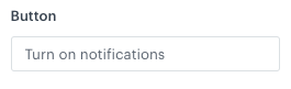
#### Results of simplifying template editing
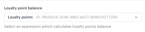
Instead of modifying the design of the template directly in the code, a user can go to the **Config** tab and define the properties of the template by filling out configuration form.
The image below presents the easy-to-edit form that lets users without coding expertise change the variable values:
Defining the settings of a string variable
### Adding a variable
1. Select one of the code editor tabs.
The tabs may be **JSON**, **HTML**, **CSS**, and **JavaScript**, depending on the communication type.
2. Position the cursor in the place where you want to add the variable.
3. On the right side, click **+ Variable**.
**Result**: A sidebar appears.
4. In the **Identifier** field, enter the ID of the variable.
This will be the title of the field unless you define the **Label** field.
The first character of the ID can't be a number.
5. From the **Type** dropdown list, select the type of variable.
Allows you to add a field that requires a string value.
1. In the **Label (Optional)** field, enter the name of the field.
If this field is empty, the name of the field will be taken from the **Identifier** field.
2. In the **Description (Optional)** field, enter a short explanation of the field's purpose.
3. In the **Default Value** field, enter the default value.
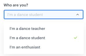
Allows you to add a dropdown list with configurable values.
1. In the **Label (Optional)** field, enter the name of the field. If this field is empty, the name of the field will be taken from the **Identifier** field.
2. In the **Description (Optional)** field, enter a short explanation what this field is for.
3. In the **Display Name** field, enter the name that will be visible in a dropdown.
4. In the **Value** field, enter a value.
5. In the **Default Value** field, enter the default value.
A select variable during configuration
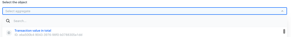
Allows you to add a dropdown list with aggregates, expressions, metrics, voucher pools, recommendations, files, catalogs, and attributes.
1. In the **Label (Optional)** field, enter the name of the field. If this field is empty, the name of the field will be taken from the **Identifier** field.
2. In the **Description (Optional)** field, enter a short explanation what this field is for.
3. From the **Insert Type** dropdown list, select the type of resource:
- **Aggregates, AI recommendations, Expressions, Metrics, Voucher pools**: creates a dropdown list of available resources of the selected type. When the user selects a resource in the form, its ID is inserted into the code of the template. This ID can be used in [Jinjava](/developers/inserts/insert-usage) to display the value of the selected resource.
- **Catalogs**: creates a dropdown list of catalogs. When the user selects a catalog in the form, its name is inserted into the code of the template. This name can be used in [Jinjava](/developers/inserts/insert-usage#catalogs) to retrieve a value from the catalog.
- **Files**: creates a dropdown list of [files](/docs/assets/files-explorer). When user selects a file, its URL is inserted into the code.
- **Profile attributes**: creates a dropdown list of profile attributes. When a user selects an attribute, its name is inserted into the code of the template. This name can be used in [Jinjava](/developers/inserts/insert-usage#customer-attributes) to retrieve the attribute value.
3. In the **Default Value (Optional)** field, enter the default value.
**Result**: A dropdown with the insert is added to the form in the **Config** tab. From the dropdown list, you can select an item of the chosen type (for example, aggregates). As a result, the value of variable will be ID of the selected item.
Synerise insert select in the configuration form
Allows you to add a field which is enabled/disabled by a toggle.
1. In the **Label (Optional)** field, enter the name of the field. If this field is empty, the name of the field will be taken from the **Identifier** field.
2. In the **Description (Optional)** field, enter a short explanation what this field is for.
3. In the **Default Value** field, select the default value (true/false).
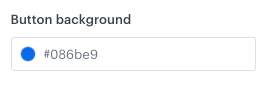
Allows you to add a color selector. You can either select a color or enter its code manually.
1. In the **Label (Optional)** field, enter the name of the field. If this field is empty, the name of the field will be taken from the **Identifier** field.
2. In the **Description (Optional)** field, enter a short explanation what this field is for.
3. In the **Default Value** field, enter the default value.
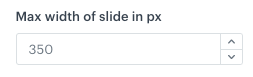
Allows you to add a field that requires a number. You can either select a number from a dropdown or enter it manually.
1. In the **Label (Optional)** field, enter the name of the field. If this field is empty, the name of the field will be taken from the **Identifier** field.
2. In the **Description (Optional)** field, enter a short explanation what this field is for.
3. In the **Default Value** field, enter the default value.
6. If you want to add the variable to a group that can be more easily displayed together in the form:
1. Click **Variable Group**.
2. Select or create a group:
- To select a group, click its name.
- To create a group:
1. Click **Add new group**.
2. Enter a group name.
3. Enter a group ID.
4. Click **Apply**.
**Result**: On the **Config** tab, the groups can be collapsed and expanded.
5. In the upper right corner, click **Add**.
**Result**: In the template code, a variable appears (it starts with `####`). It also becomes available on the **Config** tab.
6. Optionally, to modify the order of variables appearing in the configuration form, add the `order` parameter to the variable formula (for example, `#### type: "string", id: "string", label: "Text", order: 1 !####`).
## Previewing templates
5. To check the preview of the template for a particular customer or a product, click the **Preview** button on the upper left side.
1. Enter the ID of a customer or a product.
2. Click **Apply**.
 **Experience Hub > Dynamic content**.
2. On the left pane, select **Templates**.
3. From the list of template folders, select a folder with the predefined templates.
- Insert object templates - This folder contains the templates that can be used for a dynamic content that inserts an object into your website code. For example, a frame with recommendations, banner with timer, and so on.
- Web layer templates - This folder contains the templates that can be used for a dynamic content that is displayed as a layer on your website, for example, a pop-up, surveys, a frame with recommendations in the form of a pop-up, exit intents, and so on.
- Script templates - This folder contains the templates that are used only to execute certain JS scripts. For example, script for AB tests, for gathering web push agreements, and so on.
4. Select one of the templates to edit.
**Result**: You are redirected to the code editor.
4. You can edit the template in two ways:
- Edit the code of the template ([add inserts](#adding-a-snippet-to-the-template-code), [add variables](#adding-a-variable)).
- Go to the **Config** tab and fill out the form.
5. After you make changes to the template, you can check the [preview](#previewing-templates).
6. If the template is ready, in the upper right corner click **Save this template > Save as**.
7. On the pop-up:
1. In the **Template name** field, enter the name of the template.
2. From the **Template folder** dropdown list, select the folder where the template will be saved.
3. Confirm by clicking **Apply**.
## Creating a template
---
1. Go to
**Experience Hub > Dynamic content**.
2. On the left pane, select **Templates**.
3. From the list of template folders, select a folder with the predefined templates.
- Insert object templates - This folder contains the templates that can be used for a dynamic content that inserts an object into your website code. For example, a frame with recommendations, banner with timer, and so on.
- Web layer templates - This folder contains the templates that can be used for a dynamic content that is displayed as a layer on your website, for example, a pop-up, surveys, a frame with recommendations in the form of a pop-up, exit intents, and so on.
- Script templates - This folder contains the templates that are used only to execute certain JS scripts. For example, script for AB tests, for gathering web push agreements, and so on.
4. Select one of the templates to edit.
**Result**: You are redirected to the code editor.
4. You can edit the template in two ways:
- Edit the code of the template ([add inserts](#adding-a-snippet-to-the-template-code), [add variables](#adding-a-variable)).
- Go to the **Config** tab and fill out the form.
5. After you make changes to the template, you can check the [preview](#previewing-templates).
6. If the template is ready, in the upper right corner click **Save this template > Save as**.
7. On the pop-up:
1. In the **Template name** field, enter the name of the template.
2. From the **Template folder** dropdown list, select the folder where the template will be saved.
3. Confirm by clicking **Apply**.
## Creating a template
---
1. Go to