The basic drag & drop builder is an external solution provided by BeeFree implemented in Synerise that lets you create an in-app message template by dragging and dropping elements.
It is a great choice for creating in-app templates because it's user-friendly and efficient, provides visual control, offers customization options, supports collaboration, simplifies updates, and makes campaign management accessible to non-technical users.
You can personalize the content of the message by using [inserts](/docs/campaign/in-app-messages/creating-inapp-templates/creating-inapp-template#adding-a-snippet-to-the-template-code). Inserts let you refer to customer attributes (such as name, city, size), product recommendations (for example, last seen items or added to a cart), and the results of aggregates, expressions, and metrics.
## Good practices
### Campaign planning recommendations
Using a large number of in-app messages in your application can impact rendering time, message delivery, and battery usage.
To maintain optimal application performance when using in-app campaigns:
- Avoid assigning more than 10 in-app messages to the same trigger event.
- Avoid having more than 20 in-app messages active at the same time in your application.
- Review and archive in-app campaigns that you no longer need.
### Template construction
When creating or editing in-app message content:
- Place the the `SRInApp.close()` (or `SRInApp.hide()`) method at the beginning of the JS script.
- Use try/catch to handle possible fatal errors in the JS script.
- Handle situations where Jinjava inserts return empty data.
- When adding external links to your message:
- Only link to sites you trust.
- Don't link to large images that may negatively affect performance.
- Don't link to resources whose CSS/HTML may be blocked. If you have resources loaded from your own URLs, set `Synerise.settings.inAppMessaging.contentBaseUrl` and use relative paths in HTML/CSS.
## Building templates
---
1. Go to **Experience Hub > In-App Messages**.
2. On the left pane, click **Templates > New template**.
3. On the pop-up, select **Drag & drop builder**.
4. Proceed according to the instructions on building templates is available at the [BeeFree help center](https://support.beefree.io/hc/en-us/articles/360015405120-Building-Content-in-Beefree).
### Selecting in-app message type
To select the way of displaying your in-app message within a mobile application:
1. On the part of the screen with an in-app message preview, click **Display type**.
2. From the dropdown list, select one of the following options:
- **Fullscreen** - In-app messages are displayed in the center of the mobile application, with no clickable elements within the application.
- **Top bar** - In-app messages are shown at the top bar of the application, and user interaction is limited to the area below the message.
- **Bottom bar** - In-app messages appear at the bottom bar of the application, with user interaction restricted to the area above the message.
3. If you want to manage the display of in-app messages over safe area in your mobile application, use the **Cover safe area** option.
A safe area is the portion of a view that is not covered by elements such as a navigation bar, tab bar, or toolbar. Safe areas are important for ensuring visibility and access to a device's interactive features.
Available from the following application versions:
- iOS: `5.1.0` and higher
- Android: `6.1.0` and higher
- By enabling this option, the in-app message will extend into bars, notches and other UI elements.
- By disabling this option, the in-app message won't cover system UI elements such as top bars, notches, and so on. This is the default setting.
View of the Display type option in drag and drop builder
### Adding links
---
Universal links and deep links are used to navigate to specific content within an app, while web links can display web content within the app itself. In the template builder, the **Link type** option lets you incorporate links into your in-app template. The builder automatically recognizes the link type you enter, triggering the corresponding action without requiring further configuration.
The following SDK versions automatically recognize the link type and adjust the action accordingly:
- Android: `5.19.0` and higher
- iOS: `4.18.0` and higher
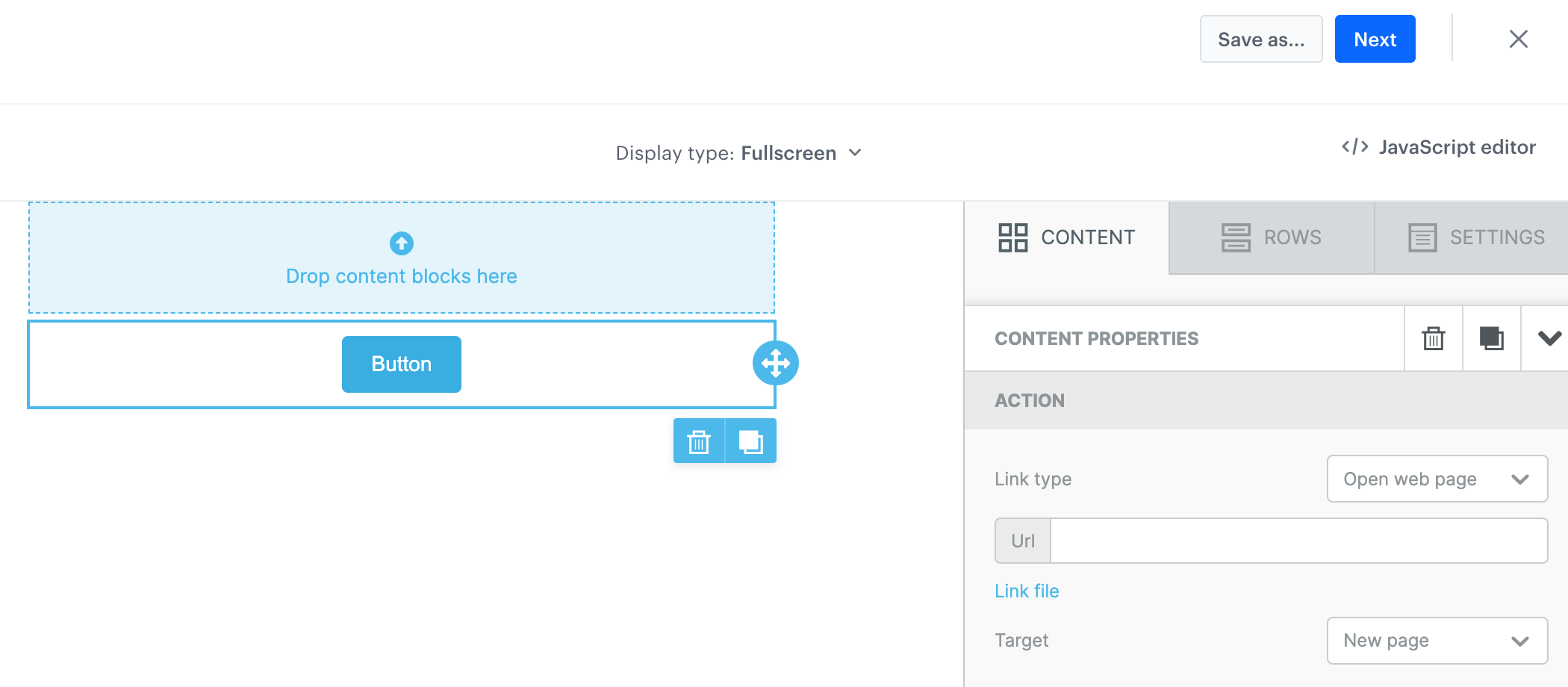
1. Drag the **Button** widget to the canvas.
**Result**:
A button widget added to the canvas
2. Go to the widget editing mode by clicking the widget on the canvas.
**Result**: The editing options appear on the right pane.
The configuration of the Button widget
3. In the **ACTION** section, set the **Link type** option to **Open web link**:
- To add a web or universal link, in the **Url** field, enter a URL address including the HTTP or HTTPS protocol, for example: `https://example-link.com/`
- To add a deep link, in the **Url** field, enter a URL in the format of mobile deep linking, for example: `myapp://product?id=123`
You can use Jinjava inserts in links for personalization.
### Creating HTML blocks
---
Apart from the standard building elements such as Title, Paragraph, List, Image, Button, Divider, Social, HTML, Icons, and Menu, the basic builder includes the custom, Synerise-native **HTML blocks** element. The configuration of this element takes place in the [Synerise-native code editor](/docs/campaign/in-app-messages/creating-inapp-templates/creating-inapp-template), that lets you derive the benefits provided by the code creator such as:
- creating re-usable HTML block templates,
- creating a block to be edited in an easy-to-use configuration form that doesn’t require programming skills
- previewing the block in the context of a specific customer in isolation from the in-app message template
You can also preview the whole template in the context of a specific customer.
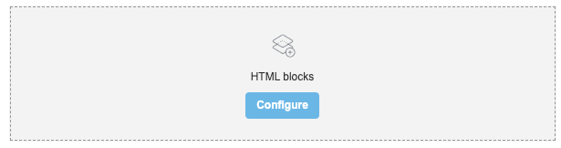
5. On the right side of the screen, select and drag the **HTML blocks** element to the template.
**Result**:
The HTML block added to the template
6. On the **HTML blocks** you added to the template, click **Configure**.
**Result**: A pop-up appears.
7. On the upper right side, click **New block**.
8. Create the structure of an HTML block by following the instructions in the ["Creating template"](/docs/campaign/in-app-messages/creating-inapp-templates/creating-inapp-template#creating-a-template) section.
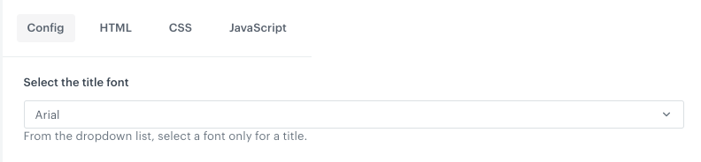
- You can build a simple HTML structure in the **HTML** section.
- On the **HTML** tab, you [can build an easy-to-use configuration form](/docs/campaign/in-app-messages/creating-inapp-templates/creating-inapp-template#template-editing-simplification) which can be filled out by users with no programming skills. To do so, [add variables](/docs/campaign/in-app-messages/creating-inapp-templates/creating-inapp-template#adding-a-variable) to the block template such as color pickers, dropdown lists (with aggregates, expressions, metrics, voucher pools, and recommendations created in Synerise), and fields, so the users who will use this template in a builder will need only to fill out the fields in this form. For example:
Example field in a configuration form
9. To save this block as a template, click an arrow on the left to the **Next** button, and select **Save as**. On the pop-up, enter the name of the template and select the folder in which the template will be saved.
10. To use this block in a dynamic content template, click **Next**.
We recommend placing the HTML block as the sole element in the row. Additionally, ensure that the styling of the block is compatible with the styling of the template.
## Previewing templates
5. To check the preview of the template for a particular customer or a product, click the **Preview** button on the upper left side.
1. Enter the ID of a customer or a product.
2. Click **Apply**.