 # Introduction to dashboards
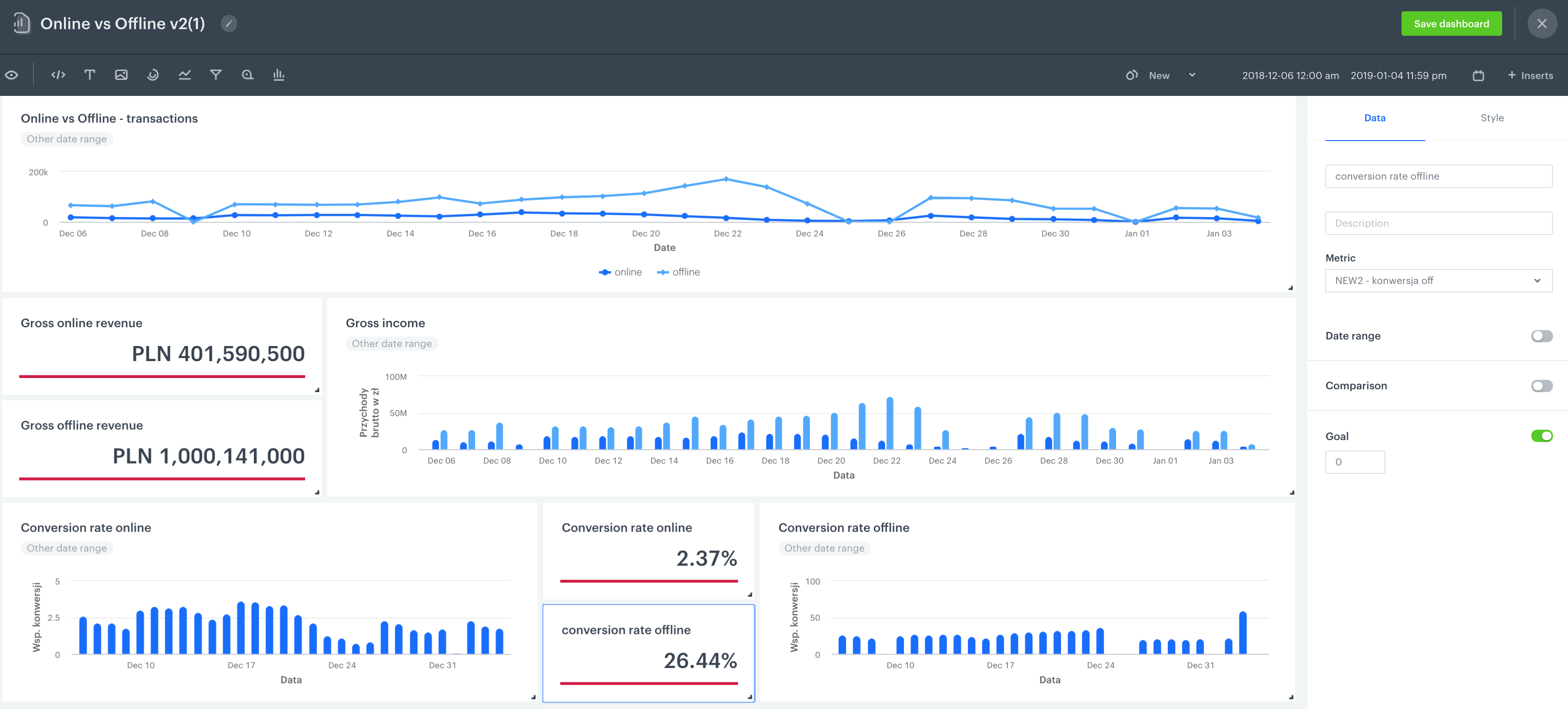
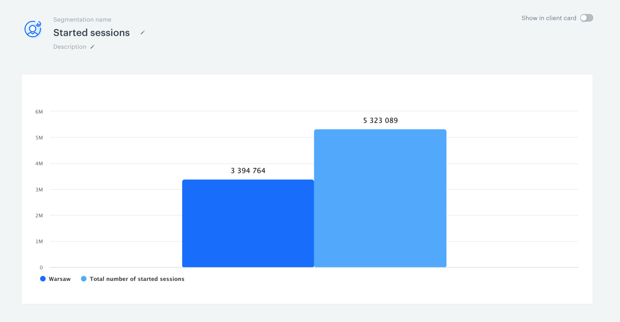
Dashboards is the feature that allows putting all your analyses together in one place so you can examine and compare key data about your business. This way you can investigate the results of carried out activities with full transparency.
Another benefit of this feature is the possibility to [display dynamic data](/docs/analytics/analytics-dashboard/creating-dashboards#dynamic-data-in-dashboards). Thanks to that, you can preview the results of particular messages sent to customers, sales results of a particular product, observe the activity of an individual customer, and so on.
Due to the additional options that facilitate editing the dashboard layout and the presentation mode, you can use a dashboard in business meetings.
## Business benefits
---
- The possibility to combine all types of analyses into one place
- Displaying the dynamic data in real time
- Sharing dashboards with non-Synerise users
-
# Introduction to dashboards
Dashboards is the feature that allows putting all your analyses together in one place so you can examine and compare key data about your business. This way you can investigate the results of carried out activities with full transparency.
Another benefit of this feature is the possibility to [display dynamic data](/docs/analytics/analytics-dashboard/creating-dashboards#dynamic-data-in-dashboards). Thanks to that, you can preview the results of particular messages sent to customers, sales results of a particular product, observe the activity of an individual customer, and so on.
Due to the additional options that facilitate editing the dashboard layout and the presentation mode, you can use a dashboard in business meetings.
## Business benefits
---
- The possibility to combine all types of analyses into one place
- Displaying the dynamic data in real time
- Sharing dashboards with non-Synerise users
-
 # Dashboards
Dashboards is the feature that allows putting all your analyses together in one place so you can examine and compare key data about your business. This way you can investigate the results of carried out activities with full transparency.
Another benefit of the feature is the possibility to [display dynamic data](/docs/analytics/analytics-dashboard/creating-dashboards#dynamic-data-in-dashboards). Thanks to that, you can preview the results of particular messages, sales results of a particular product, observe the activity of an individual customer, and so on.
Due to the additional options that facilitate editing the dashboard layout and the presentation mode, you can use a dashboard in business meetings.
## Business benefits
---
- The possibility to combine all types of analyses into one place
- Displaying the dynamic data in real time
- Sharing dashboards with non-Synerise users
-
# Dashboards
Dashboards is the feature that allows putting all your analyses together in one place so you can examine and compare key data about your business. This way you can investigate the results of carried out activities with full transparency.
Another benefit of the feature is the possibility to [display dynamic data](/docs/analytics/analytics-dashboard/creating-dashboards#dynamic-data-in-dashboards). Thanks to that, you can preview the results of particular messages, sales results of a particular product, observe the activity of an individual customer, and so on.
Due to the additional options that facilitate editing the dashboard layout and the presentation mode, you can use a dashboard in business meetings.
## Business benefits
---
- The possibility to combine all types of analyses into one place
- Displaying the dynamic data in real time
- Sharing dashboards with non-Synerise users
-
 # Introduction to reports
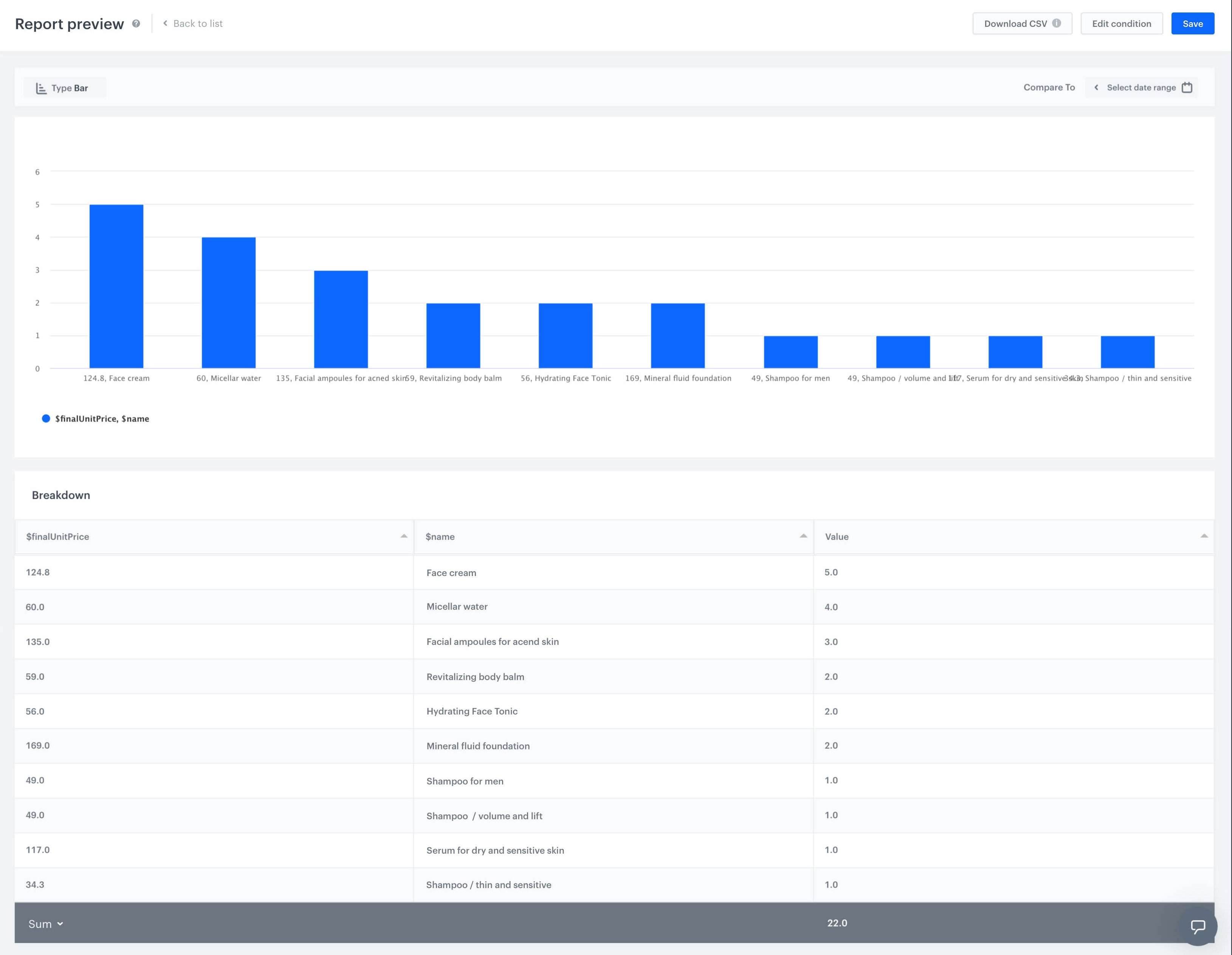
A report is a visual presentation of data aspects contained in metrics. Each parameter ( for example, event parameter, customer attribute or expression) analyzed in metrics can be presented in reports as a dimension in a report. Reports can take the form of a bar or line chart and a table. The reports present the top and last values (for example, top 10 products added to cart or last 5 bought products). Analytical reports are a basic feature in Business Intelligence-class systems.
## Business benefits
---
- Increased understanding of risks and opportunities
- Reduced costs
- Improved efficiency
- Anticipating customer behavior
- Aid in planning marketing campaigns
-
# Introduction to reports
A report is a visual presentation of data aspects contained in metrics. Each parameter ( for example, event parameter, customer attribute or expression) analyzed in metrics can be presented in reports as a dimension in a report. Reports can take the form of a bar or line chart and a table. The reports present the top and last values (for example, top 10 products added to cart or last 5 bought products). Analytical reports are a basic feature in Business Intelligence-class systems.
## Business benefits
---
- Increased understanding of risks and opportunities
- Reduced costs
- Improved efficiency
- Anticipating customer behavior
- Aid in planning marketing campaigns
-
 # Introduction to trends
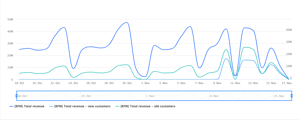
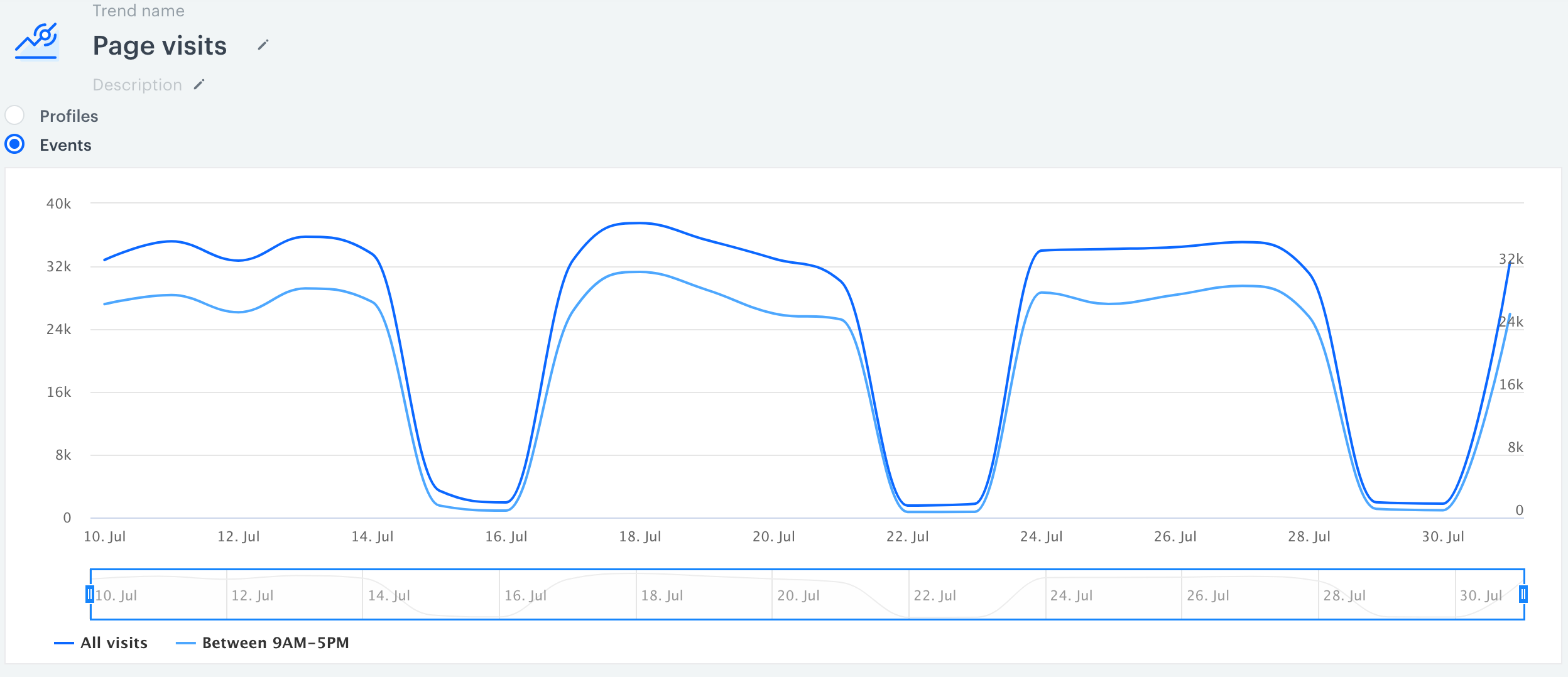
A trend is a presentation of event occurrences over time on a chart. It allows you to check the results of events you track and predict their direction. Having this knowledge, you can undertake the appropriate business activities.
## Business benefits
---
- Combining different data and finding correlations between them.
- Tracking changes in selected events over time.
- Building your own analytical models.
-
# Introduction to trends
A trend is a presentation of event occurrences over time on a chart. It allows you to check the results of events you track and predict their direction. Having this knowledge, you can undertake the appropriate business activities.
## Business benefits
---
- Combining different data and finding correlations between them.
- Tracking changes in selected events over time.
- Building your own analytical models.
-
 # Introduction to Sankey Diagrams
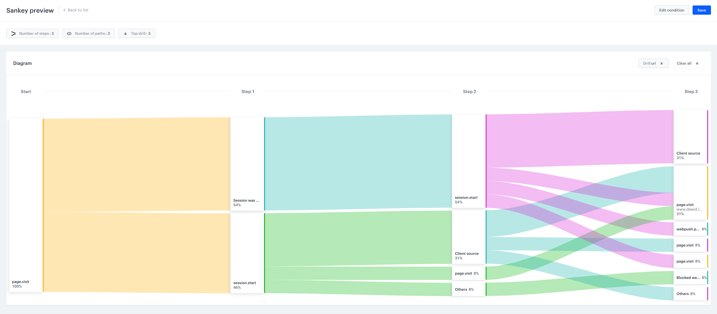
Sankey Diagrams in Synerise allow users to reconstruct the flow of customer actions before or after an occurrence of a particular event. Using an event as a reference point, users create diagrams that present steps to get the answers to questions such as "how much?" and "how is it connected with each other?".
## Benefits
---
- Personalize the user experience on the website.
- Minimize the number of steps to conversion.
- Verify the most popular conversion paths and their soft spots.
# Introduction to Sankey Diagrams
Sankey Diagrams in Synerise allow users to reconstruct the flow of customer actions before or after an occurrence of a particular event. Using an event as a reference point, users create diagrams that present steps to get the answers to questions such as "how much?" and "how is it connected with each other?".
## Benefits
---
- Personalize the user experience on the website.
- Minimize the number of steps to conversion.
- Verify the most popular conversion paths and their soft spots.
 ## Contents
# Funnels
A funnel is a division of a customer journey into steps which allows you to follow the journey step by step until the conversion point. This way you can detect soft spots as you see at which step you lose the customers in the process. Another advantage of the funnels is the possibility of breaking down various sequences of customer actions into steps to see the transitions between them.
## Business benefits
---
- Increase conversion rate by delivering messages adjusted to the preferences of individual customers.
- Predict sales volume as you see how many customers move to the next stage.
- Identify problem areas by tracing the step in the funnel they often leave.
- Funnels facilitate analyses of universal processes which let you focus on examining occurrences such as cart abandonment, cart recovery, message flows, and many more.
-
## Contents
# Creating Sankey Diagrams
Sankey Diagrams in Synerise allow the users to reconstruct the flow of customer actions before or after an occurrence of a particular event. Using an event as a reference point, users create charts that present steps to get the answers to questions such as "how much?" and "how is it connected with each other?".
## Requirements
---
You must have a [user role](/docs/settings/identity-access-management/permissions) with the following permissions:
- [access the Decision Hub](/docs/settings/identity-access-management/permissions/analytics-permissions#access-the-decision-hub)
- [view analyses](/docs/settings/identity-access-management/permissions/analytics-permissions#view-analyses)
- [create analyses](/docs/settings/identity-access-management/permissions/analytics-permissions#create-analyses)
- [edit analyses](/docs/settings/identity-access-management/permissions/analytics-permissions#edit-analyses)
- [preview results](/docs/settings/identity-access-management/permissions/analytics-permissions#preview-results)
- To collect the events on your website, you need to paste the [tracking code](/docs/settings/tool/tracking_codes) into the source of your website.
## Creating a Sankey Diagram
---
## Contents
# Funnels
A funnel is a division of a customer journey into steps which allows you to follow the journey step by step until the conversion point. This way you can detect soft spots as you see at which step you lose the customers in the process. Another advantage of the funnels is the possibility of breaking down various sequences of customer actions into steps to see the transitions between them.
## Business benefits
---
- Increase conversion rate by delivering messages adjusted to the preferences of individual customers.
- Predict sales volume as you see how many customers move to the next stage.
- Identify problem areas by tracing the step in the funnel they often leave.
- Funnels facilitate analyses of universal processes which let you focus on examining occurrences such as cart abandonment, cart recovery, message flows, and many more.
-
## Contents
# Creating Sankey Diagrams
Sankey Diagrams in Synerise allow the users to reconstruct the flow of customer actions before or after an occurrence of a particular event. Using an event as a reference point, users create charts that present steps to get the answers to questions such as "how much?" and "how is it connected with each other?".
## Requirements
---
You must have a [user role](/docs/settings/identity-access-management/permissions) with the following permissions:
- [access the Decision Hub](/docs/settings/identity-access-management/permissions/analytics-permissions#access-the-decision-hub)
- [view analyses](/docs/settings/identity-access-management/permissions/analytics-permissions#view-analyses)
- [create analyses](/docs/settings/identity-access-management/permissions/analytics-permissions#create-analyses)
- [edit analyses](/docs/settings/identity-access-management/permissions/analytics-permissions#edit-analyses)
- [preview results](/docs/settings/identity-access-management/permissions/analytics-permissions#preview-results)
- To collect the events on your website, you need to paste the [tracking code](/docs/settings/tool/tracking_codes) into the source of your website.
## Creating a Sankey Diagram
---
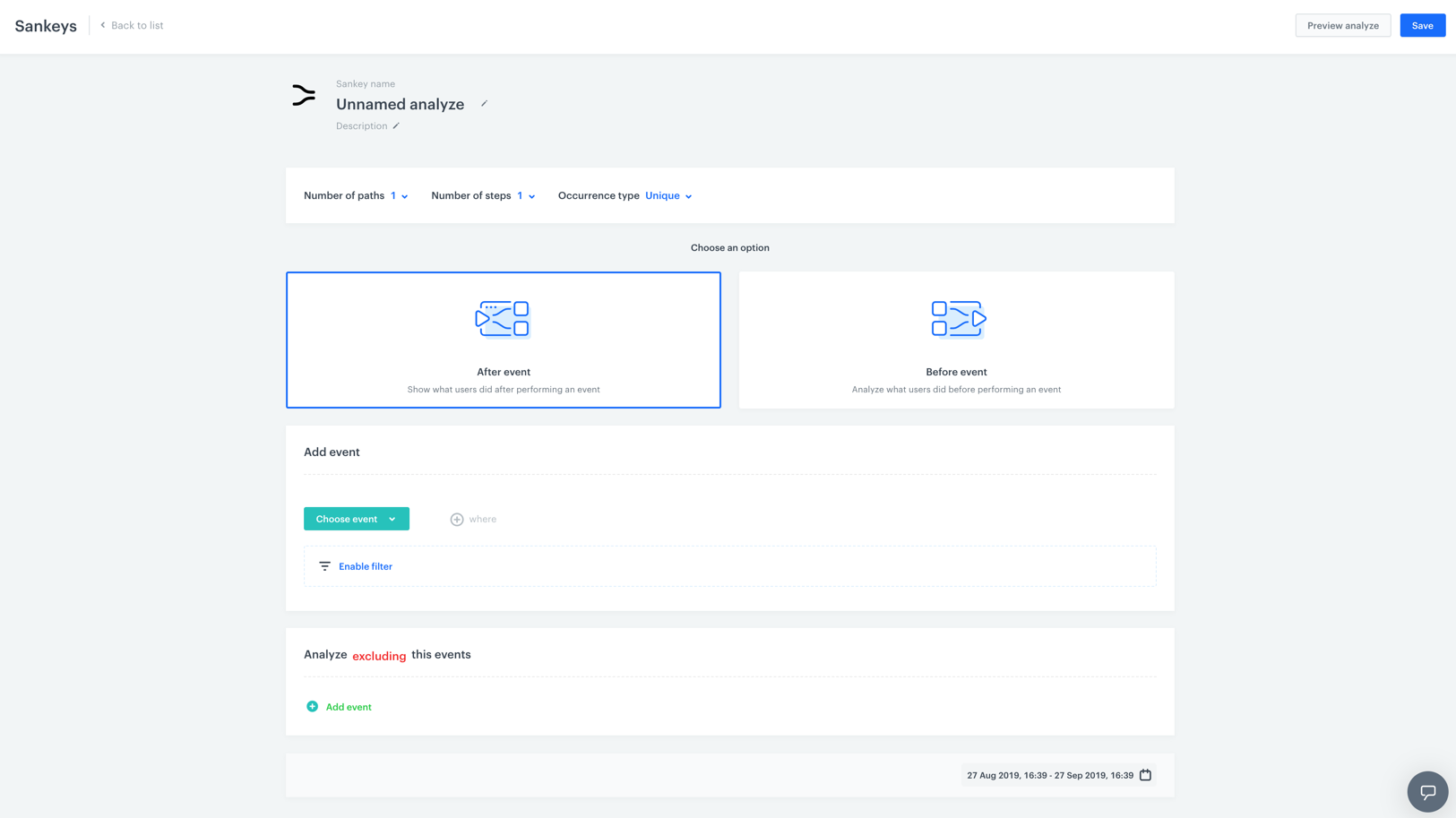
 **Decision Hub > Sankey Diagrams > New sankey**.
2. Give a name to your analysis.
3. Optionally, to let other users know what's the objective of the analysis, you can write a short description.
4. Choose the number of steps you want to analyze. To do so, click the
**Decision Hub > Sankey Diagrams > New sankey**.
2. Give a name to your analysis.
3. Optionally, to let other users know what's the objective of the analysis, you can write a short description.
4. Choose the number of steps you want to analyze. To do so, click the  and choose a number from the dropdown list.
5. Choose the number of paths that come from each step. To do so, click the and choose a number from the dropdown list.
6. Define the type of event occurrences.
- **Unique occurrences** - It means that only the first occurrence of the event is counted in the analysis. Every subsequent occurrence of the same event will be ignored in the analysis. This way you can count the number of customers who are in the flow.
- **All occurrences** - It means that if a customer repeated a series of actions, each of them will be counted in the analysis. This way you can count the number of the flow repetitions.
7. By selecting one of two following options, choose the reference point of the analysis:
- **After event** - The system will analyze the flow of customers' actions after the occurrence of a particular event.
- **Before event** - The system will analyze the flow of customers' actions before the occurrence of a particular event.
8. Choose an event that is the basis of the analysis. Depending on the option you have selected in step 4, the system generates a chart with the customer actions before or after the event you choose.
9. To narrow down the scope of the analyzed event, click the [Enable filter](/docs/analytics/i_profile-filter) button. Confirm the settings in the filter by clicking the **Apply** button.
10. If you want to exclude the occurrence of particular events from the analysis, click the **Add event** button. These events will not be considered in the analysis at all.
10. To define the time range for data analysis, click the calendar icon. Confirm the dates by clicking the **Apply** button.
11. To complete the process, click the **Save** button. When you save the chart, you can find it on the list of the Sankey charts.
# Creating geoanalytics
If you want to group your customers according to the actions performed in a specific location, create an analysis on the basis of location.
## Requirements
---
You must have a [user role](/docs/settings/identity-access-management/permissions) with the following permissions:
- [access the Decision Hub](/docs/settings/identity-access-management/permissions/analytics-permissions#access-the-decision-hub)
- [view analyses](/docs/settings/identity-access-management/permissions/analytics-permissions#view-analyses)
- [create analyses](/docs/settings/identity-access-management/permissions/analytics-permissions#create-analyses)
- [edit analyses](/docs/settings/identity-access-management/permissions/analytics-permissions#edit-analyses)
- [preview results](/docs/settings/identity-access-management/permissions/analytics-permissions#preview-results)
- A tracking code implemented into the website.
## Creating a geoanalysis
---
and choose a number from the dropdown list.
5. Choose the number of paths that come from each step. To do so, click the and choose a number from the dropdown list.
6. Define the type of event occurrences.
- **Unique occurrences** - It means that only the first occurrence of the event is counted in the analysis. Every subsequent occurrence of the same event will be ignored in the analysis. This way you can count the number of customers who are in the flow.
- **All occurrences** - It means that if a customer repeated a series of actions, each of them will be counted in the analysis. This way you can count the number of the flow repetitions.
7. By selecting one of two following options, choose the reference point of the analysis:
- **After event** - The system will analyze the flow of customers' actions after the occurrence of a particular event.
- **Before event** - The system will analyze the flow of customers' actions before the occurrence of a particular event.
8. Choose an event that is the basis of the analysis. Depending on the option you have selected in step 4, the system generates a chart with the customer actions before or after the event you choose.
9. To narrow down the scope of the analyzed event, click the [Enable filter](/docs/analytics/i_profile-filter) button. Confirm the settings in the filter by clicking the **Apply** button.
10. If you want to exclude the occurrence of particular events from the analysis, click the **Add event** button. These events will not be considered in the analysis at all.
10. To define the time range for data analysis, click the calendar icon. Confirm the dates by clicking the **Apply** button.
11. To complete the process, click the **Save** button. When you save the chart, you can find it on the list of the Sankey charts.
# Creating geoanalytics
If you want to group your customers according to the actions performed in a specific location, create an analysis on the basis of location.
## Requirements
---
You must have a [user role](/docs/settings/identity-access-management/permissions) with the following permissions:
- [access the Decision Hub](/docs/settings/identity-access-management/permissions/analytics-permissions#access-the-decision-hub)
- [view analyses](/docs/settings/identity-access-management/permissions/analytics-permissions#view-analyses)
- [create analyses](/docs/settings/identity-access-management/permissions/analytics-permissions#create-analyses)
- [edit analyses](/docs/settings/identity-access-management/permissions/analytics-permissions#edit-analyses)
- [preview results](/docs/settings/identity-access-management/permissions/analytics-permissions#preview-results)
- A tracking code implemented into the website.
## Creating a geoanalysis
---
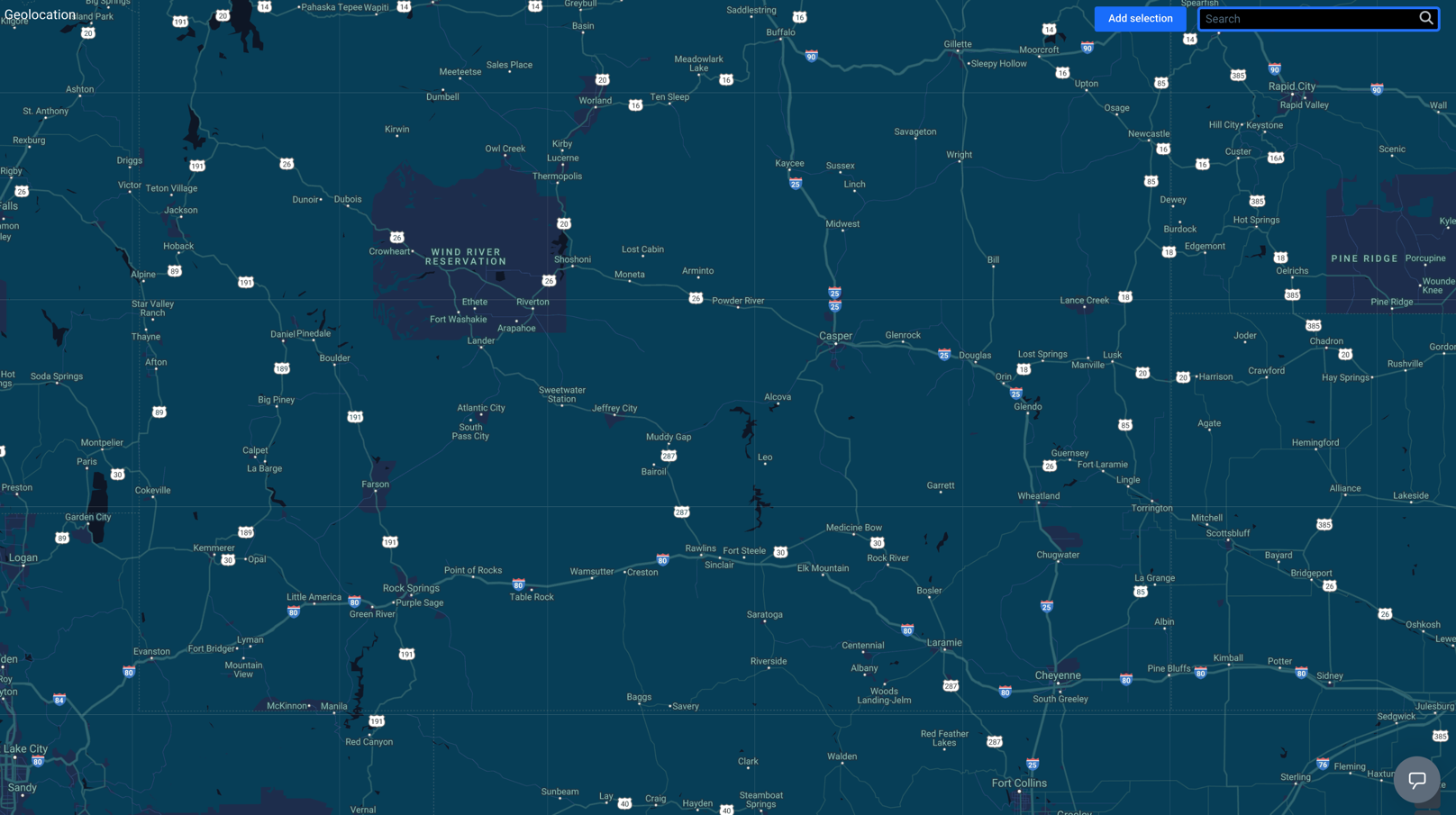 1. Go to **Decision Hub > Geolocation**.
2. In the upper right corner of the map, click the **Add selection** button.
3. To select the analyzed location, drag and drop the selection box to a place on the map.
4. Adjust the size of the selected area by clicking, holding, and moving the borders of the selection.
4. To proceed to the settings, click **Go to analytics**.
1. Go to **Decision Hub > Geolocation**.
2. In the upper right corner of the map, click the **Add selection** button.
3. To select the analyzed location, drag and drop the selection box to a place on the map.
4. Adjust the size of the selected area by clicking, holding, and moving the borders of the selection.
4. To proceed to the settings, click **Go to analytics**.
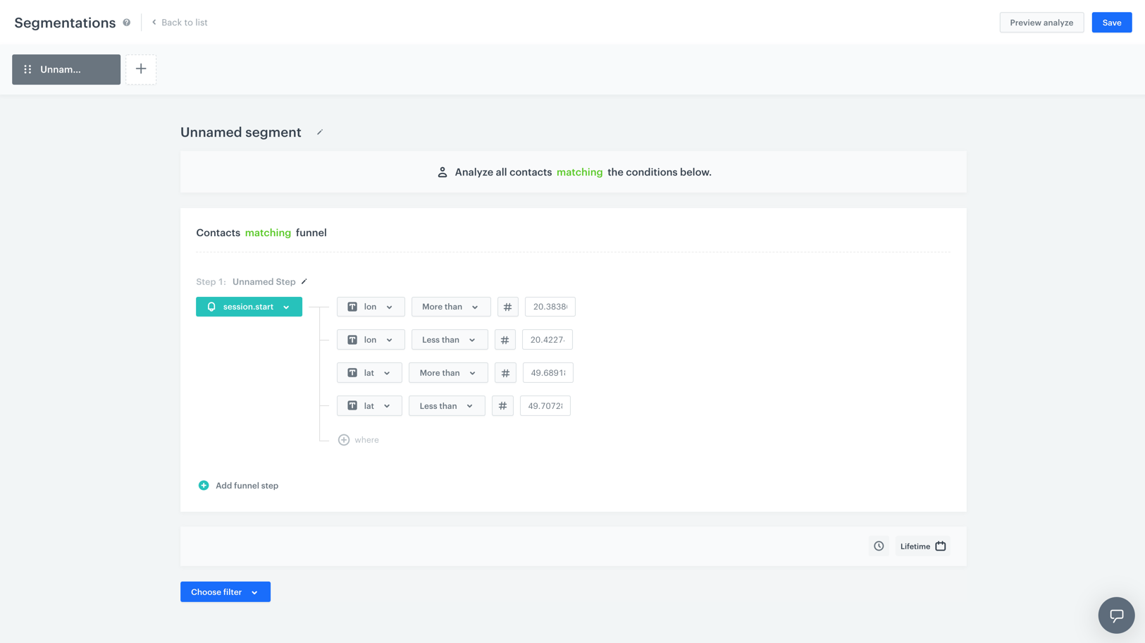 5. Enter the name of the segmentation.
6. Optionally, you can write a short description of the analysis.
**Result**: The first step is already done for you - a `session.start` event with the geographical coordinates are already selected. The system selects the group of customers which performed this event in the location you selected. Out of the group selected this way, you can select customers who meet your conditions specified in the further steps.
8. To create the next step in the segmentation, click the **Add funnel step** button.
9. To select an event, click the **Choose event** button.
10. If needed, specify the [event parameters](/docs/analytics/i_events-parameter-value) by clicking the **Where** button.
11. If you want to add a condition to the segmentation, click the **Choose filter** button.
12. Specify the dependency between the conditions by choosing the **AND** or **OR** operator.
- **OR** - Only one condition needs to be met.
- **AND** - Both conditions need to be met.
13. To set the time needed to complete all steps in the segmentation, click the clock icon.
To be included in the segmentation, a customer must complete the steps in the specified order and time.
14. To determine the time range from which the data will be analyzed, click the [calendar](/docs/analytics/i_date-filters) icon.
15. You can create several segmentations in one and compare them in one preview. To create another segmentation, click the
5. Enter the name of the segmentation.
6. Optionally, you can write a short description of the analysis.
**Result**: The first step is already done for you - a `session.start` event with the geographical coordinates are already selected. The system selects the group of customers which performed this event in the location you selected. Out of the group selected this way, you can select customers who meet your conditions specified in the further steps.
8. To create the next step in the segmentation, click the **Add funnel step** button.
9. To select an event, click the **Choose event** button.
10. If needed, specify the [event parameters](/docs/analytics/i_events-parameter-value) by clicking the **Where** button.
11. If you want to add a condition to the segmentation, click the **Choose filter** button.
12. Specify the dependency between the conditions by choosing the **AND** or **OR** operator.
- **OR** - Only one condition needs to be met.
- **AND** - Both conditions need to be met.
13. To set the time needed to complete all steps in the segmentation, click the clock icon.
To be included in the segmentation, a customer must complete the steps in the specified order and time.
14. To determine the time range from which the data will be analyzed, click the [calendar](/docs/analytics/i_date-filters) icon.
15. You can create several segmentations in one and compare them in one preview. To create another segmentation, click the  button.
15. To complete the process, click the **Save** button.
**Result**: When you save the segmentation based on geoanalytics, you can find it on the list of segmentations under the given name.
button.
15. To complete the process, click the **Save** button.
**Result**: When you save the segmentation based on geoanalytics, you can find it on the list of segmentations under the given name.
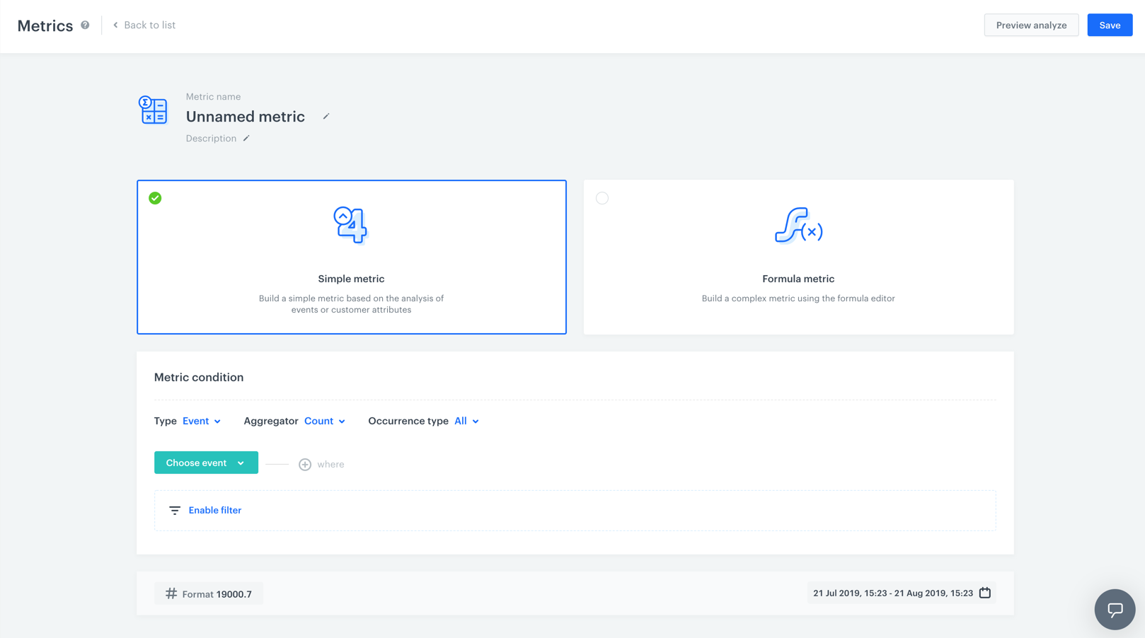 1. Go to **Decision Hub > Metrics > New metric**.
1. Enter the name of the metric.
2. Optionally, to let other users know about the purpose of the metric, you can write a short description.
3. Choose **Simple metric**.
4. To choose the context of data analyzed in the metric, next to the **Type** option, click the arrow. You can analyze events or profiles.
5. To choose the type of results, next to the **Aggregator** option, click the arrow.
#### Aggregators
1. Go to **Decision Hub > Metrics > New metric**.
1. Enter the name of the metric.
2. Optionally, to let other users know about the purpose of the metric, you can write a short description.
3. Choose **Simple metric**.
4. To choose the context of data analyzed in the metric, next to the **Type** option, click the arrow. You can analyze events or profiles.
5. To choose the type of results, next to the **Aggregator** option, click the arrow.
#### Aggregators
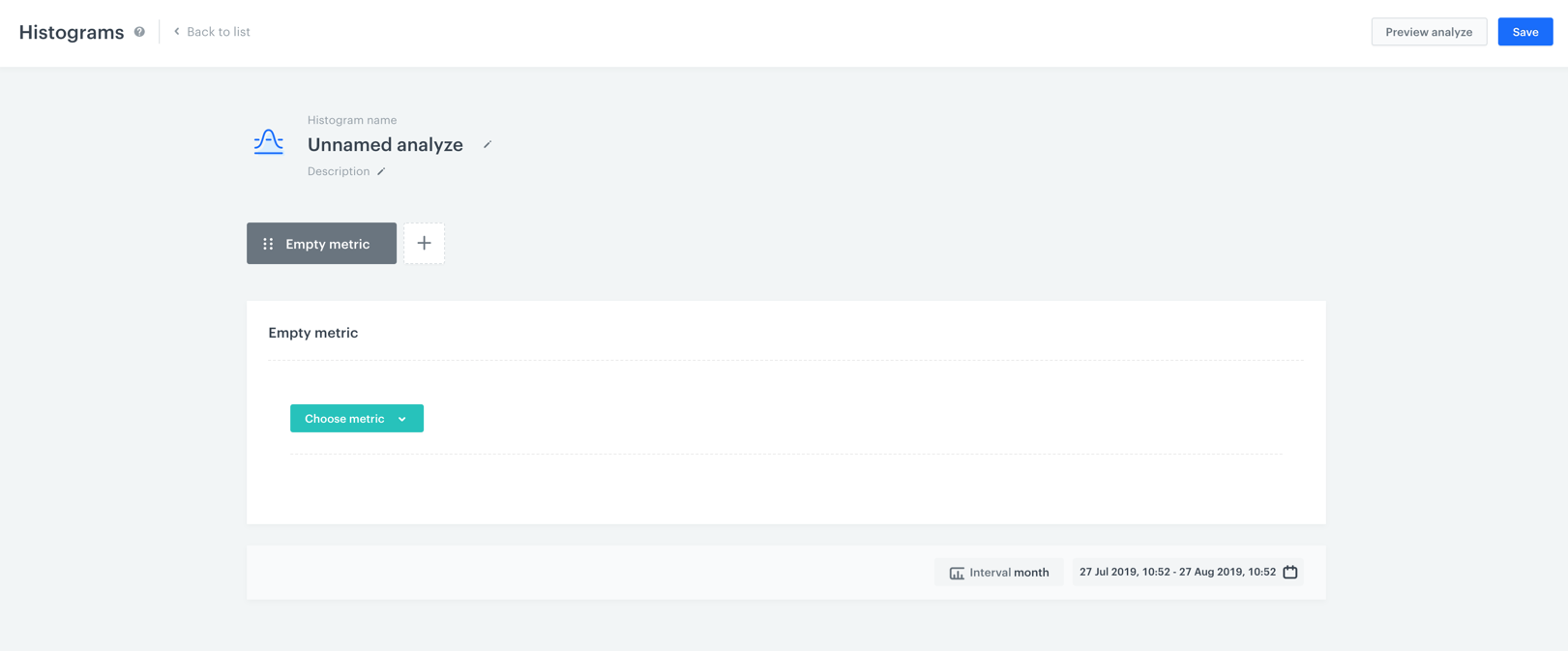 **Decision Hub > Histograms > New histogram**.
2. Enter the name of the histogram.
3. Optionally, to let other users know about the purpose of the histogram, write a short description.
4. From the list of metrics, select a metric you want to include in the histogram.
Refer to the table in the ["Allowed metrics" section](#allowed-metrics) to become familiar with the limits and constraints.
5. To choose the time units by which the metric data is aggregated in the histogram, click the **Interval** button.
**Decision Hub > Histograms > New histogram**.
2. Enter the name of the histogram.
3. Optionally, to let other users know about the purpose of the histogram, write a short description.
4. From the list of metrics, select a metric you want to include in the histogram.
Refer to the table in the ["Allowed metrics" section](#allowed-metrics) to become familiar with the limits and constraints.
5. To choose the time units by which the metric data is aggregated in the histogram, click the **Interval** button.
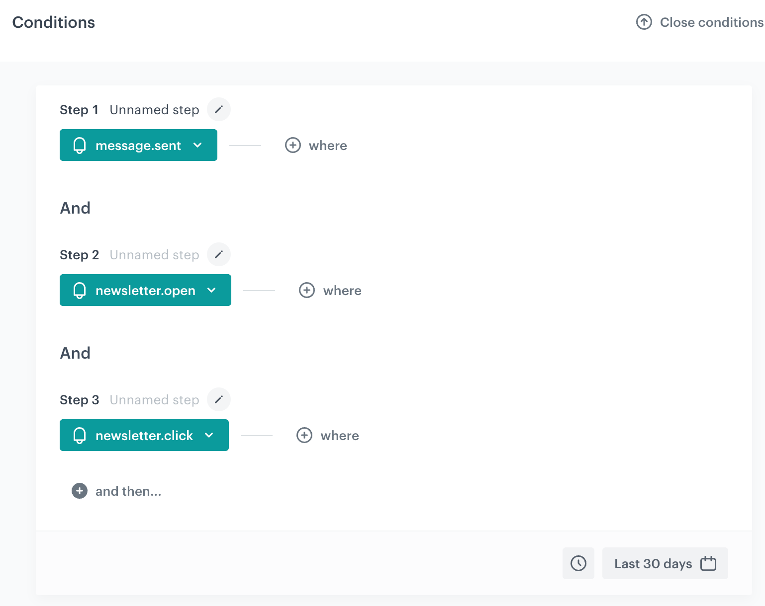
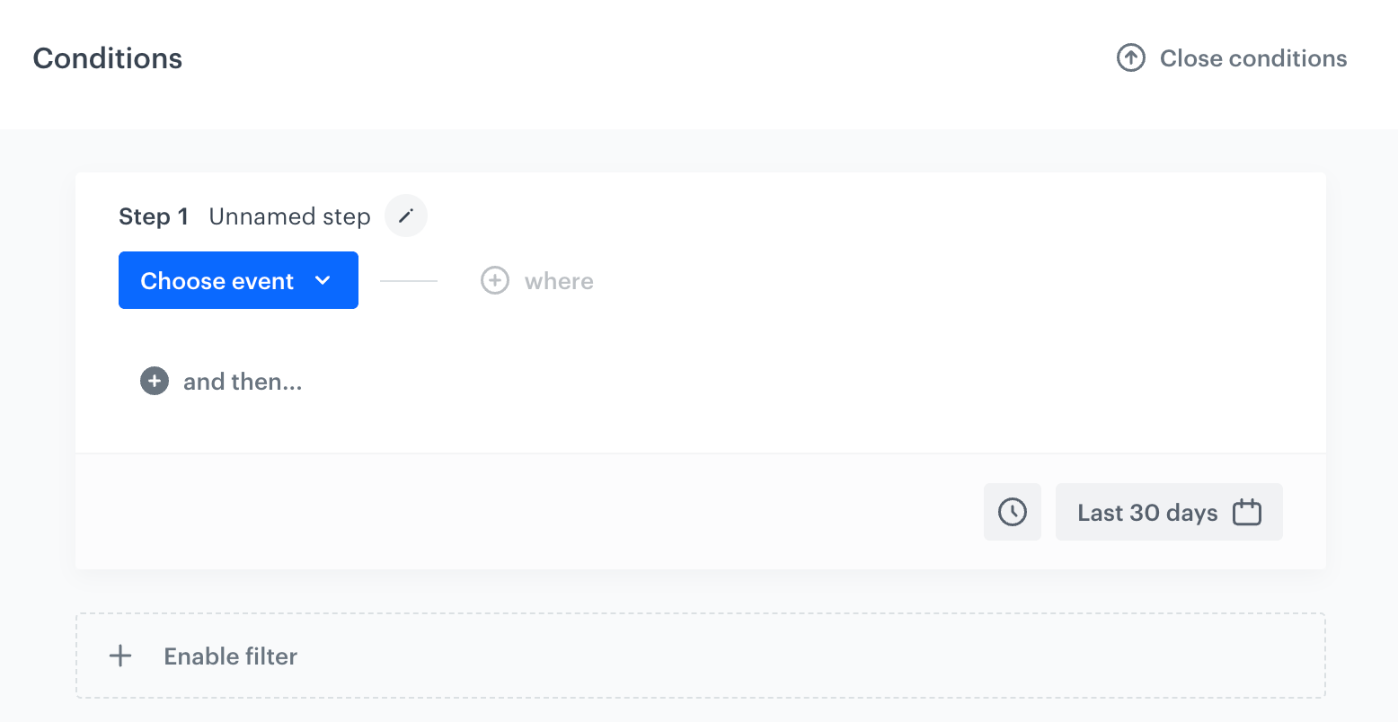 1. Go to **Decision Hub > Funnels > New funnel**.
2. Click the
1. Go to **Decision Hub > Funnels > New funnel**.
2. Click the  icon next to **Unnamed step** to enter the name of the funnel. This name is displayed in the funnel preview — if you skip this, the step is labeled **Unnamed step** instead.
3. Click **Choose event** and select an event from the dropdown list. Customers who performed a specific action (that triggers the selected event) are considered in the analysis. To narrow your analysis to only particular occurrences of a type of event, click **where** to select [event parameters](/docs/analytics/i_events-parameter-value).
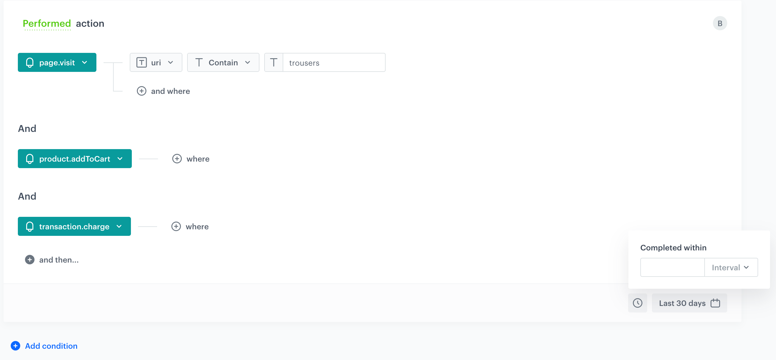
4. To add another step to the funnel, click **and then...** below the previous step, and repeat step 3. Steps are always joined with **And**, so customers must complete them in the order you define.
5. To define the maximum time allowed between the first and last step of the funnel, click the clock icon in the lower-right corner of the **Conditions** panel and set the **Completed within** interval. Profiles who complete all the steps, but take longer than the specified time, are not included in the results.
6. To determine the time range from which the data will be analyzed, click the calendar button (for example, **Last 30 days**) and confirm your choice with the **Apply** button.
7. If you want to narrow down the scope of customers, click **Enable filter** below the **Conditions** panel. In the **Profile filter** window that opens, click **Add condition** to build the query, and confirm with **Apply**. This [profile filter](/docs/analytics/i_profile-filter) works as an additional condition a profile has to meet in order to be counted in the funnel.
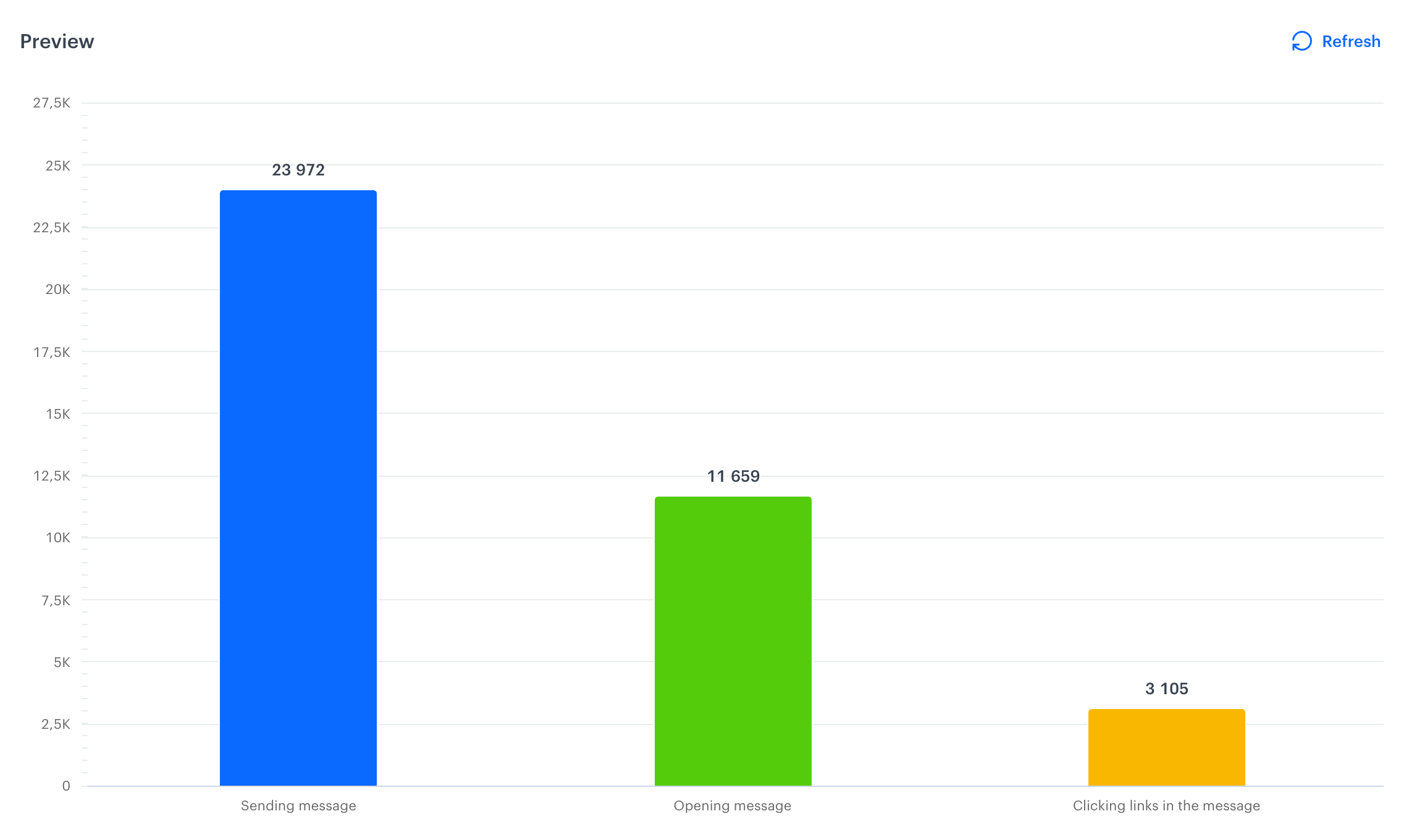
8. Optionally, you can preview the results before you save the funnel. The **Preview** chart below the **Conditions** panel shows how many profiles reached each step. Click **Refresh** to reload it with the latest data, or click **Close conditions** to collapse the **Conditions** panel and see more of the chart.
9. To complete the process, click the **Save** button. When you save the funnel, you can find it on the list of funnels under the name you entered in step two.
# Creating segmentations
---
A segmentation is a group of customers who share the same features. You can use it as a target for your marketing activities.
As features, you can use customer attributes (such as name, location, birthdate, marketing agreements), [aggregates](/docs/crm/aggregates), [expressions](/docs/crm/expressions), and other segmentations you created in your workspace.
In the process of creating a segmentation, you can define sub-groups known as segments. Each of segments can have their own specific conditions. By using multiple segments, you can categorize your customers based on various factors such as their average order value, the product categories they browse, or how frequently they make purchases.
Additionally, you can use funnels in segmentations to group customers whose [activity history](/docs/assets/events/introduction-to-events) (their actions and your actions towards them, such as sending messages) includes specific events. You can then filter those events by their parameters.
**Decision Hub > Segmentations > Create new**.
2. Enter the name of the segmentation.
3. If you want your segmentation to be visible in the profile card of the customers who belong to this segmentation, enable the **Show in Profiles** option on.
4. Create a segmentation as described further in this article.
2. To complete the process, click the **Save** button. When you save the segmentation, you can find it on the list of segmentations under the given name.
### Defining conditions
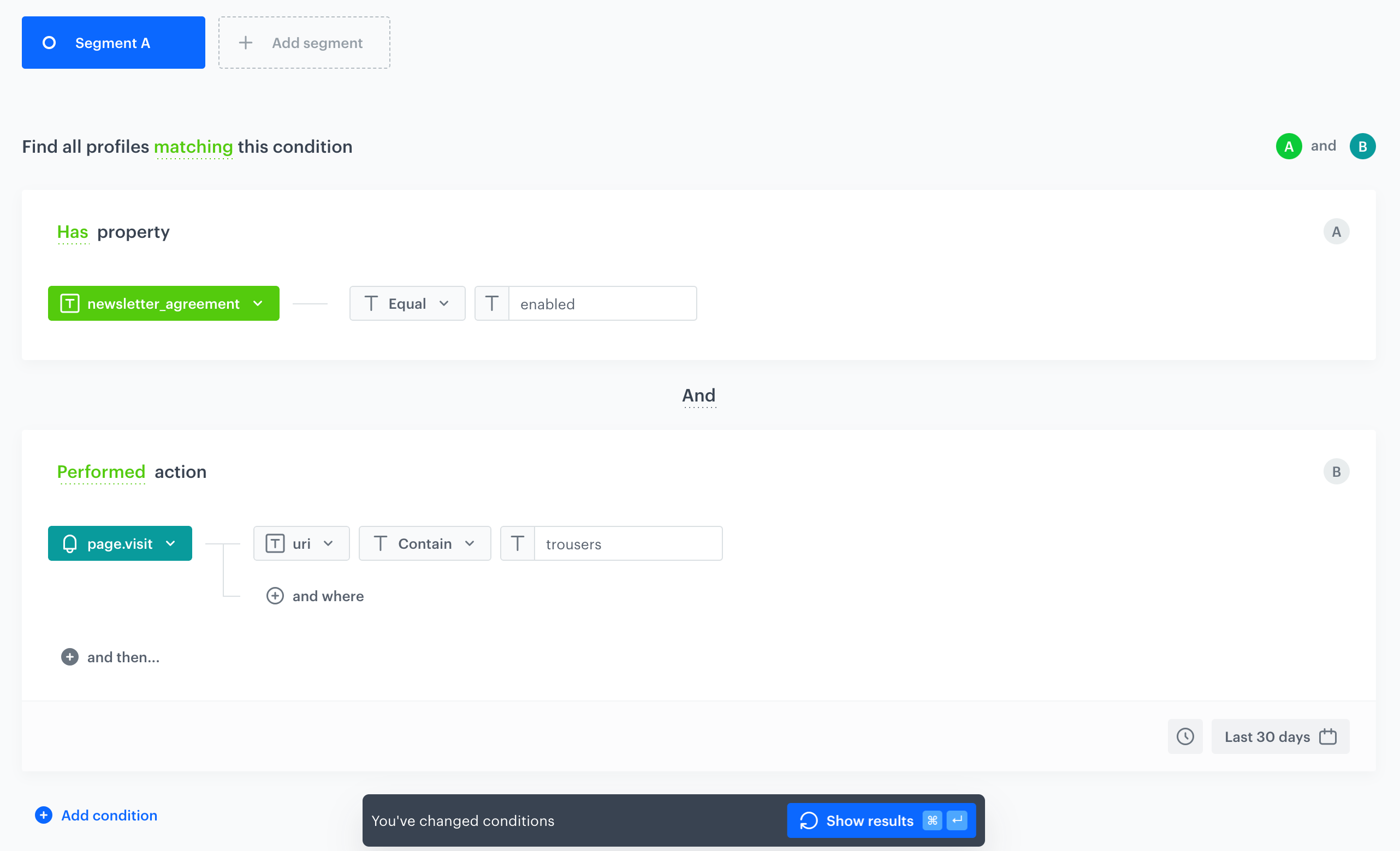
The first step is to define conditions that customers must meet in order to be included in a segment. These conditions can be based on customer attributes (**Has property**) or events and their parameters (**Perfomed action**).
If you add multiple conditions, you can specify the relationship between them as **AND** or **OR**. Additionally, event-based conditions can be limited to a specific time period.
#### Selecting an activity
2. To select a customer activity or an activity towards a customer, click **Add condition**.
2. From the **Events** tab, select an event.
1. To set additional conditions for the event, click **+ where** and from the dropdown list select an event parameter you want to filter by.
2. Use the [logical operators](/docs/analytics/i_events-parameter-operators#operators-list-by-expected-value-type) to set the type of condition.
3. Define the [value](/docs/analytics/i_events-parameter-value) that will be used as the filter according to the logical operator.
Refer to [Limits and constraints](/docs/analytics/segmentations/limits-and-constraints) for the maximum length of this value.
4. By default, the system analyzes the last 30 days, but you can define your own time period by clicking the calendar icon in the lower right corner in the condition.
icon next to **Unnamed step** to enter the name of the funnel. This name is displayed in the funnel preview — if you skip this, the step is labeled **Unnamed step** instead.
3. Click **Choose event** and select an event from the dropdown list. Customers who performed a specific action (that triggers the selected event) are considered in the analysis. To narrow your analysis to only particular occurrences of a type of event, click **where** to select [event parameters](/docs/analytics/i_events-parameter-value).
4. To add another step to the funnel, click **and then...** below the previous step, and repeat step 3. Steps are always joined with **And**, so customers must complete them in the order you define.
5. To define the maximum time allowed between the first and last step of the funnel, click the clock icon in the lower-right corner of the **Conditions** panel and set the **Completed within** interval. Profiles who complete all the steps, but take longer than the specified time, are not included in the results.
6. To determine the time range from which the data will be analyzed, click the calendar button (for example, **Last 30 days**) and confirm your choice with the **Apply** button.
7. If you want to narrow down the scope of customers, click **Enable filter** below the **Conditions** panel. In the **Profile filter** window that opens, click **Add condition** to build the query, and confirm with **Apply**. This [profile filter](/docs/analytics/i_profile-filter) works as an additional condition a profile has to meet in order to be counted in the funnel.
8. Optionally, you can preview the results before you save the funnel. The **Preview** chart below the **Conditions** panel shows how many profiles reached each step. Click **Refresh** to reload it with the latest data, or click **Close conditions** to collapse the **Conditions** panel and see more of the chart.
9. To complete the process, click the **Save** button. When you save the funnel, you can find it on the list of funnels under the name you entered in step two.
# Creating segmentations
---
A segmentation is a group of customers who share the same features. You can use it as a target for your marketing activities.
As features, you can use customer attributes (such as name, location, birthdate, marketing agreements), [aggregates](/docs/crm/aggregates), [expressions](/docs/crm/expressions), and other segmentations you created in your workspace.
In the process of creating a segmentation, you can define sub-groups known as segments. Each of segments can have their own specific conditions. By using multiple segments, you can categorize your customers based on various factors such as their average order value, the product categories they browse, or how frequently they make purchases.
Additionally, you can use funnels in segmentations to group customers whose [activity history](/docs/assets/events/introduction-to-events) (their actions and your actions towards them, such as sending messages) includes specific events. You can then filter those events by their parameters.
**Decision Hub > Segmentations > Create new**.
2. Enter the name of the segmentation.
3. If you want your segmentation to be visible in the profile card of the customers who belong to this segmentation, enable the **Show in Profiles** option on.
4. Create a segmentation as described further in this article.
2. To complete the process, click the **Save** button. When you save the segmentation, you can find it on the list of segmentations under the given name.
### Defining conditions
The first step is to define conditions that customers must meet in order to be included in a segment. These conditions can be based on customer attributes (**Has property**) or events and their parameters (**Perfomed action**).
If you add multiple conditions, you can specify the relationship between them as **AND** or **OR**. Additionally, event-based conditions can be limited to a specific time period.
#### Selecting an activity
2. To select a customer activity or an activity towards a customer, click **Add condition**.
2. From the **Events** tab, select an event.
1. To set additional conditions for the event, click **+ where** and from the dropdown list select an event parameter you want to filter by.
2. Use the [logical operators](/docs/analytics/i_events-parameter-operators#operators-list-by-expected-value-type) to set the type of condition.
3. Define the [value](/docs/analytics/i_events-parameter-value) that will be used as the filter according to the logical operator.
Refer to [Limits and constraints](/docs/analytics/segmentations/limits-and-constraints) for the maximum length of this value.
4. By default, the system analyzes the last 30 days, but you can define your own time period by clicking the calendar icon in the lower right corner in the condition.
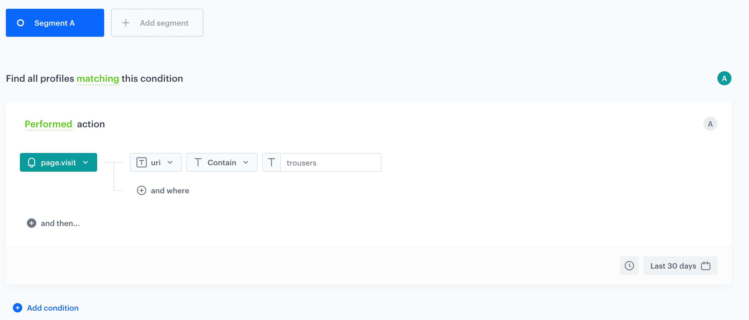
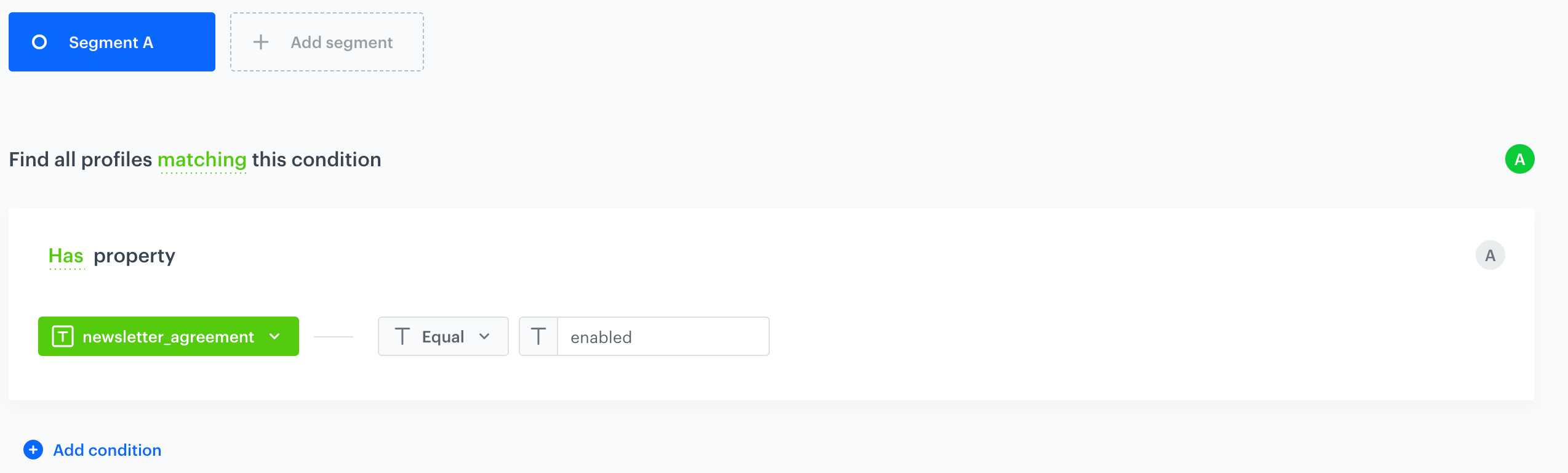


 | |
| Anne Taylor | |
| |
| Anne Taylor | |  |
| Sharon Smith | | |
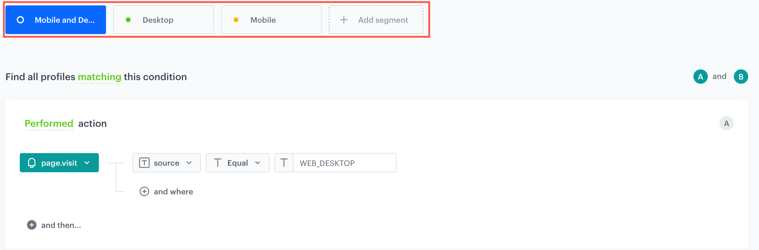
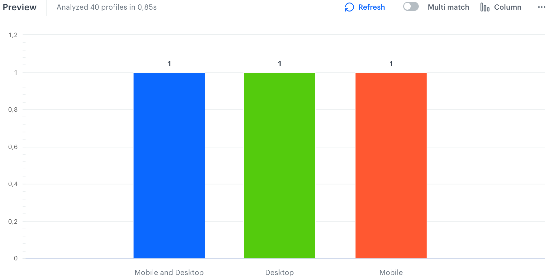
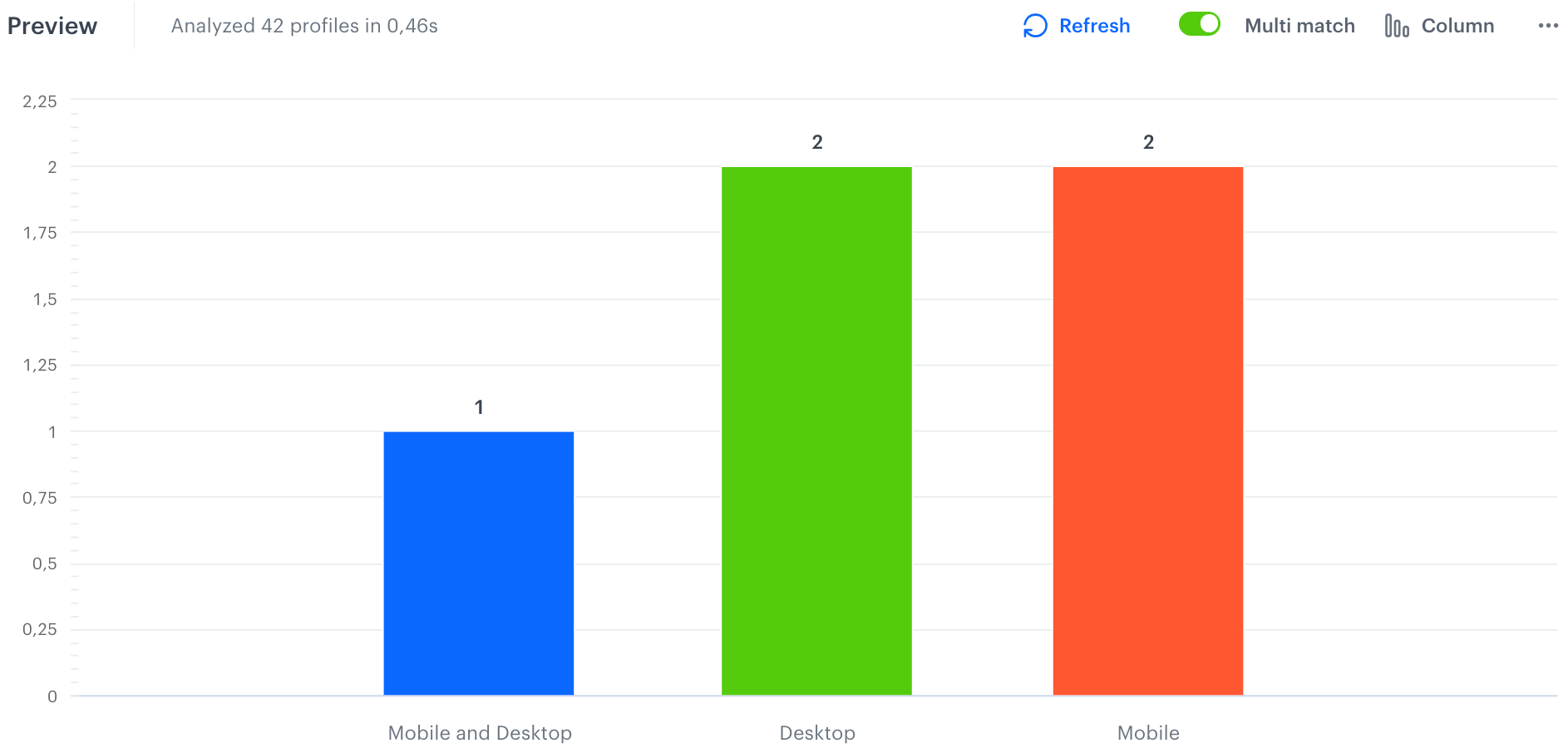
The conditions of the segmentation will contain three segments:
1. Segment that includes customers who visited website from both mobile and desktop (**Mobile and Desktop**)
2. Segment that includes customers who visited website from desktop (**Desktop**)
3. Segment that includes who visited website from mobile (**Mobile**)
|
| Sharon Smith | | |
The conditions of the segmentation will contain three segments:
1. Segment that includes customers who visited website from both mobile and desktop (**Mobile and Desktop**)
2. Segment that includes customers who visited website from desktop (**Desktop**)
3. Segment that includes who visited website from mobile (**Mobile**)
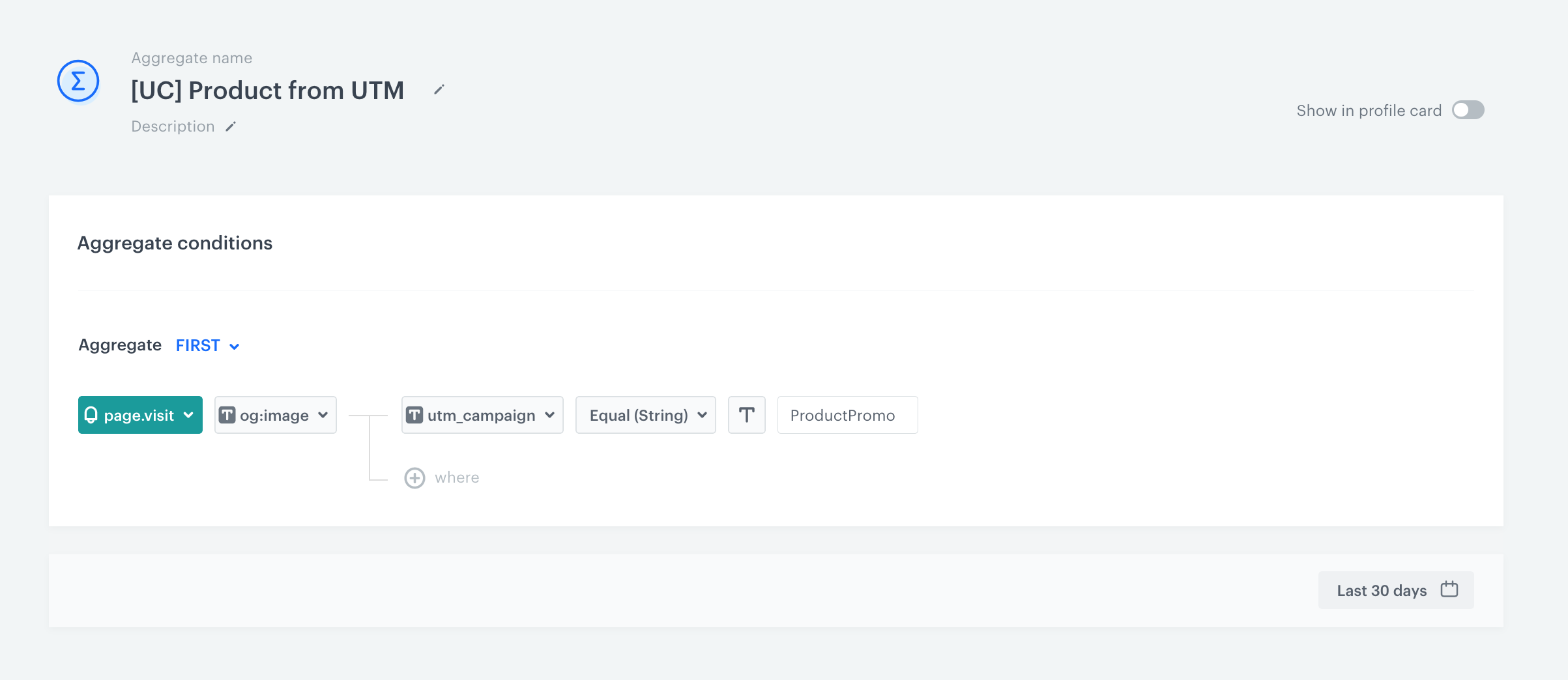
 **Behavioral Data Hub > Live Aggregates > Create aggregate**.
2. Enter the name of the aggregate.
3. By clicking the button, set **First** as the type of the aggregate result (this configures the aggregate to show the first value of the event parameter in the time range selected in the analysis).
4. From the **Choose event** dropdown list, select the **page.visit** event.
5. From the **Choose parameter** dropdown list, select **og:image**.
6. Click the **+ where** button.
7. From the **Choose parameter** dropdown list, select the **utm_campaign**.
8. Select the **Equal** logical operator.
9. Next to the logical operator, in the text field, enter the name of the UTM campaign.
10. By default, the date range for the analysis is set to the last 30 days. To change the date range, click the calendar icon. Confirm the changes with the **Apply** button.
11. Save the aggregate by clicking **Save**.
**Result**: The aggregate uses the image of the product and returns the first product viewed in the UTM campaign.
**Behavioral Data Hub > Live Aggregates > Create aggregate**.
2. Enter the name of the aggregate.
3. By clicking the button, set **First** as the type of the aggregate result (this configures the aggregate to show the first value of the event parameter in the time range selected in the analysis).
4. From the **Choose event** dropdown list, select the **page.visit** event.
5. From the **Choose parameter** dropdown list, select **og:image**.
6. Click the **+ where** button.
7. From the **Choose parameter** dropdown list, select the **utm_campaign**.
8. Select the **Equal** logical operator.
9. Next to the logical operator, in the text field, enter the name of the UTM campaign.
10. By default, the date range for the analysis is set to the last 30 days. To change the date range, click the calendar icon. Confirm the changes with the **Apply** button.
11. Save the aggregate by clicking **Save**.
**Result**: The aggregate uses the image of the product and returns the first product viewed in the UTM campaign.
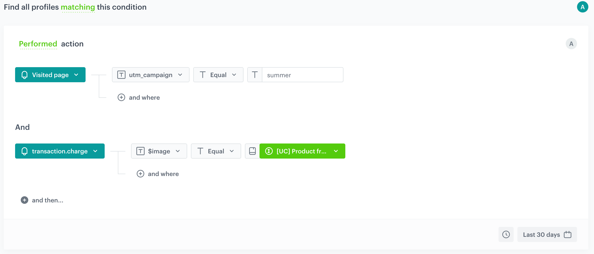
 **Decision Hub > Segmentations > New segmentation**.
13. Enter the name of the segmentation.
14. Click **Add condition** and from the dropdown list select the **page.visit** event.
15. Click **+ where** button.
16. From the **Choose parameter** dropdown list, select the **utm_campaign** parameter.
17. Select the **Equal** logical operator.
18. Next to the logical operator, in the text field, enter the UTM campaign name.
19. Click **and then...**.
20. From the dropdown list, select the **Bought product** event.
21. Click the **+ where** button.
22. From the **Choose parameter** dropdown list, select **$image**.
23. Select the **Equal** logical operator.
24. As the value select **Parameter** by clicking the icon next to the input.
25. From the **Parameter** dropdown list, select the **Aggregates** catalog.
26. Select the aggregate created in previous steps.
27. By default, the date range for the analysis is set at the last 30 days. To change the date range, click the calendar icon. Confirm the changes with the **Apply** button.
**Decision Hub > Segmentations > New segmentation**.
13. Enter the name of the segmentation.
14. Click **Add condition** and from the dropdown list select the **page.visit** event.
15. Click **+ where** button.
16. From the **Choose parameter** dropdown list, select the **utm_campaign** parameter.
17. Select the **Equal** logical operator.
18. Next to the logical operator, in the text field, enter the UTM campaign name.
19. Click **and then...**.
20. From the dropdown list, select the **Bought product** event.
21. Click the **+ where** button.
22. From the **Choose parameter** dropdown list, select **$image**.
23. Select the **Equal** logical operator.
24. As the value select **Parameter** by clicking the icon next to the input.
25. From the **Parameter** dropdown list, select the **Aggregates** catalog.
26. Select the aggregate created in previous steps.
27. By default, the date range for the analysis is set at the last 30 days. To change the date range, click the calendar icon. Confirm the changes with the **Apply** button.
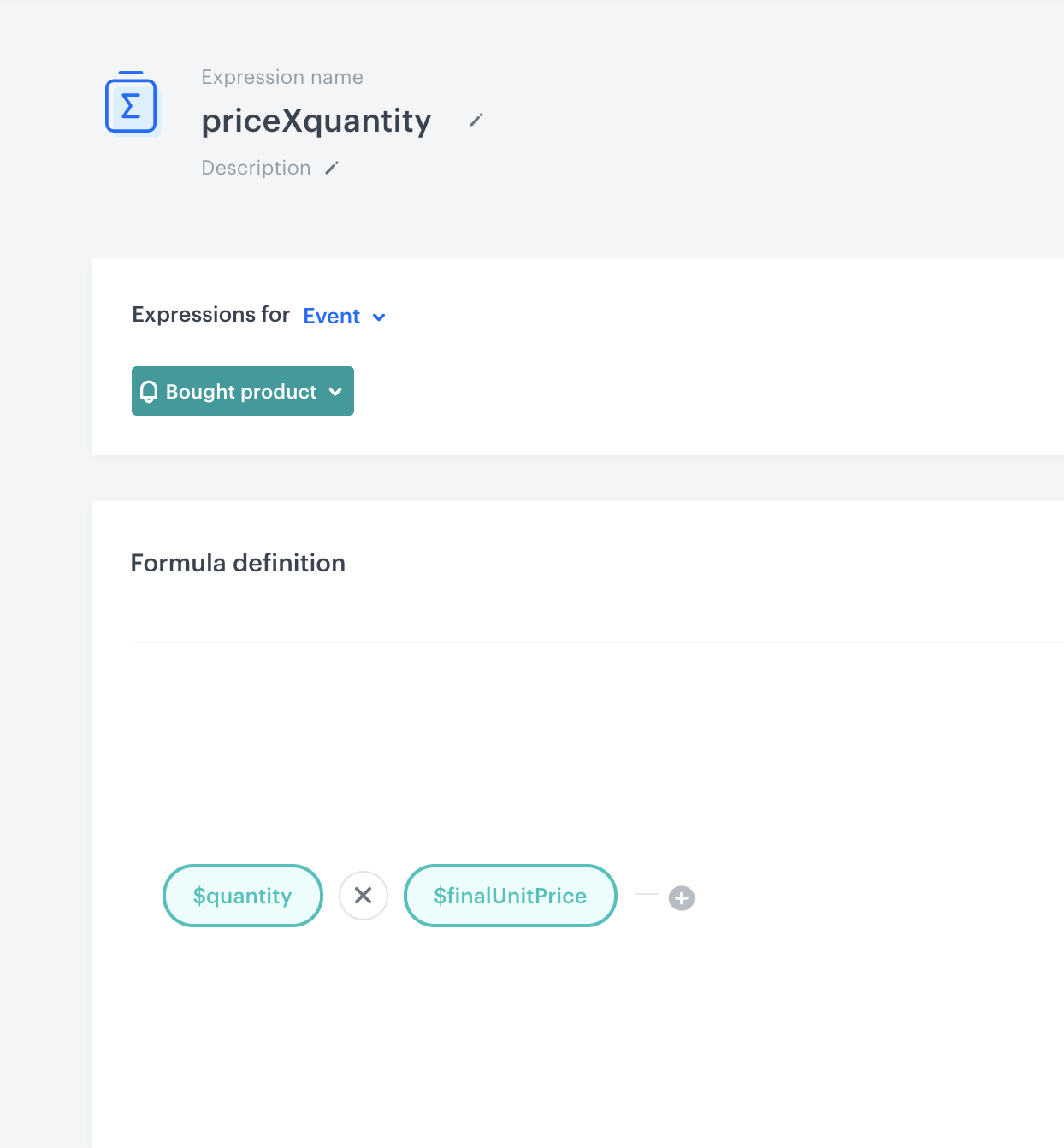
 **Behavioral Data Hub > Expressions > New expression**.
2. Enter the name of the expression.
3. Select the **Event** type of expression by clicking the icon.
4. From the **Choose event** dropdown list, select the **Bought product** event.
5. Start creating the formula of the expression by clicking the **Select** button.
**Result**: A dropdown list appears.
6. From the dropdown list, select **Event attribute**.
**Result**: The **Unnamed** event attribute appears.
7. Click the attribute.
8. From the **Choose parameter** dropdown list, select **$quantity**.
9. Click the plus button.
**Result**: Another **event attribute** appears.
10. Click the attribute.
11. From the **Choose parameter** dropdown list, select **$finalUnitPrice**.
12. Multiply those two attributes, by selecting the multiplication sign between two event attributes.
**Result**:
**Behavioral Data Hub > Expressions > New expression**.
2. Enter the name of the expression.
3. Select the **Event** type of expression by clicking the icon.
4. From the **Choose event** dropdown list, select the **Bought product** event.
5. Start creating the formula of the expression by clicking the **Select** button.
**Result**: A dropdown list appears.
6. From the dropdown list, select **Event attribute**.
**Result**: The **Unnamed** event attribute appears.
7. Click the attribute.
8. From the **Choose parameter** dropdown list, select **$quantity**.
9. Click the plus button.
**Result**: Another **event attribute** appears.
10. Click the attribute.
11. From the **Choose parameter** dropdown list, select **$finalUnitPrice**.
12. Multiply those two attributes, by selecting the multiplication sign between two event attributes.
**Result**:
 **Decision Hub > Metrics > New metric**.
15. Enter the name of the metric.
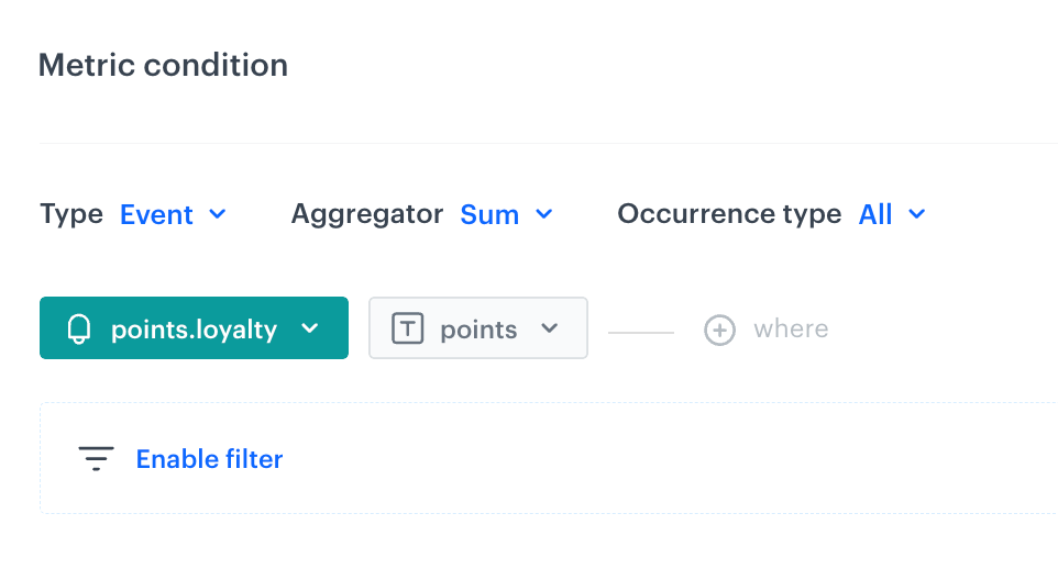
16. From the **Type** dropdown list, select **Event**.
17. From the **Aggregator** list, select **Sum**.
18. From the **Occurrence type**, select **All**.
19. From the **Choose event** dropdown, select **Bought product**
20. From the **Choose parameter** dropdown list, click the
**Decision Hub > Metrics > New metric**.
15. Enter the name of the metric.
16. From the **Type** dropdown list, select **Event**.
17. From the **Aggregator** list, select **Sum**.
18. From the **Occurrence type**, select **All**.
19. From the **Choose event** dropdown, select **Bought product**
20. From the **Choose parameter** dropdown list, click the  icon, and then select **Expression**.
21. Select the expression created in the previous steps.
22. From the **Choose parameter** dropdown list, select **$sku**.
23. As the logic operator, select **In**.
24. Click the icon next to the logic operator and keep clicking until you get
icon, and then select **Expression**.
21. Select the expression created in the previous steps.
22. From the **Choose parameter** dropdown list, select **$sku**.
23. As the logic operator, select **In**.
24. Click the icon next to the logic operator and keep clicking until you get  .
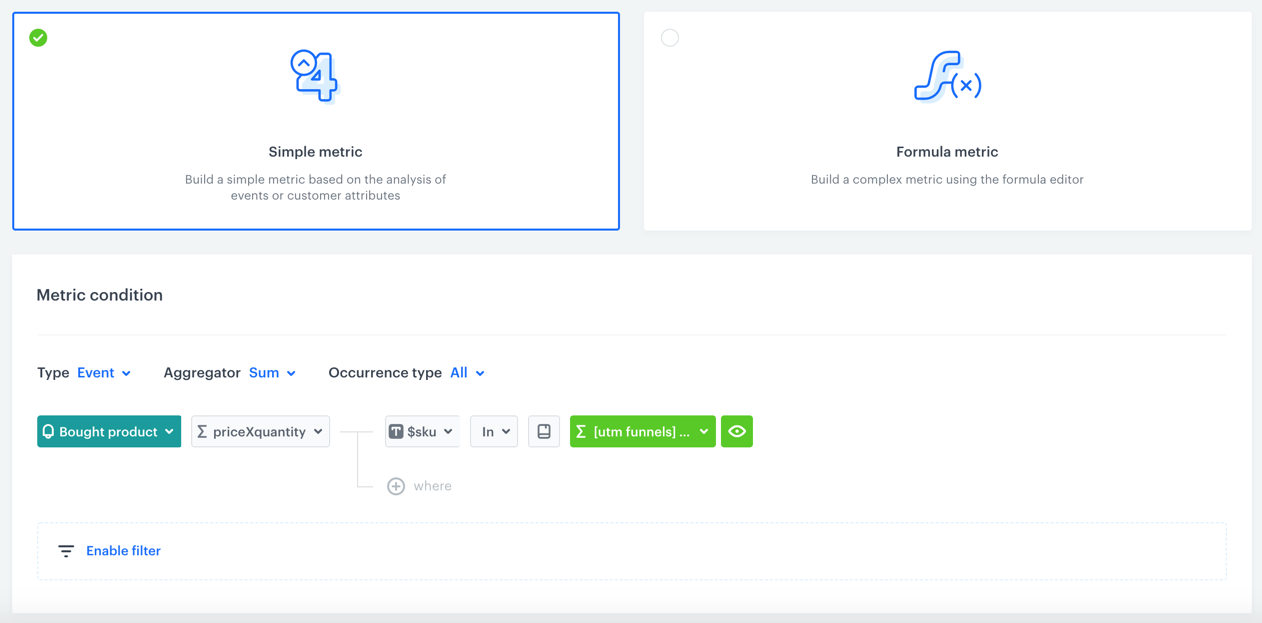
25. From the **Choose value** dropdown list, click the icon, and then select **Aggregates**.
26. Select the aggregate created in the previous steps.
**Result**:
.
25. From the **Choose value** dropdown list, click the icon, and then select **Aggregates**.
26. Select the aggregate created in the previous steps.
**Result**:
 **Behavioral Data Hub > Live Aggregates > Create aggregate**.
2. Enter the name of the aggregate.
3. By clicking the button, set **First** as the type of the aggregate result (then the aggregate result shows the first value of the event parameter in the time range selected in the analysis).
4. From the **Choose event** dropdown list, select the **page.visit** event.
5. From the **Choose parameter** dropdown list, select the **og:image**.
6. Click the **+ where** button.
7. From the **Choose parameter** dropdown list, select **utm_campaign**.
8. Select the **Equal** logical operator.
9. Click the icon next to the logic operator and keep clicking until you get
**Behavioral Data Hub > Live Aggregates > Create aggregate**.
2. Enter the name of the aggregate.
3. By clicking the button, set **First** as the type of the aggregate result (then the aggregate result shows the first value of the event parameter in the time range selected in the analysis).
4. From the **Choose event** dropdown list, select the **page.visit** event.
5. From the **Choose parameter** dropdown list, select the **og:image**.
6. Click the **+ where** button.
7. From the **Choose parameter** dropdown list, select **utm_campaign**.
8. Select the **Equal** logical operator.
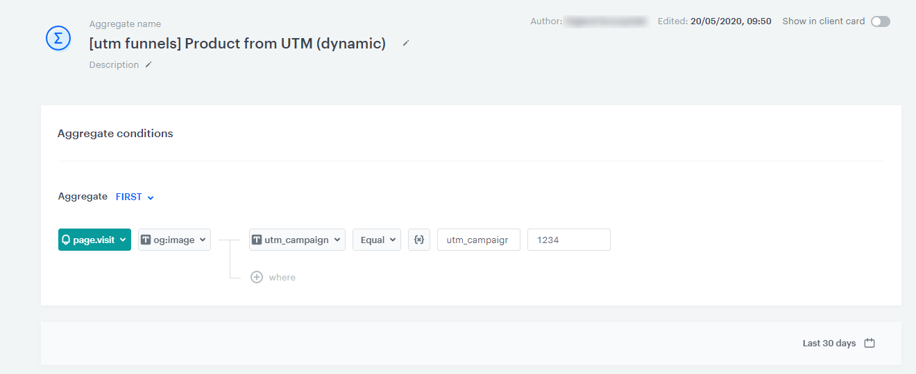
9. Click the icon next to the logic operator and keep clicking until you get  .
10. In the left text field, enter the name of the dynamic key (in this case, it's `utm_campaign`).
11. In the right text field, enter the value of the dynamic key (name of the UTM campaign).
.
10. In the left text field, enter the name of the dynamic key (in this case, it's `utm_campaign`).
11. In the right text field, enter the value of the dynamic key (name of the UTM campaign).
 **Behavioral Data Hub > Live Aggregates > Create aggregate**.
2. Enter the name of the aggregate.
3. By clicking the button, set **First** as the type of the aggregate result (this configures the aggregate to show the first value of the event parameter in the time range selected in the analysis).
4. From the **Choose event** dropdown list, select the **page.visit** event.
5. From the **Choose parameter** dropdown list, select **Specials**.
6. From the list, select **TIMESTAMP**.
6. Click the **+ where** button.
7. From the **Choose parameter** dropdown list, select **utm_campaign**.
8. Select the **Equal** logical operator.
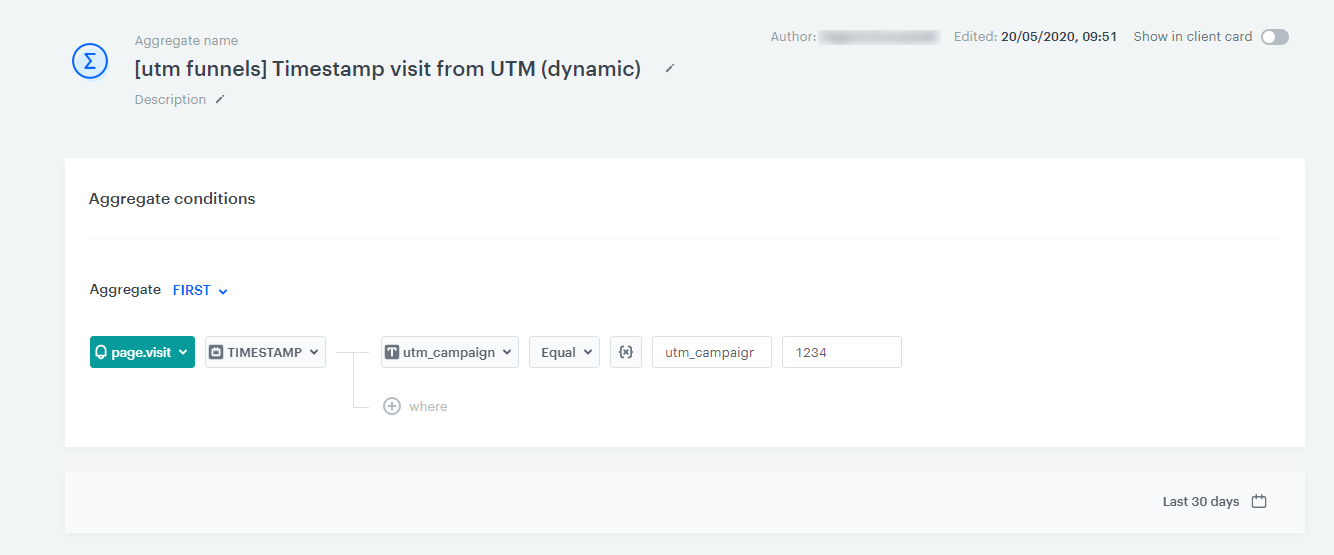
9. Click the icon next to the logic operator and keep clicking until you get .
10. In the left text field, enter the name of the dynamic key (in this case, it's `utm_campaign`).
11. In the right text field, enter the value of the dynamic key.
**Behavioral Data Hub > Live Aggregates > Create aggregate**.
2. Enter the name of the aggregate.
3. By clicking the button, set **First** as the type of the aggregate result (this configures the aggregate to show the first value of the event parameter in the time range selected in the analysis).
4. From the **Choose event** dropdown list, select the **page.visit** event.
5. From the **Choose parameter** dropdown list, select **Specials**.
6. From the list, select **TIMESTAMP**.
6. Click the **+ where** button.
7. From the **Choose parameter** dropdown list, select **utm_campaign**.
8. Select the **Equal** logical operator.
9. Click the icon next to the logic operator and keep clicking until you get .
10. In the left text field, enter the name of the dynamic key (in this case, it's `utm_campaign`).
11. In the right text field, enter the value of the dynamic key.
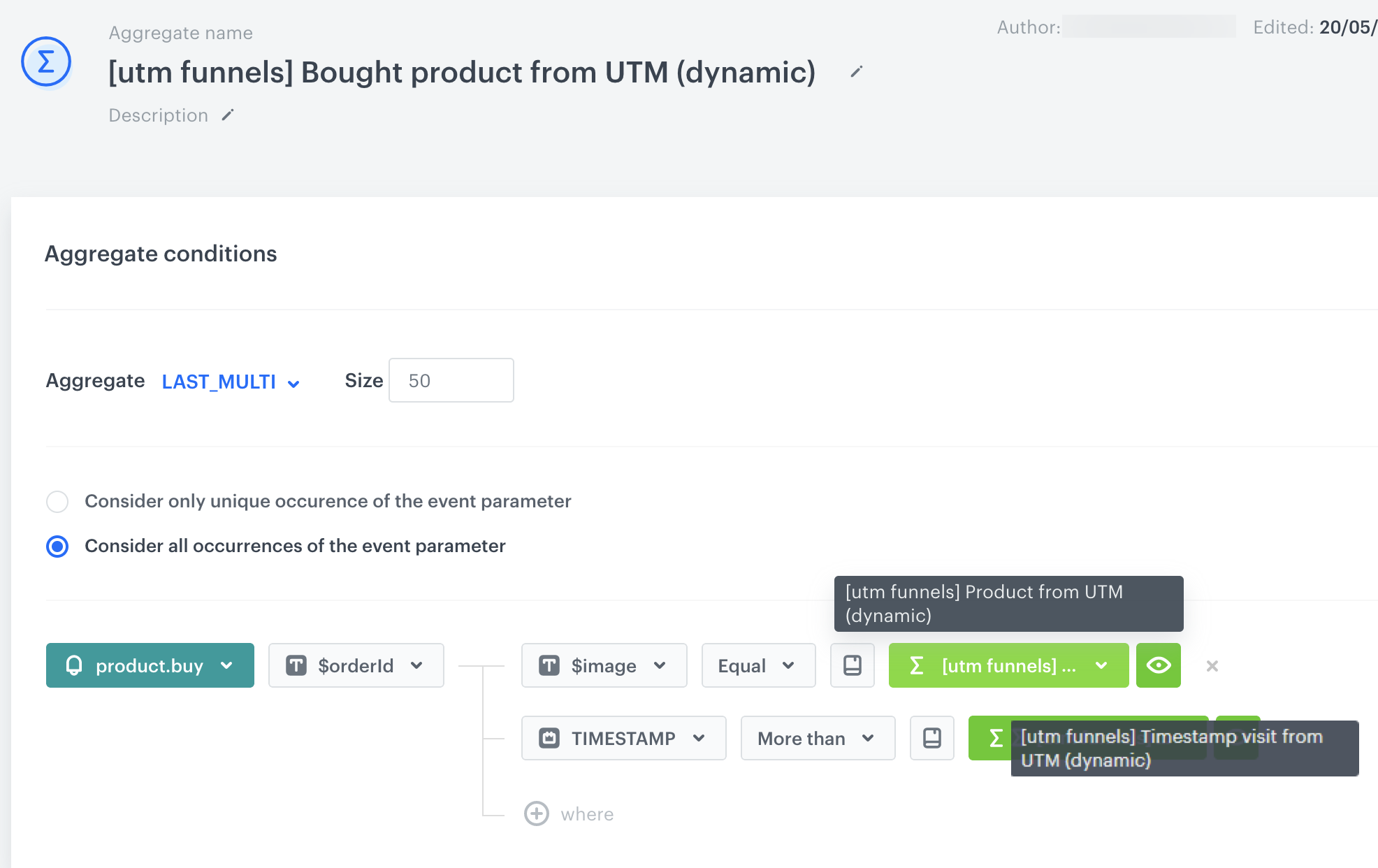
 **Behavioral Data Hub > Live Aggregates > Create aggregate**.
2. Enter the name of the aggregate.
3. By clicking the button, set **Last Multi** as the type of the aggregate result (this configures the aggregate to show the defined number of results of the event parameter in the time range selected in the analysis).
4. In the **Size** field, select the number of results of the aggregate.
4. From the **Choose event** dropdown list, select the **product.buy** event.
5. From the **Choose parameter** dropdown list, select **$orderId**.
6. Click the **+ where** button.
7. From the **Choose parameter** dropdown list, select **$image**.
8. Select the **Equal** logical operator.
9. Click the icon next to the logic operator and keep clicking until you get .
19. From the **Choose value** dropdown list, click the icon, and then select **Aggregates**.
20. Select the first aggregate created in the previous steps.
6. Click the **+ where** button.
7. From the **Choose parameter** dropdown list, select **$image**.
8. Select the **Equal** logical operator.
9. Click the icon next to the logic operator and keep clicking until you get .
19. From the **Choose value** dropdown list, click the icon, and then select **Aggregates**.
21. Select the second aggregate created in previous steps.
22. Save the aggregate by clicking **Save**.
**Result**: The aggregate returns a list of products (the number of products depend on the value entered in the **Size** field, in the step 4) from the selected UTM campaign.
**Behavioral Data Hub > Live Aggregates > Create aggregate**.
2. Enter the name of the aggregate.
3. By clicking the button, set **Last Multi** as the type of the aggregate result (this configures the aggregate to show the defined number of results of the event parameter in the time range selected in the analysis).
4. In the **Size** field, select the number of results of the aggregate.
4. From the **Choose event** dropdown list, select the **product.buy** event.
5. From the **Choose parameter** dropdown list, select **$orderId**.
6. Click the **+ where** button.
7. From the **Choose parameter** dropdown list, select **$image**.
8. Select the **Equal** logical operator.
9. Click the icon next to the logic operator and keep clicking until you get .
19. From the **Choose value** dropdown list, click the icon, and then select **Aggregates**.
20. Select the first aggregate created in the previous steps.
6. Click the **+ where** button.
7. From the **Choose parameter** dropdown list, select **$image**.
8. Select the **Equal** logical operator.
9. Click the icon next to the logic operator and keep clicking until you get .
19. From the **Choose value** dropdown list, click the icon, and then select **Aggregates**.
21. Select the second aggregate created in previous steps.
22. Save the aggregate by clicking **Save**.
**Result**: The aggregate returns a list of products (the number of products depend on the value entered in the **Size** field, in the step 4) from the selected UTM campaign.
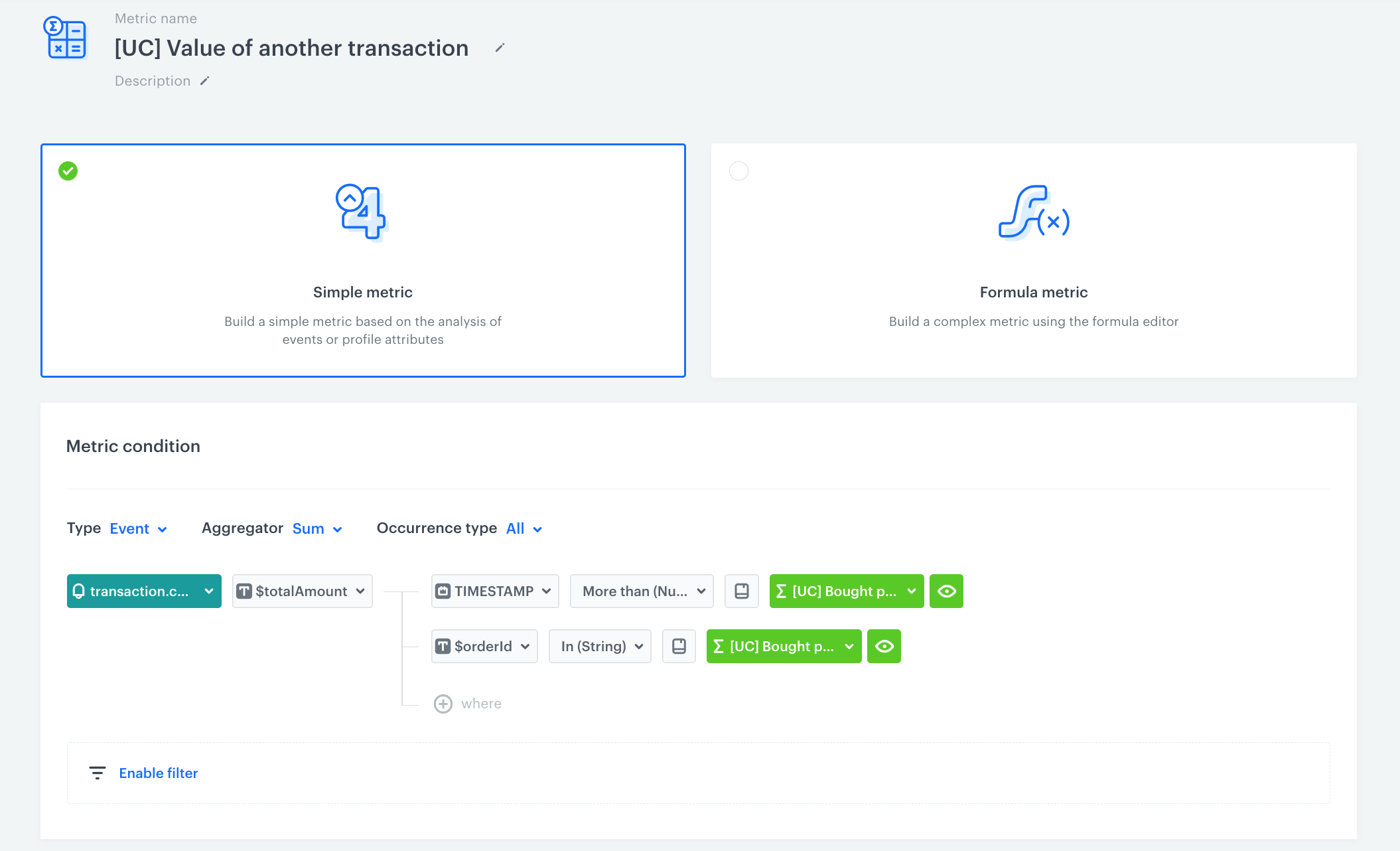
 **Decision Hub > Metrics > New metric**.
2. Enter the name of the metric.
3. Select a simple metric (set by default).
4. As the **Type**, select **Event** (set by default).
5. As the **Aggregator**, select **Sum**.
6. As the **Occurrence**, select **All**.
7. From the **Choose event** dropdown list, select **transaction.charge**.
8. Click the **+ where** button.
9. From the **Choose parameter** dropdown list, select **$totalAmount**.
10. Click the **+ where** button.
11. From the **Choose parameter** dropdown list, select **Specials**.
12. From the list, select **TIMESTAMP**.
13. As the logical operator, select **More than**.
14. Click the icon next to the logic operator and keep clicking until you get .
15. From the **Choose value** dropdown list, click the icon, and then select **Aggregates**.
16. Select the third aggregate.
17. Click the **+ where** button.
18. From the **Choose parameter** dropdown list, select **$orderId**.
19. As the logical operator, select **In**.
20. Click the icon next to the logic operator and keep clicking until you get .
21. From the **Choose value** dropdown list, click the icon, and then select **Aggregates**.
22. Select the third aggregate.
23. Save the metric.
**Result**:
**Decision Hub > Metrics > New metric**.
2. Enter the name of the metric.
3. Select a simple metric (set by default).
4. As the **Type**, select **Event** (set by default).
5. As the **Aggregator**, select **Sum**.
6. As the **Occurrence**, select **All**.
7. From the **Choose event** dropdown list, select **transaction.charge**.
8. Click the **+ where** button.
9. From the **Choose parameter** dropdown list, select **$totalAmount**.
10. Click the **+ where** button.
11. From the **Choose parameter** dropdown list, select **Specials**.
12. From the list, select **TIMESTAMP**.
13. As the logical operator, select **More than**.
14. Click the icon next to the logic operator and keep clicking until you get .
15. From the **Choose value** dropdown list, click the icon, and then select **Aggregates**.
16. Select the third aggregate.
17. Click the **+ where** button.
18. From the **Choose parameter** dropdown list, select **$orderId**.
19. As the logical operator, select **In**.
20. Click the icon next to the logic operator and keep clicking until you get .
21. From the **Choose value** dropdown list, click the icon, and then select **Aggregates**.
22. Select the third aggregate.
23. Save the metric.
**Result**:
 ## Contents
# Creating formula metrics
Compared to simple metrics, formula metrics let you perform more complex mathematical and logical operations on events and customer attributes. The result is always a number.
You can use metrics in [histograms](/docs/analytics/histograms/introduction-to-histograms) and [reports](/docs/analytics/reports/introduction-to-reports). Before proceeding, familiarize yourself with the limits and constraints that apply to metrics used in these analyses:
- [Allowed metrics in histograms](/docs/analytics/histograms/creating-histograms#allowed-metrics)
- [Allowed metrics in reports](/docs/analytics/reports/creating-reports#allowed-metrics)
## Requirements
---
You must have a [user role](/docs/settings/identity-access-management/permissions) with the following permissions:
- [access the Decision Hub](/docs/settings/identity-access-management/permissions/analytics-permissions#access-the-decision-hub)
- [view analyses](/docs/settings/identity-access-management/permissions/analytics-permissions#view-analyses)
- [create analyses](/docs/settings/identity-access-management/permissions/analytics-permissions#create-analyses)
- [edit analyses](/docs/settings/identity-access-management/permissions/analytics-permissions#edit-analyses)
- [preview results](/docs/settings/identity-access-management/permissions/analytics-permissions#preview-results)
- A tracking code implemented into your website.
## Creating a formula metric
---
## Contents
# Creating formula metrics
Compared to simple metrics, formula metrics let you perform more complex mathematical and logical operations on events and customer attributes. The result is always a number.
You can use metrics in [histograms](/docs/analytics/histograms/introduction-to-histograms) and [reports](/docs/analytics/reports/introduction-to-reports). Before proceeding, familiarize yourself with the limits and constraints that apply to metrics used in these analyses:
- [Allowed metrics in histograms](/docs/analytics/histograms/creating-histograms#allowed-metrics)
- [Allowed metrics in reports](/docs/analytics/reports/creating-reports#allowed-metrics)
## Requirements
---
You must have a [user role](/docs/settings/identity-access-management/permissions) with the following permissions:
- [access the Decision Hub](/docs/settings/identity-access-management/permissions/analytics-permissions#access-the-decision-hub)
- [view analyses](/docs/settings/identity-access-management/permissions/analytics-permissions#view-analyses)
- [create analyses](/docs/settings/identity-access-management/permissions/analytics-permissions#create-analyses)
- [edit analyses](/docs/settings/identity-access-management/permissions/analytics-permissions#edit-analyses)
- [preview results](/docs/settings/identity-access-management/permissions/analytics-permissions#preview-results)
- A tracking code implemented into your website.
## Creating a formula metric
---
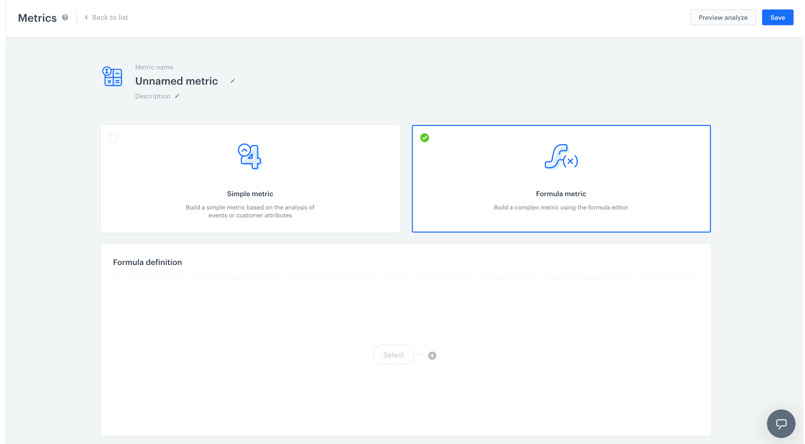 1. Go to **Decision Hub > Metrics > New metric**.
2. Enter a name of the metric.
3. Optionally, to let other users know about the purpose of the metric, you can write a short description.
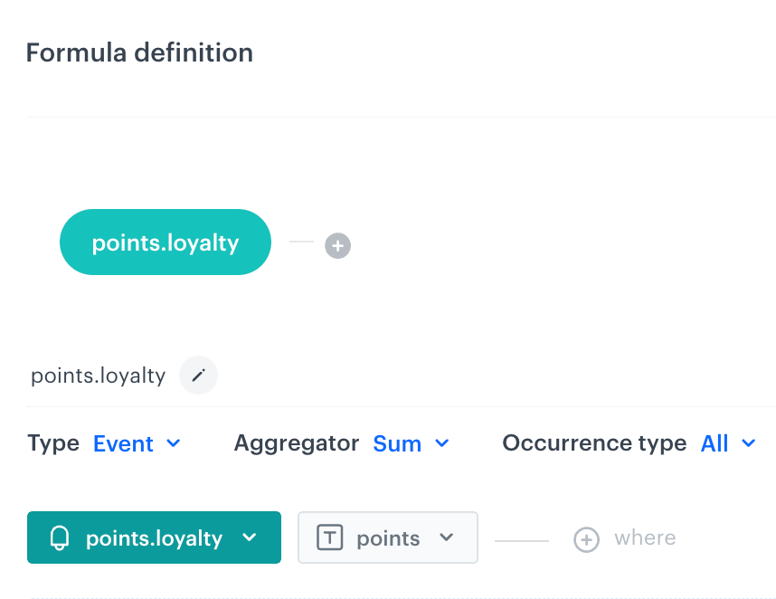
4. Choose **Formula metric**.
5. To start creating a mathematical operation, click the **Select** button.
6. You can choose one of four elements: profile, event, number or a [function](/docs/crm/expressions/functions-in-expressions).
7. To define the settings of the chosen element, click this element.
8. **If you chose an event**, perform the following steps:
- To choose the context of data analyzed in the metric, next to the **Type** option, click the arrow. You can analyze events or profiles.
- To choose the type of results, next to the **Aggregator** option, click the arrow. [The full list of aggregators and their description is available here](/docs/analytics/metrics/creating-simple-metrics#aggregators)
- To define the type of occurrence, next to the **Occurrence type** option, click the arrow. This way you can count the first, the last or all occurrences of a chosen event.
- From the dropdown list, select an event. Customers who performed a specific action (that triggers the selected event) are considered in the analysis. To define the details of the event, perform one or two actions described below:
- If you want to narrow down the scope of customers, click the **Enable filter** option. This [profile filter](/docs/analytics/i_profile-filter) works as an additional condition a customer has to meet in order to be counted in the metric.
- If you want to be more specific and analyze a particular aspect of the event, select [event parameters](/docs/analytics/i_events-parameter-value) by clicking the **Where** button.
9. To add another element, click the plus button.
10. To define the mathematical operation between the elements, click the plus button.
10. To determine the time range from which the data will be analyzed, click the calendar. Confirm the settings by clicking **Apply**.
11. To complete the process, click the **Save** button.
# Date ranges in dashboards
## Overview
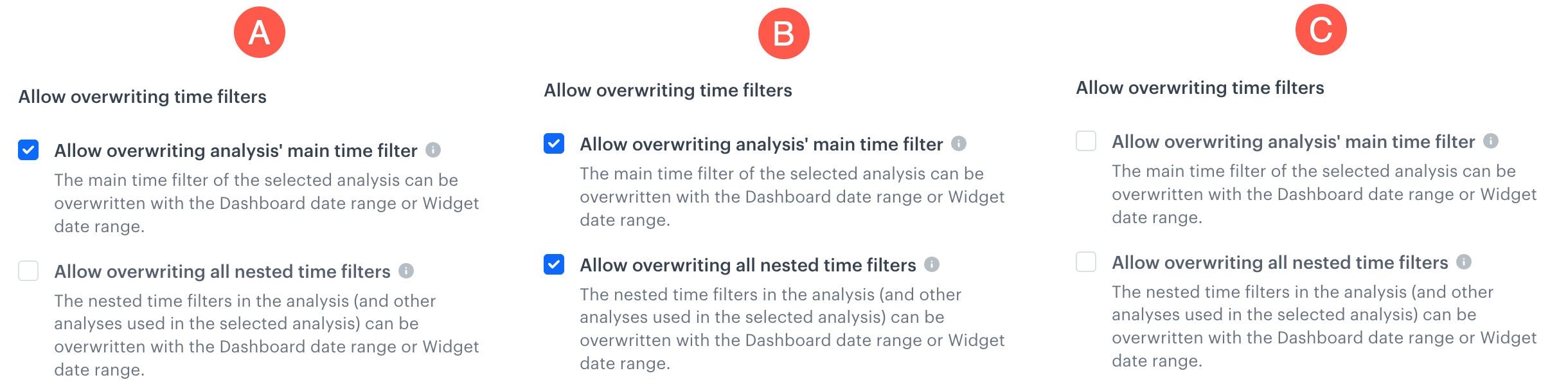
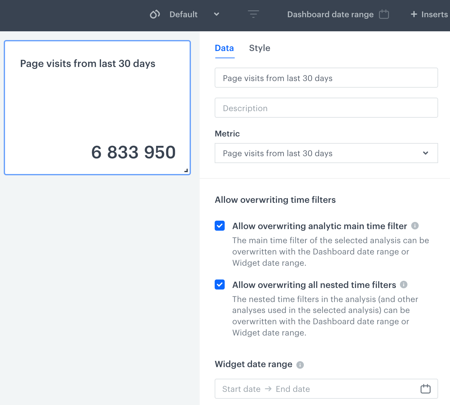
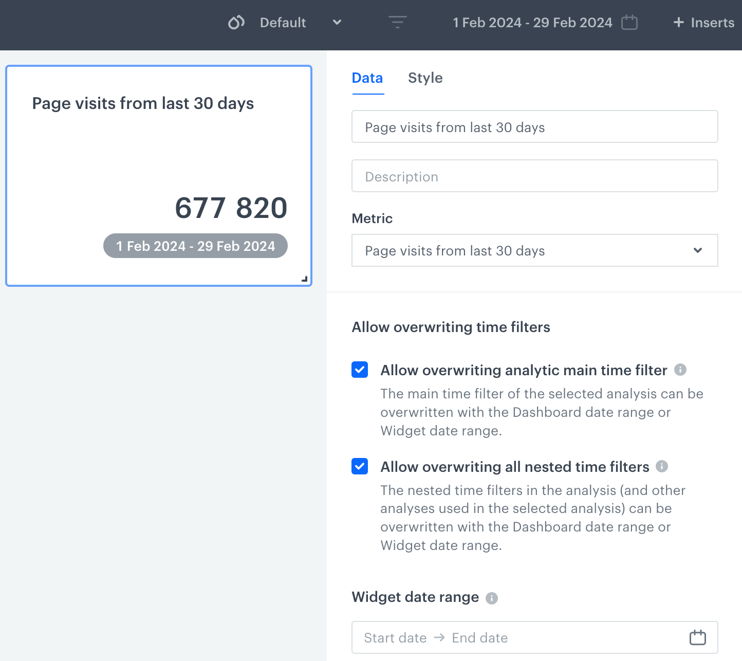
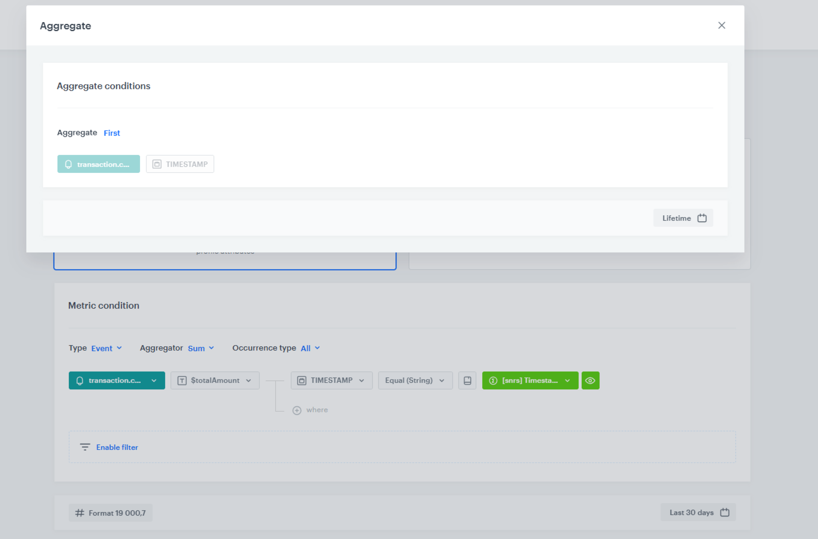
When you add an analysis to a dashboard, its date ranges can be overwritten by the dashboard or widget date range. This article explains how overwriting works:
- Analyses can contain nested date ranges: when a condition uses another analysis (a segmentation, aggregate, or expression), that inner analysis has its own date range.
- You can choose to overwrite the main date range only, both the main and nested date ranges, or neither - each combination behaves differently.
- Profile filters are not treated as nested by default — if the conditions inside are event-based, their date ranges are treated as the main analysis date range, not nested.
- Dashboard date ranges cannot overwrite segmentation widgets added directly to the dashboard; segmentations used as conditions inside a metric are treated as nested date ranges and can be overwritten.
## Date range types in analyses and dashboards
---
### Main analysis date range
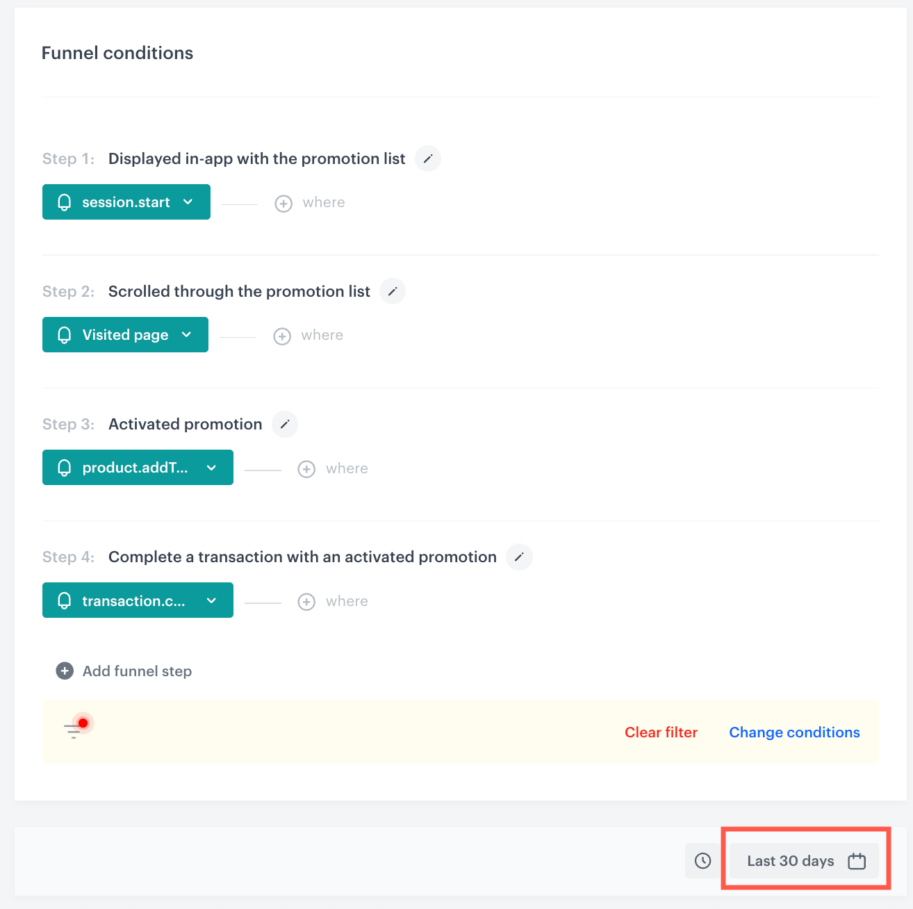
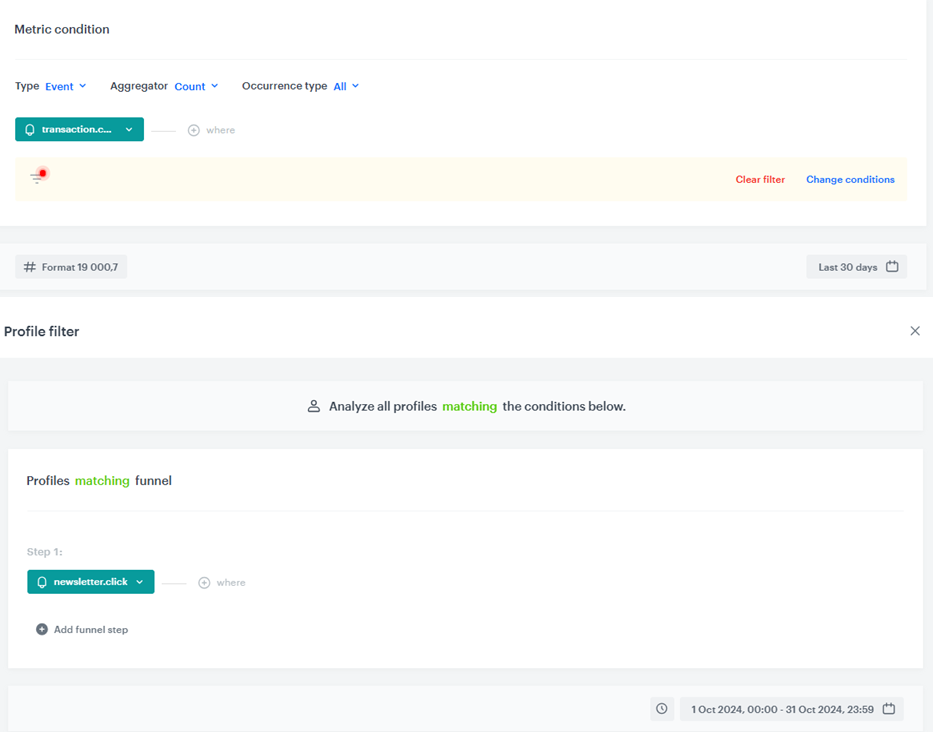
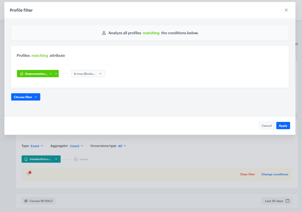
While creating an analysis, you can apply date filters. The image below presents a preview of a funnel configuration in the funnel creator, the area marked with a red rectangle presents the funnel's main filter.
1. Go to **Decision Hub > Metrics > New metric**.
2. Enter a name of the metric.
3. Optionally, to let other users know about the purpose of the metric, you can write a short description.
4. Choose **Formula metric**.
5. To start creating a mathematical operation, click the **Select** button.
6. You can choose one of four elements: profile, event, number or a [function](/docs/crm/expressions/functions-in-expressions).
7. To define the settings of the chosen element, click this element.
8. **If you chose an event**, perform the following steps:
- To choose the context of data analyzed in the metric, next to the **Type** option, click the arrow. You can analyze events or profiles.
- To choose the type of results, next to the **Aggregator** option, click the arrow. [The full list of aggregators and their description is available here](/docs/analytics/metrics/creating-simple-metrics#aggregators)
- To define the type of occurrence, next to the **Occurrence type** option, click the arrow. This way you can count the first, the last or all occurrences of a chosen event.
- From the dropdown list, select an event. Customers who performed a specific action (that triggers the selected event) are considered in the analysis. To define the details of the event, perform one or two actions described below:
- If you want to narrow down the scope of customers, click the **Enable filter** option. This [profile filter](/docs/analytics/i_profile-filter) works as an additional condition a customer has to meet in order to be counted in the metric.
- If you want to be more specific and analyze a particular aspect of the event, select [event parameters](/docs/analytics/i_events-parameter-value) by clicking the **Where** button.
9. To add another element, click the plus button.
10. To define the mathematical operation between the elements, click the plus button.
10. To determine the time range from which the data will be analyzed, click the calendar. Confirm the settings by clicking **Apply**.
11. To complete the process, click the **Save** button.
# Date ranges in dashboards
## Overview
When you add an analysis to a dashboard, its date ranges can be overwritten by the dashboard or widget date range. This article explains how overwriting works:
- Analyses can contain nested date ranges: when a condition uses another analysis (a segmentation, aggregate, or expression), that inner analysis has its own date range.
- You can choose to overwrite the main date range only, both the main and nested date ranges, or neither - each combination behaves differently.
- Profile filters are not treated as nested by default — if the conditions inside are event-based, their date ranges are treated as the main analysis date range, not nested.
- Dashboard date ranges cannot overwrite segmentation widgets added directly to the dashboard; segmentations used as conditions inside a metric are treated as nested date ranges and can be overwritten.
## Date range types in analyses and dashboards
---
### Main analysis date range
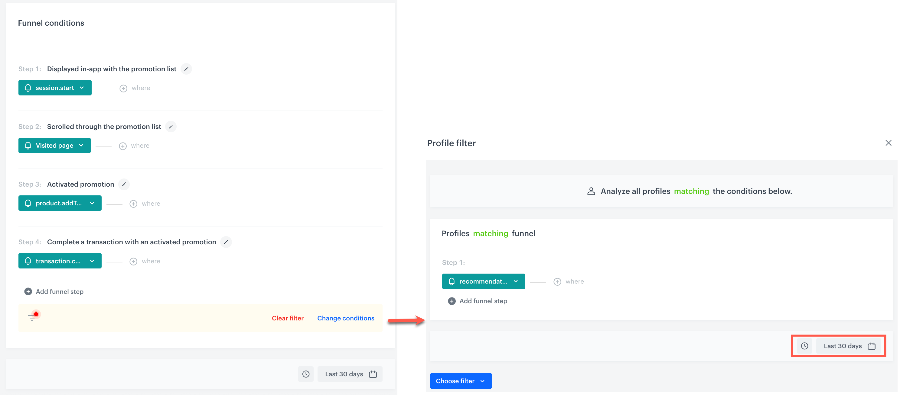
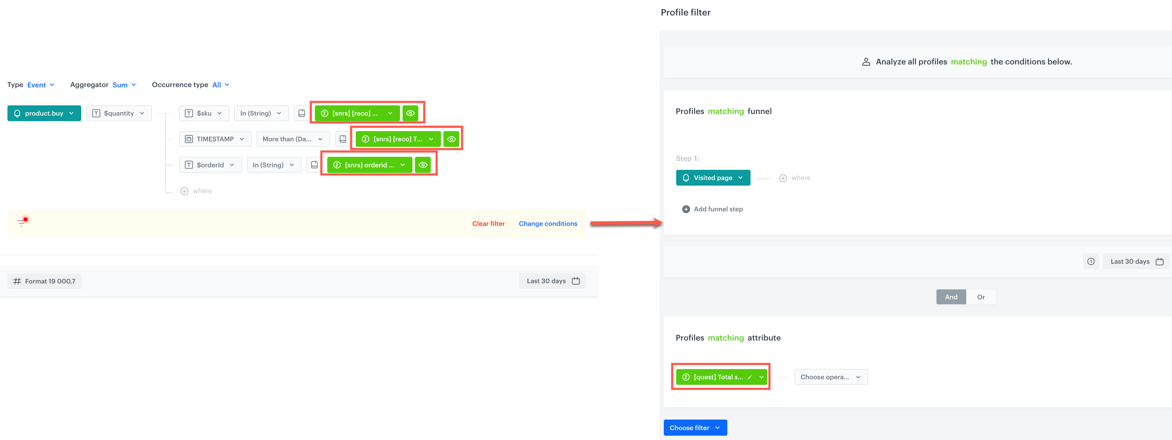
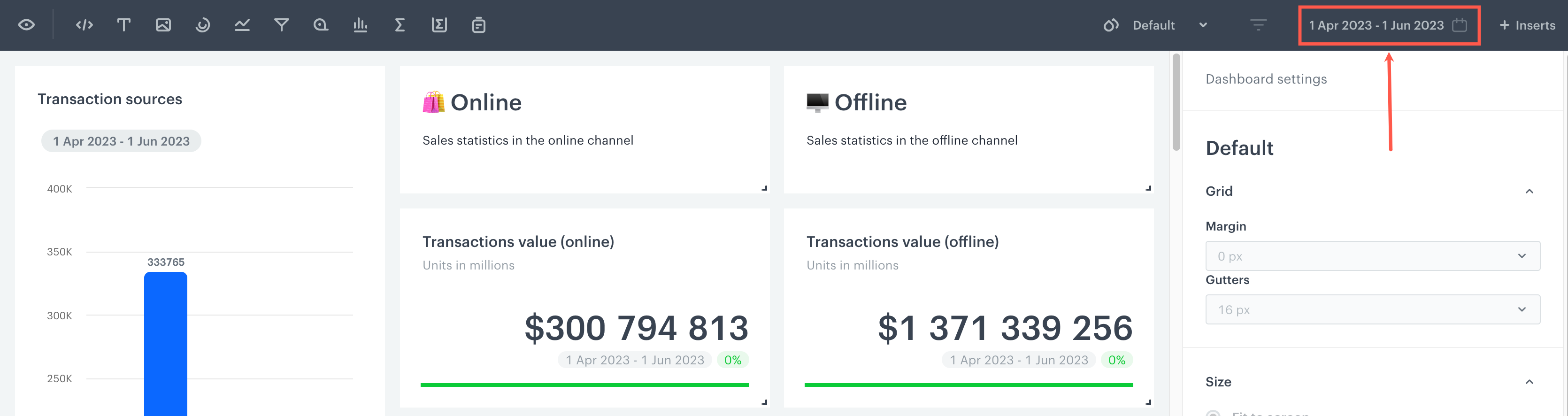
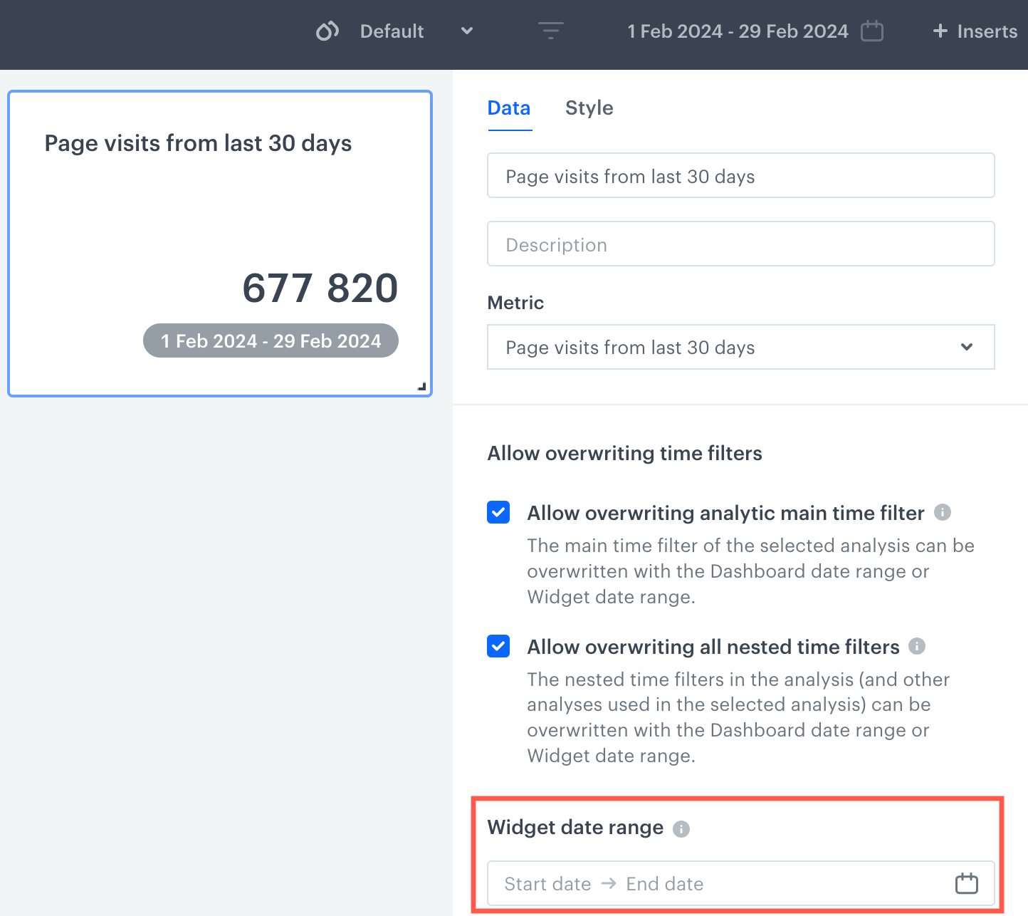
While creating an analysis, you can apply date filters. The image below presents a preview of a funnel configuration in the funnel creator, the area marked with a red rectangle presents the funnel's main filter.
 **Decision Hub > Dashboards > Add dashboard**.
2. Enter the name of the dashboard.
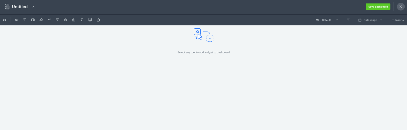
3. To add a widget to the dashboard, click an icon on the
**Decision Hub > Dashboards > Add dashboard**.
2. Enter the name of the dashboard.
3. To add a widget to the dashboard, click an icon on the  panel. The icons are (left to right): HTML code, text field, image, [segmentation](/docs/analytics/segmentations/creating-segmentations), [trend](/docs/analytics/trends/creating-trends), [funnel](/docs/analytics/funnels/creating-funnels), [metric](/docs/analytics/metrics/creating-simple-metrics), [histogram](/docs/analytics/histograms/creating-histograms), [aggregate](/docs/crm/aggregates/creating-profile-aggregates), [expression](/docs/crm/expressions), and a [report](/docs/analytics/reports/creating-reports).
4. To use [snippets](/docs/assets/snippets) in HTML code:
1. Click **Snippets**.
2. Select a snippet.
3. Paste the snippet or create a reference to it.
Snippet usage is restricted to images and blocks.
**Result**: A widget appears on the dashboard.
### Configuring analyses widgets
---
4. If you chose a particular type of an analysis to be added to the dashboard, in order to configure the widget settings, click the widget on the dashboard.
**Result**: On the right side, a panel shows up with two tabs: **Data** and **Style**.
5. In the **Data** panel, enter the title of the analysis.
6. Optionally, in the **Description** field, to let other users know the purpose of the analysis, enter a short description.
7. From the dropdown list, you can either:
- Select an existing analysis.
- Create a new analysis by clicking **Create new** at the bottom of the list.
panel. The icons are (left to right): HTML code, text field, image, [segmentation](/docs/analytics/segmentations/creating-segmentations), [trend](/docs/analytics/trends/creating-trends), [funnel](/docs/analytics/funnels/creating-funnels), [metric](/docs/analytics/metrics/creating-simple-metrics), [histogram](/docs/analytics/histograms/creating-histograms), [aggregate](/docs/crm/aggregates/creating-profile-aggregates), [expression](/docs/crm/expressions), and a [report](/docs/analytics/reports/creating-reports).
4. To use [snippets](/docs/assets/snippets) in HTML code:
1. Click **Snippets**.
2. Select a snippet.
3. Paste the snippet or create a reference to it.
Snippet usage is restricted to images and blocks.
**Result**: A widget appears on the dashboard.
### Configuring analyses widgets
---
4. If you chose a particular type of an analysis to be added to the dashboard, in order to configure the widget settings, click the widget on the dashboard.
**Result**: On the right side, a panel shows up with two tabs: **Data** and **Style**.
5. In the **Data** panel, enter the title of the analysis.
6. Optionally, in the **Description** field, to let other users know the purpose of the analysis, enter a short description.
7. From the dropdown list, you can either:
- Select an existing analysis.
- Create a new analysis by clicking **Create new** at the bottom of the list.
| Property name | Available in | Description |
|---|---|---|
| Visualization type | All types of analyses apart from a metric and an expression | Select a chart type an analysis is going to be presented in. |
| Appearance | All types of analyses | Define the unit of results and their accuracy (decimal places). |
| Layout | All types of analyses apart from a metric, aggregate and an expression | Select a horizontal or vertical layout of a chart. |
| Axes | All types of analyses apart from a metric, aggregate and an expression |
|
| Axes titles | All type of analyses apart from a metric, aggregate and an expression | Enter titles for X and Y axes. |
| Legend | All type of analyses apart from a metric, aggregate and an expression | Define the position and alignment of a chart legend. |
| Colorize | All type of analyses apart from a metric, aggregate and an expression |
|
| Color palette | All type of analyses apart from a metric, aggregate and an expression | Select colors of chart elements. |
| Text | A metric, aggregate and an expression |
|
| Icon | A metric, aggregate and an expression | Select an icon and its color. The icon is displayed above the title of the widget. |
| Goal colors | A metric, aggregate and an expression | Define the color of the lowest and the highest result. |
 icon.
9. When you complete creating the dashboard, click **Save dashboard**.
icon.
9. When you complete creating the dashboard, click **Save dashboard**.
 icon shows on the settings panel on the dashboard.
2. Click the icon.
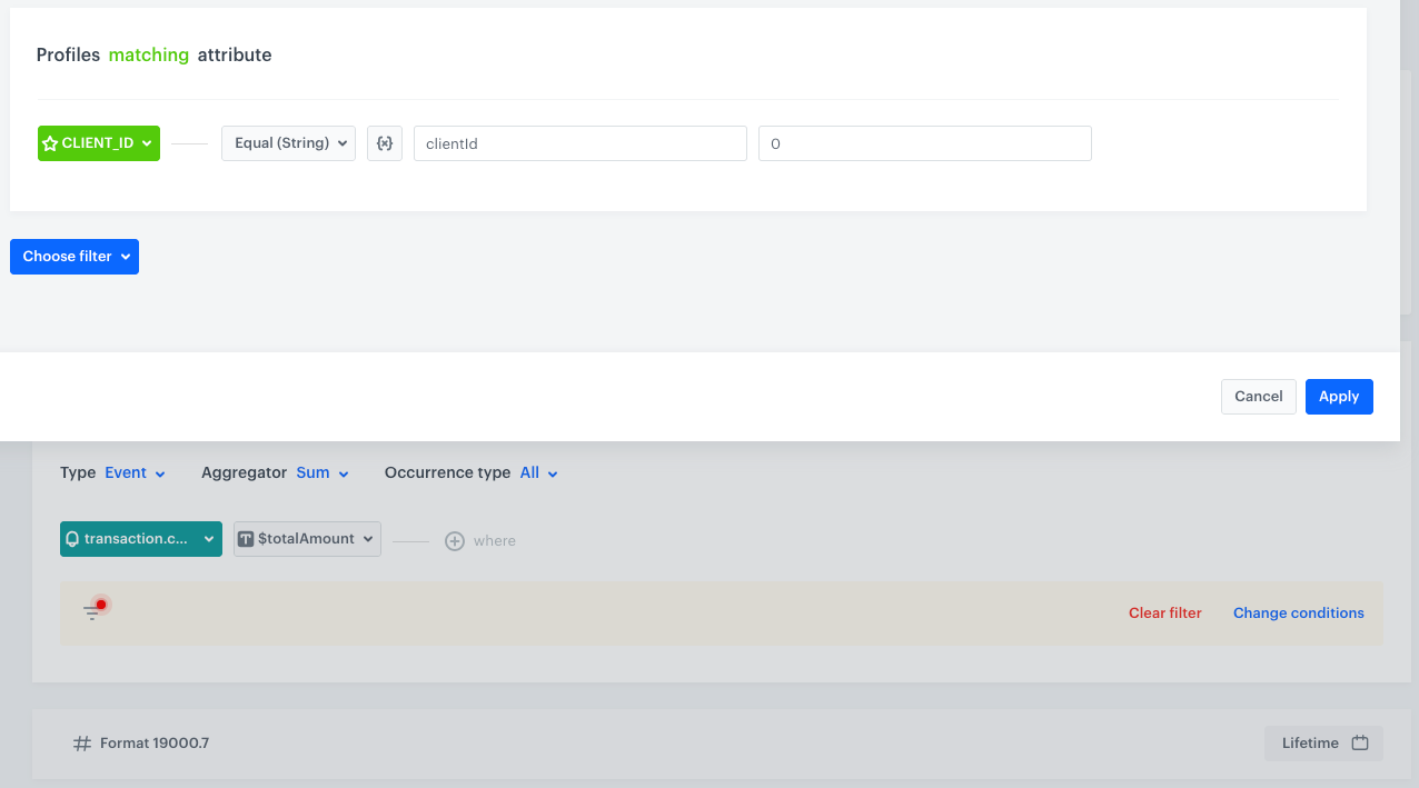
**Result**: A pop-up shows up. The name of the dynamic key that is used in the analyses added is already there.
icon shows on the settings panel on the dashboard.
2. Click the icon.
**Result**: A pop-up shows up. The name of the dynamic key that is used in the analyses added is already there.
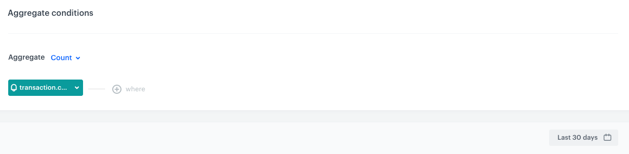
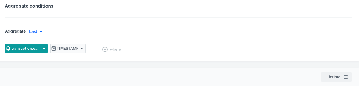 icon.
**Result**:
icon.
**Result**:
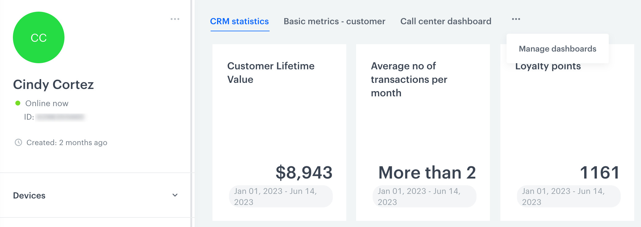 icon.
**Result**:
icon.
**Result**:
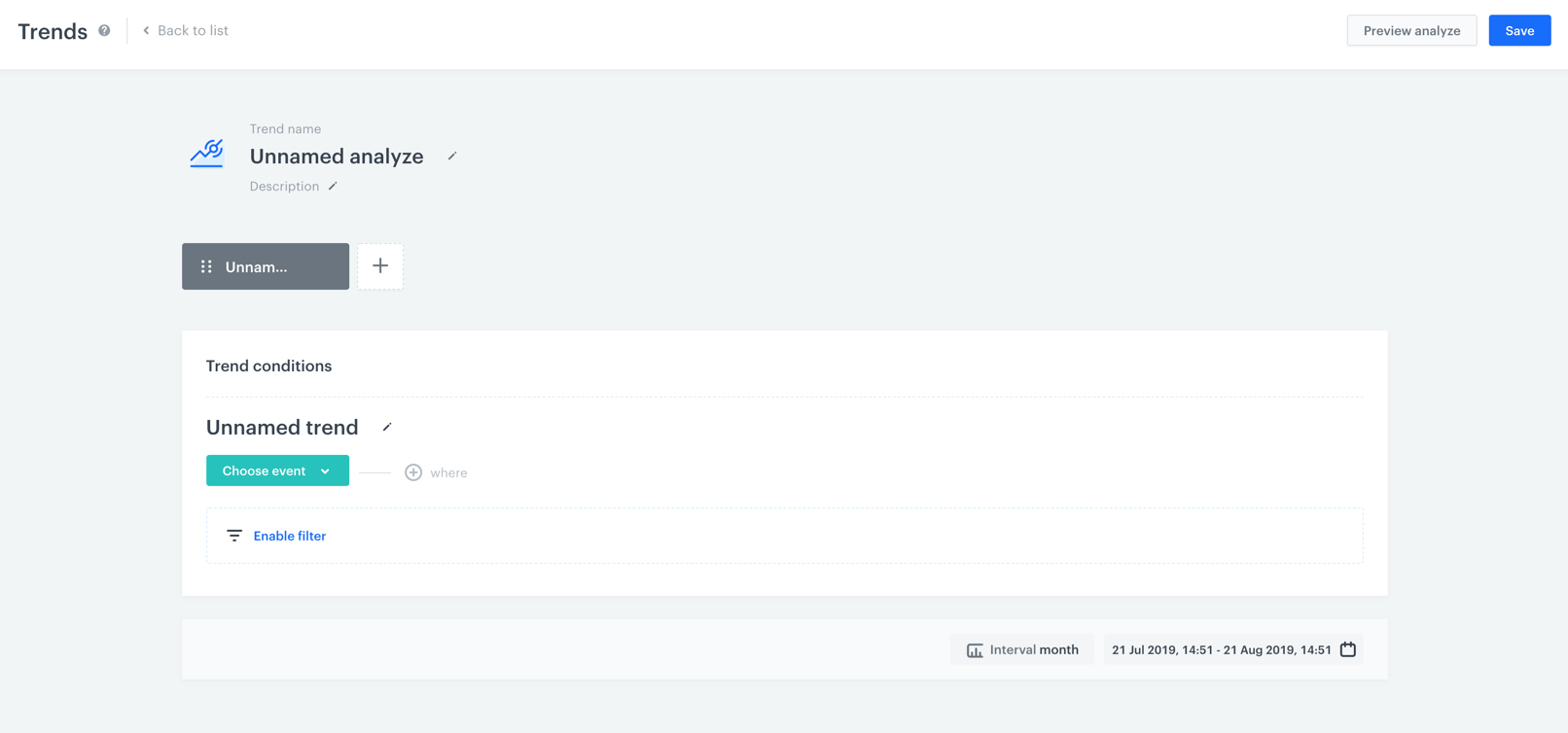 1. Go to **Decision Hub > Trends > New trend**.
2. Enter the name of the trend.
3. Optionally, to let users of the workspace know about the purpose of the trend, you can write a short description.
s3. Choose the event you want to analyze. A trend is an analysis of an event's number of occurrences. You can filter the events to analyze by setting optional filters:
- If you want to narrow down the scope of customers, click the **Enable filter** option. This [profile filter](/docs/analytics/i_profile-filter) works as an additional condition a customer has to meet in order to be counted in the trend.
**Decision Hub > Segmentations**.
2. On the segmentation you want to preview, click the icon.
3. To see the preview of the segmentation in the graphic form, from the dropdown list, choose the **Preview** option.
4. To see the list of customers who belong to the segmentation, in the upper right corner of the window click **Open in Profiles**.
# Previewing histograms
To see the outcome of the histogram, you can switch on the preview of the analysis.
---
1. Go to **Decision Hub > Histograms**.
2. On the list, find the histogram you want to see the preview of.
3. Click the histogram.
**Result**: A histogram configuration appears.
3. Select the **Preview** tab.
# Previewing funnels
When you create a funnel, you can check the results of the analysis.
1. Go to **Decision Hub > Funnels**.
2. On the list of the funnels, find the funnel you want to see the preview of.
3. Open the funnel configuration and scroll down the page to the **Preview** section.
# Previewing segmentations
When you create a segmentation, you can check the results it produces.
1. Go to **Decision Hub > Segmentations**.
2. Click the icon on the segmentation you want to preview.
3. From the dropdown list, choose the **Open** option.
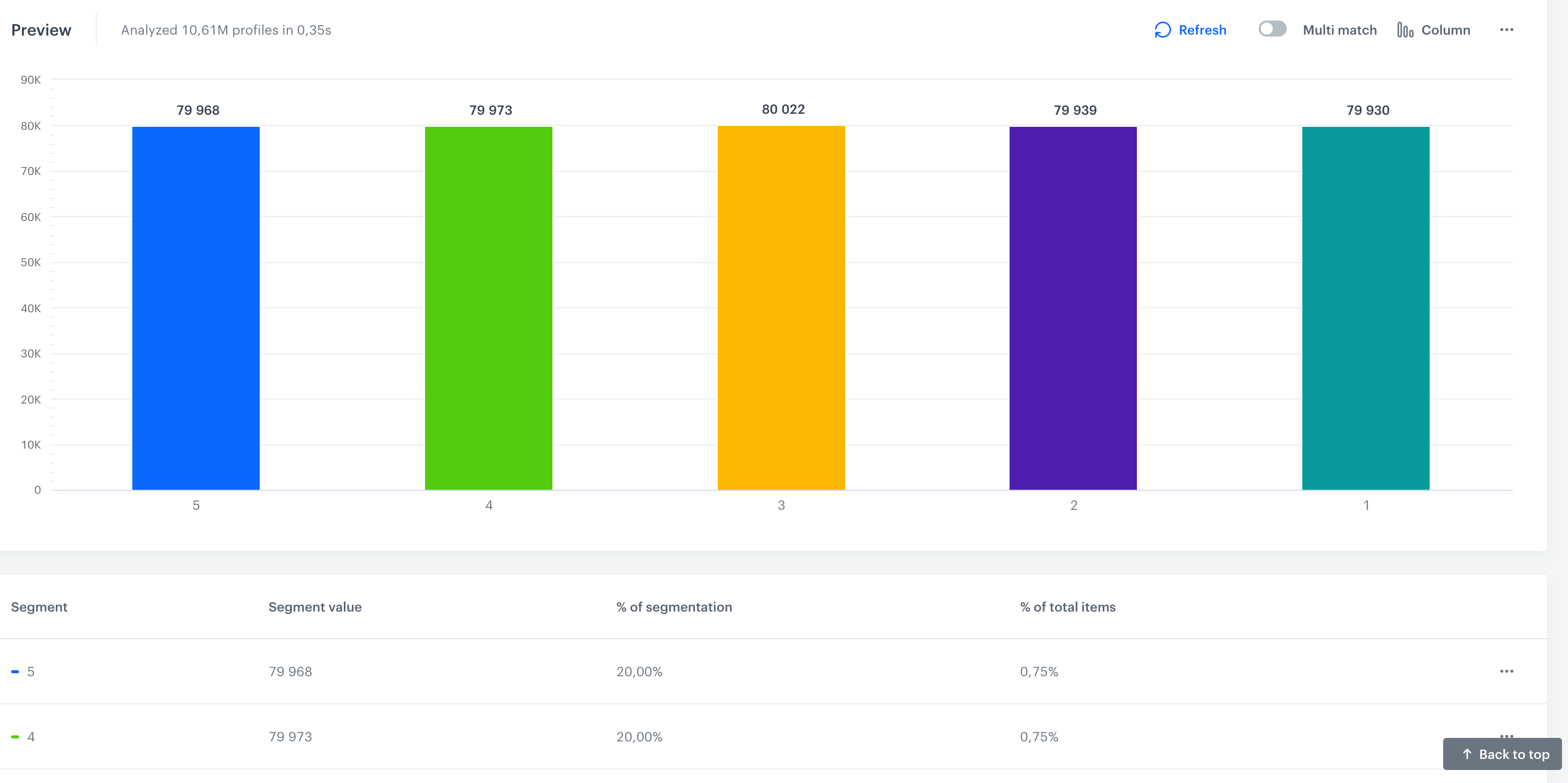
- To go back to editing the segment, scroll up the screen and click **Show conditions**
- To include a customer in more than one segment, if the customer met conditions, in the preview of the segmentation, switch the [**Multi-match**](/docs/analytics/segmentations/creating-segmentations#multi-match) toggle on.
- To see the percentage distribution, scroll down the page.
- To preview the list of customers that meet the requirements of the segmentation, click the column/slice of a pie chart that represents a segment and select **Show records**.
- To print out the preview of the segmentation, in the **Preview** section, click and select **Print chart**.
- To download the preview of the segmentation as a `.jpg`, `.png`, `.pdf`, `.csv`, or `xlsx`, click and select the option of downloading a corresponding file format.
# Previewing reports
When you create a report, you can check the results of the analysis.
1. Go to **Decision Hub > Reports**.
2. On the list of the reports, find the report you want to see the preview of.
3. Click the report.
4. Click the **Preview** tab.
4. Optionally, to change the settings of the report, click the **Edit condition** button.
# Creating reports
Create a report on the basis of metrics to analyze the aspects of selected metrics.
## Allowed metrics
The table below summarizes metric configurations and their compatibility with reports. It applies to reports with one and more metrics used in a report.
1. Go to **Decision Hub > Trends > New trend**.
2. Enter the name of the trend.
3. Optionally, to let users of the workspace know about the purpose of the trend, you can write a short description.
s3. Choose the event you want to analyze. A trend is an analysis of an event's number of occurrences. You can filter the events to analyze by setting optional filters:
- If you want to narrow down the scope of customers, click the **Enable filter** option. This [profile filter](/docs/analytics/i_profile-filter) works as an additional condition a customer has to meet in order to be counted in the trend.
**Decision Hub > Segmentations**.
2. On the segmentation you want to preview, click the icon.
3. To see the preview of the segmentation in the graphic form, from the dropdown list, choose the **Preview** option.
4. To see the list of customers who belong to the segmentation, in the upper right corner of the window click **Open in Profiles**.
# Previewing histograms
To see the outcome of the histogram, you can switch on the preview of the analysis.
---
1. Go to **Decision Hub > Histograms**.
2. On the list, find the histogram you want to see the preview of.
3. Click the histogram.
**Result**: A histogram configuration appears.
3. Select the **Preview** tab.
# Previewing funnels
When you create a funnel, you can check the results of the analysis.
1. Go to **Decision Hub > Funnels**.
2. On the list of the funnels, find the funnel you want to see the preview of.
3. Open the funnel configuration and scroll down the page to the **Preview** section.
# Previewing segmentations
When you create a segmentation, you can check the results it produces.
1. Go to **Decision Hub > Segmentations**.
2. Click the icon on the segmentation you want to preview.
3. From the dropdown list, choose the **Open** option.
- To go back to editing the segment, scroll up the screen and click **Show conditions**
- To include a customer in more than one segment, if the customer met conditions, in the preview of the segmentation, switch the [**Multi-match**](/docs/analytics/segmentations/creating-segmentations#multi-match) toggle on.
- To see the percentage distribution, scroll down the page.
- To preview the list of customers that meet the requirements of the segmentation, click the column/slice of a pie chart that represents a segment and select **Show records**.
- To print out the preview of the segmentation, in the **Preview** section, click and select **Print chart**.
- To download the preview of the segmentation as a `.jpg`, `.png`, `.pdf`, `.csv`, or `xlsx`, click and select the option of downloading a corresponding file format.
# Previewing reports
When you create a report, you can check the results of the analysis.
1. Go to **Decision Hub > Reports**.
2. On the list of the reports, find the report you want to see the preview of.
3. Click the report.
4. Click the **Preview** tab.
4. Optionally, to change the settings of the report, click the **Edit condition** button.
# Creating reports
Create a report on the basis of metrics to analyze the aspects of selected metrics.
## Allowed metrics
The table below summarizes metric configurations and their compatibility with reports. It applies to reports with one and more metrics used in a report.
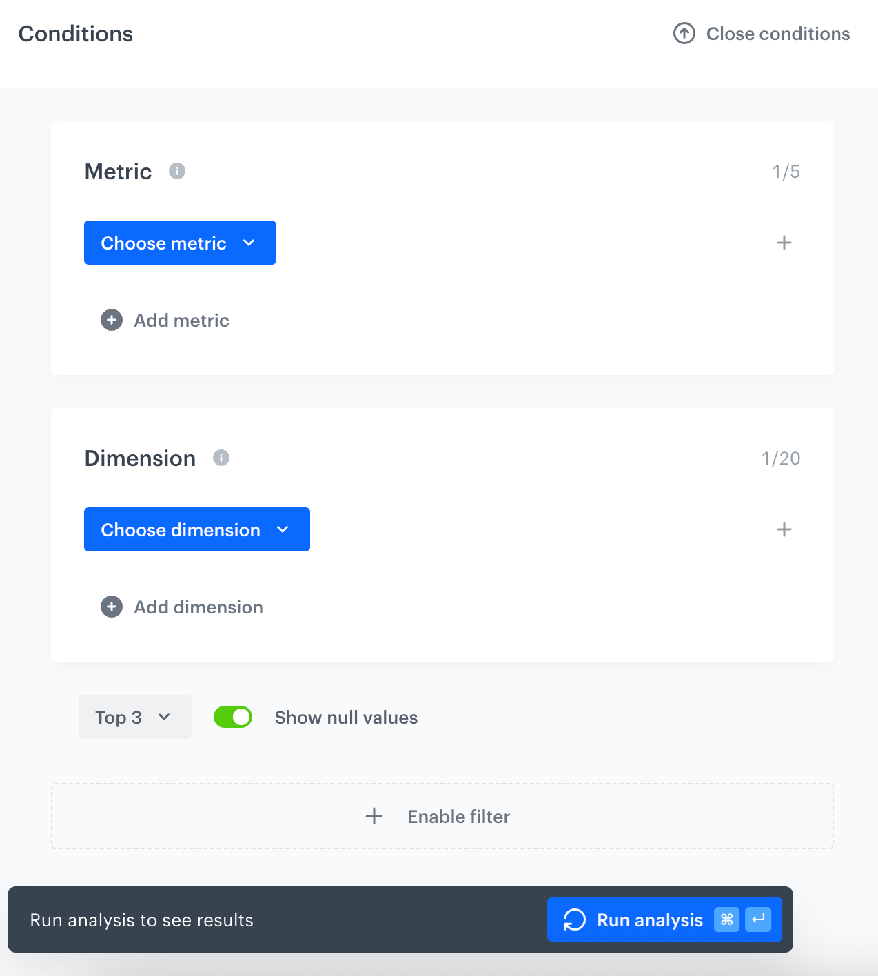 **Decision Hub > Reports > New report**.
2. Enter the name of the report.
4. Select a metric on the basis of which the report is created. To do so, click **Choose metric** and from the dropdown list, select a metric.
The table in the ["Allowed metrics" section](#allowed-metrics) explains the limits and constraints.
5. Optionally, to include more than one metric in the report, click **Add metric > Choose metric** and select an additional metric from the dropdown. The same metric can be added multiple times.
Refer to the ["Report result limits" section](#report-result-limits) for the maximum number of metrics you can add.
6. To choose the type of results you want to generate in the report, click the button in the **Range** section. From the dropdown list, select either top (receiving the highest results) or last results (last meaning recent).
Refer to the ["Report result limits" section](#report-result-limits) for the maximum **Range** value.
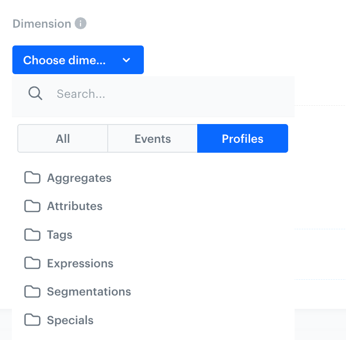
7. To choose the aspects of data from the metrics (dates, names, quantity, and more) you want to include in the report, click **Choose dimension**.
Refer to the table in the ["Allowed metrics" section](#allowed-metrics) to become familiar with the allowed dimensions for the metric you selected. When using multiple metrics, only dimensions that are valid for all selected metrics are available. Refer to the ["Report result limits" section](#report-result-limits) for the maximum number of dimensions you can add.
1. If you want to add a time context to display the dates when the event occurred, click **Add dimension**. Then go to **Events > Expressions**. From the list of expressions, select an event expression.
**Decision Hub > Reports > New report**.
2. Enter the name of the report.
4. Select a metric on the basis of which the report is created. To do so, click **Choose metric** and from the dropdown list, select a metric.
The table in the ["Allowed metrics" section](#allowed-metrics) explains the limits and constraints.
5. Optionally, to include more than one metric in the report, click **Add metric > Choose metric** and select an additional metric from the dropdown. The same metric can be added multiple times.
Refer to the ["Report result limits" section](#report-result-limits) for the maximum number of metrics you can add.
6. To choose the type of results you want to generate in the report, click the button in the **Range** section. From the dropdown list, select either top (receiving the highest results) or last results (last meaning recent).
Refer to the ["Report result limits" section](#report-result-limits) for the maximum **Range** value.
7. To choose the aspects of data from the metrics (dates, names, quantity, and more) you want to include in the report, click **Choose dimension**.
Refer to the table in the ["Allowed metrics" section](#allowed-metrics) to become familiar with the allowed dimensions for the metric you selected. When using multiple metrics, only dimensions that are valid for all selected metrics are available. Refer to the ["Report result limits" section](#report-result-limits) for the maximum number of dimensions you can add.
1. If you want to add a time context to display the dates when the event occurred, click **Add dimension**. Then go to **Events > Expressions**. From the list of expressions, select an event expression.
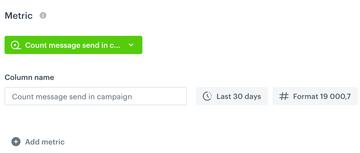
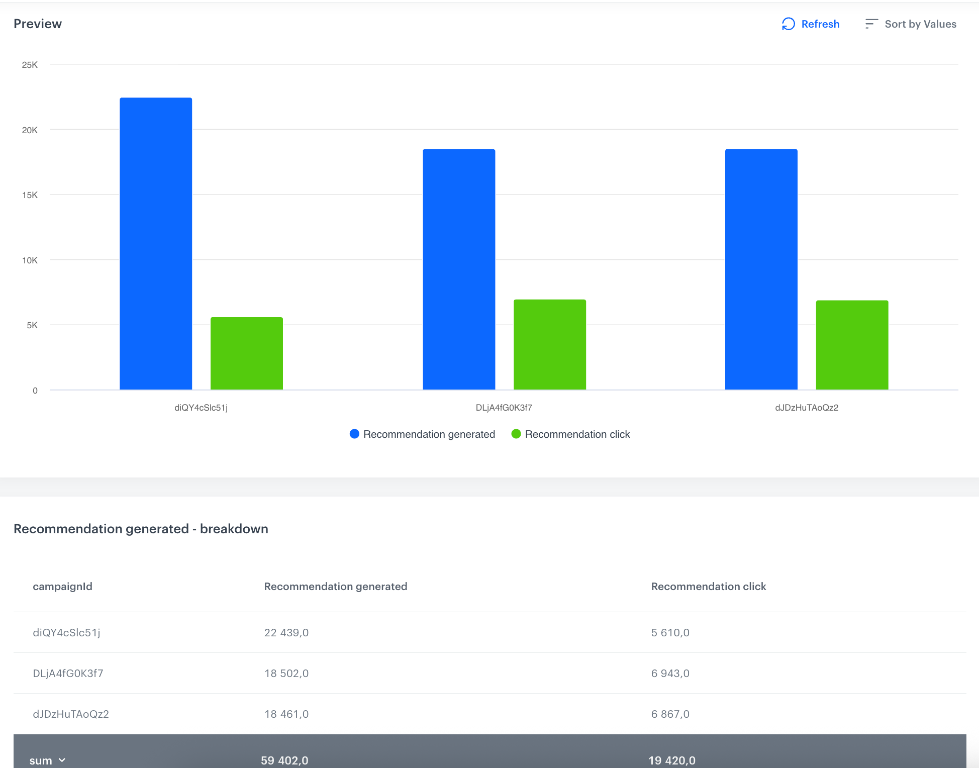 icon on the right and select the **Preview** option.
4. You can perform several actions:
- If you want to display the parameters of an event (such as URL in `page visit`), click the event under the **Step column** and select the **Drill down** option. Then, from the list of event parameters, select a parameter.
**Decision Hub > Metrics**.
2. On the list of the metrics, find the metric you want to see the preview of.
3. Click the metric as if you want to edit it.
4. Select the **Preview analyze** option.
4. Optionally, you can edit the metric by clicking the **Edit condition** button. Editing [simple metric](/docs/analytics/metrics/creating-simple-metrics) or [formula metrics](/docs/analytics/metrics/creating-formula-metrics) procedures available at the links.
# Sharing dashboards
When a dashboard is saved, it's private by default. You can make it accessible to all workspace users by changing its status, share it with specific workspace users with defined permissions, or generate a shareable link for non-workspace users.
#### Dashboard statuses
- **Private** - Only the author of the dashboard can preview and edit the dashboard.
- **Public Readable** - All users of a workspace where the dashboard was created can preview it, however, only the author can edit it.
- **Public Editable** - All users of a workspace where the dashboard was created can preview and edit it.
## Sharing with all workspace users
---
1. Go to **Decision Hub > Dashboards**.
2. Find a dashboard you want to share.
3. On the right of the dashboard name, click the icon with the status.
**Result**: A dropdown list appears.
4. From the dropdown list, select a dashboard status.
- **Public Readable** - All users of a workspace where the dashboard was created can preview it, however, only the author can edit it.
- **Public Editable** - All users of a workspace where the dashboard was created can preview and edit it.
## Sharing with specific workspace users
---
1. Go to **Decision Hub > Dashboards**.
2. Click the dashboard on the list.
3. In the upper-right corner, click the **Share** button.
**Result**: A dropdown list appears.
4. From the dropdown list, select the **With user** option.
**Result**: The **Share with user** pop-up appears.
5. In the **Email address** field, enter the email address of a workspace user you want to grant access to.
6. From the dropdown next to the email field, select the permission level:
- **View** - The user can only preview the dashboard.
- **Edit** - The user can preview and edit the dashboard. Users with this permission can also share the dashboard with other users.
7. If you want to give access to more than one user, click **Add email** and repeat steps 5–6.
8. Confirm by clicking **Apply**.
**Result**: The selected users are granted access to the dashboard. There is no email notification sent to them.
To revoke access, open the **Share with user** pop-up and remove the user's email address.
## Sharing with non-workspace users
---
To share a dashboard with users who are not part of your workspace, generate a shareable link. The link points to a snapshot of the dashboard's results from the time it was shared.
The snapshot is available even after the dashboard is deleted.
1. Go to **Decision Hub > Dashboards**.
2. Click the dashboard on the list.
3. Wait for all elements of the dashboard to calculate. If necessary, scroll down to confirm that all calculations are complete.
icon on the right and select the **Preview** option.
4. You can perform several actions:
- If you want to display the parameters of an event (such as URL in `page visit`), click the event under the **Step column** and select the **Drill down** option. Then, from the list of event parameters, select a parameter.
**Decision Hub > Metrics**.
2. On the list of the metrics, find the metric you want to see the preview of.
3. Click the metric as if you want to edit it.
4. Select the **Preview analyze** option.
4. Optionally, you can edit the metric by clicking the **Edit condition** button. Editing [simple metric](/docs/analytics/metrics/creating-simple-metrics) or [formula metrics](/docs/analytics/metrics/creating-formula-metrics) procedures available at the links.
# Sharing dashboards
When a dashboard is saved, it's private by default. You can make it accessible to all workspace users by changing its status, share it with specific workspace users with defined permissions, or generate a shareable link for non-workspace users.
#### Dashboard statuses
- **Private** - Only the author of the dashboard can preview and edit the dashboard.
- **Public Readable** - All users of a workspace where the dashboard was created can preview it, however, only the author can edit it.
- **Public Editable** - All users of a workspace where the dashboard was created can preview and edit it.
## Sharing with all workspace users
---
1. Go to **Decision Hub > Dashboards**.
2. Find a dashboard you want to share.
3. On the right of the dashboard name, click the icon with the status.
**Result**: A dropdown list appears.
4. From the dropdown list, select a dashboard status.
- **Public Readable** - All users of a workspace where the dashboard was created can preview it, however, only the author can edit it.
- **Public Editable** - All users of a workspace where the dashboard was created can preview and edit it.
## Sharing with specific workspace users
---
1. Go to **Decision Hub > Dashboards**.
2. Click the dashboard on the list.
3. In the upper-right corner, click the **Share** button.
**Result**: A dropdown list appears.
4. From the dropdown list, select the **With user** option.
**Result**: The **Share with user** pop-up appears.
5. In the **Email address** field, enter the email address of a workspace user you want to grant access to.
6. From the dropdown next to the email field, select the permission level:
- **View** - The user can only preview the dashboard.
- **Edit** - The user can preview and edit the dashboard. Users with this permission can also share the dashboard with other users.
7. If you want to give access to more than one user, click **Add email** and repeat steps 5–6.
8. Confirm by clicking **Apply**.
**Result**: The selected users are granted access to the dashboard. There is no email notification sent to them.
To revoke access, open the **Share with user** pop-up and remove the user's email address.
## Sharing with non-workspace users
---
To share a dashboard with users who are not part of your workspace, generate a shareable link. The link points to a snapshot of the dashboard's results from the time it was shared.
The snapshot is available even after the dashboard is deleted.
1. Go to **Decision Hub > Dashboards**.
2. Click the dashboard on the list.
3. Wait for all elements of the dashboard to calculate. If necessary, scroll down to confirm that all calculations are complete.
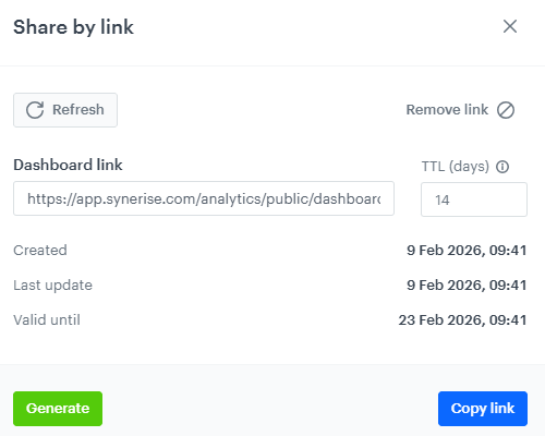 **Decision Hub > Dashboards**.
2. Click the dashboard you want to export.
3. In the upper-right corner, click the icon.
**Result**: A dropdown list appears.
4. From the dropdown list, select **Export to XLSX**.
**Result**: The file is generated and downloaded. The export always contains all widgets on the dashboard; you can't select which ones to include.
**Decision Hub > Dashboards**.
2. Click the dashboard you want to check.
3. In the upper-right corner, click the icon.
**Result**: A dropdown list appears.
4. From the dropdown list, select **Show audit log**.
**Result**: You can view the history of changes for that specific dashboard in the [Audit Log](/docs/settings/workspace/audit-log).
## Cloning a dashboard to another workspace
---
1. Go to **Decision Hub > Dashboards**.
2. Click the dashboard you want to clone.
3. In the upper-right corner, click the icon.
**Result**: A dropdown list appears.
4. From the dropdown list, select **Clone to workspace**.
**Result**: The **Choose destination** pop-up appears.
For the rest of the procedure, see [Cloning analyses to other workspaces](/docs/settings/workspace/cloning-objects/cloning-analyses-to-workspaces#cloning-objects).
# Removing Sankey Diagrams
If you don't need a diagram any longer, you can remove it.
icon on the right and from the dropdown list, select **Delete**.
# Adding segmentations to analytics dashboards
When you create an analytical dashboard, you can add all types of analytics.
## Adding existing segmentations
1. Go to **Decision Hub > Dashboards > Add dashboard**
2. Click the Segmentation icon on the dashboard.
3. Select from the list the segmentation you want to add.
## Adding a new segmentation
1. Go to **Decision Hub > Dashboards > Add dashboard**
2. Click the Segmentation icon on the dashboard.
3. Select the option **Create new** at the bottom of the list.
4. Follow the steps in the procedure described [here](/docs/analytics/segmentations/creating-segmentations).
# Removing dashboards
If you don't need a dashboard anymore, you can remove it from the application.
**Decision Hub > Dashboards**.
2. Find the dashboard you want to remove.
3. Click the icon on the right side from the dropdown and select the **Delete** option.
**Result**: A pop-up appears.
4. Confirm the action by clicking **OK**.
# Adding reports to analytical dashboards
When you create an analytical dashboard, you can add all types of analytics.
**Decision Hub > Dashboards > Add dashboard**.
2. Click the
**Decision Hub > Dashboards**.
2. Click the dashboard you want to export.
3. In the upper-right corner, click the icon.
**Result**: A dropdown list appears.
4. From the dropdown list, select **Export to XLSX**.
**Result**: The file is generated and downloaded. The export always contains all widgets on the dashboard; you can't select which ones to include.
**Decision Hub > Dashboards**.
2. Click the dashboard you want to check.
3. In the upper-right corner, click the icon.
**Result**: A dropdown list appears.
4. From the dropdown list, select **Show audit log**.
**Result**: You can view the history of changes for that specific dashboard in the [Audit Log](/docs/settings/workspace/audit-log).
## Cloning a dashboard to another workspace
---
1. Go to **Decision Hub > Dashboards**.
2. Click the dashboard you want to clone.
3. In the upper-right corner, click the icon.
**Result**: A dropdown list appears.
4. From the dropdown list, select **Clone to workspace**.
**Result**: The **Choose destination** pop-up appears.
For the rest of the procedure, see [Cloning analyses to other workspaces](/docs/settings/workspace/cloning-objects/cloning-analyses-to-workspaces#cloning-objects).
# Removing Sankey Diagrams
If you don't need a diagram any longer, you can remove it.
icon on the right and from the dropdown list, select **Delete**.
# Adding segmentations to analytics dashboards
When you create an analytical dashboard, you can add all types of analytics.
## Adding existing segmentations
1. Go to **Decision Hub > Dashboards > Add dashboard**
2. Click the Segmentation icon on the dashboard.
3. Select from the list the segmentation you want to add.
## Adding a new segmentation
1. Go to **Decision Hub > Dashboards > Add dashboard**
2. Click the Segmentation icon on the dashboard.
3. Select the option **Create new** at the bottom of the list.
4. Follow the steps in the procedure described [here](/docs/analytics/segmentations/creating-segmentations).
# Removing dashboards
If you don't need a dashboard anymore, you can remove it from the application.
**Decision Hub > Dashboards**.
2. Find the dashboard you want to remove.
3. Click the icon on the right side from the dropdown and select the **Delete** option.
**Result**: A pop-up appears.
4. Confirm the action by clicking **OK**.
# Adding reports to analytical dashboards
When you create an analytical dashboard, you can add all types of analytics.
**Decision Hub > Dashboards > Add dashboard**.
2. Click the  icon on the dashboard.
3. From the list select the report you want to add.
## Adding a new report
1. Go to **Decision Hub > Dashboards > Add dashboard**.
2. Click the icon on the dashboard.
3. At the bottom of the list, select the option **Create new**.
4. Follow the steps in the procedure described [here](/docs/analytics/reports/creating-reports).
# Adding funnels to analytics dashboards
When you create an analytical dashboard, you can add all types of analytics to it.
## Adding existing funnels
1. Go to **Decision Hub > Dashboards > Add dashboard**.
2. Click the
icon on the dashboard.
3. From the list select the report you want to add.
## Adding a new report
1. Go to **Decision Hub > Dashboards > Add dashboard**.
2. Click the icon on the dashboard.
3. At the bottom of the list, select the option **Create new**.
4. Follow the steps in the procedure described [here](/docs/analytics/reports/creating-reports).
# Adding funnels to analytics dashboards
When you create an analytical dashboard, you can add all types of analytics to it.
## Adding existing funnels
1. Go to **Decision Hub > Dashboards > Add dashboard**.
2. Click the  icon on the dashboard.
3. From the list, select the funnel you want to add.
## Adding a new funnel
1. Go to **Decision Hub > Dashboards > Add dashboard**.
2. Click the icon on the dashboard.
3. At the bottom of the list, Select the **Create new** option.
4. Follow the steps in the procedure described [here](/docs/analytics/funnels/creating-funnels).
# Adding metrics to analytics dashboards
When you create an analytical dashboard, you can add all types of analytics to it.
## Adding existing metrics
1. Go to **Decision Hub > Dashboards > Add dashboard**.
2. Click the
icon on the dashboard.
3. From the list, select the funnel you want to add.
## Adding a new funnel
1. Go to **Decision Hub > Dashboards > Add dashboard**.
2. Click the icon on the dashboard.
3. At the bottom of the list, Select the **Create new** option.
4. Follow the steps in the procedure described [here](/docs/analytics/funnels/creating-funnels).
# Adding metrics to analytics dashboards
When you create an analytical dashboard, you can add all types of analytics to it.
## Adding existing metrics
1. Go to **Decision Hub > Dashboards > Add dashboard**.
2. Click the  icon on the dashboard.
**Result**: A space dedicated for a metric appears on the dashboard.
3. Click the space dedicated for the metric.
3. From the list on the right, select the metric you want to add.
## Adding a new metric
1. Go to **Decision Hub > Dashboards > Add dashboard**.
2. Click the icon on the dashboard.
**Result**: A space dedicated for a metric appears on the dashboard.
3. Click the space dedicated for the metric.
3. From the list on the right, select the option **Create new** .
4. Create the metric by following the steps in the procedure described [here](/docs/analytics/metrics/creating-simple-metrics).
# Previewing trends
To see the outcome of the trend, you can switch on the preview of the analysis. You can check the results with regard to customers or events.
1. Go to **Decision Hub > Trends**.
2. On the list of trends, find the trend you want to see the preview of.
3. Click the trend.
4. Click the **Preview analyze** button.
5. To define the context of the data presented in the chart, select **Profiles** or **Events**.
# Adding histograms to analytics dashboards
When you create analytical dashboards, you can add all types of analytics to them.
## Adding existing histograms
---
1. Go to **Decision Hub > Analytics dashboards > Add dashboard**.
2. Click the
icon on the dashboard.
**Result**: A space dedicated for a metric appears on the dashboard.
3. Click the space dedicated for the metric.
3. From the list on the right, select the metric you want to add.
## Adding a new metric
1. Go to **Decision Hub > Dashboards > Add dashboard**.
2. Click the icon on the dashboard.
**Result**: A space dedicated for a metric appears on the dashboard.
3. Click the space dedicated for the metric.
3. From the list on the right, select the option **Create new** .
4. Create the metric by following the steps in the procedure described [here](/docs/analytics/metrics/creating-simple-metrics).
# Previewing trends
To see the outcome of the trend, you can switch on the preview of the analysis. You can check the results with regard to customers or events.
1. Go to **Decision Hub > Trends**.
2. On the list of trends, find the trend you want to see the preview of.
3. Click the trend.
4. Click the **Preview analyze** button.
5. To define the context of the data presented in the chart, select **Profiles** or **Events**.
# Adding histograms to analytics dashboards
When you create analytical dashboards, you can add all types of analytics to them.
## Adding existing histograms
---
1. Go to **Decision Hub > Analytics dashboards > Add dashboard**.
2. Click the  icon on the dashboard.
3. From the list, select the histogram you want to add.
## Adding a new histogram
---
1. Go to **Decision Hub > Analytics dashboards > Add dashboard**.
2. Click the icon on the dashboard.
3. At the bottom of the list, select the **Create new** option.
4. Follow the steps in the procedure described in [Creating histograms](/docs/analytics/histograms/creating-histograms).
# Adding geoanalytics to analytics dashboards
When you create an analytical dashboard, you can add all types of analytics to it.
1. Go to **Decision Hub > Dashboards > Add dashboard**.
2. Click the
icon on the dashboard.
3. From the list, select the histogram you want to add.
## Adding a new histogram
---
1. Go to **Decision Hub > Analytics dashboards > Add dashboard**.
2. Click the icon on the dashboard.
3. At the bottom of the list, select the **Create new** option.
4. Follow the steps in the procedure described in [Creating histograms](/docs/analytics/histograms/creating-histograms).
# Adding geoanalytics to analytics dashboards
When you create an analytical dashboard, you can add all types of analytics to it.
1. Go to **Decision Hub > Dashboards > Add dashboard**.
2. Click the  icon on the dashboard.
3. From the list, select the segmentation you want to add.
# Previewing dashboards
You can check your analysis in two types of preview:
- Presentation mode - A full screen preview with an option of setting an autorefresh
- Preview - A preview with an option of defining the date range of data presented on the dashboard and, if possible, an option of defining a [dynamic key](/docs/analytics/i_events-parameter-value#dynamic-key) for the dashboard.
**Decision Hub > Dashboards**.
2. On the list, next to the dashboard you want to get the preview of, click the icon.
**Result**: A dropdown list appears.
3. Select the preferred type of preview.
**Result**: You are redirected to the selected preview window.
# Histograms
Histograms allow users to present metrics on a chart in order to analyze the results of several metrics achieved in a specific time range. This way you can compare the sets of data against each other and examine the correlations between them.
## Business benefits
---
- The possibility of more detailed analysis of the metrics in a specific time interval.
- Histograms can be useful when you want to compare several marketing metrics.
-
## Contents
# Exporting reports to a file
You can export a report into a CSV file.
## Report export limits
A report can contain up to 250,000 records. If your report exceeds this limit, you must divide it into smaller parts. You can do this in the settings of a metric used in a report.
For example, when you want to request a list of bestselling items and, you can:
1. Create simple metrics for item categories, for example summer, autumn, winter, spring.
2. Create a report and add one of the metrics to it.
3. Export the report.
4. Change the report to another metric and export it.
5. Repeat until you export all the data you need.
Alternatively, you can also create separate reports for each category.
## Procedure
1. Go to **Decision Hub > Reports**.
2. On the list of reports, find the report you want to export as a CSV file.
3. Click the report.
4. Click the **Preview analyze** button.
5. In the preview mode, you can download the report by clicking the **Download CSV** button.
# Reports
A report is a visual presentation of data aspects contained in metrics. Each parameter ( for example, event parameter, customer attribute or expression) analyzed in metrics can be presented in reports as a dimension in a report. Reports can take the form of a bar or line chart and a table. The reports present the top and last values (for example, top 10 products added to cart or last 5 bought products). Analytical reports are a basic feature in Business Intelligence-class systems.
## Business benefits
---
- Increased understanding of risks and opportunities
- Reduced costs
- Improved efficiency
- Anticipating customer behavior
- Aid in planning marketing campaigns
-
## Contents
---
# Removing metrics
When you do not need an analysis any longer, you can delete it from the system.
**Decision Hub > Metrics**.
2. Find the metric you want to remove.
icon and from the dropdown, select the **Delete** option.
# Removing segmentations
To permanently remove segmentations from the application, follow this procedure.
**Decision Hub > Segmentations**.
2. Click the icon available on the segmentation you want to remove.
icon.
4. From the dropdown list, select the **Delete** option.
# Removing geoanalyses
To permanently remove a segmentation based on geolocation from the application, follow the procedure.
1. Go to **Decision Hub > Segmentations**
2. On the item you want to remove, click .
**Decision Hub > Dashboards > Add dashboard**.
2. On the dashboard, click the
icon on the dashboard.
3. From the list, select the segmentation you want to add.
# Previewing dashboards
You can check your analysis in two types of preview:
- Presentation mode - A full screen preview with an option of setting an autorefresh
- Preview - A preview with an option of defining the date range of data presented on the dashboard and, if possible, an option of defining a [dynamic key](/docs/analytics/i_events-parameter-value#dynamic-key) for the dashboard.
**Decision Hub > Dashboards**.
2. On the list, next to the dashboard you want to get the preview of, click the icon.
**Result**: A dropdown list appears.
3. Select the preferred type of preview.
**Result**: You are redirected to the selected preview window.
# Histograms
Histograms allow users to present metrics on a chart in order to analyze the results of several metrics achieved in a specific time range. This way you can compare the sets of data against each other and examine the correlations between them.
## Business benefits
---
- The possibility of more detailed analysis of the metrics in a specific time interval.
- Histograms can be useful when you want to compare several marketing metrics.
-
## Contents
# Exporting reports to a file
You can export a report into a CSV file.
## Report export limits
A report can contain up to 250,000 records. If your report exceeds this limit, you must divide it into smaller parts. You can do this in the settings of a metric used in a report.
For example, when you want to request a list of bestselling items and, you can:
1. Create simple metrics for item categories, for example summer, autumn, winter, spring.
2. Create a report and add one of the metrics to it.
3. Export the report.
4. Change the report to another metric and export it.
5. Repeat until you export all the data you need.
Alternatively, you can also create separate reports for each category.
## Procedure
1. Go to **Decision Hub > Reports**.
2. On the list of reports, find the report you want to export as a CSV file.
3. Click the report.
4. Click the **Preview analyze** button.
5. In the preview mode, you can download the report by clicking the **Download CSV** button.
# Reports
A report is a visual presentation of data aspects contained in metrics. Each parameter ( for example, event parameter, customer attribute or expression) analyzed in metrics can be presented in reports as a dimension in a report. Reports can take the form of a bar or line chart and a table. The reports present the top and last values (for example, top 10 products added to cart or last 5 bought products). Analytical reports are a basic feature in Business Intelligence-class systems.
## Business benefits
---
- Increased understanding of risks and opportunities
- Reduced costs
- Improved efficiency
- Anticipating customer behavior
- Aid in planning marketing campaigns
-
## Contents
---
# Removing metrics
When you do not need an analysis any longer, you can delete it from the system.
**Decision Hub > Metrics**.
2. Find the metric you want to remove.
icon and from the dropdown, select the **Delete** option.
# Removing segmentations
To permanently remove segmentations from the application, follow this procedure.
**Decision Hub > Segmentations**.
2. Click the icon available on the segmentation you want to remove.
icon.
4. From the dropdown list, select the **Delete** option.
# Removing geoanalyses
To permanently remove a segmentation based on geolocation from the application, follow the procedure.
1. Go to **Decision Hub > Segmentations**
2. On the item you want to remove, click .
**Decision Hub > Dashboards > Add dashboard**.
2. On the dashboard, click the  icon.
3. From the list, select the trend you want to add.
## Adding a new trend
1. Go to **Decision Hub > Dashboards > Add dashboard**.
2. On the dashboard, click the icon.
3. At the bottom of the list, select the **Create new** option.
4. Follow the steps in the procedure described [here](/docs/analytics/trends/creating-trends).
# Removing funnels
If you don't need a funnel anymore, you can remove it from the application.
icon on the right side from the dropdown and select the **Delete** option.
# Removing reports
To remove reports permanently from the application. Deleting a report is irreversible
1. Go to **Decision Hub > Reports**
2. Click the icon available on an item you want to remove.
3. Select the **Delete** option from the dropdown.
4. On the pop-up confirm your choice.
# Removing trends
If you don't need a trend anymore, you can remove it from the application.
icon on the right side and select the **Remove** option on the dropdown list.
# Sankey Diagrams
Sankey Diagrams in Synerise allow users to reconstruct the flow of customer actions before or after an occurrence of a particular event. Using an event as a reference point, users create diagrams that present steps to get the answers to questions such as "how much?" and "how is it connected with each other?".
## Benefits
---
- Personalize the user experience on the website.
- Minimize the number of steps to conversion.
- Verify the most popular conversion paths and their soft spots.
## Requirements
---
A tracking code implemented into the website.
## Sankey diagram example
---
icon.
3. From the list, select the trend you want to add.
## Adding a new trend
1. Go to **Decision Hub > Dashboards > Add dashboard**.
2. On the dashboard, click the icon.
3. At the bottom of the list, select the **Create new** option.
4. Follow the steps in the procedure described [here](/docs/analytics/trends/creating-trends).
# Removing funnels
If you don't need a funnel anymore, you can remove it from the application.
icon on the right side from the dropdown and select the **Delete** option.
# Removing reports
To remove reports permanently from the application. Deleting a report is irreversible
1. Go to **Decision Hub > Reports**
2. Click the icon available on an item you want to remove.
3. Select the **Delete** option from the dropdown.
4. On the pop-up confirm your choice.
# Removing trends
If you don't need a trend anymore, you can remove it from the application.
icon on the right side and select the **Remove** option on the dropdown list.
# Sankey Diagrams
Sankey Diagrams in Synerise allow users to reconstruct the flow of customer actions before or after an occurrence of a particular event. Using an event as a reference point, users create diagrams that present steps to get the answers to questions such as "how much?" and "how is it connected with each other?".
## Benefits
---
- Personalize the user experience on the website.
- Minimize the number of steps to conversion.
- Verify the most popular conversion paths and their soft spots.
## Requirements
---
A tracking code implemented into the website.
## Sankey diagram example
---
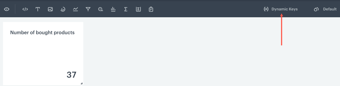

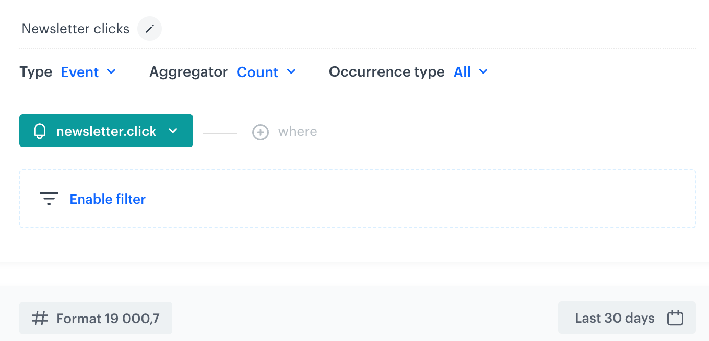
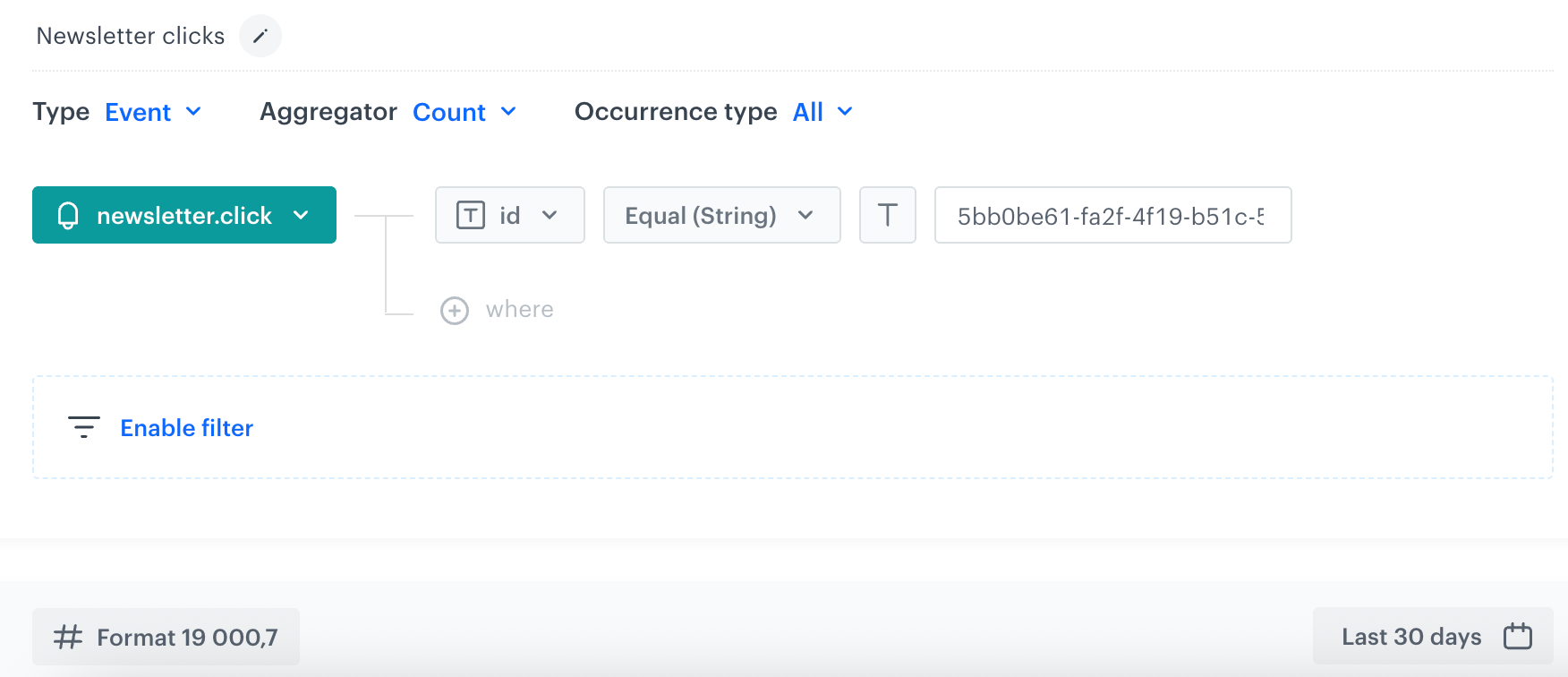

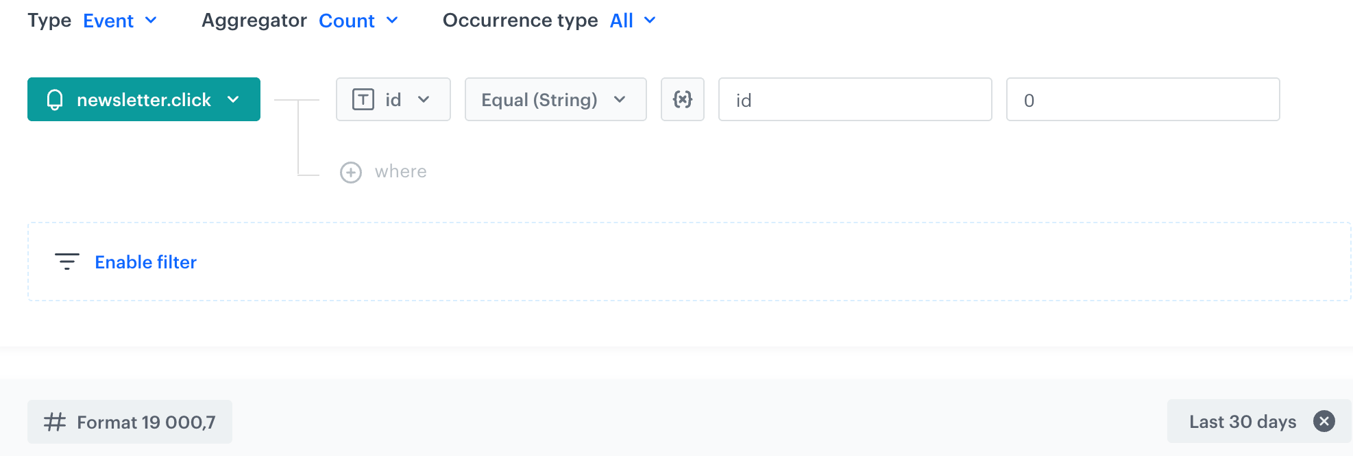
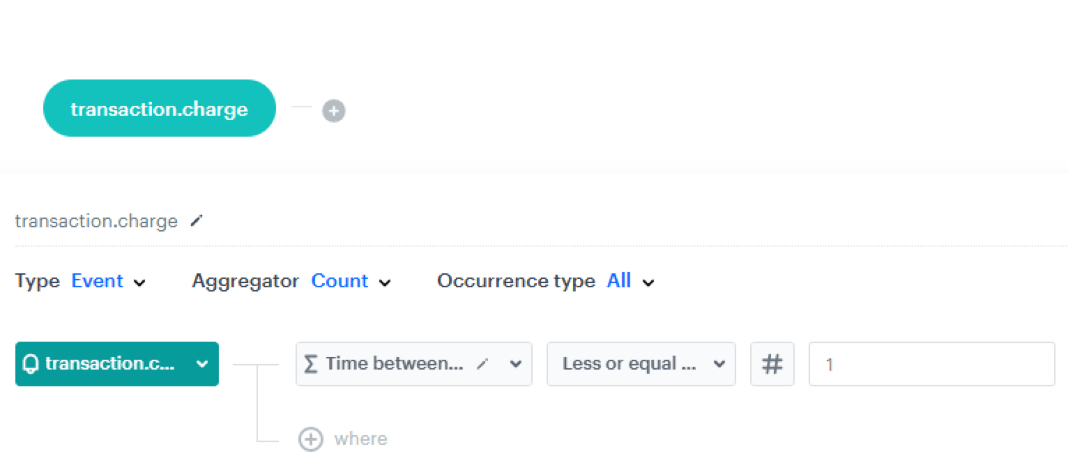
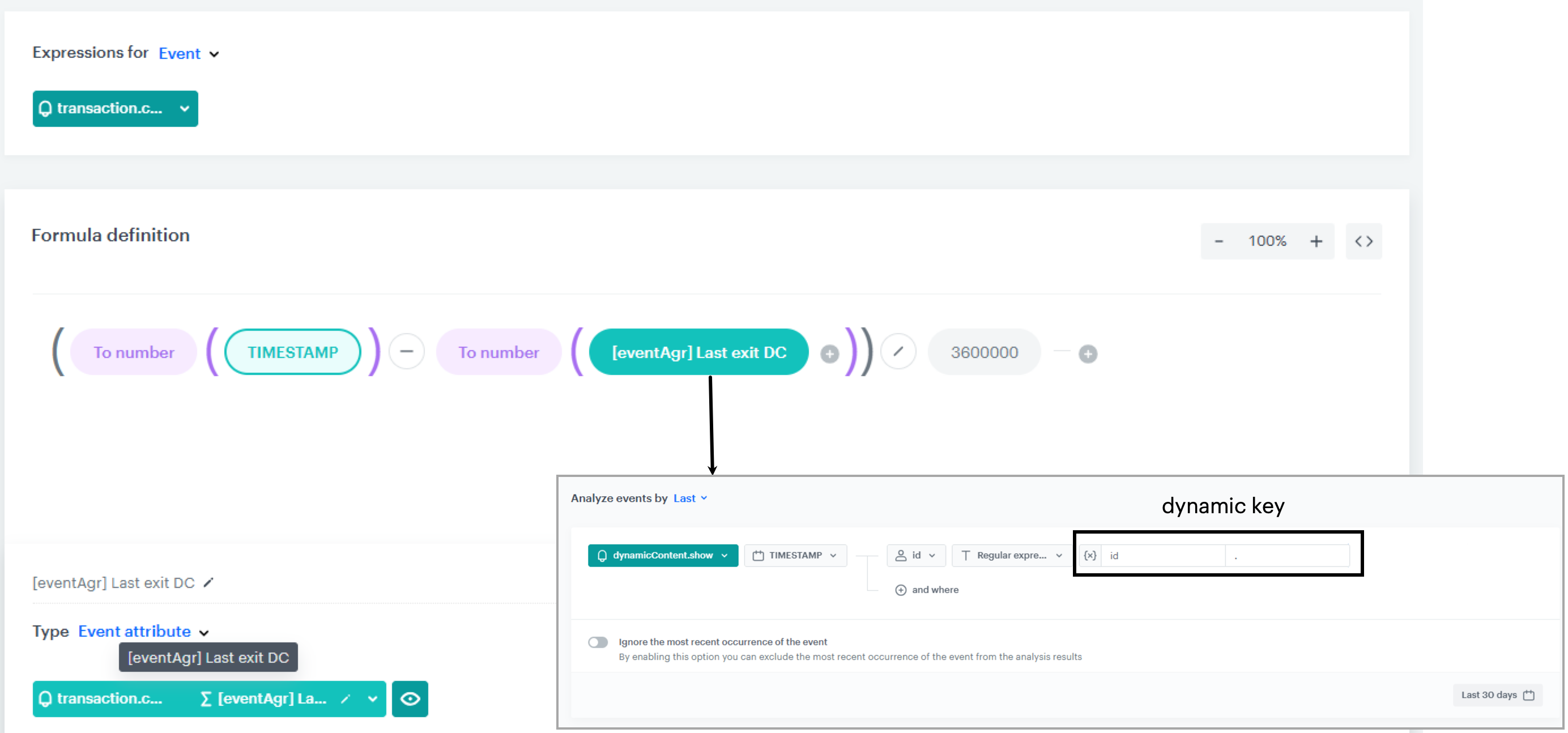
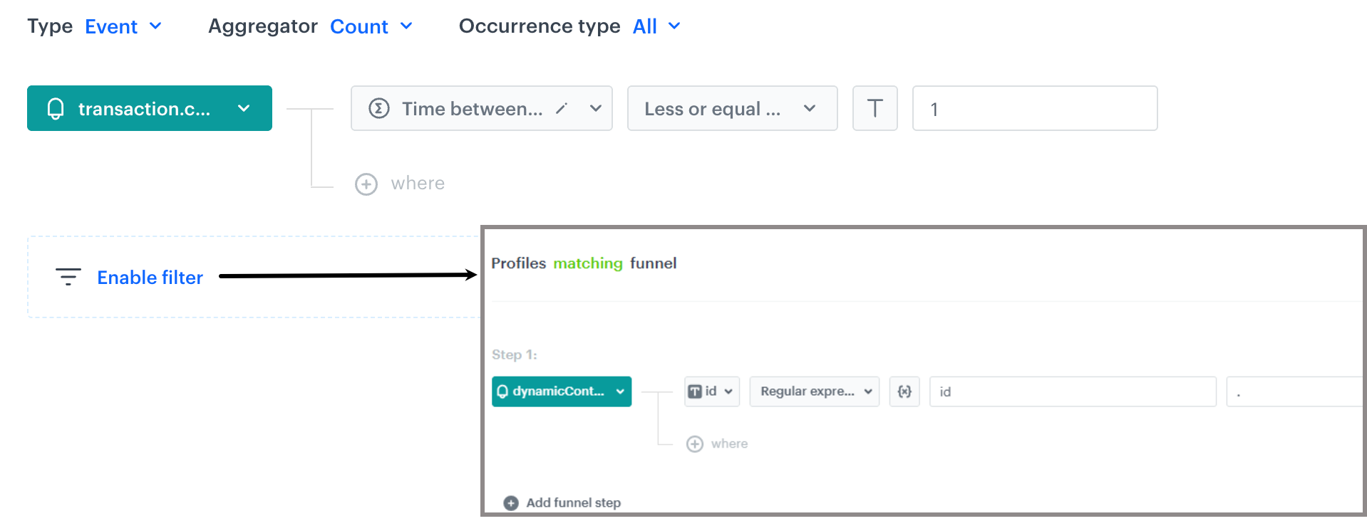
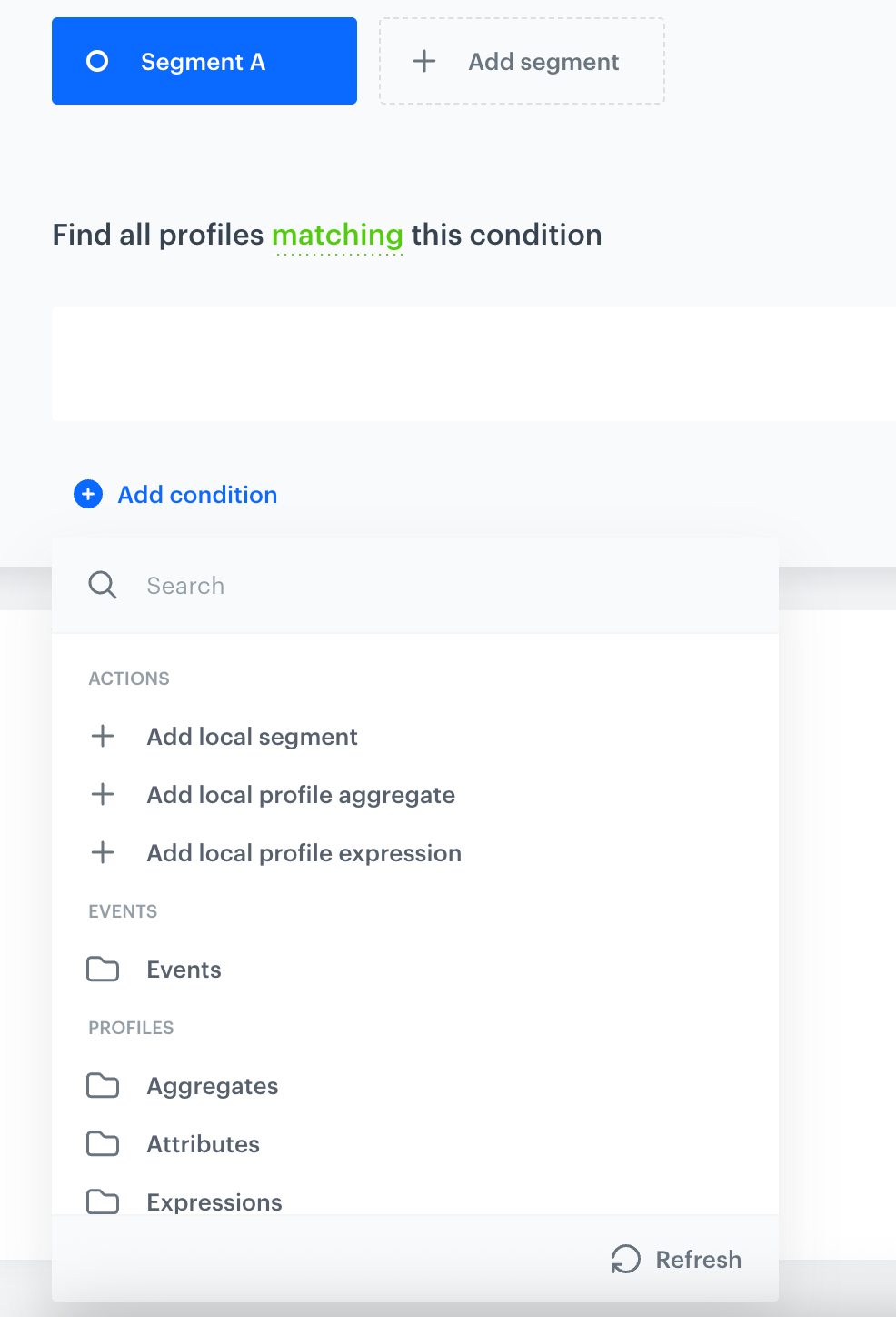
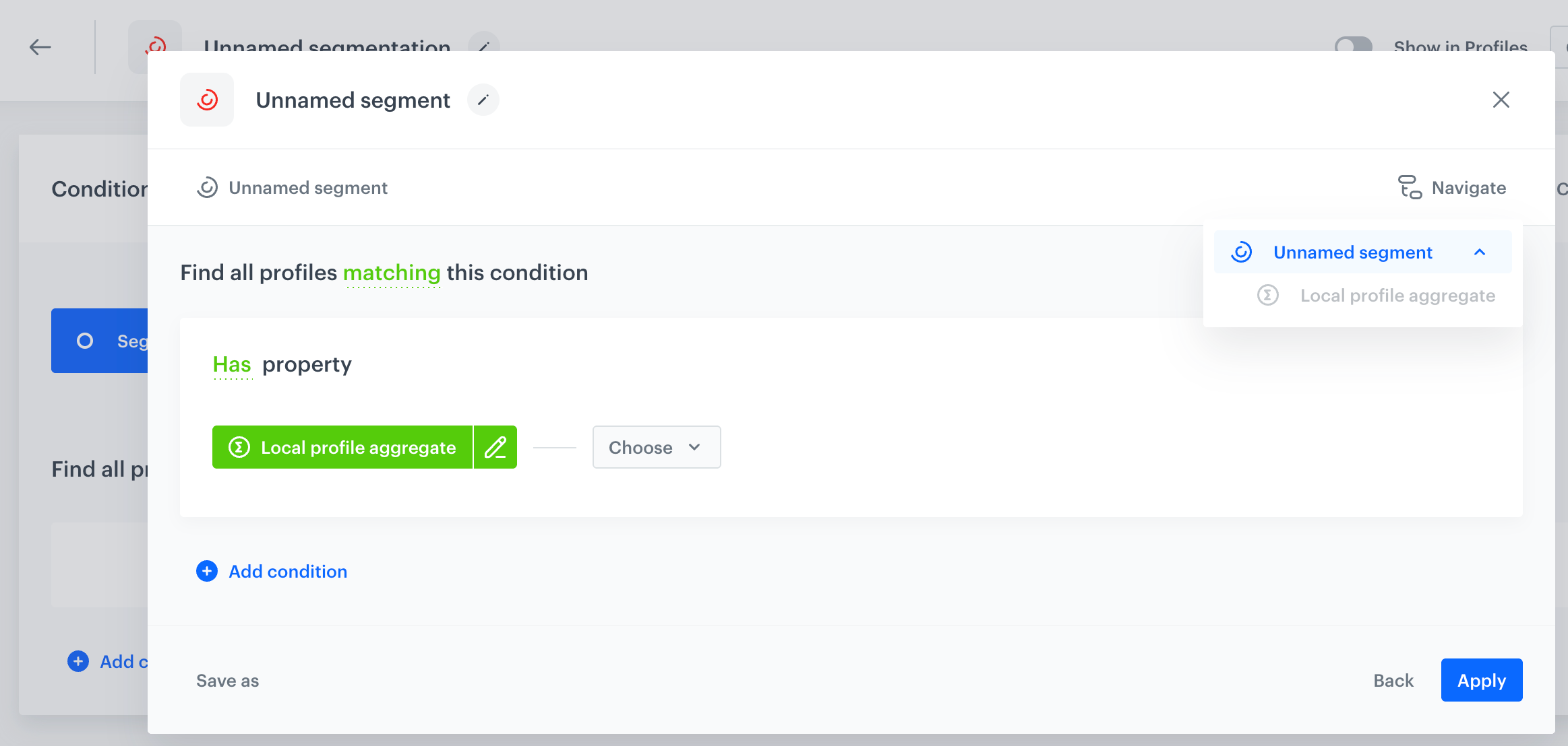
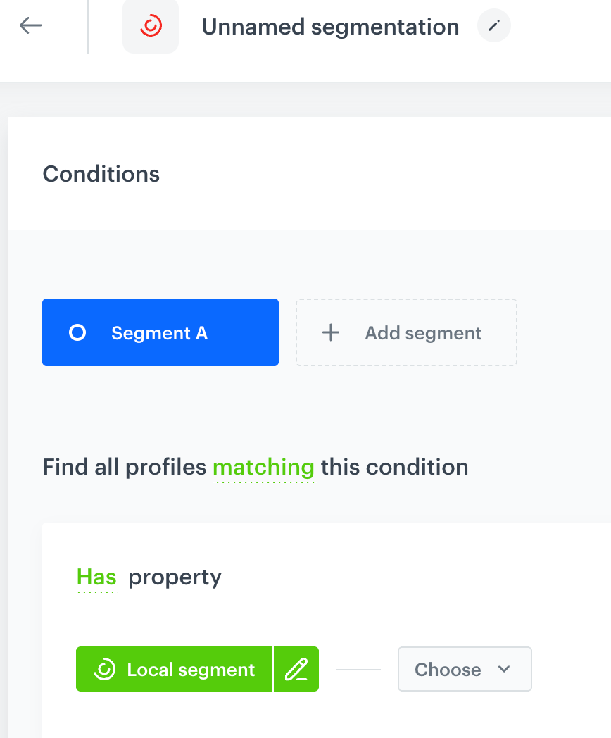
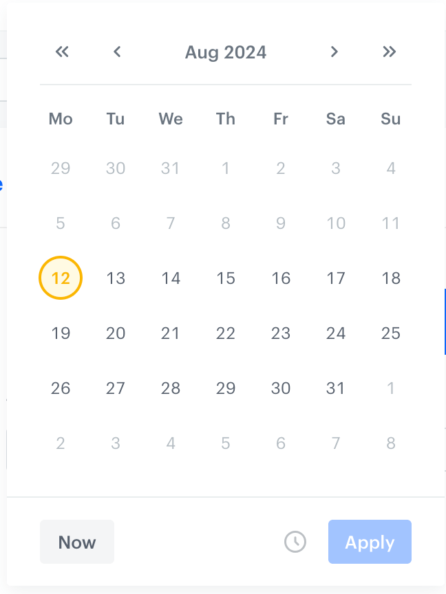
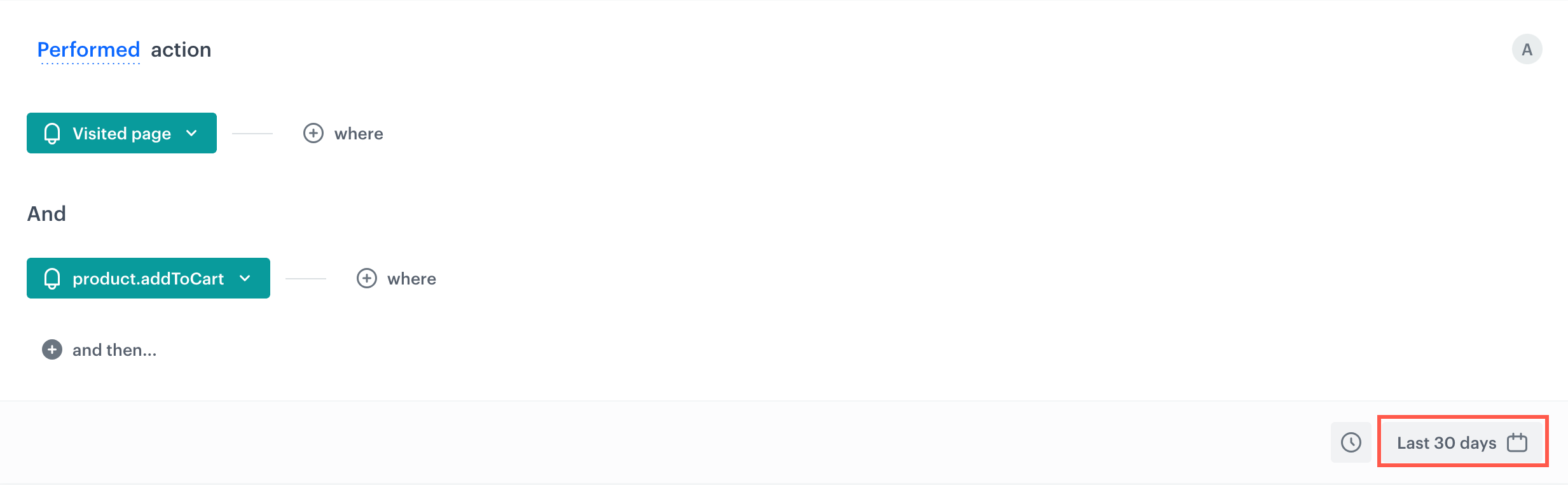
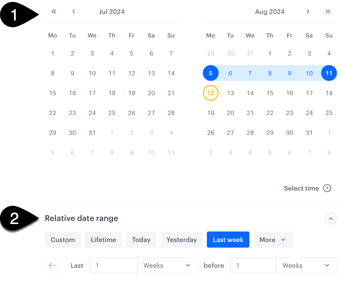
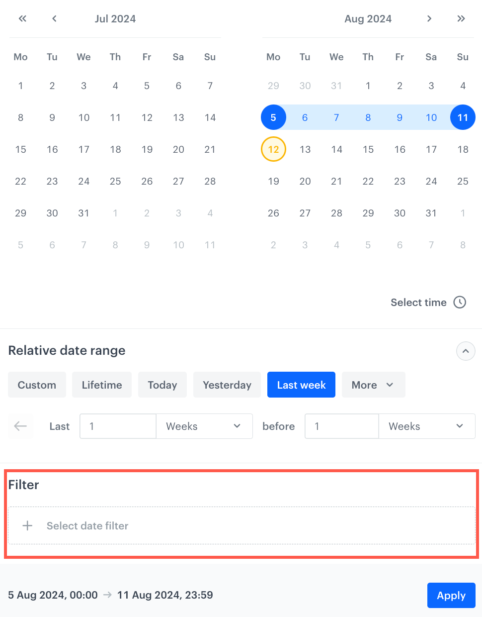
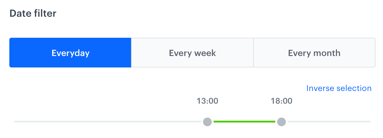
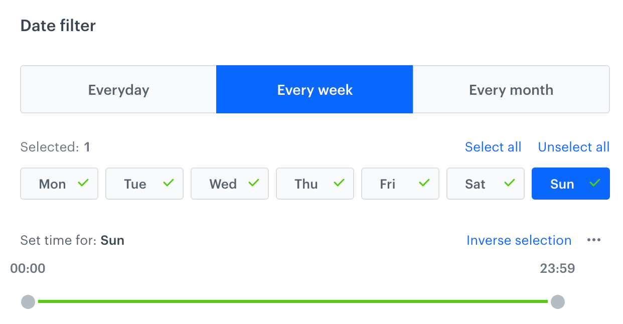
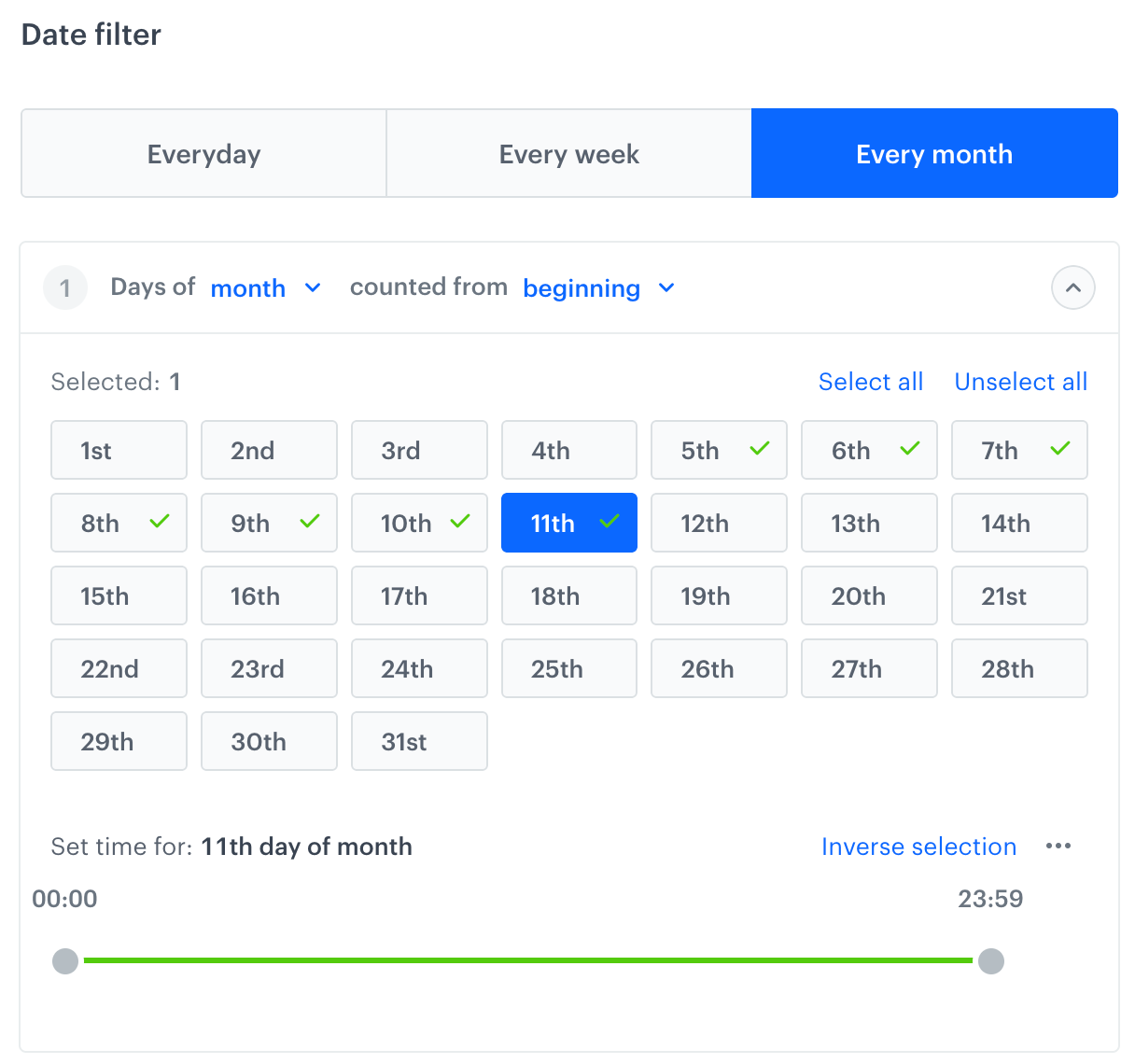
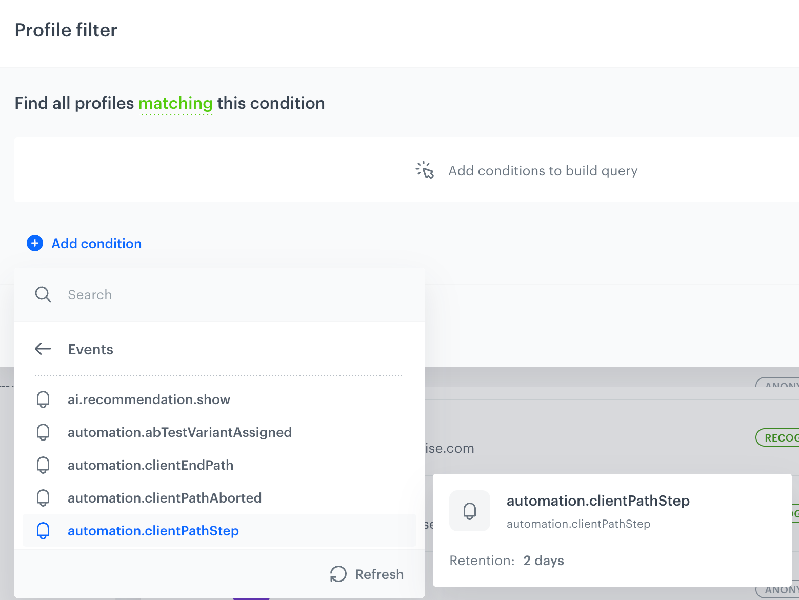
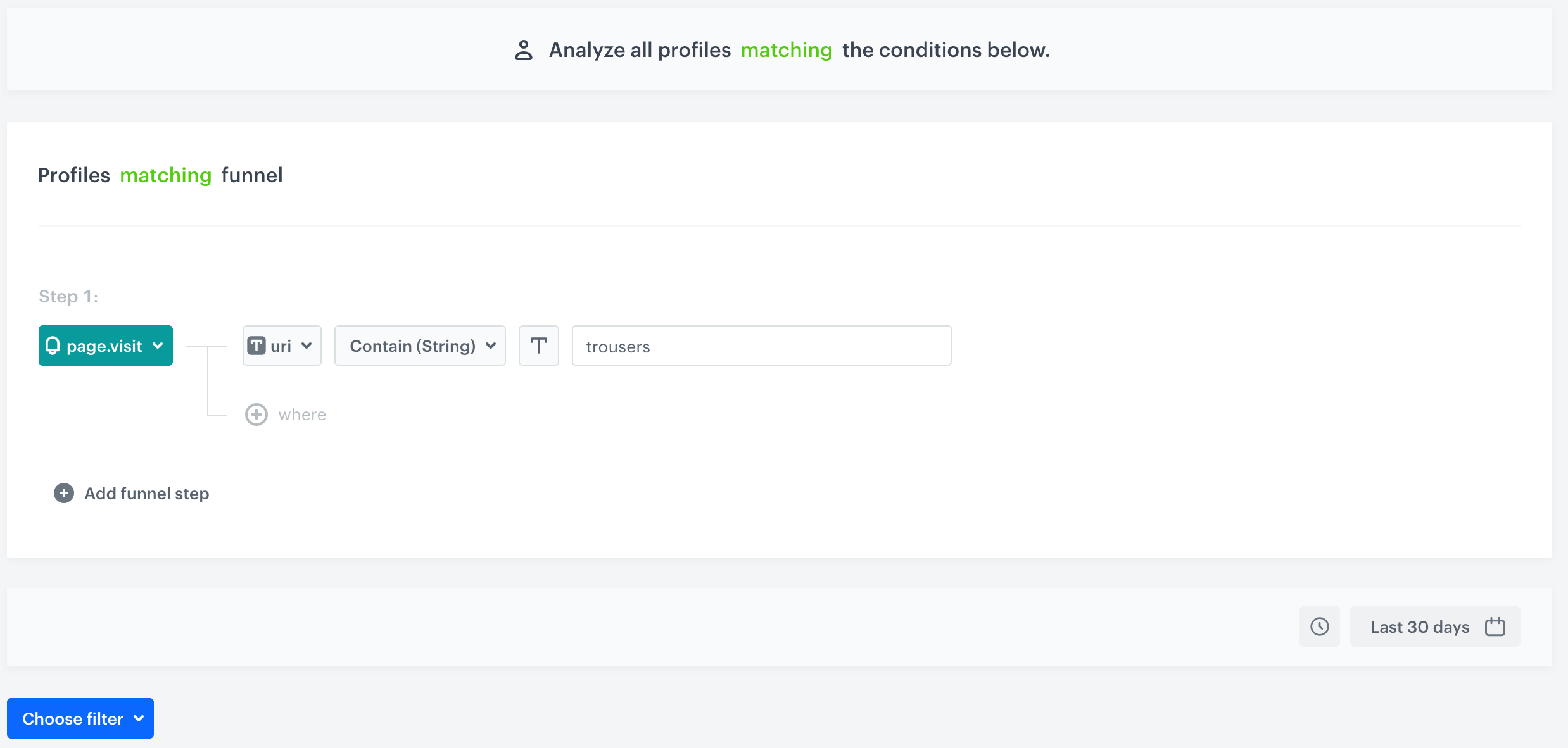
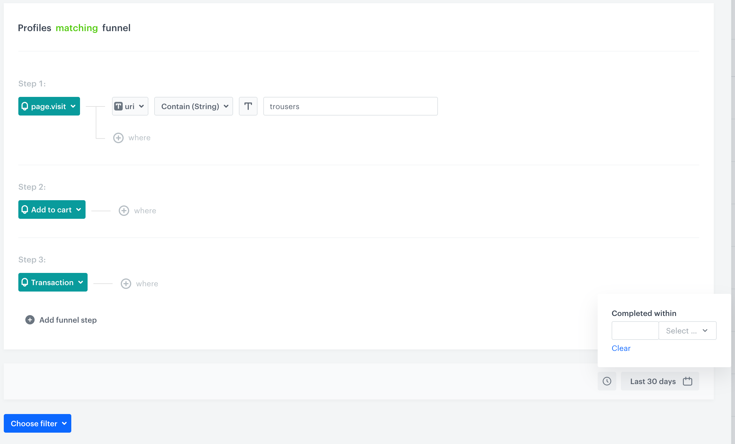
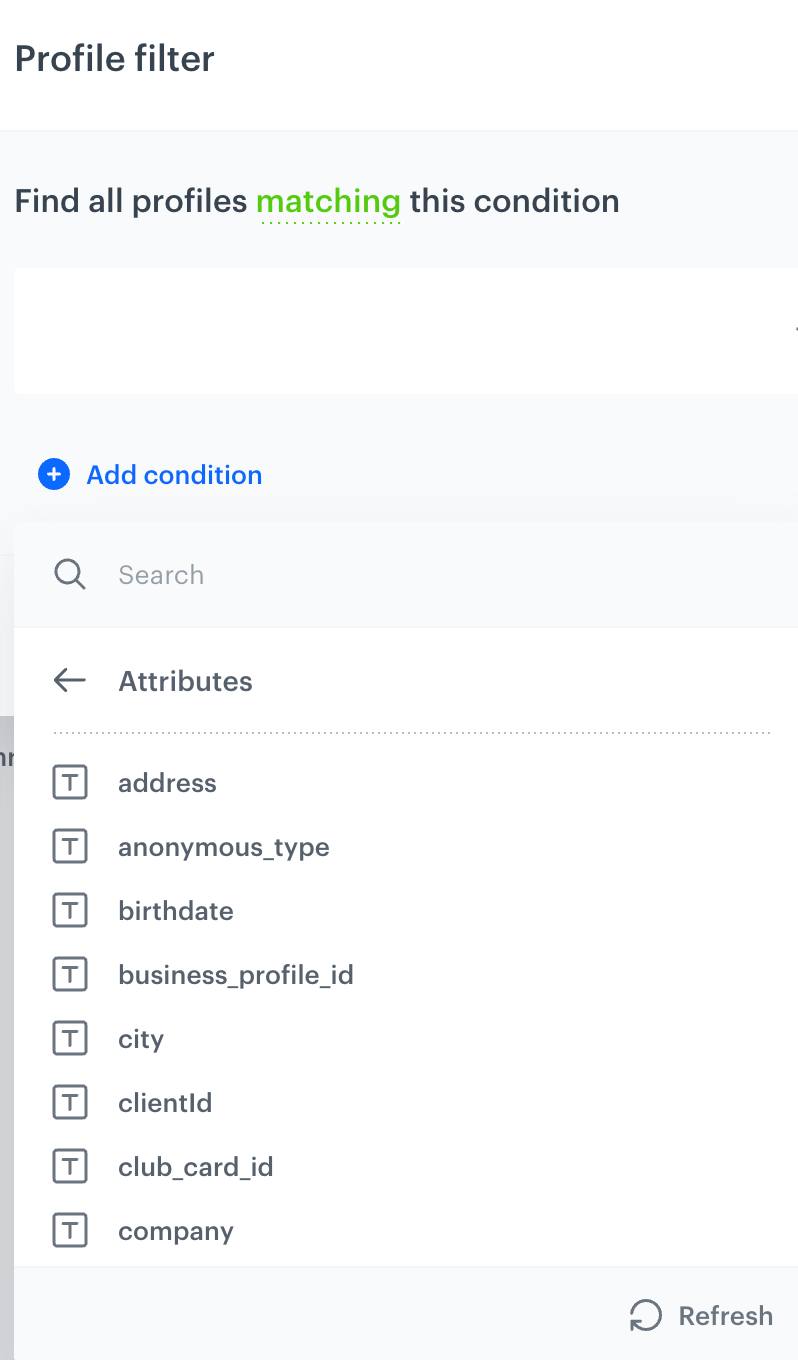
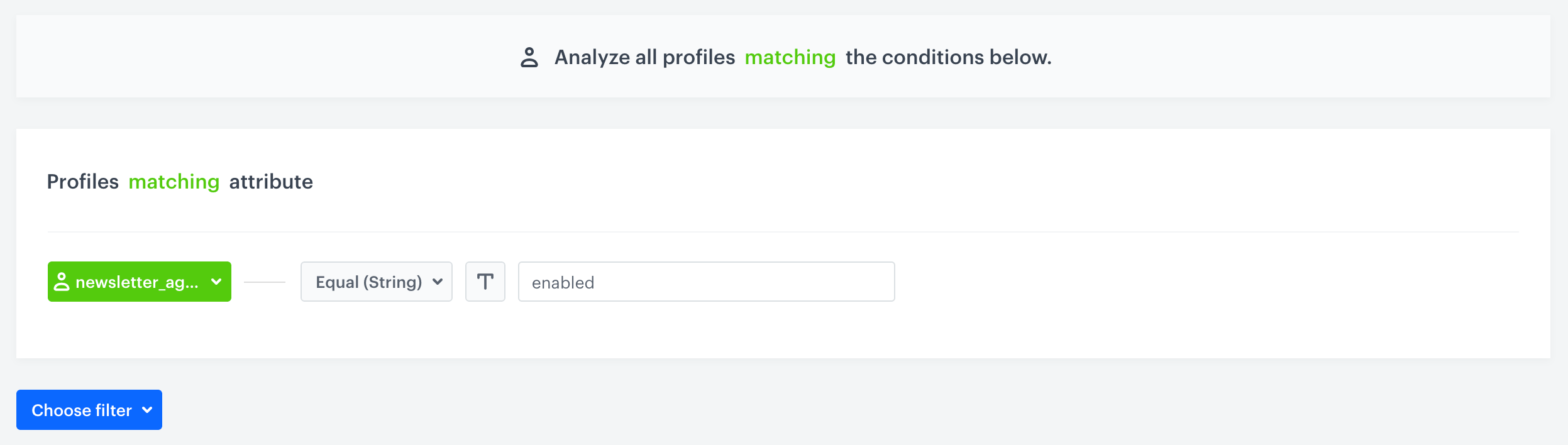
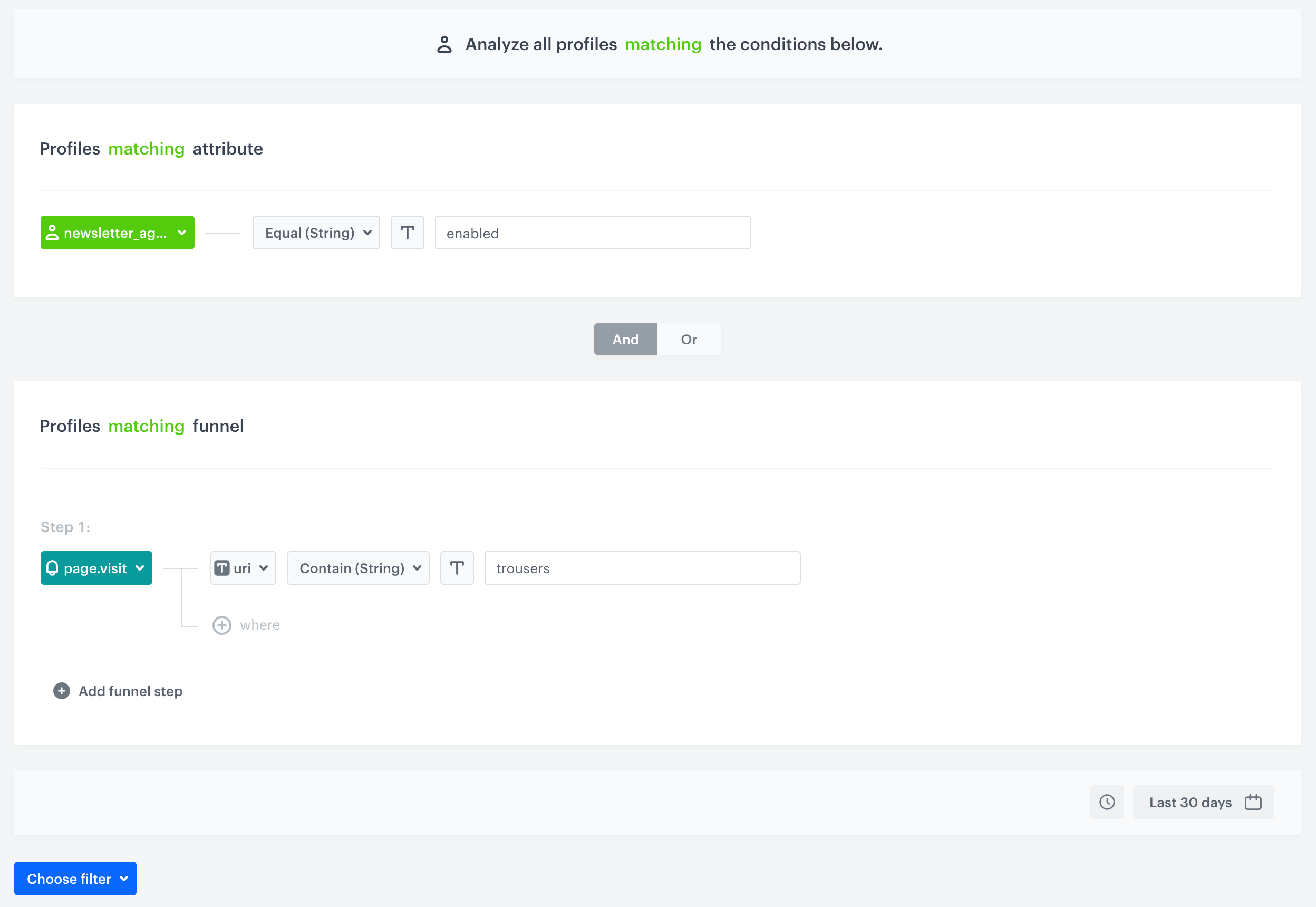
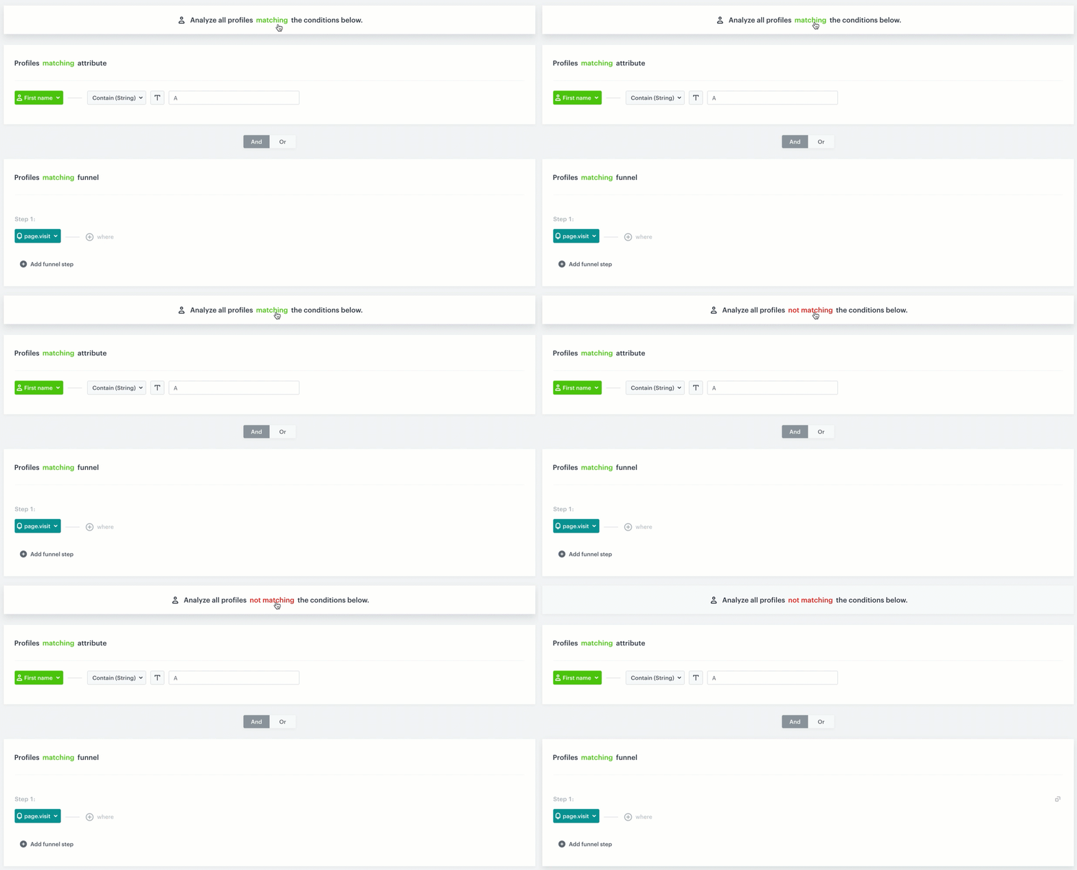
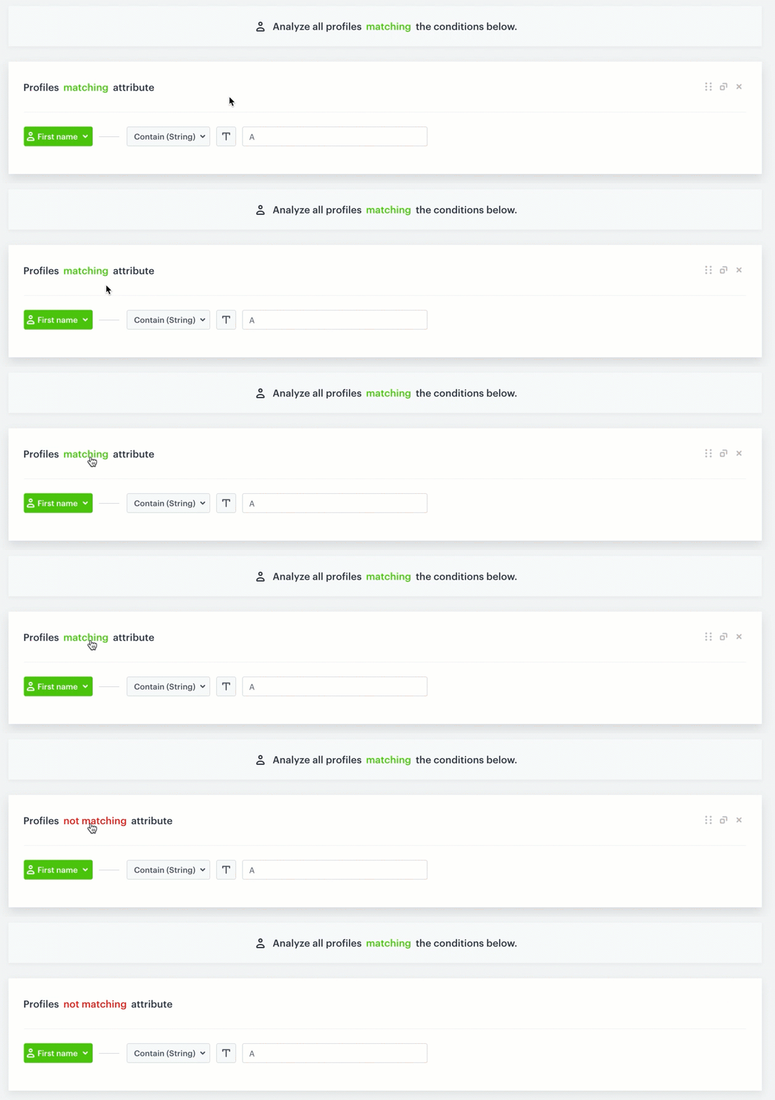
 icon), **number** (
 icon), **boolean** (
 icon), **null** (
 icon) **array** (
 icon), and **date** (
 icon).
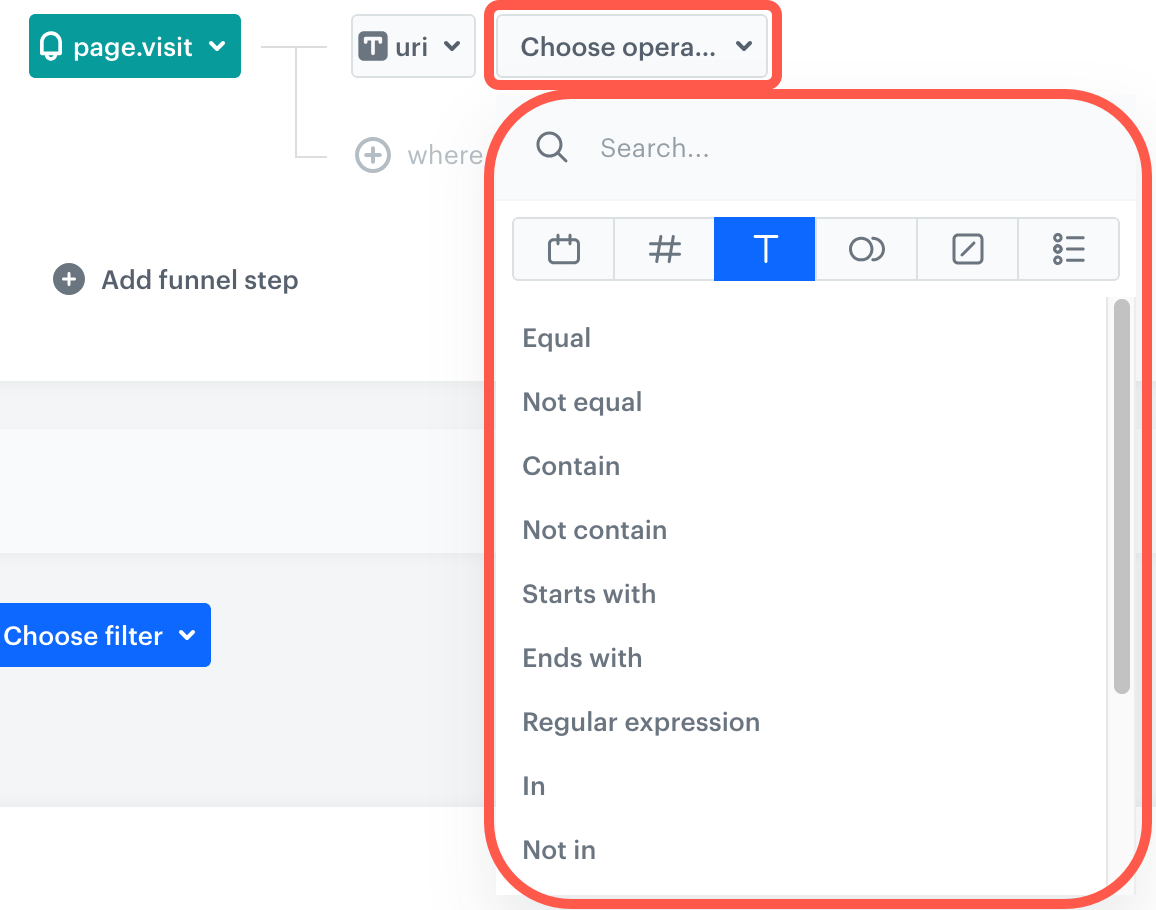 : the operator returns "true" (match) for the value
- : the operator returns "false" (doesn't match) for the value
| Example value | Is true | Is false | Is empty | Is not empty | Is null | Is not null |
| :----------------------------: | :---------------------------------------------------------: | :---------------------------------------------------------: | :---------------------------------------------------------: | :---------------------------------------------------------: | :---------------------------------------------------------: | :---------------------------------------------------------: |
| `""` | | | | | | |
| `" "`, `"foo"`, `"null"` | | | | | | |
| `1`; `"1"`; `true`; `"true"` | | | | | | |
| `0`; `"0"`; `false`, `"false"` | | | | | | |
| `-1`; `"-1"` | | | | | | |
| `null` | | | | | | |
| Empty array (`[]`) | | | | | | |
| Non-empty array (at least one item) | | | | | | |
#### Where can I find operators?
Operators can be found across the whole [Decision Hub](/docs/analytics) in which you create analyses based on events, their parameters and profile attributes. Additionally, you can find operators in various filters across the application, for example on the list of profiles, while defining audiences for messages and workflows, where the operators are used in [Profile filters](/docs/analytics/i_profile-filter).
You can also find operators while defining filters within item feed, such as defining the [filters for items to be displayed in AI recommendations](/docs/ai-hub/recommendations-v2/recommendation-filters).
{#array}
---
An array is an ordered collection of elements of the same or different type.
- If you want to operate on a value that is already an array of strings, no additional action is required to analyze the value.
- If the array contains different data types (numbers, objects, arrays) it must be [converted into a string](#converting-arrays-into-strings) and analyzed as a string.
#### Converting arrays into strings
: the operator returns "true" (match) for the value
- : the operator returns "false" (doesn't match) for the value
| Example value | Is true | Is false | Is empty | Is not empty | Is null | Is not null |
| :----------------------------: | :---------------------------------------------------------: | :---------------------------------------------------------: | :---------------------------------------------------------: | :---------------------------------------------------------: | :---------------------------------------------------------: | :---------------------------------------------------------: |
| `""` | | | | | | |
| `" "`, `"foo"`, `"null"` | | | | | | |
| `1`; `"1"`; `true`; `"true"` | | | | | | |
| `0`; `"0"`; `false`, `"false"` | | | | | | |
| `-1`; `"-1"` | | | | | | |
| `null` | | | | | | |
| Empty array (`[]`) | | | | | | |
| Non-empty array (at least one item) | | | | | | |
#### Where can I find operators?
Operators can be found across the whole [Decision Hub](/docs/analytics) in which you create analyses based on events, their parameters and profile attributes. Additionally, you can find operators in various filters across the application, for example on the list of profiles, while defining audiences for messages and workflows, where the operators are used in [Profile filters](/docs/analytics/i_profile-filter).
You can also find operators while defining filters within item feed, such as defining the [filters for items to be displayed in AI recommendations](/docs/ai-hub/recommendations-v2/recommendation-filters).
{#array}
---
An array is an ordered collection of elements of the same or different type.
- If you want to operate on a value that is already an array of strings, no additional action is required to analyze the value.
- If the array contains different data types (numbers, objects, arrays) it must be [converted into a string](#converting-arrays-into-strings) and analyzed as a string.
#### Converting arrays into strings
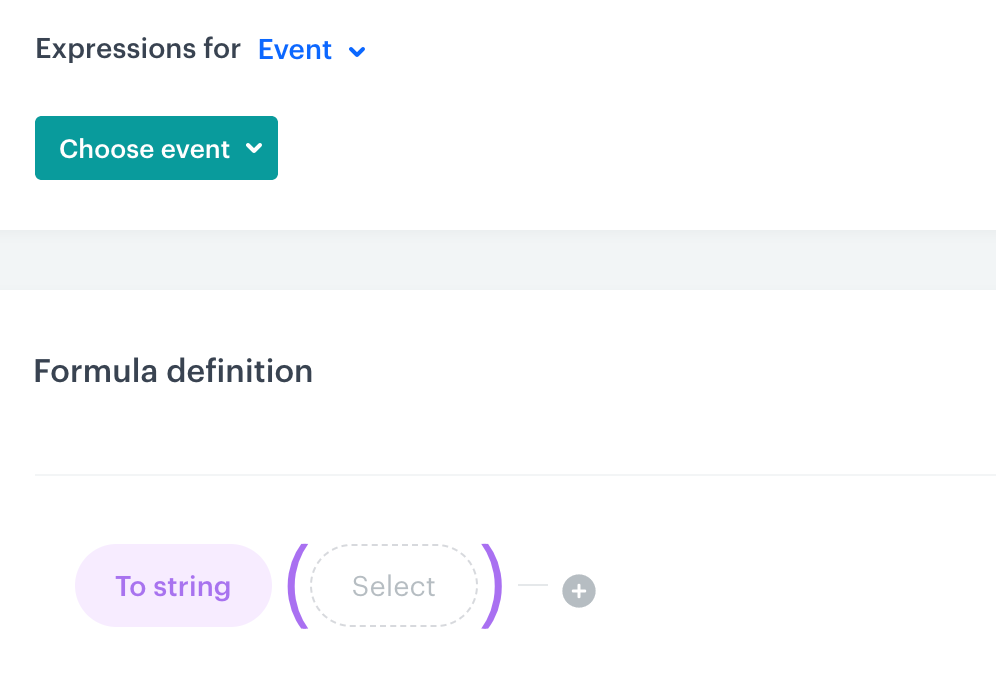 {#boolean}
---
This operator type is used in analyses/filters to verify whether an attribute/event parameter/event exists, the value of an attribute is `false` or `true` (string or boolean) or `null`.
This operator type contains the following logical operators:
1. **Is true** - Choose this operator to analyze event parameters and/or attributes whose value is `true` (string) or true boolean (attribute or parameter value sent to Synerise as a boolean value).
2. **Is false** - Choose this operator to analyze event parameters and/or attributes whose value is `false` (string), false boolean (attribute or parameter value sent to Synerise as a boolean value), `null`, empty.
### Null {#null}
---
{#date}
---
This operator can be used only for event parameters and profile attributes whose value is a date/time string formatted according to ISO 8601.
While defining the condition for this operator type, you can select a date from a calendar. All the operators are meant to narrow the scope of dates considered in the general date filter of the analysis/filter.
{#boolean}
---
This operator type is used in analyses/filters to verify whether an attribute/event parameter/event exists, the value of an attribute is `false` or `true` (string or boolean) or `null`.
This operator type contains the following logical operators:
1. **Is true** - Choose this operator to analyze event parameters and/or attributes whose value is `true` (string) or true boolean (attribute or parameter value sent to Synerise as a boolean value).
2. **Is false** - Choose this operator to analyze event parameters and/or attributes whose value is `false` (string), false boolean (attribute or parameter value sent to Synerise as a boolean value), `null`, empty.
### Null {#null}
---
{#date}
---
This operator can be used only for event parameters and profile attributes whose value is a date/time string formatted according to ISO 8601.
While defining the condition for this operator type, you can select a date from a calendar. All the operators are meant to narrow the scope of dates considered in the general date filter of the analysis/filter.
The screen below presents a segmentation that groups profiles in terms of their date of birth. The conditions of the segmentation uses the Custom logical operator to define the date range for the birth date attribute.
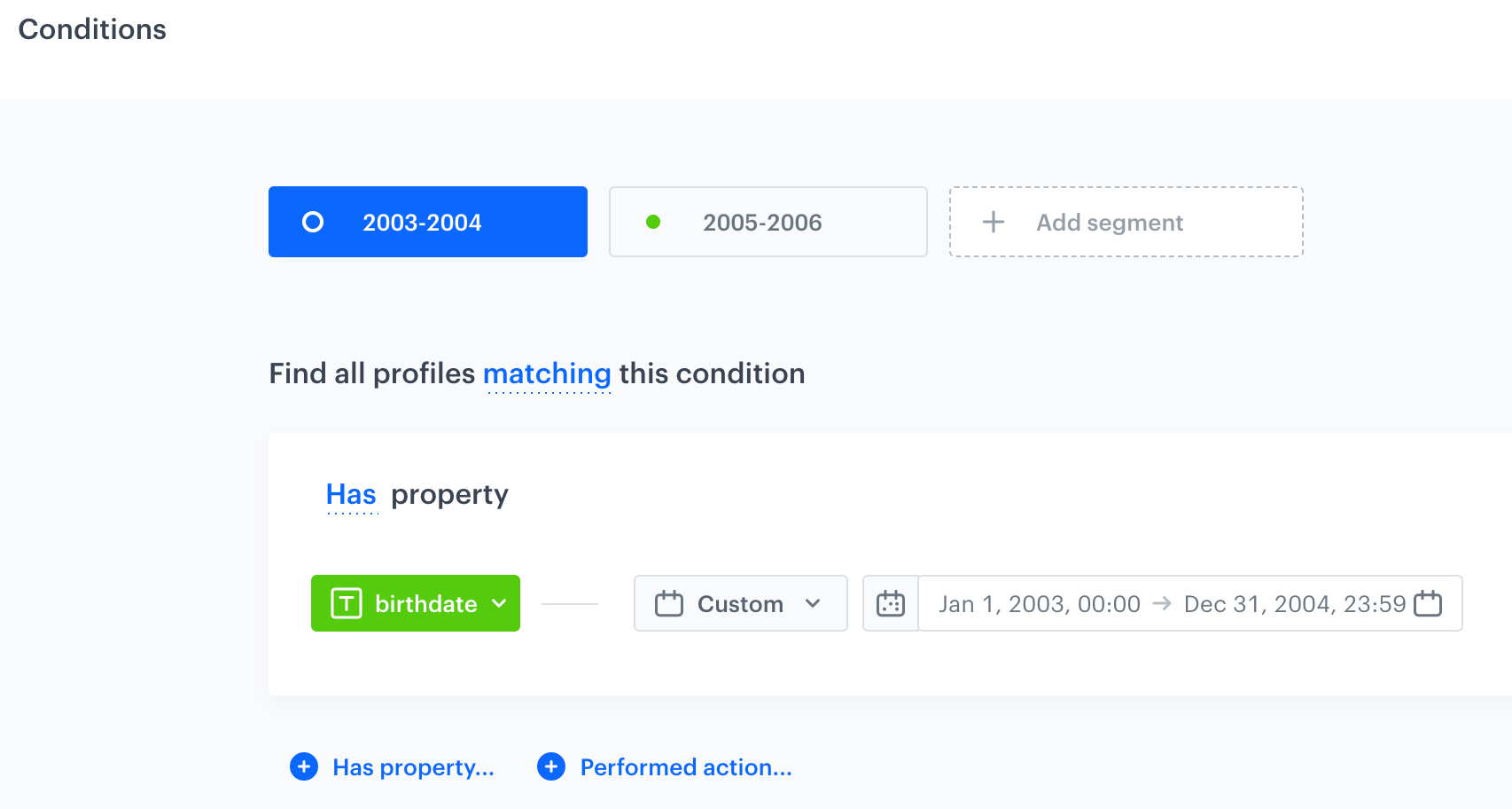 {#number}
---
This operator can be used only for event parameters or attributes whose values are expressed as numbers (including those sent as a string). For example, you can create a following condition: `size more than 8` (analyze the `size` attribute whose value is higher than 8, which is 9, 10, and higher).
This type contains the following logical operators:
1. **Equal** and **Not equal** - Choose these options to check if the attribute is or isn't exactly the same as the value you enter.
2. **Less than** and **More than** - Choose these options to analyze an event parameter or attribute whose value is lower or higher than the provided value (for example, for the following condition - the `size` attribute is `More than 8`, the results will contain entities whose `size` attribute is 8,01 or higher).
3. **Less or equal to** - Choose this option if you want to analyze an event parameter or attribute whose value is lower than or equal to the provided value.
4. **More or equal to** - Choose this option if you want to consider the elements which are equal or bigger than the number you provide.
### Object
---
If you want to analyze an object (a collection of key/value data) in the event parameters, that object must be [converted into a string](#converting-arrays-into-strings) and analyzed as a [string](#string).
### String {#string}
---
This operator can be used with event parameters and attributes whose values is a piece of text. For example,`favoriteBrand equals XYZ`. This type contains the following logical operators:
1. **Equal** and **Not equal** - Choose these options to check if the parameter/attribute value is or isn't the same as the value you enter.
2. **Contain** and **Not contain** - Choose these options to either include or exclude values that contain a specific phrase, respectively.
3. **Starts with** and **Ends with** - Choose these options if you want to include values that start or end with a particular string of characters.
4. **Regular expression** - Choose this option when you want to check if the value of an event parameter or attribute matches a regular expression.
{#number}
---
This operator can be used only for event parameters or attributes whose values are expressed as numbers (including those sent as a string). For example, you can create a following condition: `size more than 8` (analyze the `size` attribute whose value is higher than 8, which is 9, 10, and higher).
This type contains the following logical operators:
1. **Equal** and **Not equal** - Choose these options to check if the attribute is or isn't exactly the same as the value you enter.
2. **Less than** and **More than** - Choose these options to analyze an event parameter or attribute whose value is lower or higher than the provided value (for example, for the following condition - the `size` attribute is `More than 8`, the results will contain entities whose `size` attribute is 8,01 or higher).
3. **Less or equal to** - Choose this option if you want to analyze an event parameter or attribute whose value is lower than or equal to the provided value.
4. **More or equal to** - Choose this option if you want to consider the elements which are equal or bigger than the number you provide.
### Object
---
If you want to analyze an object (a collection of key/value data) in the event parameters, that object must be [converted into a string](#converting-arrays-into-strings) and analyzed as a [string](#string).
### String {#string}
---
This operator can be used with event parameters and attributes whose values is a piece of text. For example,`favoriteBrand equals XYZ`. This type contains the following logical operators:
1. **Equal** and **Not equal** - Choose these options to check if the parameter/attribute value is or isn't the same as the value you enter.
2. **Contain** and **Not contain** - Choose these options to either include or exclude values that contain a specific phrase, respectively.
3. **Starts with** and **Ends with** - Choose these options if you want to include values that start or end with a particular string of characters.
4. **Regular expression** - Choose this option when you want to check if the value of an event parameter or attribute matches a regular expression.



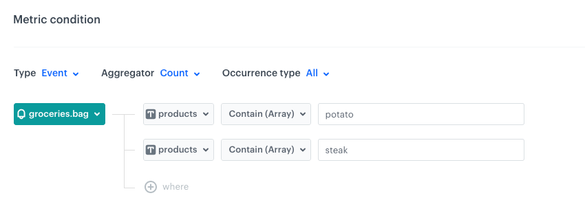
 icon until you get two fields: **Dynamic key** and **Value**.



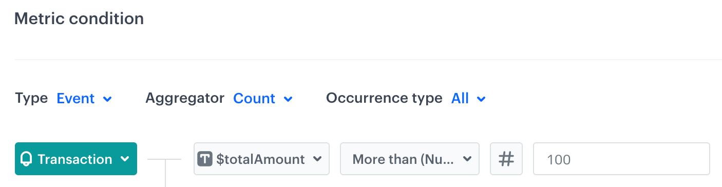


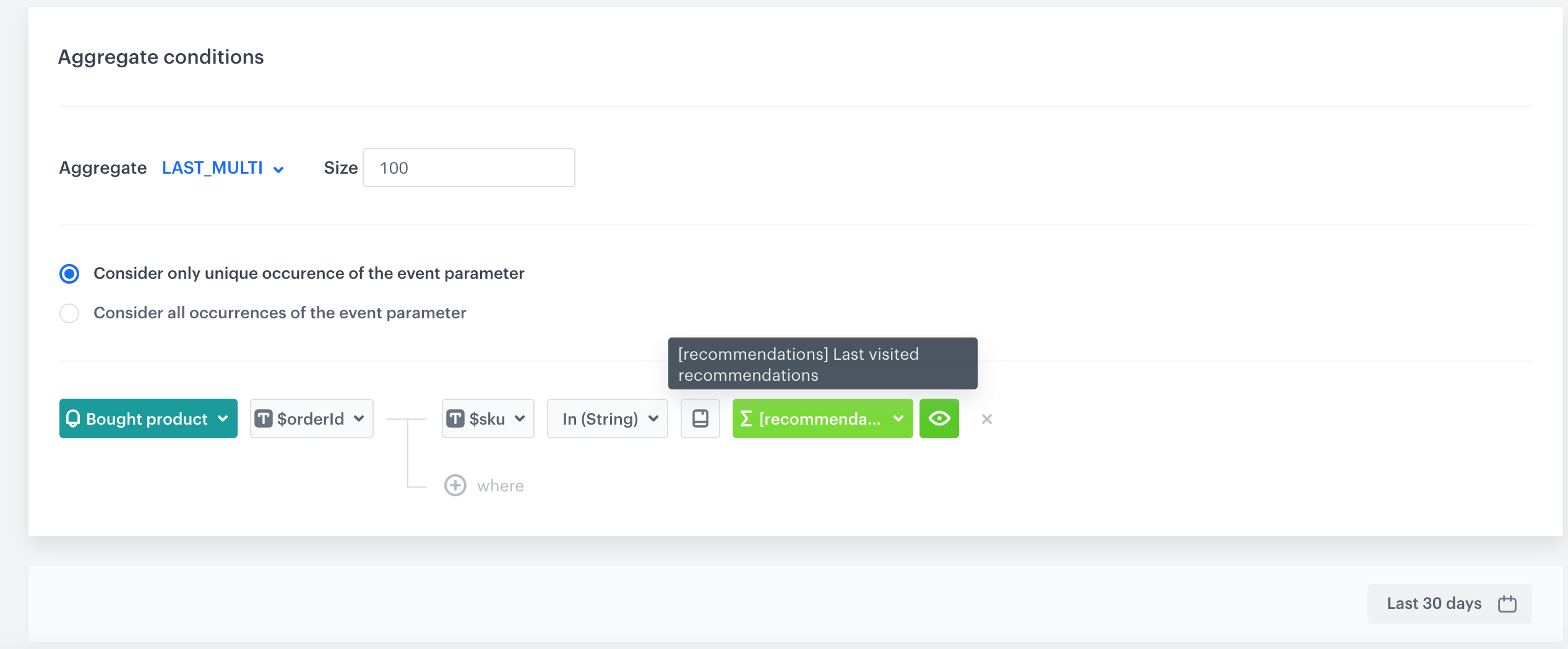
{
    "clientId": 6855607997,
    "email": "default_unique_71fa217a-4c72-4224-89d0-780b7fdfda16@anonymous.invalid",
    ...
    "agreements": {
        ...
    },
    "attributes": {
        "exampleCustomAttribute": "2023-08-03T11:30:00",
    },
    "tags": []
}{
"time": "2023-08-04T14:08:33.990Z",
"action": "docs.read",
"client": {
"id": 6855607997,
"email": "default_unique_71fa217a-4c72-4224-89d0-780b7fdfda16@anonymous.invalid",
"uuid": "eb73d1c7-c9de-491a-a7bf-992a7167311c"
},
"params": {
"exampleCustomParam": "2023-08-03T11:30:00"
}
}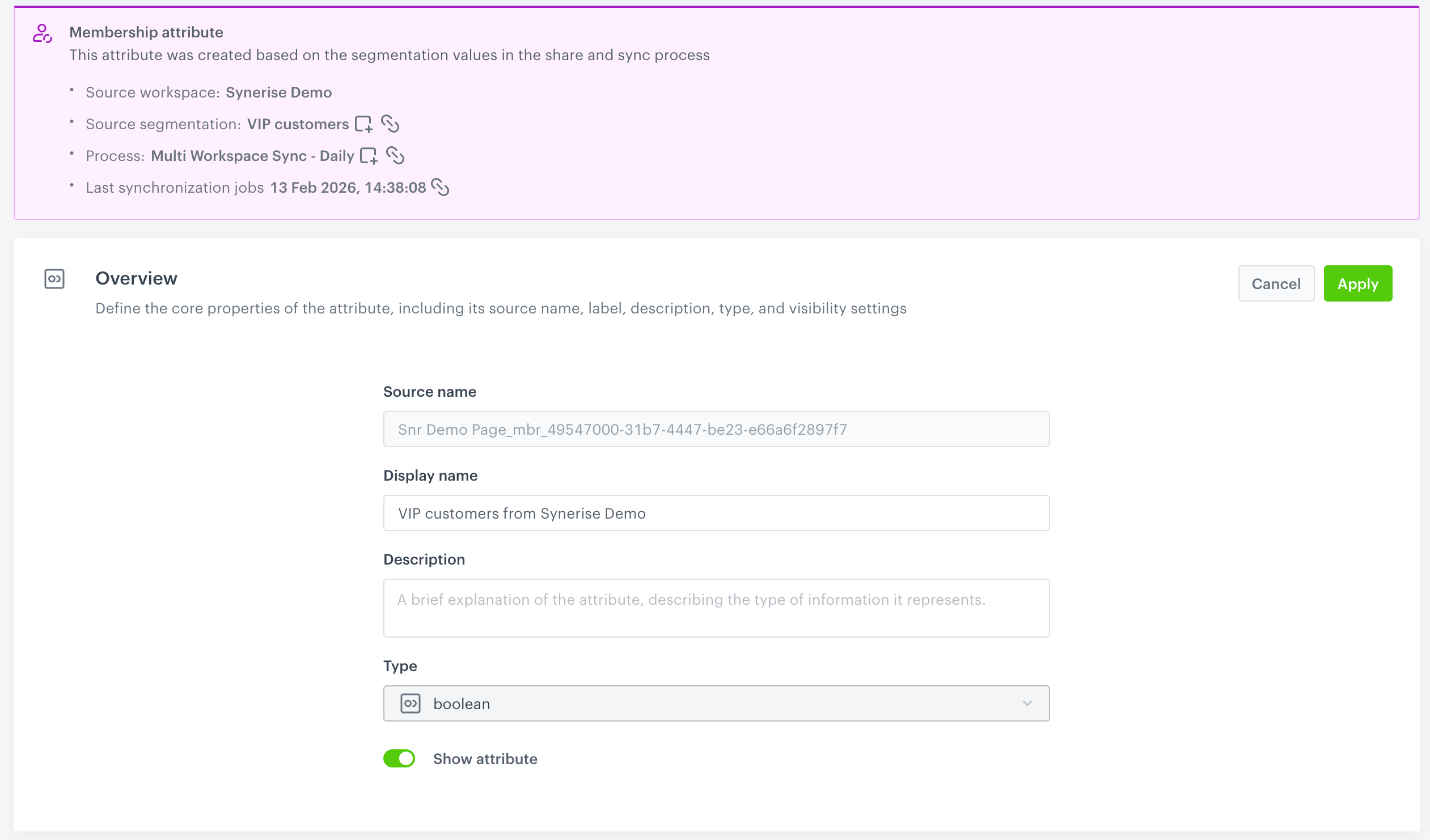 **Behavioral Data Hub > Membership Attributes Sync**.
2. Select the **Processes** tabs.
3. Open the details of a synchronization process.
4. Add or remove segmentations from the process.
5. Confirm changes by clicking **Apply**.
**Result**: The synchronization process with the change is launched immediately. Other jobs will be performed as scheduled through the **Process frequency** option.
### I want to edit synchronization process
- **Frequency and location cannot be edited for existing processes**
To change the frequency or sharing location, you must create a new synchronization process.
- **Segmentations can be added or removed from existing processes**
Changes will take effect:
- immediately for synchronizations scheduled every 6 hours - subsequent runs will be performed according to the schedule.
- on the next scheduled run for daily synchronizations.
- **Stopping synchronizations**
To stop synchronizing, remove segmentations from the process.
### I want to manage membership attributes in a workspace
- [Previewing attribute details](/docs/crm/customer-properties#viewing-attribute-details)
- [Changing display name and attribute description](/docs/crm/customer-properties#changing-display-name-and-description)
- [Changing attribute visibility across filters](/docs/crm/customer-properties#changing-membership-attribute-visibility)
### I want to analyze how profiles joined and left segmentations
The analysis will be based on the `profile.updated` event, which captures changes to membership attributes. Since the state of a membership attribute indicates whether a profile belongs to the segmentation it was created from, analyzing the `profile.updated` event ensures reliable results.
1. Create a formula metric which will deduct the count of `profile.updated` events with the membership attribute value set to true from the count of `profile.updated` events with the membership attribute value set to false.
1. Go to **Decision Hub > Metrics > New metric**.
2. Select **Formula metric**.
3. Select **Event**.
4. Select `profile.updated`.
5. Click **+ where**.
6. From the dropdown list, select the attribute with the name of a membership attribute.
7. Set the condition to `is true`.
**Behavioral Data Hub > Membership Attributes Sync**.
2. Select the **Processes** tabs.
3. Open the details of a synchronization process.
4. Add or remove segmentations from the process.
5. Confirm changes by clicking **Apply**.
**Result**: The synchronization process with the change is launched immediately. Other jobs will be performed as scheduled through the **Process frequency** option.
### I want to edit synchronization process
- **Frequency and location cannot be edited for existing processes**
To change the frequency or sharing location, you must create a new synchronization process.
- **Segmentations can be added or removed from existing processes**
Changes will take effect:
- immediately for synchronizations scheduled every 6 hours - subsequent runs will be performed according to the schedule.
- on the next scheduled run for daily synchronizations.
- **Stopping synchronizations**
To stop synchronizing, remove segmentations from the process.
### I want to manage membership attributes in a workspace
- [Previewing attribute details](/docs/crm/customer-properties#viewing-attribute-details)
- [Changing display name and attribute description](/docs/crm/customer-properties#changing-display-name-and-description)
- [Changing attribute visibility across filters](/docs/crm/customer-properties#changing-membership-attribute-visibility)
### I want to analyze how profiles joined and left segmentations
The analysis will be based on the `profile.updated` event, which captures changes to membership attributes. Since the state of a membership attribute indicates whether a profile belongs to the segmentation it was created from, analyzing the `profile.updated` event ensures reliable results.
1. Create a formula metric which will deduct the count of `profile.updated` events with the membership attribute value set to true from the count of `profile.updated` events with the membership attribute value set to false.
1. Go to **Decision Hub > Metrics > New metric**.
2. Select **Formula metric**.
3. Select **Event**.
4. Select `profile.updated`.
5. Click **+ where**.
6. From the dropdown list, select the attribute with the name of a membership attribute.
7. Set the condition to `is true`.
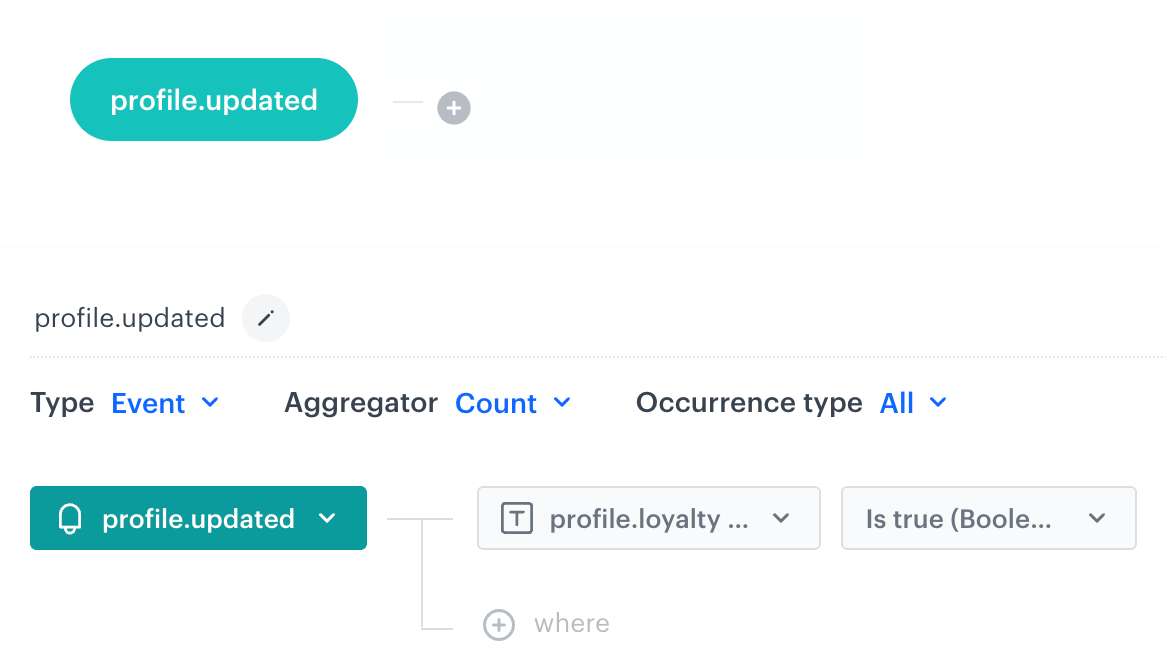
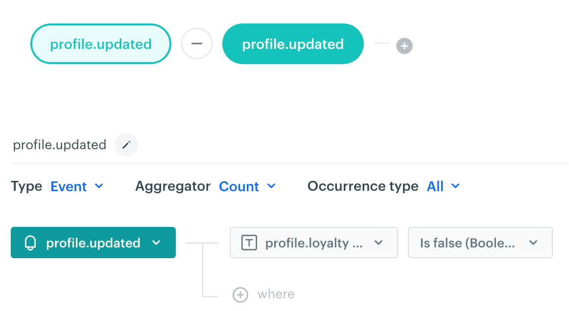 **Decision Hub > Histograms > New histogram**.
2. Select the metric you created in the previous step.
3. Save the histogram.
3. Create a dashboard which displays the histogram results.
1. Go to **Decision Hub > Dashboards > Add dashboard**.
2. Click the icon on the dashboard.
3. Select the histogram you created in the previous step.
4. Click the histogram widget which has been added to the dashboard.
5. On the right panel, select the **Style** tab.
6. Select the following visualization type:
**Decision Hub > Histograms > New histogram**.
2. Select the metric you created in the previous step.
3. Save the histogram.
3. Create a dashboard which displays the histogram results.
1. Go to **Decision Hub > Dashboards > Add dashboard**.
2. Click the icon on the dashboard.
3. Select the histogram you created in the previous step.
4. Click the histogram widget which has been added to the dashboard.
5. On the right panel, select the **Style** tab.
6. Select the following visualization type:
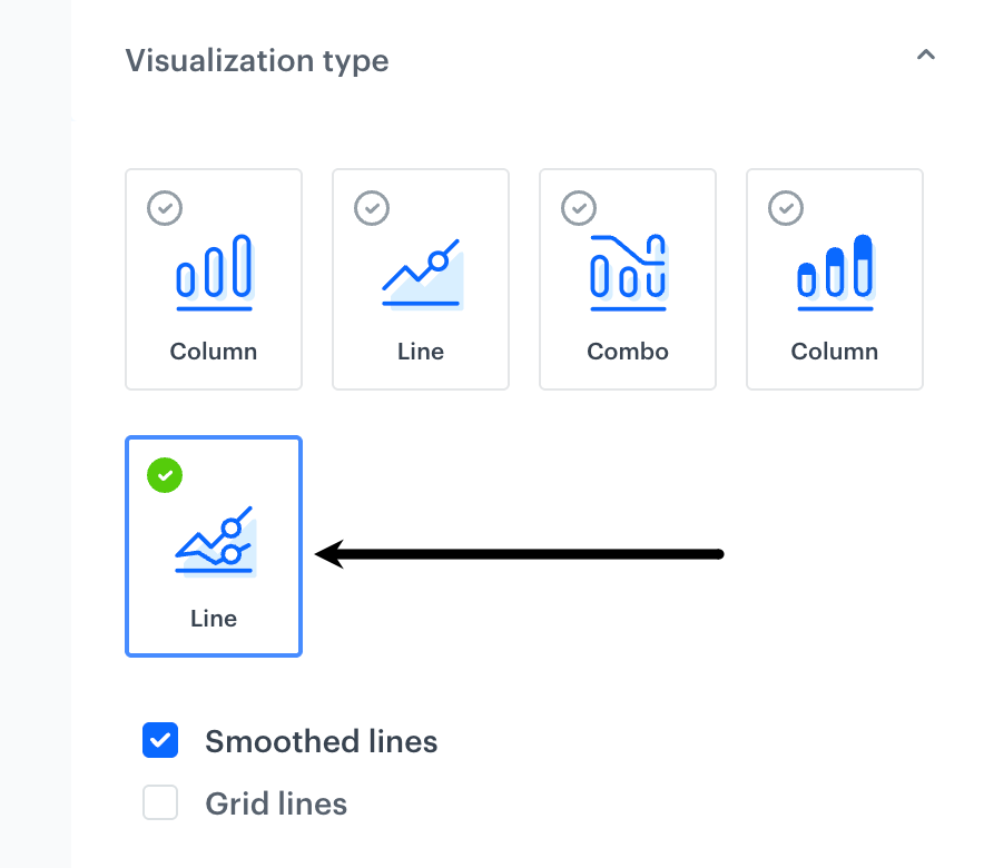
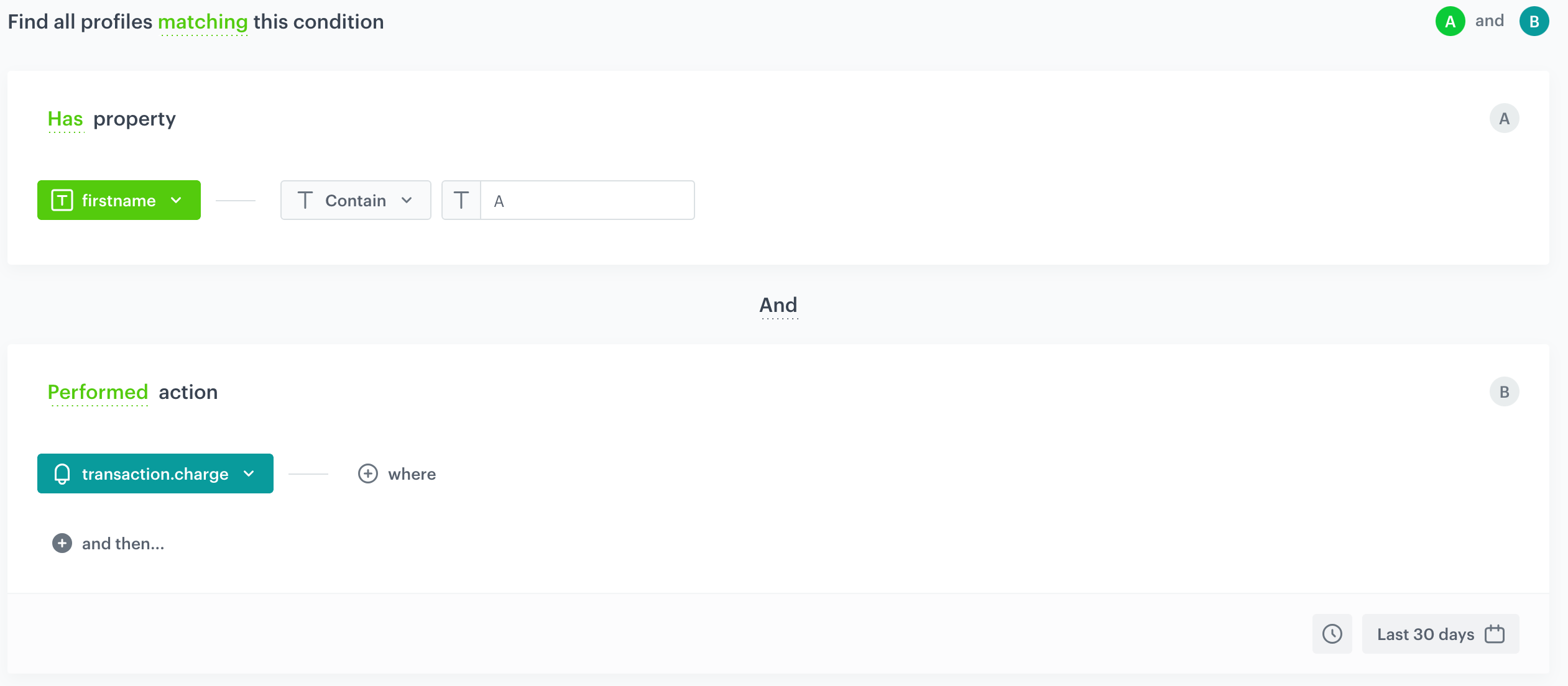
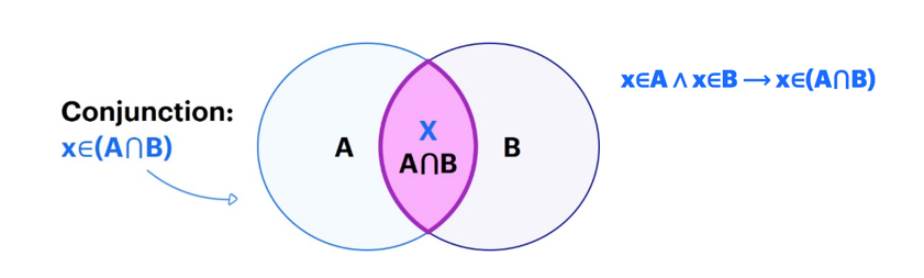
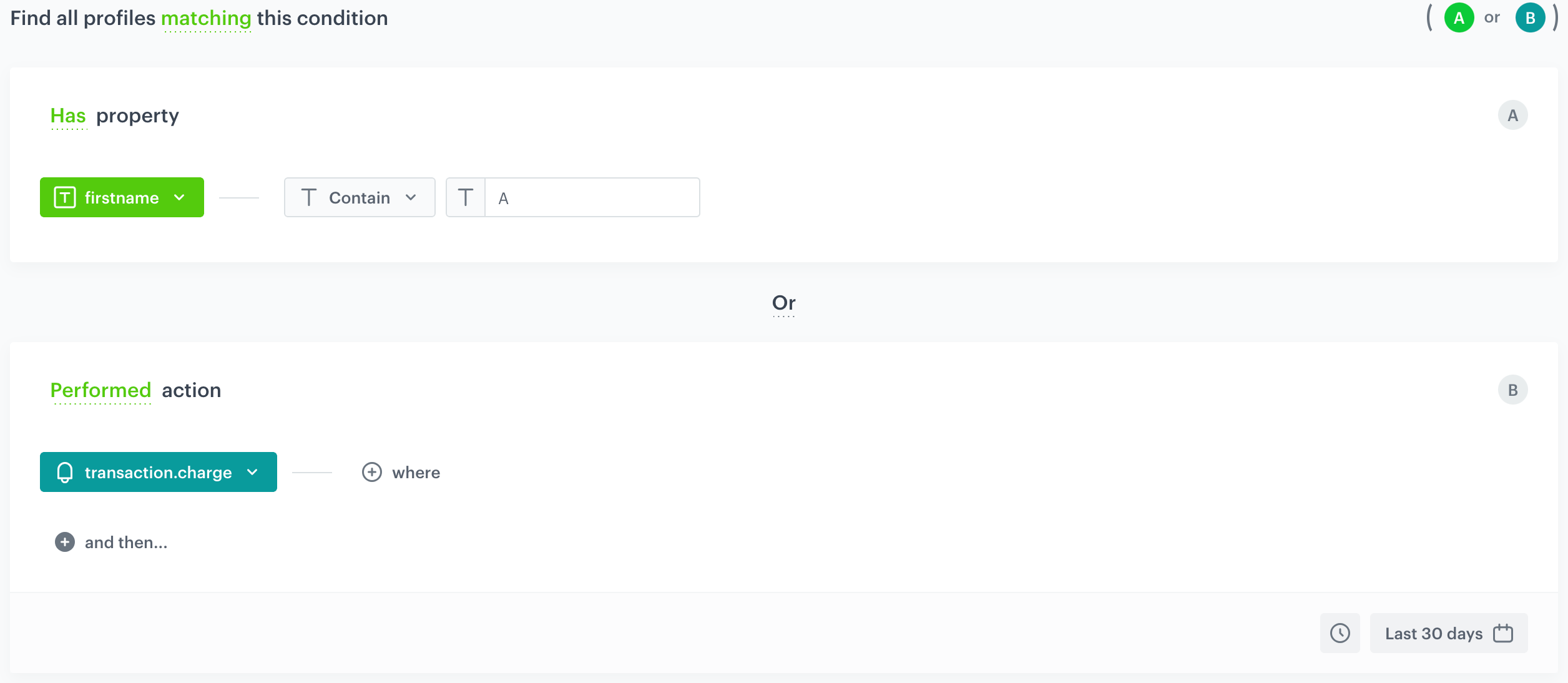
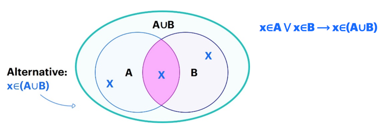
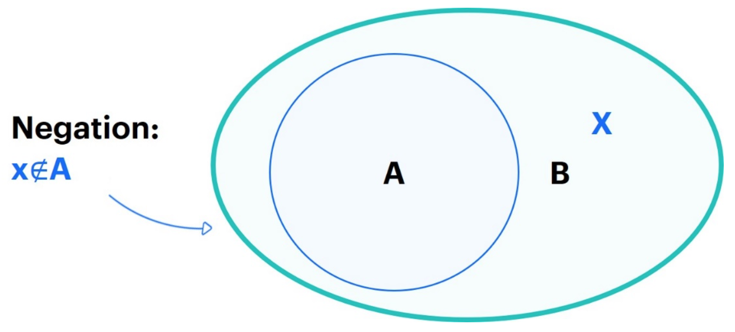
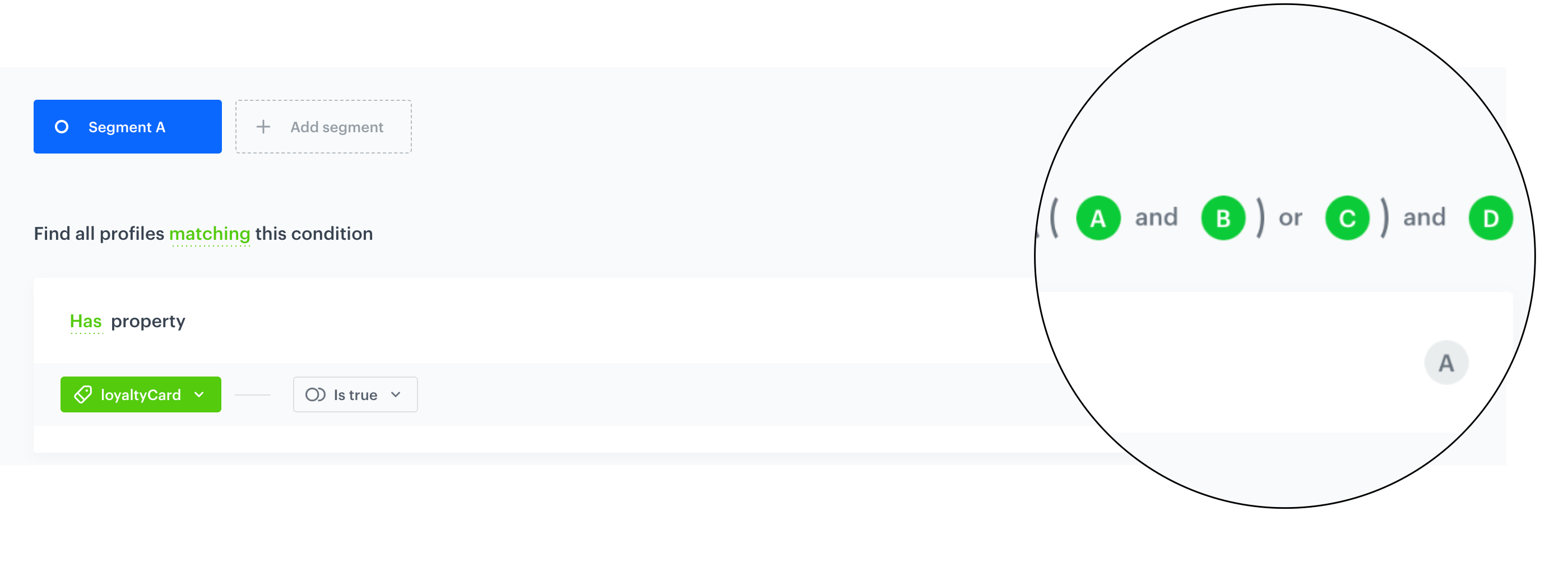
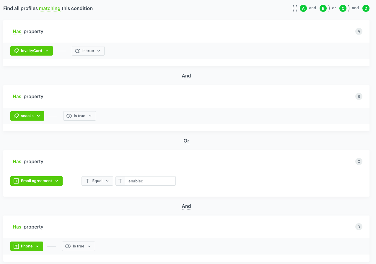 | | | |
| Customers who have | | | | |
| Customers who have | | | | |
| Customers who have | | | | |
| Customers who have | | | | |
| | | |
| Customers who have | | | | |
| Customers who have | | | | |
| Customers who have | | | | |
| Customers who have | | | | |