You can create a dashboard to monitor churn predictions.
The scenario in this example is a continuation of [Predict churn](/use-cases/churn-prediction), but with some tweaks it can be used for other predictions.
Reducing churn
## Prerequisites
---
- The prediction from [Predict churn](/use-cases/churn-prediction) is ready.
- You are familiar with [expressions](/docs/analytics/expressions), [metrics](/docs/analytics/metrics), and [dashboards](/docs/analytics/analytics-dashboard).
## Process
---
In this use case, you will go through the following steps:
1. [Create metric](/use-cases/predictions-dashboard#create-metric) to calculate the conversion of customers who were at different risks of churn.
2. [Create dashboard](/use-cases/predictions-dashboard#create-dashboard).
## Create metric
---
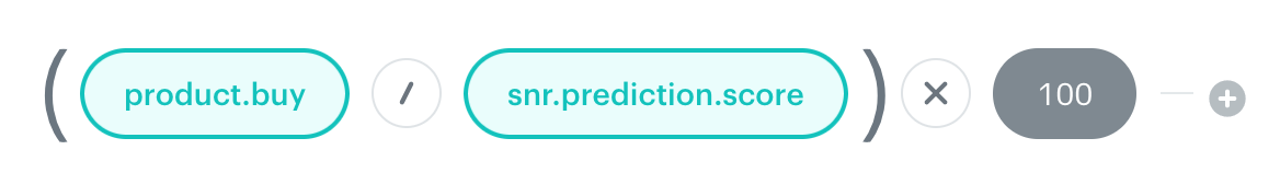
In this stage, you create two metrics to calculate the conversion of customers who were at different risks of churn.
1. Create new metric.
2. As the metric type, select **Formula metric**.
3. As the first node, add a `product.buy` event:
1. Set the **aggregator** to **Count**.
2. Set **Occurrence type** to **All**.
3. Add a contact filter with the following event conditions:
- Action: `snr.prediction.score`
- `modelId` equal to the model ID of your prediction.
The model ID can be copied from the menu in the Prediction list.
- `score_label` equal to `Low`
Contact filter for product.buy event
4. As the second node, add a `snr.prediction.score` event:
1. Set the **aggregator** to **Count**.
2. Set **Occurrence type** to **All**.
3. Set the following conditions:
- `modelId` equal to the model ID of your prediction.
- `score_label` equal to `Low`
3. Set the mathematical operator between the nodes to division.
4. Encase the nodes in brackets.
5. Multiply the result by 100.
Completed metric formula
6. Save the metric.
**Result:** This metric shows the percentage of customers who were at low risk of churn and made a purchase.
7. Repeat steps 1-8 to create a second metric, but replace the value of `score_label` with `High`.
This will create a metric showing the percentage of customers who were at high risk of churn and made a purchase.
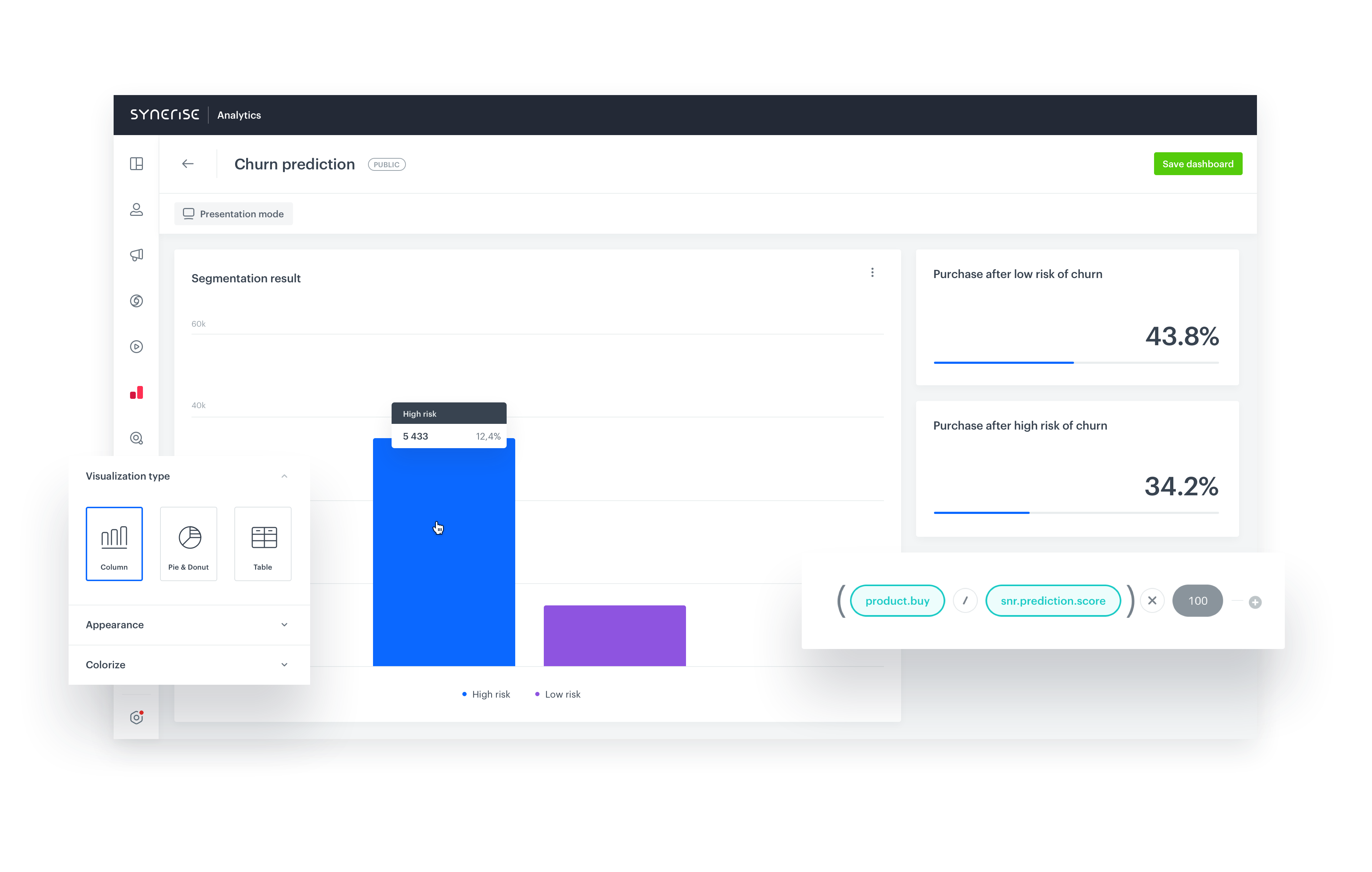
## Create dashboard
---
In this stage, you create a dashboard that counts customers at risk of churn and shows the results of the metrics created in the previous stage. You can use this information to assess the effectiveness of churn prediction.
1. Go to **Decision Hub > Dashboards > Add dashboard**.
2. Add a segment to the dashboard:
1. In the menu above the canvas, click .
2. Click the widget that appears.
3. In the panel on right, from the **Segmentation** drop-down list, select **Create new**.
**Result:** The segmentation editor opens.
4. Add the segment with customers whose probability of churn is high:
1. Click **Choose filter** and select the `snr.prediction.score` event.
2. Add the following condition: `modelId` equals the ID of the model of the prediction you want to analyze.
The model ID can be copied from the menu in the Prediction list.
3. Add the following condition: `score_label` parameter equals `high`.
4. Enter a meaningful name for the segment.
1. Add a new segment by clicking the plus icon next to the current segment.
2. Repeat step **d** for the new segment, but change the condition to `score_label` parameter equals `low`.
3. Click **Save & Exit**.
**Result:** You are returned to the dashboard creator.
1. Add the metrics to the dashboard:
1. Click .
2. Click the widget that appears.
3. From the **Metric** drop-down list, select one of the metrics that you created previously.
4. On the **Style** tab, change **Data format** to **%**.
5. Repeat steps **3a-3d** to add the other metric.
2. Click **Save dashboard**.
**Result:** The dashboard becomes available for viewing and sharing. You can change the date range when viewing the results.
## Check the use case set up on the Synerise Demo workspace
---
You can check the [dashboard](https://app.synerise.com/analytics/dashboards/027184a7-d282-43c4-8acd-8fb192fb5e58) configuration directly in Synerise Demo workspace.
If you’re our partner or client, you already have automatic access to the **Synerise Demo workspace (1590)**, where you can explore all the configured elements of this use case and copy them to your workspace.
If you’re not a partner or client yet, we encourage you to fill out the contact [form](https://demo.synerise.com/request) to schedule a meeting with our representatives. They’ll be happy to show you how our demo works and discuss how you can apply this use case in your business.
## Read more
---
- [Dashboards](/docs/analytics/analytics-dashboard)
- [Metrics](/docs/analytics/metrics)
- [Predictions](/docs/ai-hub/predictions)