Testing and Optimizing Dynamic Content with A/B Tests
AB tests are decent way to improve decision-making. You can use for example dynamic content to start testing your content and design. Banners can present information to the customer at the right time in a visual and attractive way. In this way, you can, for example, encourage the customers to buy your products. It also tests two different designs for campaign optimization purposes.
By changing the copy and graphics of a specific element of the website you can easily see which version of the campaign converts better in terms of results and use the one that brings more conversions. Synerise lets you not only create an unlimited number of such designs, but randomly assigns them to a specific percentage of users.
Test dynamic elements, popups or banners for campaign optimization purposes. In this way, you’ll find out which design, for example, encourages the customers to buy your products, fill a form, register, visit a landing page and much more.

Example of use
Banking Industry
Dynamic website experience optimization
The challenge is to keep the user on the website and increase the number of completed e-account applications. We can achieve additional conversions if we stop users from exiting the site using an exit pop-up and A/B tests.
For our client from the banking industry we created a landing page with the main CTA, which allowed users to set up a bank account. To users who were in the right segment, we sent an exit pop up with the question: “Are you sure you don’t want to set up an account?” In addition, we included some benefits of having an account in this bank.
With the help of exit intent technology and the ability to conduct A/B tests in real-time, we prepared 16 different messages for various segments and were able to measure their effectiveness.

Results
- 153% increase of customer conversion rate,
- 21% increase of new customer acquisition,
- 52% increase in the number of pages viewed/visited.
Retail Industry
Our client from the fashion industry wanted to encourage users of a mobile website to download a mobile application. For this purpose, he displayed three types of banners to clients, which graphically looked the same but the copy was a little bit different.
-
“The best promotions and discounts available at hand!”
-
“More convenient product browsing, club card and the latest promotions always at hand!”
-
“More options in the application! Check promotions earlier than others, browse products more conveniently!
A / B test was carried out on iOS users.
- The first version had 3.45% clicks,
- The second version had 2.52% clicks,
- The third version had 2% clicks.
The winning option has been sent in the campaign for Android users.
How to do it
-
Create dynamic content campaign in our creator.
-
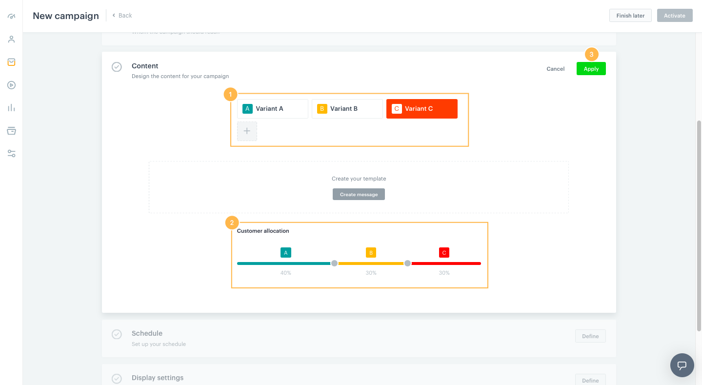
Variant A of the campaign is available by default. You can add more variants if you want to run A/B/X tests (click “+”). The maximum number of versions sent within one campaign is 3. Use Customer allocation by selecting more than one variant within the A/B/X tests, you will be able to set the size of the groups to which a given variant should be displayed. The control group (if you previously marked the Audience view) is already removed from the recipients’ bar.
