Transaction trends dashboard
Creating a transaction trends dashboard is an efficient way for businesses to keep track of their financial performance by analyzing transactional data. With this reporting tool, businesses can easily monitor trends in transaction values and purchase data. The goal of this dashboard is to provide a quick and clear overview of transactional activity, helping businesses to make data-driven decisions in real time.
In this use case, you will design a transaction trends dashboard that enables businesses to gain insights into their financial performance by visualizing transactional data.
Prerequisites
- Implement a tracking code on your website.
- Implement transaction events using SDK or API.
- Implement OG tags on your website.
Process
In this use case, you will go through the following steps:
- Create metrics for a number and value of transactions, Average Order Value (AOV), and number of bought products.
- Create a histogram that presents a number and value of transactions in time.
- Create an expression that returns the month and year for the
product.buyevent. - Create reports for most frequently bought products, most frequently bought products by categories and by month, most frequently bought categories by month, most frequently visited products, most frequently visited products by categories.
- Create a dashboard that gathers created analyses.
Create metrics
In this part of the process, you will create four metrics for the transaction.charge, product.buy and Visited page events. They will be later used in a histogram,reports and the dashboard.
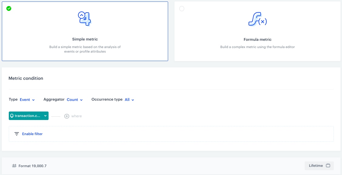
Number of transactions
This metric will return the number of all transactions.
- Go to
 Decision Hub > Metrics > New metric.
 - Enter the name of the metric.
- As a metric kind, select Simple metric.
- As the type, set Event.
- As the aggregator, set Count.
- As the occurrence type, set All.
- From the Choose event dropdown list, select
transaction.charge. - To select a specific time range, click the calendar icon. In our case, it will be Lifetime. Confirm your choice with the Apply button.
- Click Save.
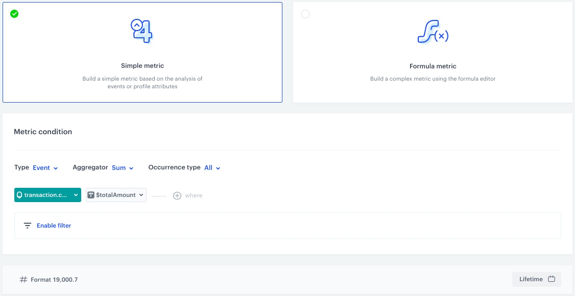
Transactions value
This metric will return the value of transactions.
- Go to Decision Hub > Metrics > New metric.
- Enter the name of the metric.
- As a metric kind, select Simple metric.
- As the type, set Event.
- As the aggregator, set Sum.
- As the occurrence type, set All.
- From the Choose event dropdown list, select
transaction.charge. - Click the + where button.
Result: The Choose parameter button appears. - From the Choose parameter dropdown list, choose
$totalAmount. - To select a specific time range, click the calendar icon. In our case, it will be Lifetime. Confirm your choice with the Apply button.
- Click Save.
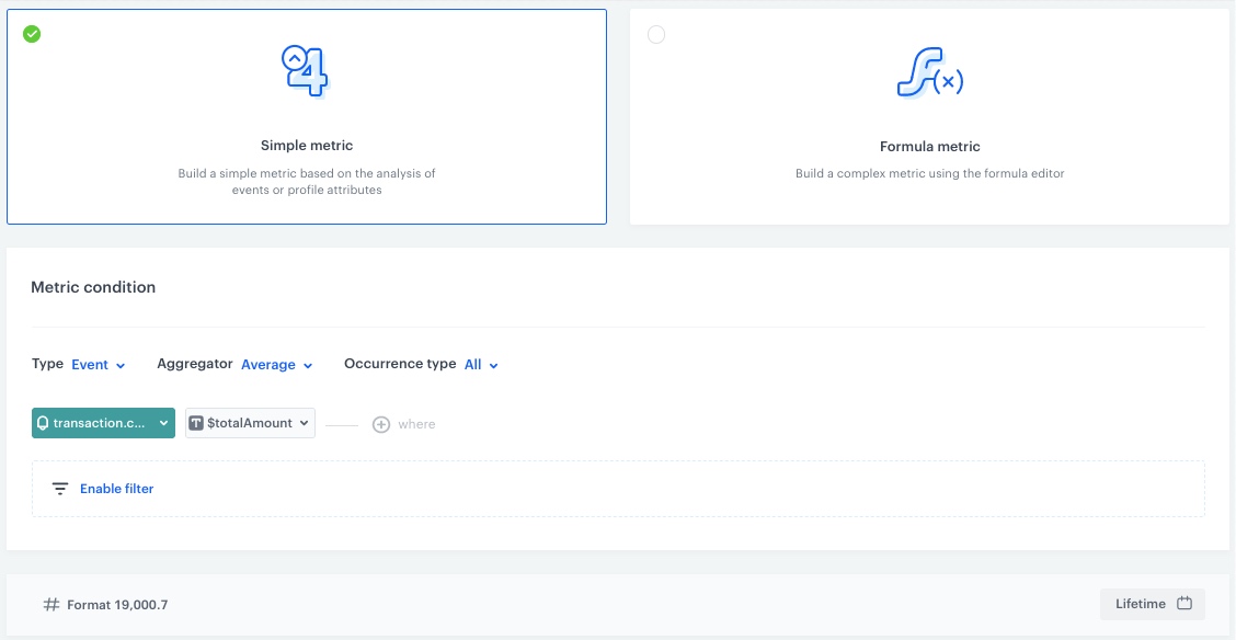
AOV
This metric will return the avarage order value.
- Go to Decision Hub > Metrics > New metric.
- Enter the name of the metric.
- As a metric kind, select Simple metric.
- As the type, set Event.
- As the aggregator, set Average.
- As the occurrence type, set All.
- From the Choose event dropdown list, select
transaction.charge. - Click the + where button.
Result: The Choose parameter button appears. - From the Choose parameter dropdown list, choose
$totalAmount. - To select a specific time range, click the calendar icon. In our case, it will be Lifetime. Confirm your choice with the Apply button.
- Click Save.
 *
*
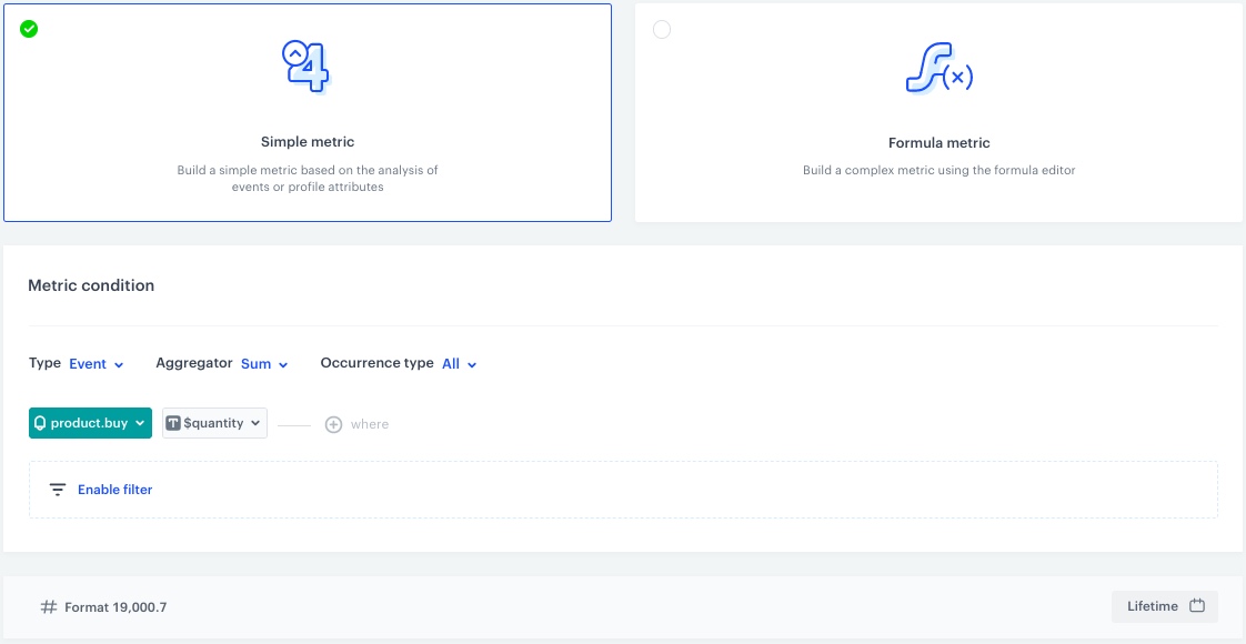
Number of bought products
This metric will return the number of bought products.
- Go to Decision Hub > Metrics > New metric.
- Enter the name of the metric.
- As a metric kind, select Simple metric.
- As the type, set Event.
- As the aggregator, set Sum.
- As the occurrence type, set All.
- From the Choose event dropdown list, select
product.buy. - Click the + where button.
Result: The Choose parameter button appears. - From the Choose parameter dropdown list, choose
$quantity. - To select a specific time range, click the calendar icon. In our case, it will be Lifetime. Confirm your choice with the Apply button.
- Click Save.
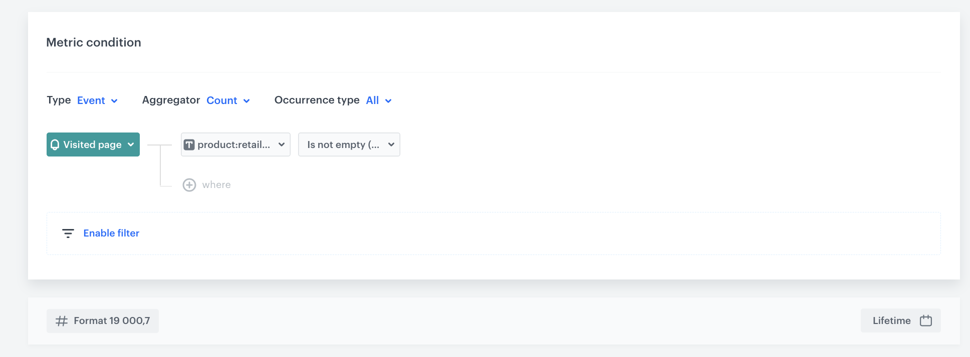
Number of visits on the product page
This metric will return the number of visits on the product page.
- Go to Decision Hub > Metrics > New metric.
- Enter the name of the metric.
- As a metric kind, select Simple metric.
- As the type, set Event.
- As the aggregator, set Count.
- As the occurrence type, set All.
- From the Choose event dropdown list, select
Visited page. - Click the + where button.
Result: The Choose parameter button appears. - From the Choose parameter dropdown list, choose
product:retailer_part_no. - From the Choose operator dropdown list, select String and Is not empty.
- To select a specific time range, click the calendar icon. In our case, it will be Lifetime. Confirm your choice with the Apply button.
- Click Save.
Create a histogram
In this part of the process, you will create a histogram for the transactions value and number of bought products metrics. They will be later used in the dashboard.
-
Go to
Decision Hub > Histograms > New histogram. -
Enter the name of the histogram.
-
From the Choose metric dropdown, select the transactions value metric created in the previous step.
-
Click the Interval button and set it for day.
-
To select a specific time range, click the calendar icon. In our case, it will be Last 30 days. Confirm your choice with the Apply button.
-
Add another metric to the histogram:
- Click the
 button.
 - Repeat steps 3-5 for the number of bought products metric created in the previous step.
- Click the
-
Click Save.
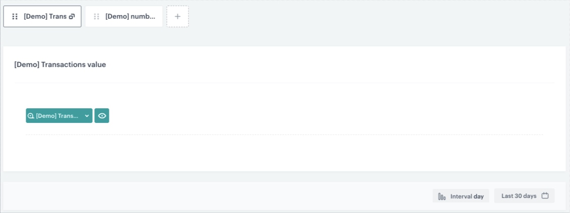
Configuration of the histogram
Create an expression
In this part of the process, create an expression for the product.buy event. It will return month and year of the purchase and will be later used in reports.
-
Go to
Behavioral Data Hub > Expressions > New expression. -
Enter the name of the expression.
-
Set the Expression for option to Event.
-
From the Choose event dropdown list, select
product.buyevent. -
Build the following formula of the expression:
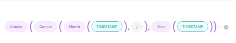
Configuration of the expression which returns the date in month/year format -
Save the expression.
Create reports
In this part of the process, you will create reports:
- for most frequently bought products,
- most frequently bought products by categories,
- most frequently bought products by month,
- most frequently bought categories by month,
- most frequently visited products,
- most frequently visited products by categories. All the reports will be used in the dashboard in the further part of the process.
This report will return the names of most frequently bought products and its values.
- Go to Decision Hub > Reports > New report.
- Enter a meaningful name of the report.
- Click the Choose metric and from the dropdown list, select a metric that returns the number of bought products, created in the previous part of the process.
- From the Range dropdown list, select the number of top (the most frequently bought) products to be shown in the preview of the report. In this case, it will be TOP 20 products.
- In the Dimension section, from the dropdown list, select Events > Parameters. To be able to show product names in the report, choose
title. - To select a specific time range, click the calendar icon. In our case, it will be Lifetime. Confirm your choice with the Apply button.
- Click Save.
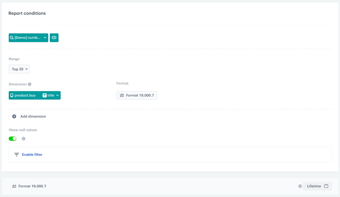
Configuration of the most frequently bought products report
This report will return the names of most frequently bought products and its values by its categories.
- Go to Decision Hub > Reports > New report.
- Enter a meaningful name of the report.
- Click the Choose metric and from the dropdown list, select a metric that returns the number of bought products, created in the previous part of the process.
- From the Range dropdown list, select the number of top (the most frequently bought) products to be shown in the preview of the report. In this case it will be TOP 20 products.
- In the Dimension section, from the dropdown list, select Events > Parameters. To be able to show products name in the report, choose
category. - To select a specific time range, click the calendar icon. In our case, it will be Lifetime. Confirm your choice with the Apply button.
- Click Save.
This report will return the names of most frequently bought products by categories and its values in a specific month.
- Go to Decision Hub > Reports > New report.
- Enter a meaningful name of the report.
- Click the Choose metric and from the dropdown list, select a metric that returns number of bought products, created in the previous part of the process.
- From the Range dropdown list, select the number of top (the most frequently bought) products to be shown in the preview of the report. In this case, it will be TOP 20 products.
- In the Dimension section, from the dropdown list, select Events > Parameters. To be able to show product names in the report, choose
title. - Click Add dimension.
- Click Choose dimension and from the dropdown list, select Events > Expressions. To be able to show the date of the transaction in the month/year format choose the expression you created in the previous part of the process.
- To select a specific time range, click the calendar icon. In our case it will be Lifetime. Confirm your choice with the Apply button.
- Click Save.
This report will return the names of most frequently bought products by categories and its values in a specific month.
- Go to Decision Hub > Reports > New report.
- Enter a meaningful name of the report.
- Click the Choose metric and from the dropdown list, select a metric that returns the number of bought products, created in the previous part of the process.
- From the Range dropdown list, select the number of top (the most frequently bought) products to be shown in the preview of the report. In this case, it will be TOP 20 products.
- In the Dimension section, from the dropdown list, select Events > Parameters. To be able to show products name in the report, choose
category. - Click Add dimension.
- Click Choose dimension and from the dropdown list, select Events > Expressions. To be able to show the date of the transaction in the month/year format choose the expression you created in the previous part of the process.
- To select a specific time range, click the calendar icon. In our case, it will be Lifetime. Confirm your choice with the Apply button.
- Click Save.
This report will return the names of most frequently visited products and its values.
- Go to Decision Hub > Reports > New report.
- Enter a meaningful name of the report.
- Click the Choose metric and from the dropdown list, select a metric that returns the number of visits on the product page, created in the previous part of the process.
- From the Range dropdown list, select the number of top (the most frequently bought) products to be shown in the preview of the report. In this case, it will be TOP 20 products.
- In the Dimension section, from the dropdown list, select Events > Parameters. To be able to show product names in the report, choose
og:title. - Switch off the Show null values toggle.
- To select a specific time range, click the calendar icon. In our case it will be Lifetime. Confirm your choice with the Apply button.
- Click Save.
This report will return the names of most frequently visited products and its values by categories.
- Go to Decision Hub > Reports > New report.
- Enter a meaningful name of the report.
- Click the Choose metric and from the dropdown list, select a metric that returns the number of visits on the product page, created in the previous part of the process.
- From the Range dropdown list, select the number of top (the most frequently bought) products to be shown in the preview of the report. In this case, it will be TOP 20 products.
- In the Dimension section, from the dropdown list, select Events > Parameters. To be able to show products name in the report, choose
product:category. - Switch off the Show null values toggle.
- To select a specific time range, click the calendar icon. In our case, it will be Lifetime. Confirm your choice with the Apply button.
- Click Save.
Create a dashboard
In the final part of the process you will create a dashboard with the metrics, reports and the histogram created in previous steps.
-
Go to
Decision Hub > Dashboards > Add dashboard. -
Enter the name of the dashboard.
-
To add a widget to the dashboard, click an icon on the
 panel. The icons are (left to right): HTML code, text field, image, segmentation, trend, funnel, metric, histogram, aggregate, expression, and a report.Tip: You can create a custom template according to your business needs with the help of this article or follow the sample instructions below.
 -
Add a metric by clicking the
 on the panel.
Tip: You can adjust the size of widgest by dragging their lower right corner.
on the panel.
Tip: You can adjust the size of widgest by dragging their lower right corner. -
Edit widget contents with the editor on the right. In the Metric section, choose the metric that returns the number of all transactions you have created in the previous part of the process. You can change the title and description. Do the same for the following metrics created in the previous part of the process: transactions value, AOV, and number of bought products
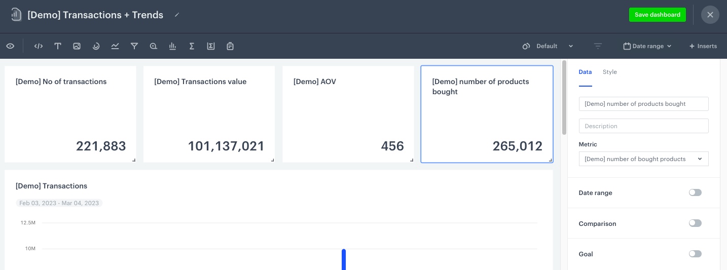
Configuration of the metric widget -
Add a histogram by clicking the Histogram icon on the panel.
-
Edit widget contents with the editor on the right. In the Histograms section, choose the histogram for the transactions value and number of bought products you have created in the previous part of the process. You can change the title and description.
-
Click the Style section in the widget editor and change Visualization type to Column.
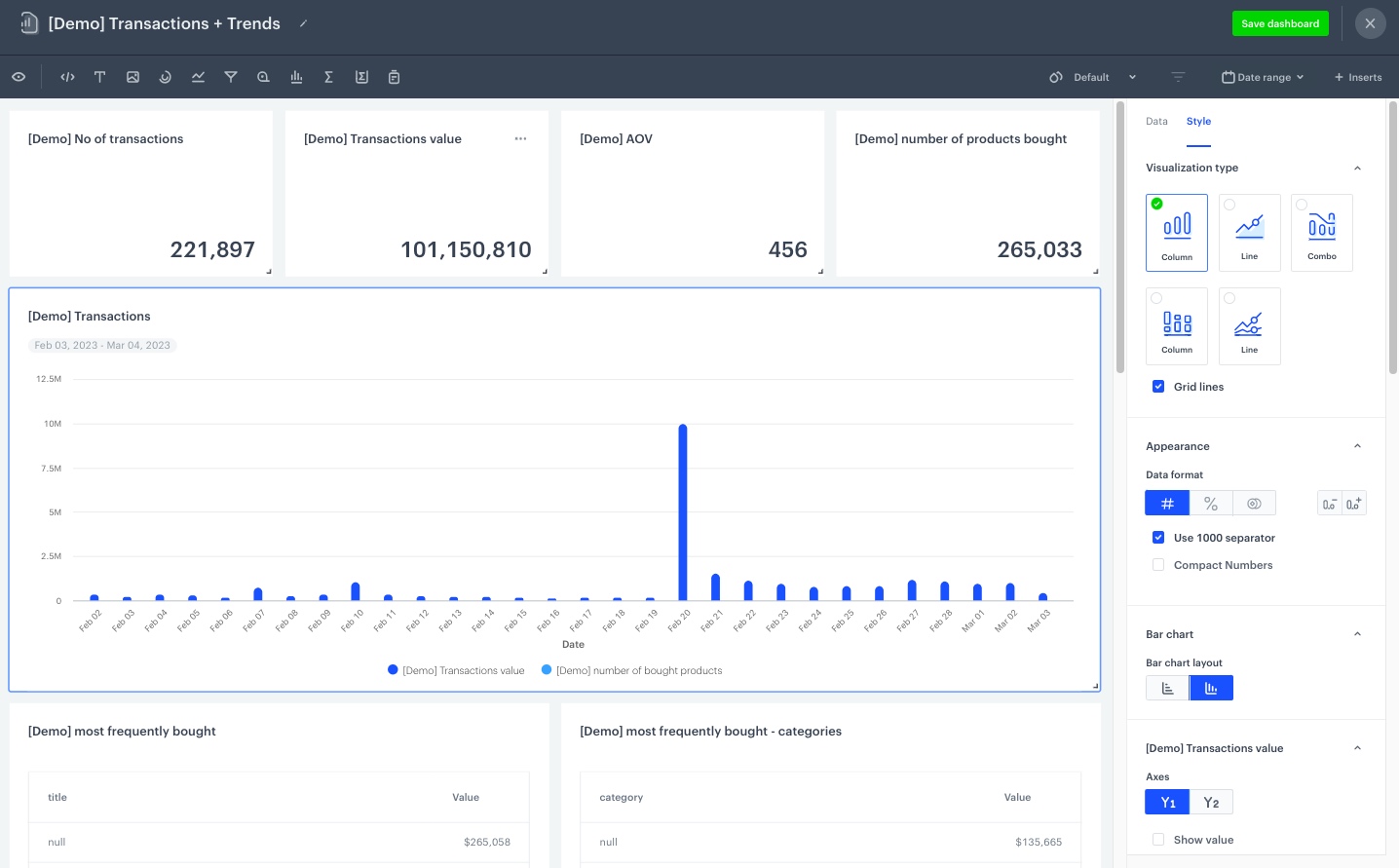
Style configuration of the histogram -
Add a report by clicking the Report icon on the panel.
-
Edit widget contents with the editor on the right. In the Reports section, choose the report for most frequently bought products you have created in the previous part of the process. You can change the title and description.
-
Click the Style section in the widget editor and change Visualization type to Table.
-
Do the same for the following reports created in the previous part of the process: most frequently bought products by categories, most frequently bought products - month comparison, most frequently bought products by categories - month comparison, most frequently visited products, most frequently visited products by categories.
Note: You can look up the sample dashboard created in the Demo workspace here -
When you complete creating the dashboard, click Save dashboard.
Tip: By default, a new dashboard is private. If you want to share it with others, check the instruction here.
Check the use case set up on the Synerise Demo workspace
You can check all configurations directly in Synerise Demo workspace:
- Metrics
- Histogram
- Expression
- Reports
- Dashboard
If you’re our partner or client, you already have automatic access to the Synerise Demo workspace (1590), where you can explore all the configured elements of this use case and copy them to your workspace.
If you’re not a partner or client yet, we encourage you to fill out the contact form to schedule a meeting with our representatives. They’ll be happy to show you how our demo works and discuss how you can apply this use case in your business.