An advanced landing page drag and drop builder lets create customizable landing pages without the need for coding or technical expertise. You can easily arrange and personalize different page elements like text, images, forms, and buttons. Just drag and drop them where you want them to appear on the page.
If you use AdBlock, you need to disable it before proceeding to the Landing Page Creator. Otherwise, you may not be able to use it.
Creating a template
- Go to Experience Hub > Landing Page > Add landing page.
- In the Content section, click Define.
- Click Create message > New template.
- On the pop-up, select Drag & drop builder > Advanced builder.
Result: You are redirected to the advanced builder.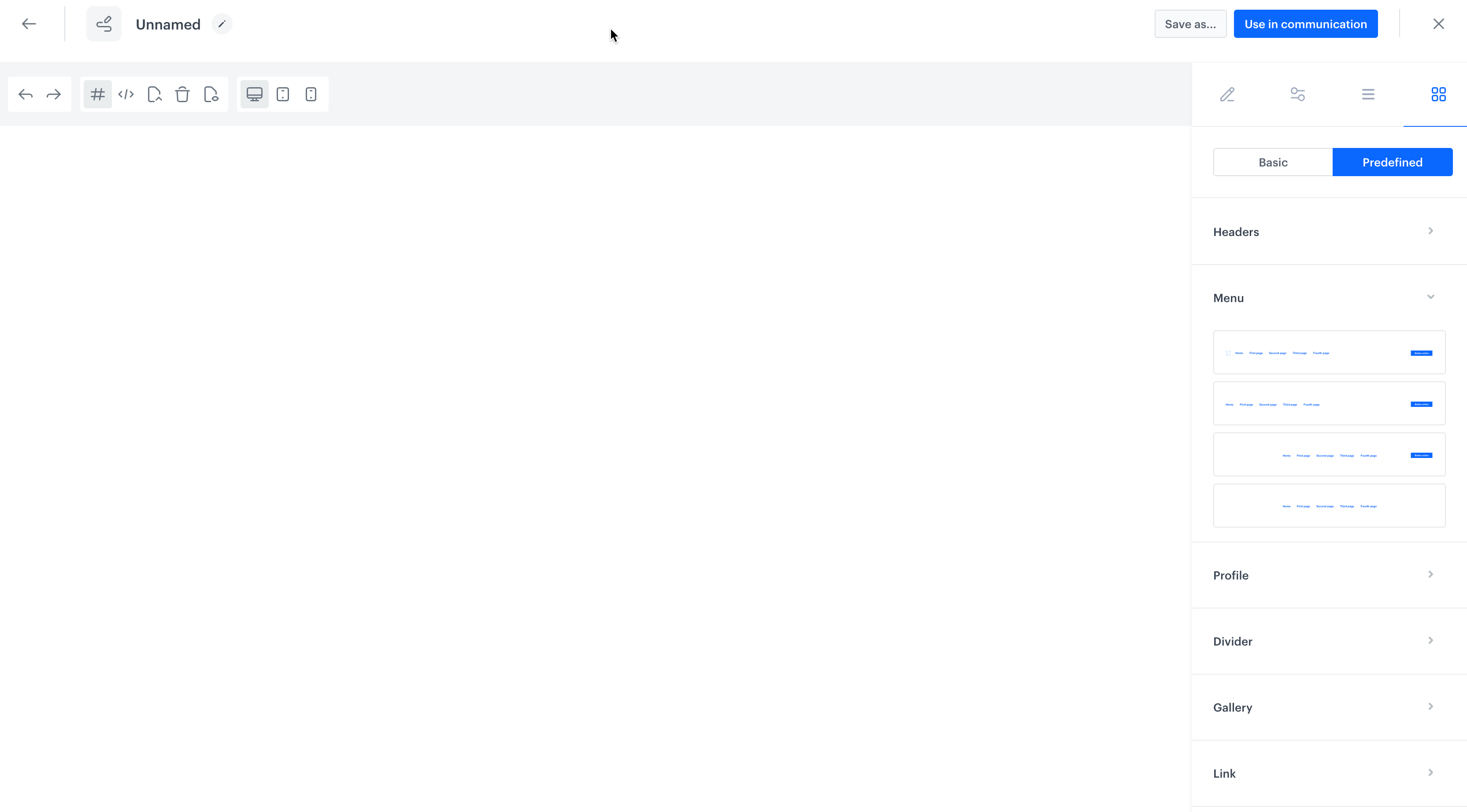
Advanced landing page builder
Widget reference
- To access widget library, on the right pane, click

You can make use of the folders in the widget library:
Basic - This library offers a collection of basic widgets that provide a starting point for your designs.
Basic Description 1 section Inserts one box 1/2 section Inserts one box divided into two smaller spaces 1/3 section Inserts one box divided into three smaller spaces 3/7 section Inserts one box divided into two spaces - one smaller, one bigger Button Inserts a button Divider Inserts a line that can be used to divide content inside a template Text Inserts a text box Image Inserts a box dedicated for image upload to the template Image link Inserts a container for the link to the image Quote Inserts a text box with a default setting of italic font Link Inserts a link - Predefined - This library offers a collection of pre-designed widgets. Each widget comes with a variety of design options, allowing you to select the most suitable design that aligns with your specific requirements and customize it to match your needs.
Predefined Description Headers Inserts a header of a landing page Menu Inserts a top menu of landing page for easy navigation between different content sections Profile Inserts a box which you can dedicate to introducing people Divider Inserts a line which lets you separate content sections in a template Gallery Inserts a section with the boxes in which you can add images Link Inserts a section dedicated to links, it contains spaces into which you can incorporate short description, icons, and images Module Inserts a box with a large image, description, and action link Product Inserts a section dedicated to products, it contains dedicated space for images, product descriptions, and links Footer Inserts a bottom section of the page that typically appears across all pages of a website. It contains a variety of information such as contact details, links to important pages, social media icons, copyright notices, and legal disclaimers. - To add a widget to the canvas, drag it from the library and drop it to the canvas
- You can customize the design of the widget (widget personalizing options) and define functional options in the Components section available on the right pane by clicking

Widget personalizing options
To customize the widget design, click the widget on the canvas. On the right pane, the following options will be available:
- Classes - This section lets you define a class of the widget you are editing.
- General - This section lets you adjust the position of the widget, define the size of the space between the widget and the top, bottom, left and right edges.
- Dimension - This section lets you change the size of the widget, its width and height, space between the widgets and padding.
- Typography - This section lets you adjust the font-related settings, you can change font type and size, its weight and letter spacing. Such options as text alignment, text shadow and text decoration will help you make the content on the landing page look more attractive.
- Decorations - This section lets you change opacity, background color, the rounding corner, the width and border style.
- Extra - This section lets you change the dimension of the widgets, by making them look tilted or turned upside down.
- Flex - This section lets you create a container of elastic blocks and manipulate those blocks in regard of their parent and children elements.
Additionally, in the components settings tab (), you can add additional parameters of the widget you are editing. For example, for an image it will be an alternative description that will appear instead of an image if it cannot be correctly displayed in the browser. For a button it will be a link to a website and settings whether a website will open in a new window.
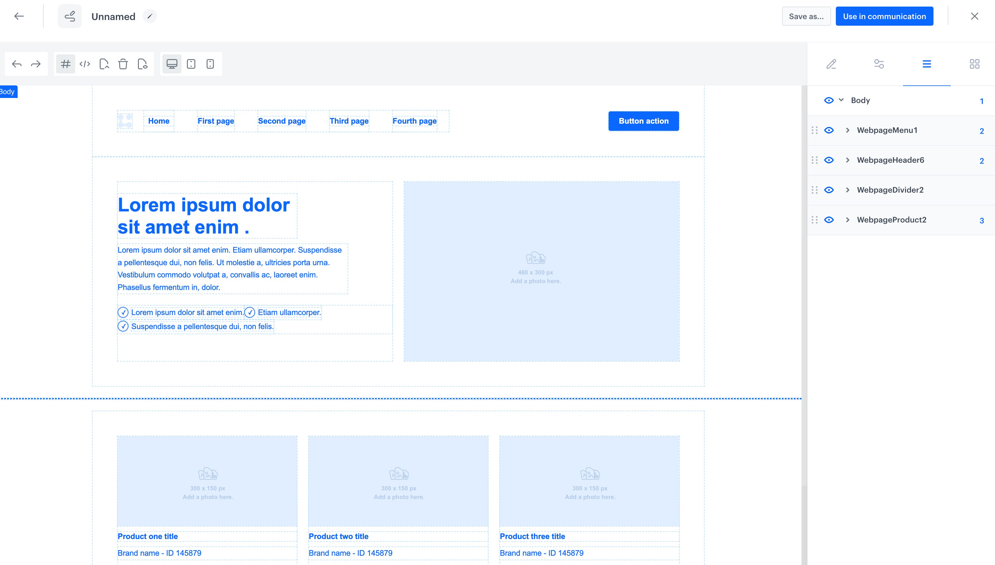
Template body preview
You can check the structure of the landing page and change the position of widgets used in the landing page. The template body preview is available on the right pane by clicking 
Saving template
- To save the template, on the top of the page, click Save as.
- On the pop-up, in the Template name field, enter the name of the template.
- Select the template directory in which the template will be saved.
- Click Save.
- To use the template in for a landing page, click Use in communication.
Result: You will be redirected to the configuration form of the landing page.